


什么是 CSS Float(浮动)?
CSS 的 Float(浮动),会使元素向左或向右移动,其周围的元素也会重新排列。
Float(浮动),往往是用于图像,但它在布局时一样非常有用。
最早是为了让web开发人员实现简单的布局,
例如:文章的文字环绕图片 而诞生的,web开发人员
很快的就意识到,浮动不仅仅可以浮动图片,而且可以浮动其他的元素,浮动被用来实现网站的布
局,它使信息可以横向排列,浮动曾经是运用最广泛的布局方法
元素怎样浮动
- 元素的水平方向浮动,意味着元素只能左右移动而不能上下移动。
- 一个浮动元素会尽量向左或向右移动,直到它的外边缘碰到包含框或另一个浮动框的边框为止。
- 浮动元素之后的元素将围绕它。
浮动元素之前的元素将不会受到影响。
浮动特点:
浮动元素会脱离文档流,在页面中不占位置,但是文本会环绕浮动元素,这是由于浮动最早的设计
理念,行内标签浮动之后可以设置宽高,可以设置内外边距,块标签浮动之后不再独占一行;
浮动元素的位置/定位
- 脱离文档流
- 随着兄元素到一个能容纳自己的位置,之后向左或向右平移,直到碰到容器的边缘或者另一个浮动的元素
清除浮动 - 使用 clear
元素浮动之后,周围的元素会重新排列,为了避免这种情况,使用 clear 属性。
clear 属性指定元素两侧不能出现浮动元素。
.text_line
{
clear:both/right/left;
}
溢出 overflow:
- hidden 隐藏 隐藏溢出的内容
- scroll 滚动条 通过滚动条显示溢出的内容
- auto 自动
visible 可见,除了visible 都可以解决 margin带来的共边穿透的问题,还可以解决浮动带来的问题;
扩展:
BFC 块格式化上下文
形成了一个块级盒子
包含内部浮动
排除外部浮动
阻止共边穿透
在容器上加上除了overflow:visible的 overflow属性
让我们看看案例吧!
<!DOCTYPE html>
<html lang="en">
<head>
<meta charset="UTF-8">
<meta http-equiv="X-UA-Compatible" content="IE=edge">
<meta name="viewport" content="width=device-width, initial-scale=1.0">
<title>Document</title>
<style>
body{
margin: 0;
}
.page{
width: 800px;
background-color: rgb(255, 126, 126);
/* height: 800px; */
overflow: hidden;
}
.box1,.box2,.box3{
/* width: 300px; */
width: 50%;
height: 200px;
}
.box1{
background-color: rgb(93, 246, 246);
float: left;
/* float: right; */
}
.box2{
background-color: rgb(179, 106, 246);
float: left;
/* float: right; */
}
.box3{
background-color: rgb(244, 239, 91);
float: left;
/* float: right; */
}
.spanbox{
background-color: rgb(244, 239, 91);
float: left;
/* float: right; */
width: 50%;
height:100px;
margin-top: 50px;
}
.floatElement1{
width: 300px;
height: 300px;
background-color: #5df6f6;
float: left;
}
.floatElement2{
width: 300px;
height: 200px;
background-color: #b36af6;
float: left;
}
.floatElement3{
width: 300px;
height: 200px;
background-color: #f4ef5b;
float: left;
}
.floatElement4{
width: 200px;
height: 200px;
background-color: #77f45b;
float: left;
}
.clearfloat{
clear: both;
}
</style>
</head>
<body>
<div class="page" >
<div class="" style="width: 200px;height:200px;background-color:red; margin-top: 100px;"></div>
<div class="floatElement1">第一个浮动元素</div>
<div class="floatElement2">第二个浮动元素</div>
<div class="clearfloat"></div>
<div class="floatElement3">第三个浮动元素</div>
<div class="floatElement4">第四个浮动元素</div>
<div class="floatElement1">第一个浮动元素</div>
<div class="clearfloat"></div>
</div>
<div class="fatherElement" style="width: 200px;background-color: #b36af6; overflow:hidden;margin-bottom: 50px;">
<div class="sonElement" style="width: 100px;height: 300px;background-color: #f4ef5b;margin-top: 100px; overflow: hidden;"></div>
<div class="" style="width: 200px;height:200px;border: 1px solid red; margin-top: 50px; overflow: hidden;">这是一个正方形</div>
</div>
</body>
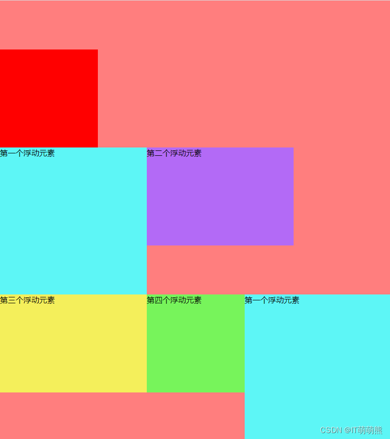
</html>运行效果图:
赶紧点赞收藏起来运行一下吧!


 834
834


 被折叠的 条评论
为什么被折叠?
被折叠的 条评论
为什么被折叠?
 到【灌水乐园】发言


