


antd-table 滚动条+分页
方法一:
HTML
<div className="all-table">
                  <Table
                    className="auto-scroll-y"
                    size={'small'}
                    pagination={{
                      ...tablePagination,
                    }}
                    rowSelection={{
                      type: 'checkbox',
                      ...rowSelection,
                    }}
                    scroll={{ y: '100%', scrollToFirstRowOnChange: true }}
                    columns={columns}
                    dataSource={data}
                  />
                </div>
CSS
.all-table {
padding: 0 24px;
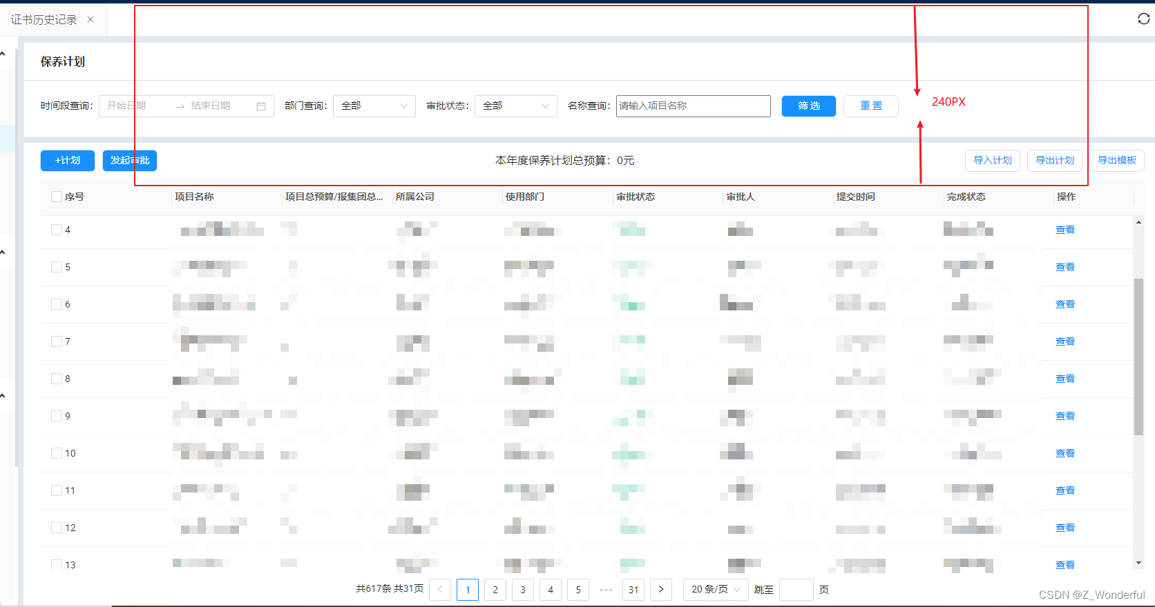
// 视情况而定
height: ~'calc(100% - 240px)';
.auto-scroll-y {
width: 100%;
.ant-table.ant-table-small {
height: 100%;
}
.ant-table-pagination.ant-pagination {
margin: 0;
padding: 32px 0;
}
}
}
方法二:
HTML
<div className="acontent-table">
<Table
className="auto-scroll-t"
// rowSelection={{
// type: 'checkbox',
// onChange: (selectedRowKeys) => {
// this.setState({
// delDataIDs: selectedRowKeys,
// });
// },
// }}
pagination={{
...tableIndex,
position: ['bottomCenter'],
showQuickJumper: true,
showSizeChanger: true,
showTotal: () => `共${Math.ceil(tableIndex.total / tableIndex.pageSize)}页`,
onChange: async (pageNo, pageSize) => {
// getCertificateInfoList(pageNo, pageSize);
setTableIndex({
pageNo: pageNo,
pageSize: pageSize,
total: tableIndex.value,
});
},
}}
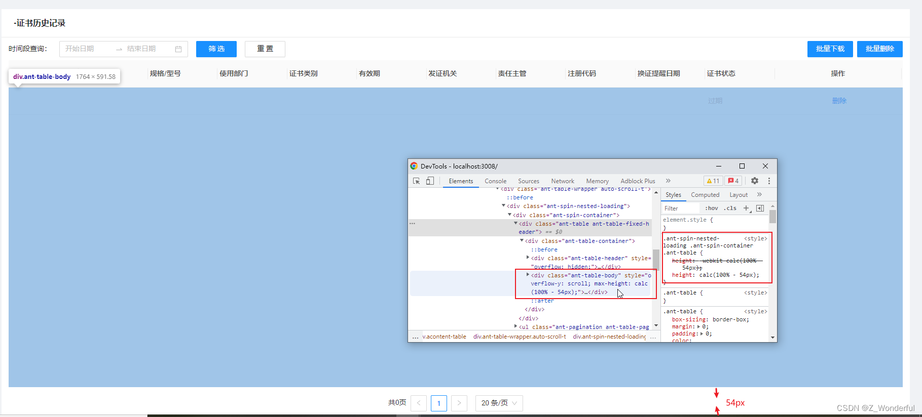
//calc(100% - 64px) 内容与 css .ant-table-body { height: ~'calc(100% - 64px)'}一致
scroll={{ y: 'calc(100% - 64px)', scrollToFirstRowOnChange: true }}
columns={columns}
dataSource={dataSource}
/>
</div>
CSS
.acontent-table {
  width: 100%;
  height: 100%;
}

.auto-scroll-y {
  height: 100%;
}
.auto-scroll-t {
  height: 100%;
  .ant-spin-nested-loading .ant-spin-container .ant-table .ant-table-container .ant-table-body {
  //与scroll={{ y: 'calc(100% - 64px)', scrollToFirstRowOnChange: true }}一致
    height: ~'calc(100% - 64px)';
  }
}


 1万+
1万+


 被折叠的 条评论
为什么被折叠?
被折叠的 条评论
为什么被折叠?
 到【灌水乐园】发言


