


参考:前端emo怪
地址:https://www.bilibili.com/video/BV14Y4y1i7Xh?spm_id_from=333.851.header_right.history_list.click
1.实现渐变色动态背景效果
(1)animation(动画)属性:animation则是通过关键帧@keyframes来实现更为复杂的动画效果。
__格式:animation: 绑定关键帧 秒数 重复次数
(2)CSS linear-gradient() 函数:用于创建一个表示两种或多种颜色线性渐变的图片.
__格式:linear-gradient(顺时针旋转读数,颜色1,颜色2,…)
实例:
<style type="text/css">
	body {
		margin: 0;
		padding: 0;
		font-family: "montserrat";
		background-image: linear-gradient(100deg,#3498db,#27ae60,#9b59b6,#3498db,#f39c12,#d35400);
		background-size: 800%;
		animation: bganimation 105s infinite;
	}
	.text {
		color: white;
		text-align: center;
		text-transform: uppercase;
		margin: 350px 0;
		font-size: 22px;
	}
	@keyframes bganimation{
		0% {
			background-position:0% 50% ;
		}
		50% {
			background-position:100% 50% ;
		}
		100% {
			background-position:0% 50% ;
		}
	}
</style>
</head>
<body>
<div id="" class="text">
	Gradient Background Animation
</div>
</body>
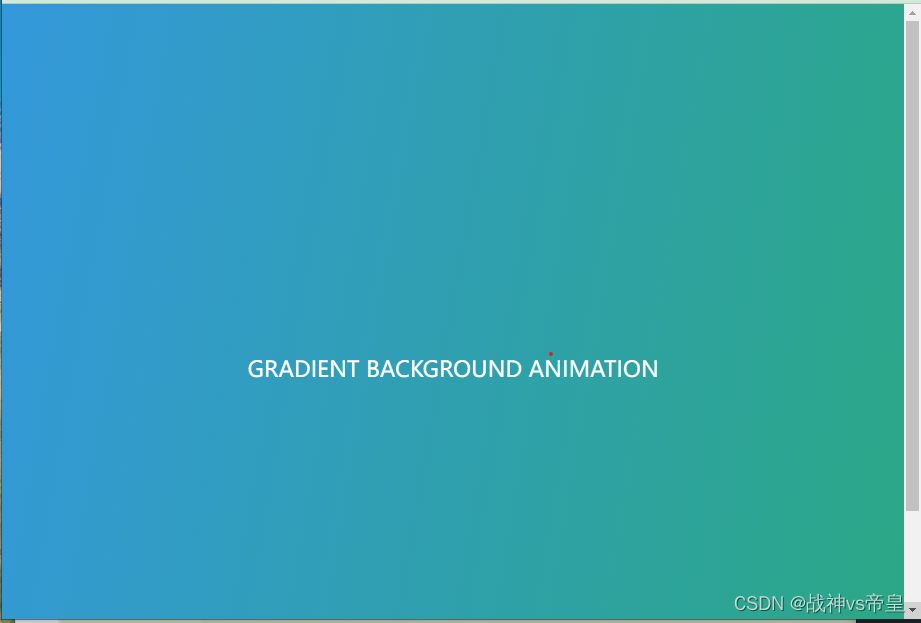
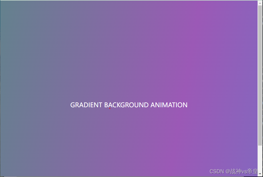
输出:(动画)


 292
292


 被折叠的 条评论
为什么被折叠?
被折叠的 条评论
为什么被折叠?
 到【灌水乐园】发言


