


文中全部代码已由作者跑过,真实可靠,发现bug或者遇到困惑请后台私信或者评论区留言~
直方图也叫频数分布图或柱状图。什么是直方图?我们生动的介绍一下

想象一下,你正站在一个大型超市的某个过道中,周围堆满了各种各样的商品。你开始注意到,一些商品的价格分布得非常不均匀。有些商品的价格非常低,而有些则价格颇高。你想要了解这个过道上商品价格的整体分布情况,于是你拿出了一张空白的纸和一支笔。现在,你开始记录起来。你将纵轴分成了几段,代表着不同价格的范围,比如说0到10美元、10到20美元、20到30美元,以此类推。然后你沿着水平轴绘制出了一系列的条形,每个条形的宽度代表了价格范围,而条形的高度则代表了该价格范围内有多少商品。绘制完成后,你看到了一幅生动的图景:柱状图像是一棵树,树干高度不一,枝叶繁茂。这就是直方图!在这个直方图里,你可以清晰地看到哪个价格范围的商品最多,哪个价格范围的商品最少。这就像是站在超市过道里,透过这棵“树”,你能够看到不同价格商品的密度和分布情况。
直方图可以用ggplot2中的geom_histogram()函数或R语言自带的基本函数hist绘制。
让我们看下第1种方法, 使用ggplot2中的geom_histogram():
# library加载要用的ggplot2包
library(ggplot2)
# data.frame生成一个数据集
data=data.frame(value=rnorm(100))
# 画一个基本的直方图
p <- ggplot(data, aes(x=value)) + # aes是ggplot函数中最基本的一个参数,表示映射,里面包含要用来画图的数据信息,这里x轴代表value值
  geom_histogram()
p
基本直方图:
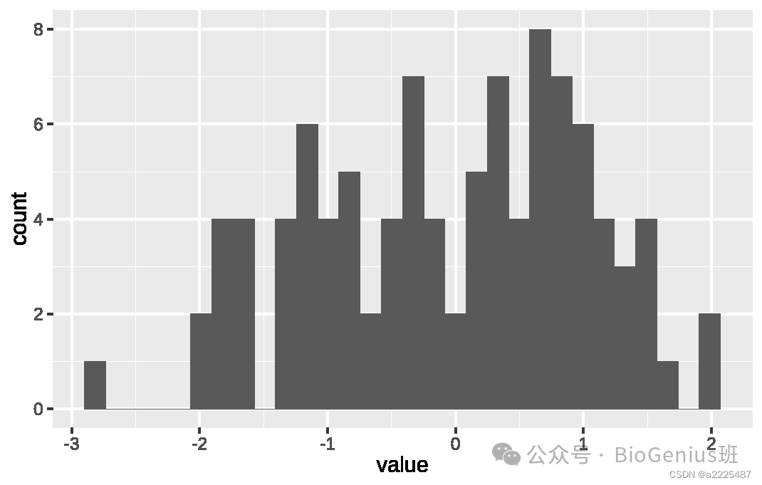
接下来换个数据集练手,并学习设置直方图每条的宽度:
# 加载包
library(tidyverse)
library(hrbrthemes)
library(showtext)
# 加载数据
data <- read.table("https://raw.githubusercontent.com/holtzy/data_to_viz/master/Example_dataset/1_OneNum.csv", header=TRUE)
data <- read.table("1_OneNum.csv",header = T) #也可以访问上行的网址,下载数据集,从本地读入
# 画图
showtext.auto()
p <- data %>%
filter( price<300 ) %>%
ggplot( aes(x=price)) +
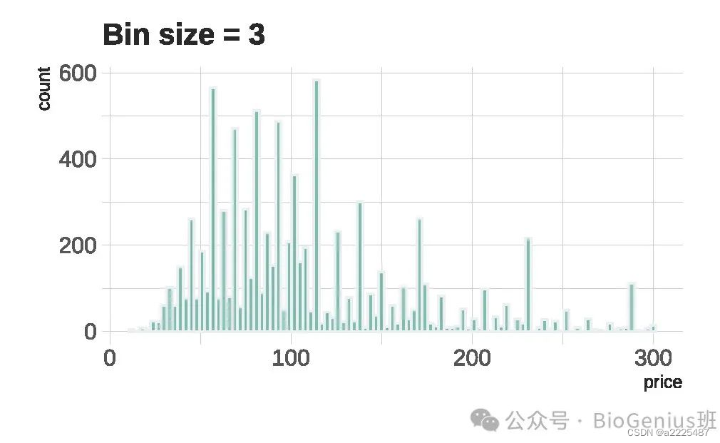
geom_histogram( binwidth=3, fill="#69b3a2", color="#e9ecef", alpha=0.9) + #binwidth 参数指定了每个直方图箱(bin)的宽度
ggtitle("Bin size = 3") +
theme_ipsum() +
theme(
plot.title = element_text(size=15)
)
p画出这样Bin size为3的直方图:
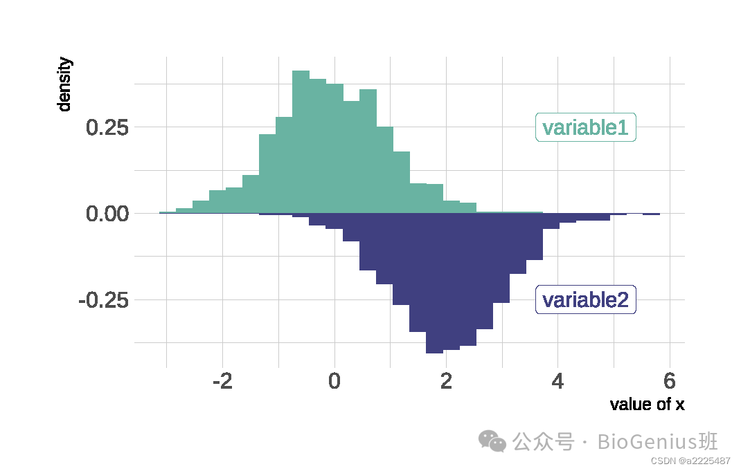
当有两组变量需要展示其密度分布时,可以使用镜像直方图(或镜像密度图,后期会讲):
# 加载包
library(ggplot2)
library(hrbrthemes)

# 创建数据
data <- data.frame(
  var1 = rnorm(1000),
  var2 = rnorm(1000, mean=2)
)
#画图
p <- ggplot(data, aes(x=x) ) +
  geom_histogram( aes(x = var1, y = ..density..), fill="#69b3a2" ) +
  geom_label( aes(x=4.5, y=0.25, label="variable1"), color="#69b3a2") +
  geom_histogram( aes(x = var2, y = -..density..), fill= "#404080") +
  geom_label( aes(x=4.5, y=-0.25, label="variable2"), color="#404080") +
  theme_ipsum() +
  xlab("value of x")
p
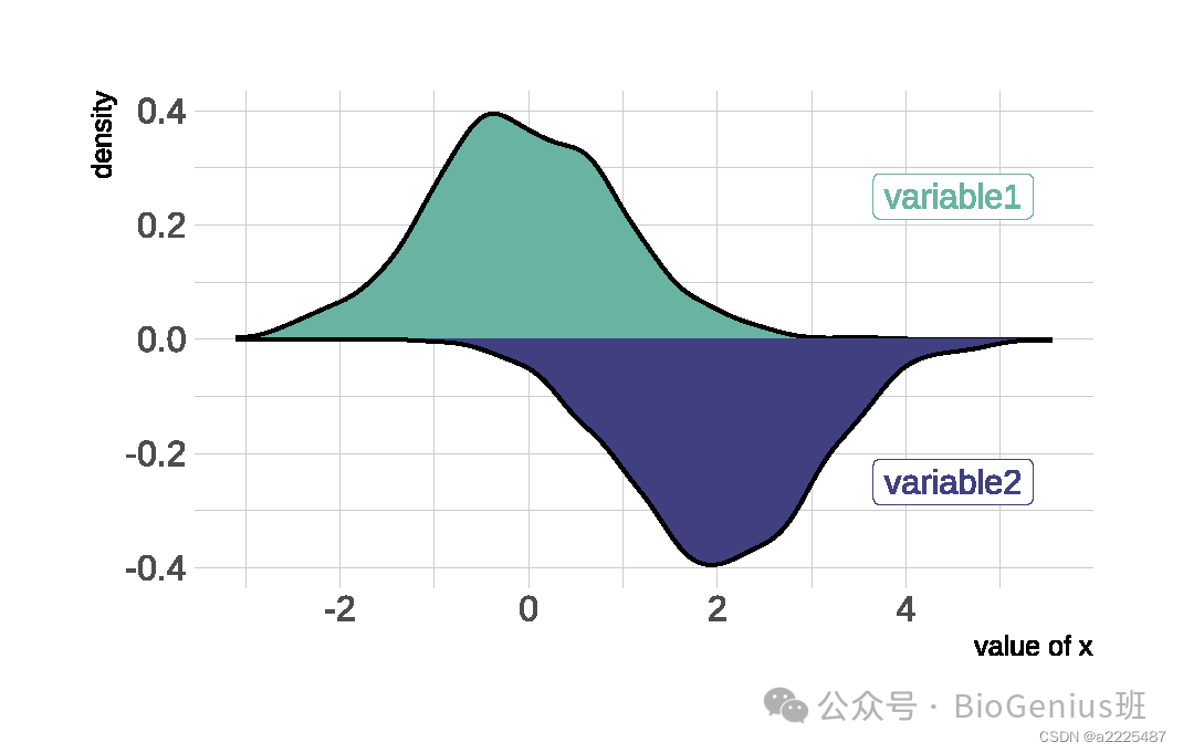
#再试一下镜像密度图,只需把geom_histogram换为geom_density函数
p <- ggplot(data, aes(x=x) ) +
  # Top
  geom_density( aes(x = var1, y = ..density..), fill="#69b3a2" ) +
  geom_label( aes(x=4.5, y=0.25, label="variable1"), color="#69b3a2") +
  # Bottom
  geom_density( aes(x = var2, y = -..density..), fill= "#404080") +
  geom_label( aes(x=4.5, y=-0.25, label="variable2"), color="#404080") +
  theme_ipsum() +
  xlab("value of x")
p
镜像密度图:
绘制具有多个分组的直方图:
# library
library(ggplot2)
library(dplyr)
library(hrbrthemes)

# Build dataset with different distributions
data <- data.frame(
  type = c( rep("variable 1", 1000), rep("variable 2", 1000) ),
  value = c( rnorm(1000), rnorm(1000, mean=4) )
)

# Represent it
p <- data %>%
  ggplot( aes(x=value, fill=type)) + #将按type类型分组
    geom_histogram( color="#e9ecef", alpha=0.6, position = 'identity') +
    scale_fill_manual(values=c("#69b3a2", "#404080")) +
    theme_ipsum() +
    labs(fill="")
p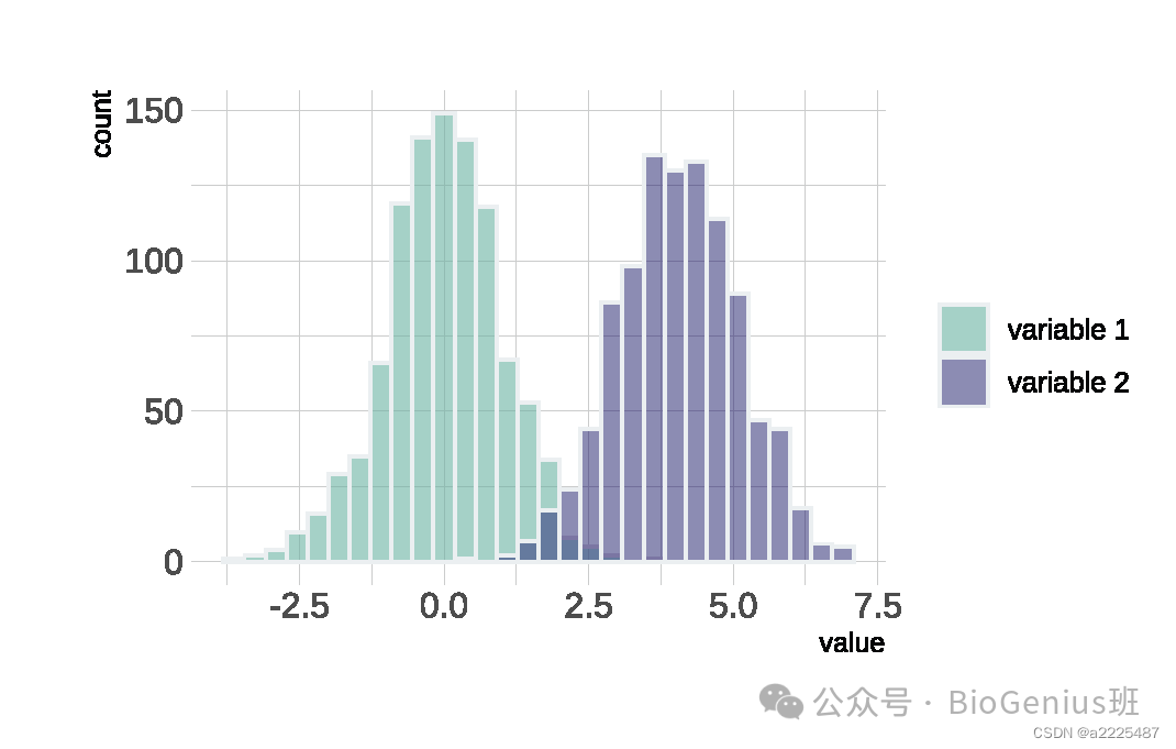
分面展示直方图:
# Libraries
library(tidyverse)
library(hrbrthemes)
library(viridis)
library(forcats)

# Load dataset from github
data <- read.table("https://raw.githubusercontent.com/zonination/perceptions/master/probly.csv", header=TRUE, sep=",")
data <- read.table("probly.csv", header=TRUE, sep=",")
data <- data %>%
  gather(key="text", value="value") %>%
  mutate(text = gsub("\\.", " ",text)) %>%
  mutate(value = round(as.numeric(value),0))

# plot
p <- data %>%
  mutate(text = fct_reorder(text, value)) %>%
  ggplot( aes(x=value, color=text, fill=text)) +
    geom_histogram(alpha=0.6, binwidth = 5) +
    scale_fill_viridis(discrete=TRUE) +
    scale_color_viridis(discrete=TRUE) +
    theme_ipsum(base_size = 3) +
    theme(
      legend.position="none",
      panel.spacing = unit(0.1, "lines"),#设置图形中面板之间的间距大小
      strip.text.x = element_text(size = 5),
      axis.text.x = element_text(size = 5),#设置 X 轴方向上条带文本的外观
      axis.title.y = element_text(vjust = 2.5)
    ) +
    xlab("") +    ylab("Assigned Probability (%)") +
    facet_wrap(~text)
p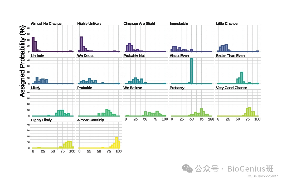
接下来介绍R语言中第2种画直方图的函数:hist()函数。
hist()函数是基础的统计绘图函数,它用于创建直方图。这个函数通常在R的内置基础包 stats 中,因此您需加载其他包即可使用它。
画一下叠加直方图:
#创建数据
set.seed(1)
Ixos=rnorm(4000 , 120 , 30)
Primadur=rnorm(4000 , 200 , 30)

# 先画出一个分组的直方图
hist(Ixos, breaks=30, xlim=c(0,300), col=rgb(1,0,0,0.5), xlab="height",
     ylab="nbr of plants", main="distribution of height of 2 durum wheat varieties" )#breaks指定直方图中的箱数。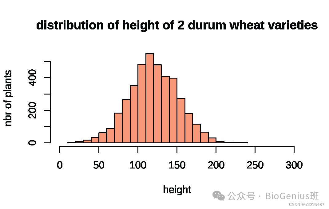
# 使用add=T把第二个分组的直方图加到图里
hist(Primadur, breaks=30, xlim=c(0,300), col=rgb(0,0,1,0.5), add=T)
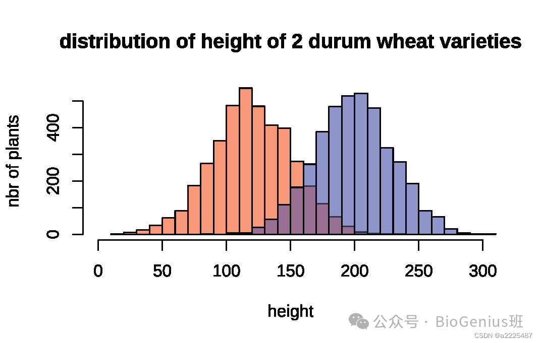
#添加图例
legend("topright", legend=c("Ixos","Primadur"), col=c(rgb(1,0,0,0.5),
     rgb(0,0,1,0.5)), pt.cex=2, pch=15,cex = 0.8,box.lty = 0)#pt.cex指定图例中标记点的相对大小,pch=15指定标记点的形状大小,cex文本的相对大小,box.lty去掉图例周围的边框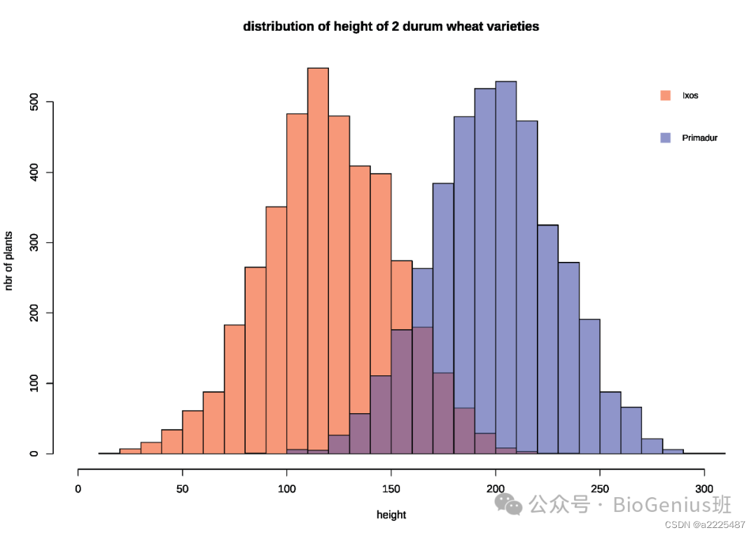
也可以把叠加的拆成两个图:
par(
  mfrow=c(1,2),#将绘图区域分割成一个行和两列的布局,即创建了一个包含两个图形的面板
  mar=c(4,4,1,0)#设置了图形的边距
)

hist(Ixos, breaks=30 , xlim=c(0,300) , col=rgb(1,0,0,0.5) , xlab="height" , ylab="nbr of plants" , main="" )
hist(Primadur, breaks=30 , xlim=c(0,300) , col=rgb(0,0,1,0.5) , xlab="height" , ylab="" , main="")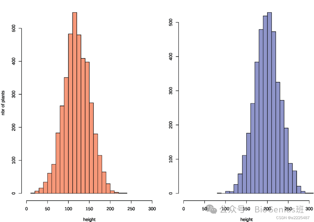
无边框直方图:
# Create data
my_variable=c(rnorm(1000 , 0 , 2) , rnorm(1000 , 9 , 2))

# Draw the histogram with border=F
hist(my_variable , breaks=40 , col=rgb(0.2,0.8,0.5,0.5) , border=F , main="")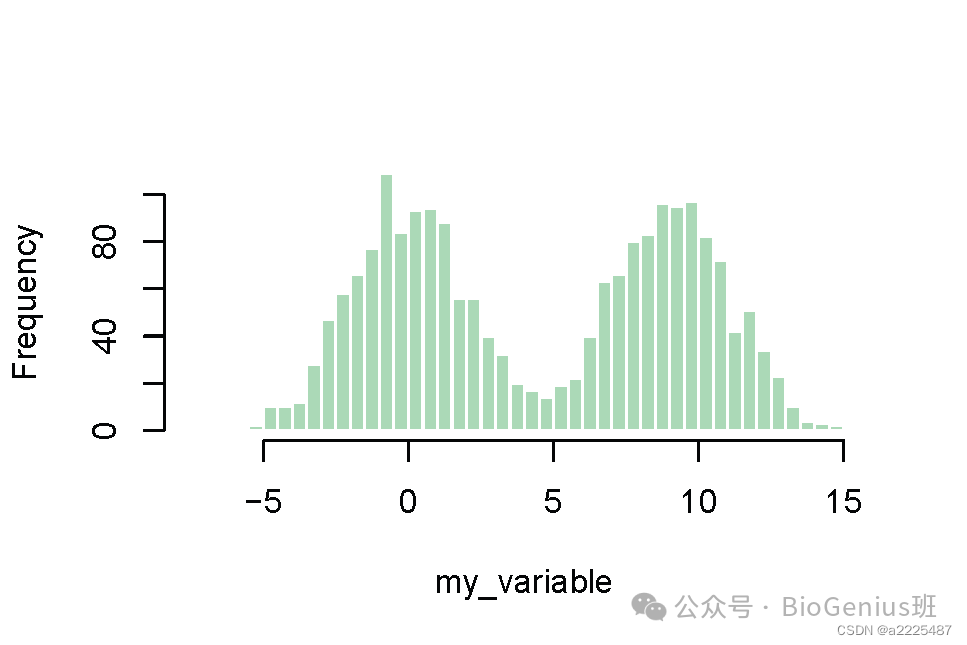
带彩色尾巴的直方图:
# Create data
my_variable=rnorm(2000, 0 , 10)
# Calculate histogram, but do not draw it
my_hist=hist(my_variable , breaks=40  , plot=F)
# Color vector
my_color= ifelse(my_hist$breaks < -10, rgb(0.2,0.8,0.5,0.5) , ifelse (my_hist$breaks >=10, "purple", rgb(0.2,0.2,0.2,0.2) ))
# Final plot
plot(my_hist, col=my_color , border=F, main="" , xlab="value of the variable", xlim=c(-40,40) ) #border设置为无边框,main设置主标题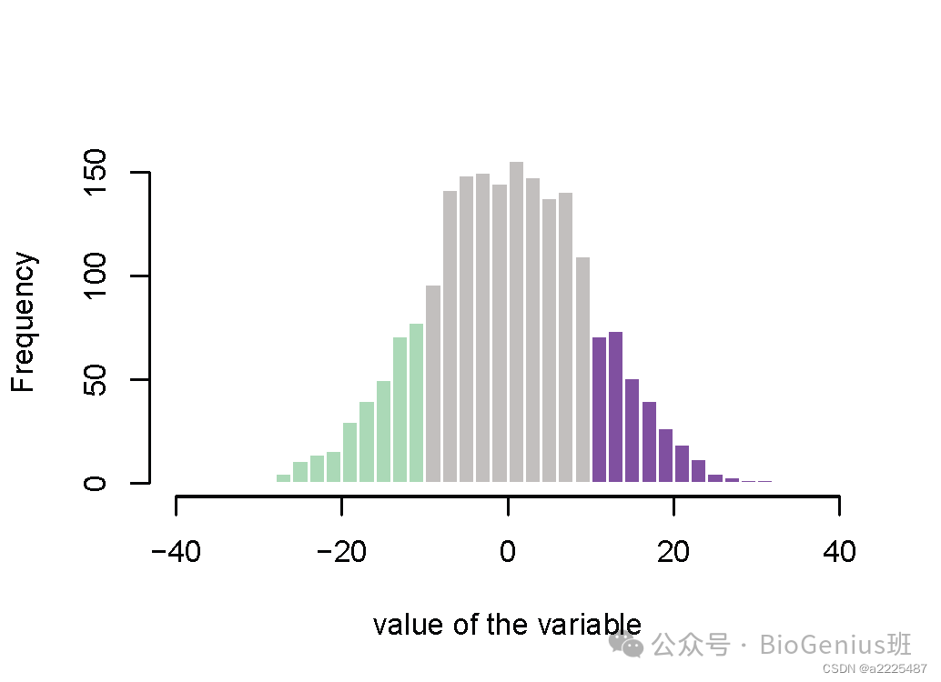
也可以画镜像直方图:
#Create Data
x1 = rnorm(100)
x2 = rnorm(100)+rep(2,100)
par(mfrow=c(2,1))

#Make the plot
par(mar=c(0,5,3,3))
hist(x1 , main="" , xlim=c(-2,5), ylab="Frequency for x1", xlab="", ylim=c(0,25) , xaxt="n", las=1 , col="slateblue1", breaks=10)
par(mar=c(5,5,0,3))
hist(x2 , main="" , xlim=c(-2,5), ylab="Frequency for x2",
xlab="Value of my variable", ylim=c(25,0) , las=1 , col="tomato3"  , breaks=10) #当 las=1 时,刻度标签水平显示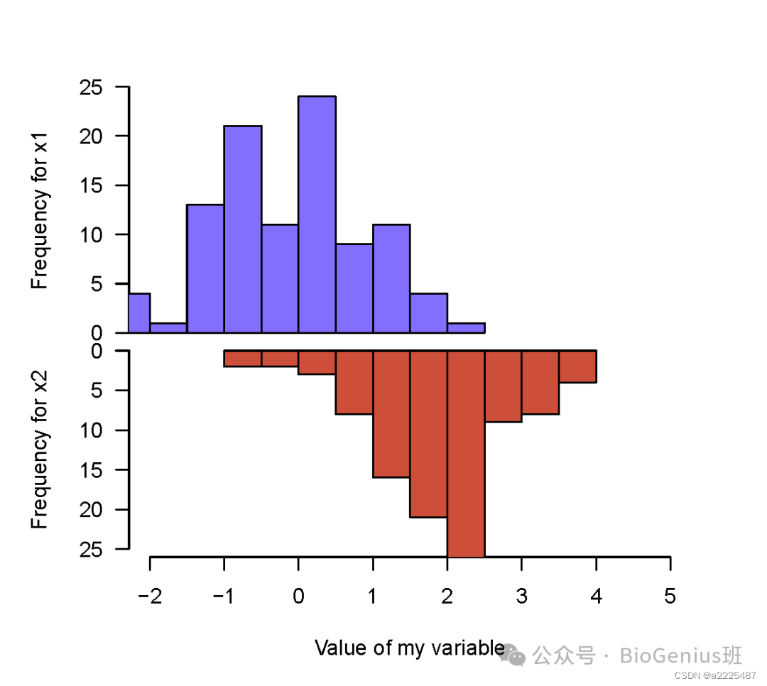
本篇直方图教程就到这里结束了,欢迎点赞、转发、打赏支持!
该篇文章代码均来自于互联网开源项目,若侵权请提供版权证明。
公众号原文见下方链接:
https://mp.weixin.qq.com/s/ePflta4dCrRjQMpLUGQHmg https://mp.weixin.qq.com/s/ePflta4dCrRjQMpLUGQHmg


 被折叠的 条评论
为什么被折叠?
被折叠的 条评论
为什么被折叠?
 到【灌水乐园】发言


