


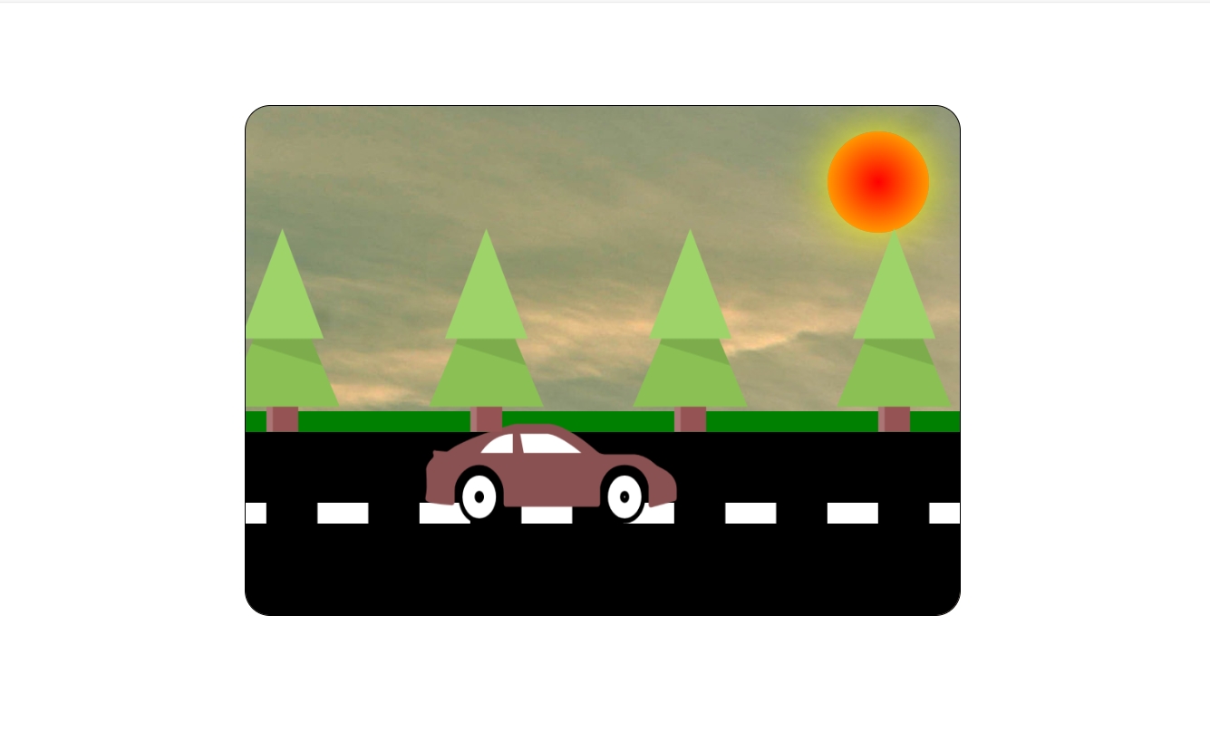
代码效果图
代码部分
<%@page contentType="text/html" pageEncoding="UTF-8"%>
<!DOCTYPE html>
<html>
     <meta http-equiv="Content-Type" content="text/html; charset=UTF-8">
        <title>JSP Page</title>
        <style>
            body{
                margin: 0px;
                padding: 0px;
            }
            .da{
                width: 700px;
                height: 500px;
                border: 1px solid black;
                margin: auto;
                margin-top: 100px;
                position: relative;
                border-radius: 25px;
                overflow: hidden;
                background-image:url(scene.jpg);
            }
            .sun{
                width: 100px;
                height: 100px;
                background: radial-gradient(circle at center, red, gold);
                border-radius: 50%;
                position: absolute;
                right:30px;
                top:25px;
                box-shadow: 0px 0px 50px #FFFF00;
            }
            .roat{
                width: 700px;
                height:180px;
                background-color: black;
                position: absolute;
                bottom: 0px;
            }
            .cao{
                width: 700px;
                height:20px;
                background-color:green;
                position: absolute;
                bottom: 180px;
            }
            .linear{
                 width:50px;
                height:20px;
                background-color:white;
                position: absolute;
                bottom:90px;
                left: 20px;
                box-shadow:100px 0px 0px white,200px 0px 0px white,300px 0px 0px white,400px 0px 0px white,500px 0px 0px white,600px 0px 0px white,700px 0px 0px white;
               animation: an 0.2s ease infinite;
               background-size: 20px;
            }
            @keyframes an{
                0%{
                transform: translateX(0px);
                /*left:0px;*/
                }
                50%{
                    /*left:-50px;*/
                    transform: translateX(-50px);
                }
                100%{
             transform: translateX(-100px);
             /*left:-100px;*/
                }
            }
            .tree{
                width:900px;
                height: 200px;
                position: absolute;
                bottom: 180px;
/*                z-index: 2;
                animation: tree 7s linear infinite;
                animation-delay:calc(-1s*var(--i));*/
            }
            .col{
                z-index:1;
                animation: tree 7s linear infinite;
                animation-delay:calc(-1s*var(--i));
            }
            @keyframes tree{
                0%{
                transform: translateX(700px);
                }
                100%{
                    transform: translateX(-700px);
                }
            }
            .img{
                position: absolute;
                bottom:90px;
                animation: car 0.2s ease infinite;
                left: 20px;
                animation: car1 10s ease infinite;
            }
            @keyframes car1{
                0%{
                    left:20px;
                }
                100%{
                  left:700px;
                }
            }
            @keyframes car{
                0%{
                transform: translateY(0px);
                }
                100%{
                    transform:translateY(-1px);
                }
            }
            .man{
                position: absolute;
                width: 200px;
                height: 300px;
                /*background-image: url(man.png);*/
                background-repeat: no-repeat;
                animation: man 1.4s infinite steps(4);
                left:80%;
                      }
            @-webkit-keyframes man{
               0%{
                  background-position:0,0;
                }
                100%{
                     background-position:-1600px,0;
                }
            }
            @keyframes man{
               0%{
                  background-position:0,0;
                }
                100%{
                     background-position:-200px,0;
                }
            }
        </style>
    </head>
    <body>
        <div class="man">
            <!--<img src="man.png" width="100" height="150">-->
        </div>
        <div class="da">

            <div class="sun">

            </div>
            <div class="roat">

            </div>
            <div class="cao">

            </div>
            <div class="linear">

            </div>
            <!--<img src="cao.png" style="bottom:180px;position: absolute;" width="700" height="20">-->
            <div class="tree">
                <img src="shu.png" width="150" height="200" style="--i:1;position: absolute;" class="col">
                <img src="shu.png" width="150" height="200" style="--i:2;position: absolute;" class="col">
                 <img src="shu.png" width="150" height="200" style="--i:3;position: absolute;" class="col">
                 <img src="shu.png" width="150" height="200" style="--i:4;position: absolute;" class="col">
                 <img src="shu.png" width="150" height="200" style="--i:5;position: absolute;" class="col">
                 <img src="shu.png" width="150" height="200" style="--i:6;position: absolute;" class="col">
                 <img src="shu.png" width="150" height="200" style="--i:7;position: absolute;" class="col">
            </div>
            <img src="bus.png" width="250" height="100" class="img">
        </div>
    </body>
</html>
技术要点
-
CSS动画:使用
@keyframes和animation属性创建各种动画效果 -
定位:大量使用
position: absolute进行精确布局 -
分层:通过
z-index控制元素的叠放顺序 -
性能优化:使用
transform代替left/top进行动画,提高性能 -
雪碧图:人物动画使用雪碧图技术减少HTTP请求
这个动画场景通过组合多个简单的CSS动画,创造出了一个生动的车辆行驶场景。
我认为CSS3的核心部分和值得学习的部分就是动画部分,通过代码实现各种旋转效果,运动效果等等。
我认为比较好的学习前段知识点的两个网站:
 https://www.w3school.com.cn/


 扫一扫
扫一扫


 1039
1039

 被折叠的 条评论
为什么被折叠?
被折叠的 条评论
为什么被折叠?
 到【灌水乐园】发言


