


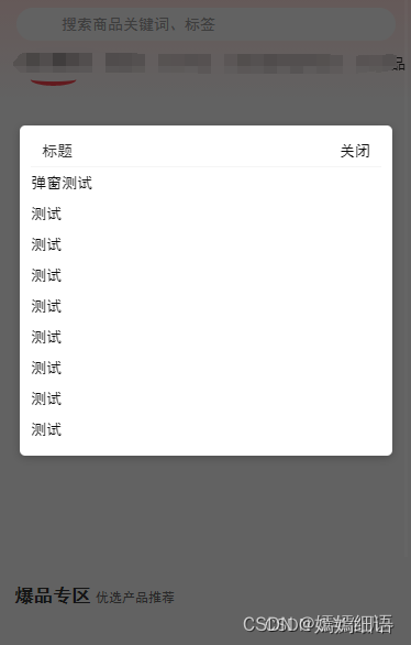
1. 如何调用?
<modal showPopup="{{true}}">
    <view slot="content">
      <image class="page_logo" src='/image/hbgg0526.png' mode="widthFix" style="width: 100%;"></image>
    </view>
</modal>
2. 组件封装
<!--components/modal/modal.wxml-->
<!-- 弹窗组件-start -->
<view class="popup-container" catchtouchmove="{{true}}" wx:if="{{showPopup}}">
    <!-- 背景遮罩层 -->
    <view class="popup-mask" catch:tap="hidePopup"></view>
    <!-- 弹窗内容 -->
    <view class="popup-content">
      <view class="popup-top-box">
        <slot name="title"></slot>
      </view>
      <view class="tag-box">
        <slot name="content"></slot>
      </view>
    </view>
  </view>
  <!-- 弹窗组件-end -->
Component({
/**
* 组件的属性列表 //传过来的参数
*/
properties: {
showPopup:{
type:Boolean,
}
},
data: {
localArray:["西安","重庆","北京市","西安","重庆","北京", ],
// showPopup: true,
},
options: {
multipleSlots: true // 复数插槽: 是
},
methods: {
showPopup() { // 显示弹窗
this.setData({ showPopup: true});
},
hidePopup() { // 隐藏弹窗
this.setData({showPopup: false});
},
}
})/* 弹窗样式 */
.popup-container {
position: fixed;
top: 0;
left: 0;
width: 100%;
height: 100%;
display: flex;
justify-content: center;
align-items: center;
z-index: 999;
}
.popup-mask {
position: absolute;
top: 0;
left: 0;
width: 100%;
height: 100%;
background-color: rgba(0, 0, 0, 0.6);
}
.popup-content {
position: relative;
width: 85%;
background-color: #fff;
border-radius: 10rpx;
padding: 20rpx;
box-shadow: 0 4rpx 16rpx rgba(0, 0, 0, 0.2);
margin-top: -200rpx;
}
.popup-top-box{
padding:6rpx 20rpx;
display: flex;
justify-content:space-between;
border-bottom: 2rpx solid #f5f5f5;
}


 1290
1290


 被折叠的 条评论
为什么被折叠?
被折叠的 条评论
为什么被折叠?
 到【灌水乐园】发言


