


Material概述及主题
学习地址:http://developer.android.com/training/material/get-started.html
使用material design创建App:
- 温习一下material design说明
- 在app中应用material 主题
- 创建遵循material design规则的布局
- 指定投射阴影的高度
- 使用ListView和CardView
- 自定义动画
使用Material 主题
<!-- res/values/styles.xml -->
<resources>
  <!-- your theme inherits from the material theme -->
  <style name="AppTheme" parent="android:Theme.Material">
    <!-- theme customizations -->
  </style>
</resources>
新的Material 主题提供了一下内容:
- 可以让你调色的系统组件
- 系统组件的触摸反馈动画
- Activity的过渡动画
Material 主题有几种:
- @android:style/Theme.Material(黑色版本)
- @android:style/Theme.Material.Light(浅色版本)
- @android:style/Theme.Material.Light.DarkActionBar
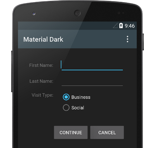
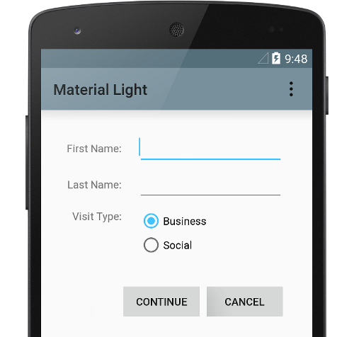
注意:Material 主题只在Android 5.0 (API level 21)及以上版本可用。
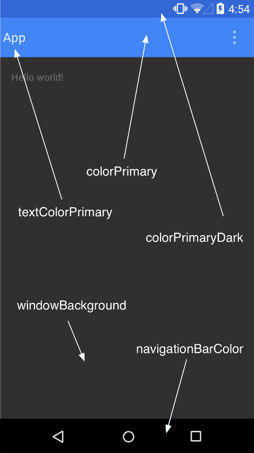
自定义调色
<resources>
  <!-- inherit from the material theme -->
  <style name="AppTheme" parent="android:Theme.Material">
    <!-- Main theme colors -->
    <!--   your app branding color for the app bar -->
    <item name="android:colorPrimary">@color/primary</item>
    <!--   darker variant for the status bar and contextual app bars -->
    <item name="android:colorPrimaryDark">@color/primary_dark</item>
    <!--   theme UI controls like checkboxes and text fields -->
    <item name="android:colorAccent">@color/accent</item>
  </style>
</resources>
自定义状态栏
使用android:statusBarColor属性修改状态栏颜色。
在XML布局中,可以通过android:theme属性修改布局元素或子元素的主题,这样很方便修改部分特定界面的颜色。
为你的View指定z轴高度
<TextView
    android:id="@+id/my_textview"
    android:layout_width="wrap_content"
    android:layout_height="wrap_content"
    android:text="@string/next"
    android:background="@color/white"
    android:elevation="5dp" />
使用List和Card
CardView的使用:
<android.support.v7.widget.CardView
    android:id="@+id/card_view"
    android:layout_width="200dp"
    android:layout_height="200dp"
    card_view:cardCornerRadius="3dp">
    ...
</android.support.v7.widget.CardView>
自定义动画
Android 5.0 (API level 21)提供了一个新的API来自定义动画,如Activity退出有一个过渡的动画:
public class MyActivity extends Activity {

    @Override
    protected void onCreate(Bundle savedInstanceState) {
        super.onCreate(savedInstanceState);
        // enable transitions
        getWindow().requestFeature(Window.FEATURE_CONTENT_TRANSITIONS);
        setContentView(R.layout.activity_my);
    }

    public void onSomeButtonClicked(View view) {
        getWindow().setExitTransition(new Explode());
        Intent intent = new Intent(this, MyOtherActivity.class);
        startActivity(intent,
                      ActivityOptions
                          .makeSceneTransitionAnimation(this).toBundle());
    }
}
RecycleView和CardView
参考地址:http://developer.android.com/training/material/lists-cards.html
RecycleView
RecyclerView是一个更高级更灵活的ListView,它让滚动大量的列表数据更加高效。
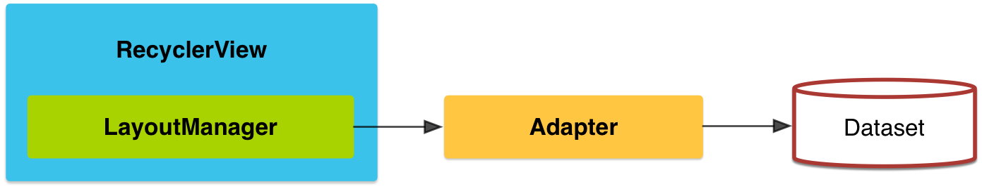
使用RecyclerView,必须指定一个Adapter(RecyclerView.Adapter)和一个LayoutManager。 layout manager 将item放到recycleView中并决定什么时候reuse它。layout manager可以向adapter请求不同的数据源来更新界面内容。回收view这种方式提升了性能,因为它避免了非必需的view的创建以及大量的findViewById()消耗。
RecyclerView提供了三个内置的layoutmanager:
- LinearLayoutManager:提供一个水平和垂直的滚动列表
- GridLayoutManager显示一个grid
- StaggeredGridLayoutManager 显示一个错列的grid
动画
RecyclerView为添加和删除item提供了一些内置的动画。可以继承RecyclerView.ItemAnimator然后使用RecyclerView.setItemAnimator()方法定制动画。
例子
<!-- A RecyclerView with some commonly used attributes -->
<android.support.v7.widget.RecyclerView
    android:id="@+id/my_recycler_view"
    android:scrollbars="vertical"
    android:layout_width="match_parent"
    android:layout_height="match_parent"/>
定义好了recycleview,然后连接一个layoutmanager,绑定一个adapter:
public class MyActivity extends Activity {
    private RecyclerView mRecyclerView;
    private RecyclerView.Adapter mAdapter;
    private RecyclerView.LayoutManager mLayoutManager;

    @Override
    protected void onCreate(Bundle savedInstanceState) {
        super.onCreate(savedInstanceState);
        setContentView(R.layout.my_activity);
        mRecyclerView = (RecyclerView) findViewById(R.id.my_recycler_view);

        // use this setting to improve performance if you know that changes
        // in content do not change the layout size of the RecyclerView
        mRecyclerView.setHasFixedSize(true);

        // use a linear layout manager
        mLayoutManager = new LinearLayoutManager(this);
        mRecyclerView.setLayoutManager(mLayoutManager);

        // specify an adapter (see also next example)
        mAdapter = new MyAdapter(myDataset);
        mRecyclerView.setAdapter(mAdapter);
    }
    ...
}
adapter示例:
public class MyAdapter extends RecyclerView.Adapter<MyAdapter.ViewHolder> {
    private String[] mDataset;

    // Provide a reference to the views for each data item
    // Complex data items may need more than one view per item, and
    // you provide access to all the views for a data item in a view holder
    public static class ViewHolder extends RecyclerView.ViewHolder {
        // each data item is just a string in this case
        public TextView mTextView;
        public ViewHolder(TextView v) {
            super(v);
            mTextView = v;
        }
    }

    // Provide a suitable constructor (depends on the kind of dataset)
    public MyAdapter(String[] myDataset) {
        mDataset = myDataset;
    }

    // Create new views (invoked by the layout manager)
    @Override
    public MyAdapter.ViewHolder onCreateViewHolder(ViewGroup parent,
                                                   int viewType) {
        // create a new view
        View v = LayoutInflater.from(parent.getContext())
                               .inflate(R.layout.my_text_view, parent, false);
        // set the view's size, margins, paddings and layout parameters
        ...
        ViewHolder vh = new ViewHolder(v);
        return vh;
    }

    // Replace the contents of a view (invoked by the layout manager)
    @Override
    public void onBindViewHolder(ViewHolder holder, int position) {
        // - get element from your dataset at this position
        // - replace the contents of the view with that element
        holder.mTextView.setText(mDataset[position]);

    }

    // Return the size of your dataset (invoked by the layout manager)
    @Override
    public int getItemCount() {
        return mDataset.length;
    }
}
CardView
CardView继承FrameLayout,它显示一个卡片视图,内置了阴影和圆角。使用card_view:cardElevation使cardview有阴影,card_view:cardCornerRadius设置cardview的圆角半径(代码中使用CardView.setRadius方法),使用card_view:cardBackgroundColor设置卡片的背景颜色。
<LinearLayout xmlns:android="http://schemas.android.com/apk/res/android"
    xmlns:tools="http://schemas.android.com/tools"
    xmlns:card_view="http://schemas.android.com/apk/res-auto"
    ... >
    <!-- A CardView that contains a TextView -->
    <android.support.v7.widget.CardView
        xmlns:card_view="http://schemas.android.com/apk/res-auto"
        android:id="@+id/card_view"
        android:layout_gravity="center"
        android:layout_width="200dp"
        android:layout_height="200dp"
        card_view:cardCornerRadius="4dp">

        <TextView
            android:id="@+id/info_text"
            android:layout_width="match_parent"
            android:layout_height="match_parent" />
    </android.support.v7.widget.CardView>
</LinearLayout>
添加依赖
RecyclerView 和CardView 组件是 v7 Support Libraries中的内容。所以需要添加依赖:
dependencies {
    ...
    compile 'com.android.support:cardview-v7:21.0.+'
    compile 'com.android.support:recyclerview-v7:21.0.+'
}
定义阴影和ClippingView
原文地址:http://developer.android.com/training/material/shadows-clipping.html
Material design定义了在UI元素z轴高度(z值)。z值帮助用户了解元素的相对重要性,并重点关注手头的任务。
z值越大,它投射的阴影更大,更柔和,高z值的view将遮住低z值的view。然而,z值不影响view的size。
阴影由有z值的view的父view进行的clipping的,默认情况。
当view超出view的平面时,z值有助于创建动画。
为view指定z值
z值有两部分组成:
1、z轴高度:静态成分
2、平移:动态成分,用于动画
Z = elevation + translationZ
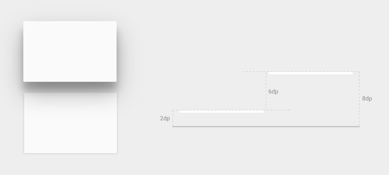
图:不同View的z值的阴影
在XML布局中使用android:elevation设置z轴高度,在代码中使用View.setElevation()方法设置。
设置平移,使用View.setTranslationZ()方法。
新的方法ViewPropertyAnimator.z() 和 ViewPropertyAnimator.translationZ()允许你很简单在z轴进行动画。
自定义View的阴影和轮廓(Outlines)
view的背景图片边界决定了默认的阴影形状。轮廓代表一个图形对象的外部形状,它定义了用于触摸波纹区域。
<TextView
    android:id="@+id/myview"
    ...
    android:elevation="2dp"
    android:background="@drawable/myrect" />
定义一个圆角背景图:
<!-- res/drawable/myrect.xml -->
<shape xmlns:android="http://schemas.android.com/apk/res/android"
       android:shape="rectangle">
    <solid android:color="#42000000" />
    <corners android:radius="5dp" />
</shape>
view投射了一个圆角的阴影,因为背景图片定义了view的轮廓。提供一个自定义的轮廓可以覆盖view阴影的默认形状。定义一个自定义轮廓用以下代码:
1、继承ViewOutlineProvider类
2、覆盖getOutline()方法
3、使用View.setOutlineProvider()方法给view定义自定义的轮廓。
你可以使用Outline类来创建一个椭圆或矩形的圆角轮廓,view的默认的轮廓获取的是view的背景。阻止view投射阴影,设置它的轮廓为null。
裁剪(Clip)View
裁剪View让你可以容易的改变View的形状。你可以使用View.setClipToOutline()或android:clipToOutline属性裁剪View到它的轮廓中。只有矩形、圆形、圆角矩形支持裁剪,在Outline.canClip()中定义的。
要裁剪一个view成一个图片形状,需要设置这个图片作为view的背景,并调用View.setClipToOutline() 方法。
裁剪View是一个耗时操作,不要使用动图来裁剪View。为了达到这个效果,使用 Reveal Effect动画。
使用Drawable
原文地址:http://developer.android.com/training/material/drawables.html#ColorExtract
在material design中drawable的能力如下:
- Drawable 着手
- 突出颜色提取
- 矢量图
Drawable 资源着色
Android 5.0 (API level 21)及以上版本,可以给drawable和9patch图片着色为**α**Mask,可以用颜色或主题属性来着色(如?android:attr/colorPrimary)。
使用setTint()方法将着色应用到BitmapDrawable, NinePatchDrawable 或 VectorDrawable对象中,也可以在布局文件中使用android:tint 和android:tintMode来设置。
从一个图片中提取突出颜色
在Android Support Library r21以上的支持库中包含了Palette类,它可以帮你从一个图片中提取突出颜色(Vibrant、Vibrant dark、Vibrant light、Muted、Muted dark、Muted light)。
在加载image的地方,将bitmap对象传到Palette.generate()静态方法中,如果用不了这个线程,使用Palette.generateAsync()并设置监听来实现。
比如可以使用Palette.getVibrantColor方法来提取颜色。使用Palette,需添加依赖:
dependencies {
    ...
    compile 'com.android.support:palette-v7:21.0.0'
}
创建矢量图
Android 5.0 (API Level 21)及以上版本,可以创建一个不失帧的矢量图。只需要使用一个文件作为矢量图,而不用为每个屏幕密度来定义多个文件。使用元素来定义,下面是一个心形的矢量图示例:
<!-- res/drawable/heart.xml -->
<vector xmlns:android="http://schemas.android.com/apk/res/android"
    <!-- intrinsic size of the drawable -->
    android:height="256dp"
    android:width="256dp"
    <!-- size of the virtual canvas -->
    android:viewportWidth="32"
    android:viewportHeight="32">

  <!-- draw a path -->
  <path android:fillColor="#8fff"
      android:pathData="M20.5,9.5
                        c-1.955,0,-3.83,1.268,-4.5,3
                        c-0.67,-1.732,-2.547,-3,-4.5,-3
                        C8.957,9.5,7,11.432,7,14
                        c0,3.53,3.793,6.257,9,11.5
                        c5.207,-5.242,9,-7.97,9,-11.5
                        C25,11.432,23.043,9.5,20.5,9.5z" />
</vector>
矢量图在Android中是一个VectorDrawable对象。
自定义动画
参考地址:http://developer.android.com/training/material/animations.html#Reveal
Material 主题提供一些默认的按钮和Activity转场的动画, Android 5.0 (API level 21)及以上的版本中还允许自定义这些动画并创建下面这些新的动画:
- 触摸反馈
- 循环显示
- Activity 转场
- 曲线运动
- View状态改变
自定义触摸反馈
按钮默认的触摸反馈是使用RippleDrawable类,它提供了一种切换状态时过渡的波纹效果。大部分情况下,你只需要使用?android:attr/selectableItemBackground(有界波纹)作为背景即可,或者?android:attr/selectableItemBackgroundBorderless(API level 21才有,无界波纹)。或者你可以在XML中定义RippleDrawable,使用ripple元素。可以改变的RippleDrawable对象颜色,使用主题的android:colorControlHighlight改变触摸反馈颜色。
使用显示效果
显示动画(Reveal animations)提供了一组UI元素显示隐藏的视觉连续性的动画效果。ViewAnimationUtils.createCircularReveal()方法提供一个极好的循环显示和隐藏的动画。显示一个之前没显示的view使用这个效果:
// previously invisible view
View myView = findViewById(R.id.my_view);

// get the center for the clipping circle
int cx = myView.getWidth() / 2;
int cy = myView.getHeight() / 2;

// get the final radius for the clipping circle
float finalRadius = (float) Math.hypot(cx, cy);

// create the animator for this view (the start radius is zero)
Animator anim =
    ViewAnimationUtils.createCircularReveal(myView, cx, cy, 0, finalRadius);

// make the view visible and start the animation
myView.setVisibility(View.VISIBLE);
anim.start();
隐藏之前显示的view使用:
// previously visible view
final View myView = findViewById(R.id.my_view);

// get the center for the clipping circle
int cx = myView.getWidth() / 2;
int cy = myView.getHeight() / 2;

// get the initial radius for the clipping circle
float initialRadius = (float) Math.hypot(cx, cy);

// create the animation (the final radius is zero)
Animator anim =
    ViewAnimationUtils.createCircularReveal(myView, cx, cy, initialRadius, 0);

// make the view invisible when the animation is done
anim.addListener(new AnimatorListenerAdapter() {
    @Override
    public void onAnimationEnd(Animator animation) {
        super.onAnimationEnd(animation);
        myView.setVisibility(View.INVISIBLE);
    }
});

// start the animation
anim.start();
自定义Activity转场
Android 5.0 (API level 21)提供了如下进场和退场动画:爆炸(从中间进场退场),平移(从边缘进场退场),淡入淡出(进场退场改变透明度)。任何继承了Visibility类的过渡都支持进场和退场过渡效果。
Android 5.0 (API level 21)也提供了共享元素过渡。changeBounds、changeClipBounds、changeTransform、changeImageTransform 。
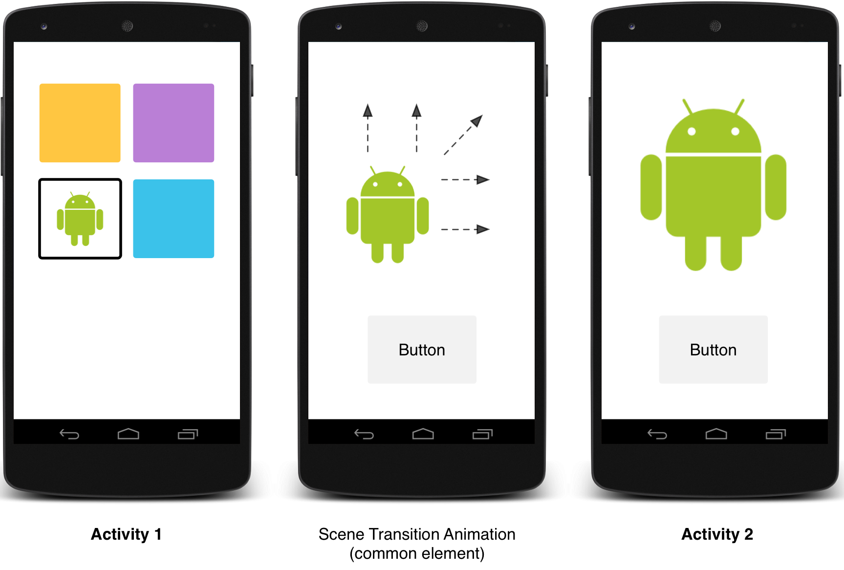
图:使用共享元素效果的场景过度
图:使用共享元素转场
在主题中使用android:windowActivityTransitions属性设置Activity是否允许window过渡效果,可以指定进场、退场、共享元素动画效果:
<style name="BaseAppTheme" parent="android:Theme.Material">
  <!-- enable window content transitions -->
  <item name="android:android:windowActivityTransitions">true</item>

  <!-- specify enter and exit transitions -->
  <item name="android:windowEnterTransition">@transition/explode</item>
  <item name="android:windowExitTransition">@transition/explode</item>

  <!-- specify shared element transitions -->
  <item name="android:windowSharedElementEnterTransition">
    @transition/change_image_transform</item>
  <item name="android:windowSharedElementExitTransition">
    @transition/change_image_transform</item>
</style>
change_image_transform动画效果定义如下:
<!-- res/transition/change_image_transform.xml -->
<!-- (see also Shared Transitions below) -->
<transitionSet xmlns:android="http://schemas.android.com/apk/res/android">
  <changeImageTransform/>
</transitionSet>changeImageTransform元素对应ChangeImageTransform类。
在代码中允许window过渡效果,使用Window.requestFeature()方法:
// inside your activity (if you did not enable transitions in your theme)
getWindow().requestFeature(Window.FEATURE_CONTENT_TRANSITIONS);

// set an exit transition
getWindow().setExitTransition(new Explode());所有代码中设置Activity转场动画的方法有:Window.setEnterTransition()、Window.setExitTransition()、Window.setSharedElementEnterTransition()、Window.setSharedElementExitTransition()。
为得到一个完整的过渡效果,需要在两个Activity(起止)中同时设置动画。使用Window.setAllowEnterTransitionOverlap()方法可以让进场动画尽可能快的执行。这个会让你有更加令人心动的进场动画。
使用转场启动Activity
当你允许转场并设置了退场动画,那么当你启动另一个Activity时就激活了转场:
startActivity(intent,
              ActivityOptions.makeSceneTransitionAnimation(this).toBundle());
如果你在第二个Activity中设置了进场动画,那么当Activity启动时也会激活转场。要在启动Activity时禁止使用转场,将bundle参数设为null即可。
使用共享元素启动Activity
1、在主题中设置允许window内容转场
2、在主题中指定一个共享元素转场
3、在XML资源中定义转场
4、使用android:transitionName在两个Activity的XML布局中定义相同的共享元素名称
5、使用ActivityOptions.makeSceneTransitionAnimation()方法
// get the element that receives the click event
final View imgContainerView = findViewById(R.id.img_container);

// get the common element for the transition in this activity
final View androidRobotView = findViewById(R.id.image_small);

// define a click listener
imgContainerView.setOnClickListener(new View.OnClickListener() {
    @Override
    public void onClick(View view) {
        Intent intent = new Intent(this, Activity2.class);
        // create the transition animation - the images in the layouts
        // of both activities are defined with android:transitionName="robot"
        ActivityOptions options = ActivityOptions
            .makeSceneTransitionAnimation(this, androidRobotView, "robot");
        // start the new activity
        startActivity(intent, options.toBundle());
    }
});对于在代码中生成的动态共享元素,使用View.setTransitionName()方法在两个Activity中设置元素名称。
为了使动画反转,在结束Activity时调用Activity.finishAfterTransition(),而不是Activity.finish()。
使用多个共享元素启动Activity
为使用多个共享元素启动Activity,在android:transitionName属性(或代码中View.setTransitionName() 方法)在两个Activity布局中定义共享元素,然后 创建ActivityOptions:
ActivityOptions options = ActivityOptions.makeSceneTransitionAnimation(this,
        Pair.create(view1, "agreedName1"),
        Pair.create(view2, "agreedName2"));
曲线运动
Material Design中的曲线动画依赖时间插值和空间运动模式。在Android 5.0 (API level 21) 及以上版本中,你可以使用自定义的时间曲线和曲线运动模式。
PathInterpolator类是一个新的基于贝叶斯曲线或Path类的插值。这个插值定义了1x1的正方形的运动曲线,(0,0)和(1,1)两个锚点,以及使用构造参数指定的控制点。你可以定义一个path插值如下:
<pathInterpolator xmlns:android="http://schemas.android.com/apk/res/android"
    android:controlX1="0.4"
    android:controlY1="0"
    android:controlX2="1"
    android:controlY2="1"/>
在material design的说明中,系统定义了3个基本的曲线的XML资源:
- @interpolator/fast_out_linear_in.xml
- @interpolator/fast_out_slow_in.xml
- @interpolator/linear_out_slow_in.xml
你可以传一个PathInterpolator对象给Animator.setInterpolator()方法。
ObjectAnimator类新的构造方法允许你沿着一个path一次使用两个以上的属性进行坐标的动画。
ObjectAnimator mAnimator;
mAnimator = ObjectAnimator.ofFloat(view, View.X, View.Y, path);
...
mAnimator.start();
View状态变化的动画
StateListAnimator类允许你在View的状态变化时定义动画。下面是StateListAnimator的XML资源:
<!-- animate the translationZ property of a view when pressed -->
<selector xmlns:android="http://schemas.android.com/apk/res/android">
  <item android:state_pressed="true">
    <set>
      <objectAnimator android:propertyName="translationZ"
        android:duration="@android:integer/config_shortAnimTime"
        android:valueTo="2dp"
        android:valueType="floatType"/>
        <!-- you could have other objectAnimator elements
             here for "x" and "y", or other properties -->
    </set>
  </item>
  <item android:state_enabled="true"
    android:state_pressed="false"
    android:state_focused="true">
    <set>
      <objectAnimator android:propertyName="translationZ"
        android:duration="100"
        android:valueTo="0"
        android:valueType="floatType"/>
    </set>
  </item>
</selector>定义好动画后,使用android:stateListAnimator属性赋值给需要在状态变化时进行动画的View。在代码中使用AnimationInflater.loadStateListAnimator()装载动画,然后使用View的View.setStateListAnimator()方法设置View的动画。
当你的主题继承material 的主题时,Button默认有一个z方向的动画,要禁止掉这个,设置android:stateListAnimator为@null。
AnimatedStateListDrawable类允许你创建状态变化动画的drawable。下面是一个例子:
<!-- res/drawable/myanimstatedrawable.xml -->
<animated-selector
    xmlns:android="http://schemas.android.com/apk/res/android">

    <!-- provide a different drawable for each state-->
    <item android:id="@+id/pressed" android:drawable="@drawable/drawableP"
        android:state_pressed="true"/>
    <item android:id="@+id/focused" android:drawable="@drawable/drawableF"
        android:state_focused="true"/>
    <item android:id="@id/default"
        android:drawable="@drawable/drawableD"/>

    <!-- specify a transition -->
    <transition android:fromId="@+id/default" android:toId="@+id/pressed">
        <animation-list>
            <item android:duration="15" android:drawable="@drawable/dt1"/>
            <item android:duration="15" android:drawable="@drawable/dt2"/>
            ...
        </animation-list>
    </transition>
    ...
</animated-selector>
矢量图动画
AnimatedVectorDrawable类允许你对矢量图进行属性动画。一般定义动画矢量图在3个XML文件中:
- 在res/drawable/中使用 元素定义矢量图
- 在res/drawable/中使用元素定义动画的矢量图
- 在res/anim/中使用定义一个或多个动画
动画矢量图主要是对 和 进行动画。
<!-- res/drawable/vectordrawable.xml -->
<vector xmlns:android="http://schemas.android.com/apk/res/android"
    android:height="64dp"
    android:width="64dp"
    android:viewportHeight="600"
    android:viewportWidth="600">
    <group
        android:name="rotationGroup"
        android:pivotX="300.0"
        android:pivotY="300.0"
        android:rotation="45.0" >
        <path
            android:name="v"
            android:fillColor="#000000"
            android:pathData="M300,70 l 0,-70 70,70 0,0 -70,70z" />
    </group>
</vector>
动画矢量图的定义引用了groups 和paths在矢量图中的名称:
<!-- res/drawable/animvectordrawable.xml -->
<animated-vector xmlns:android="http://schemas.android.com/apk/res/android"
  android:drawable="@drawable/vectordrawable" >
    <target
        android:name="rotationGroup"
        android:animation="@anim/rotation" />
    <target
        android:name="v"
        android:animation="@anim/path_morph" />
</animated-vector>动画定义使用ObjectAnimator 或AnimatorSet对象。
<!-- res/anim/rotation.xml -->
<objectAnimator
    android:duration="6000"
    android:propertyName="rotation"
    android:valueFrom="0"
    android:valueTo="360" />
<!-- res/anim/path_morph.xml -->
<set xmlns:android="http://schemas.android.com/apk/res/android">
<objectAnimator
android:duration="3000"
android:propertyName="pathData"
android:valueFrom="M300,70 l 0,-70 70,70 0,0 -70,70z"
android:valueTo="M300,70 l 0,-70 70,0 0,140 -70,0 z"
android:valueType="pathType" />
</set>保持兼容
原文地址:http://developer.android.com/training/material/compatibility.html#SupportLib
很多Material Design都是在Android 5.0 (API level 21)及以上的版本中才能用,要在老版本中使用这些新特性,需要做些兼容工作。
定义多个Styles
兼容主题,可以在支持Material主题的设备中使用Material 主题,不支持的使用替代主题。
1、在旧版(Android 5.0以前)中定义res/values/styles.xml(比如holo主题)
2、在res/values-v21/styles.xml中定义一个Material主题
3、在Manifest中将app的主题设置为上面定义的主题
如果你使用Material主题但没有提供兼容的主题,则app不会运行在Android5.0之前的系统里
定义多个Layout
参考布局别名。在这里,定义Android5.0的布局在res/layout-v21/*.xml中定义。
使用支持库
v7 Support Libraries r21以上版本的支持库,支持Material主题。
- Theme.AppCompat主题支持很多Material Design的组件:EditText、Spinner、CheckBox、RadioButton、SwitchCompat、CheckedTextView。
- 支持Color palette。
<!-- extend one of the Theme.AppCompat themes -->
 <style name="Theme.MyTheme" parent="Theme.AppCompat.Light">
 <!-- customize the color palette -->
 <item name="colorPrimary">@color/material_blue_500</item>
 <item name="colorPrimaryDark">@color/material_blue_700</item>
 <item name="colorAccent">@color/material_green_A200</item>
</style> - RecycleView和CardView
添加依赖
dependencies {
    compile 'com.android.support:appcompat-v7:21.0.+'
    compile 'com.android.support:cardview-v7:21.0.+'
    compile 'com.android.support:recyclerview-v7:21.0.+'
}
检测系统版本
下面特性是Android5.0及以上版本才有的:
- Activity转场(Activity transitions)
- 触摸反馈(Touch feedback)
- 显示动画(Reveal animations)
- 基于Path的动画(Path-based animations)
- 矢量图(Vector drawables)
- Drawable着色(Drawable tinting)
为保持兼容,需要判断版本:
// Check if we're running on Android 5.0 or higher
if (Build.VERSION.SDK_INT >= Build.VERSION_CODES.LOLLIPOP) {
    // Call some material design APIs here
} else {
    // Implement this feature without material design
}
注意:让app支持Material主题,需要在Manifest文件中设置android:targetSdkVersion=21。


 扫一扫
扫一扫
 2381
2381

 被折叠的 条评论
为什么被折叠?
被折叠的 条评论
为什么被折叠?
 到【灌水乐园】发言


