


 超级会员免费看
 本文档详细介绍了如何在Qt QML中封装一个自定义按键,包括按键的间距属性、内容构成、背景颜色与边框控制、普通按键的实现,以及状态按键和按键组的使用。通过重写contentItem属性和使用states状态管理器,实现了可自定义图标和颜色的按键组件。还提供了ButtonGroup的使用方法,以便在一组按键中实现单选功能。
间距属性
继上回我们已经创建了一个BinButton , 但是是很简单的继承了Button的,此刻我们需要分析
按键内部布局的情况,我们才能更加好的自定义我们按键
我们先通过qtcreator的帮助,我们了解到Button继承AbstractButton
而AbstractButton继承与Control,而Control继承与Item
基于此,我们展开了解
我们发现 leftInset 与 rightInset ,topInset, bottomInset
还有 topPadding ,bottomPadding, leftPading,rightPadding
implicitBackgroundWidth,implicitContentWidth,implicitBackgroundHeight,implicitContentHeight
这些属性,这里就直接贴官方给的图—更直观了解
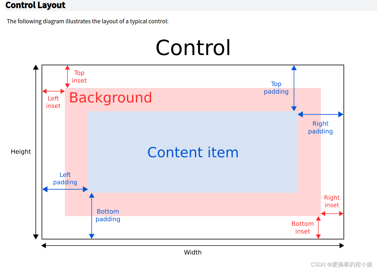
很明显一个按键的大小构成是两个不同的组合的
通过下面的代码可以了解
    implicitWidth: Math.max(implicitBackgroundWidth + leftInset + rightInset,
                            implicitContentWidth + leftPadding + rightPadding)
    implicitHeight: Math.max(implicitBackgroundHeight + topInset + bottomInset,
                             implicitContentHeight + topPadding + bottomPadding)
按键内容构成
核心在与contentItem属性,我们重绘按键的内容就行,而官方源码采用了IconLabel组件
需要引入import QtQuick.Controls.impl 2.12模块
IconLabel
    contentItem: IconLabel {
        spacing: control.spacing //图标与文字间距
        mirrored: control.mirrored // 是否镜像
        display: control.display // 显示内容

        icon: control.icon // 显示的图标
        text: control.text // 显示的文本
        font: control.font // 文本字体

		// 文本颜色
        color: control.checked || control.highlighted ? control.palette.brightText :
               control.flat && !control.down ? (control.visualFocus ? control.palette.highlight : control.palette.windowText) : control.palette.buttonText
    }
背景颜色与边框控制
    background: Rectangle {

        implicitWidth: 100
        implicitHeight: 40
//        visible: !control.flat || control.down || control.checked || control.highlighted
//        color: Color.blend(control.checked || control.highlighted ? control.palette.dark : control.palette.button,
//                                                                    control.palette.mid, control.down ? 0.5 : 0.0)
//        border.color: control.palette.highlight
//        border.width: control.visualFocus ? 2 : 0
    }
了解以上关系,我们开始封装我们自己的按键把!
参考element-ui调色板进行封装
普通按键
这里我们需要自定义一些属性, 使用states状态管理器进行渲染我们组件的状态
// 因为考虑到性能的问题,部分linux设备动态很损耗性能所以以后尽可能不加入动态变化
操作前,我们最好弄个管理我们所有组件的颜色的单例文件
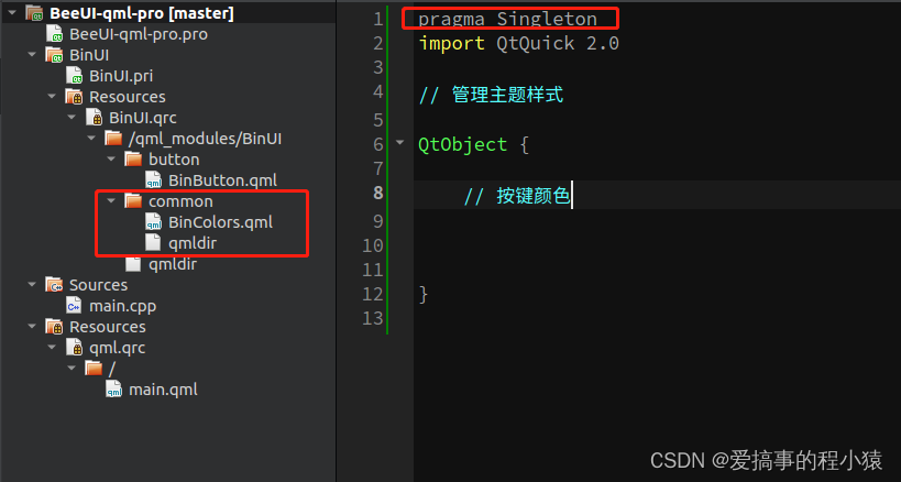
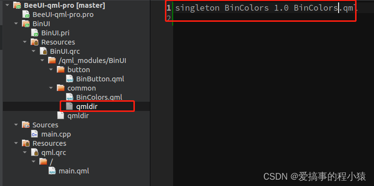
我们直接引入并使用即可
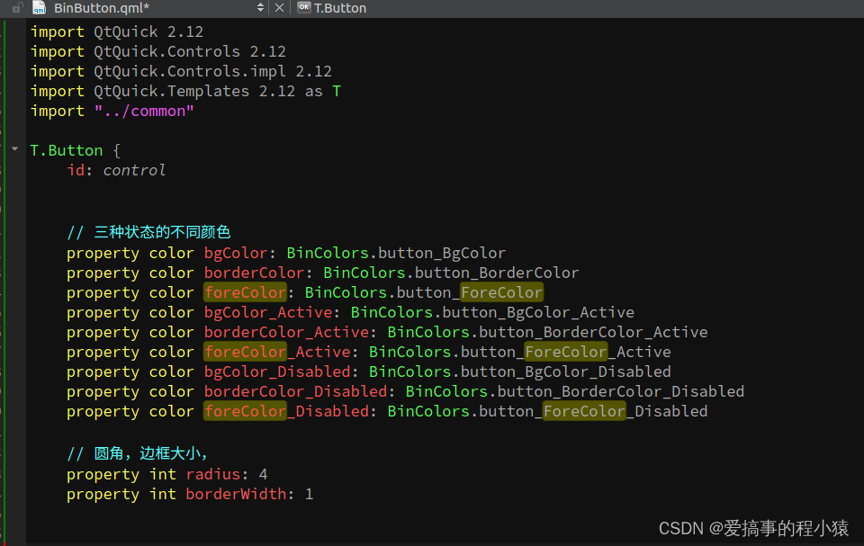
我们按键有三种状态颜色
checked选中,down按下,activeFocus ,visualFocus聚焦,enabled禁用
具体代码如下:
import QtQuick 2.12
import QtQuick.Controls 2.12
import QtQuick.Controls.impl 2.12
import QtQuick.Templates 2.12 as T
import "../common"

T.Button {
    id: control


    // 三种状态的不同颜色
    property color bgColor: BinColors.button_BgColor
    property color borderColor: BinColors.button_BorderColor
    property color foreColor: BinColors.button_ForeColor
    property color bgColor_Active: BinColors.button_BgColor_Active
    property color borderColor_Active: BinColors.button_BorderColor_Active
    property color foreColor_Active: BinColors.button_ForeColor_Active
    property color bgColor_Disabled: BinColors.button_BgColor_Disabled
    property color borderColor_Disabled: BinColors.button_BorderColor_Disabled
    property color foreColor_Disabled: BinColors.button_ForeColor_Disabled

    // 圆角,边框大小,
    property int radius: 4
    property int borderWidth: 1


    state: {
        // 聚焦样式先不用|| activeFocus || visualFocus || highlighted
        if(checked || down){
            return "active"
        }else if(!enabled){
            return "disabled"
        }else{
            return "normal"
        }
    }

    states: [
        State {
            name: "normal"
            PropertyChanges {
                target: back
                color: control.bgColor
                border.color: control.borderColor
            }
            PropertyChanges {
                target: txt
                color: control.foreColor
            }
        },
        State {
            name: "active"
            PropertyChanges {
                target: back
                color: control.bgColor_Active
                border.color: control.borderColor_Active
            }
            PropertyChanges {
                target: txt
                color: control.foreColor_Active
            }
        },
        State {
            name: "disabled"
            PropertyChanges {
                target: back
                color: control.bgColor_Disabled
                border.color: control.borderColor_Disabled
            }
            PropertyChanges {
                target: txt
                color: control.foreColor_Disabled
            }
        }
    ]


    implicitWidth: Math.max(implicitBackgroundWidth + leftInset + rightInset,
                            implicitContentWidth + leftPadding + rightPadding)
    implicitHeight: Math.max(implicitBackgroundHeight + topInset + bottomInset,
                             implicitContentHeight + topPadding + bottomPadding)

    padding: 6
    horizontalPadding: padding + 2
    spacing: 6

    icon.width: 24
    icon.height: 24

    // 图标&文字
    contentItem: IconLabel {
        id: txt
        spacing: control.spacing
        mirrored: control.mirrored
        display: control.display
        icon: control.icon
        text: control.text
        font: control.font
    }

    // 背景
    background: Rectangle {
        id: back
        implicitWidth: 100
        implicitHeight: 40
        radius: control.radius
        border.width: control.borderWidth
    }
}
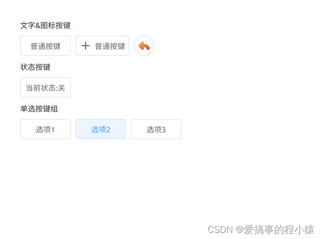
使用按键
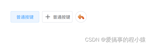
使用按键图标支持自定义图标,也可以直接使用系统中自带的图标
icon.name 优先级大于 icon.source (两个同时设置了的话)
icon.color 用来修改图标颜色
    Row{

        x: 40
        y:40
        spacing: 10

        BinButton{
            text: qsTr("普通按键")
        }

        // 带图标
        BinButton{
            text: qsTr("普通按键")
            //icon.name: "edit-undo"
            icon.source: "/qml_modules/BinUI/assets/icons/plus.png"
            icon.color: foreColor
        }

        // 图标圆角按键
        BinButton{
            width: height
            icon.name: "edit-undo"
            radius: width
            onClicked: {

            }
        }


    }
状态按键
由于按键是继承与abstractButton的里面有两个属性
checkable,checked
开启checkable既可以开启状态模式
通过控制checked来控制on或者off
        Row{
            spacing: 10

            BinButton{
                text: checked? qsTr("当前状态:开"):qsTr("当前状态:关")
                checkable: true
            }

        }
按键组(单选)
一堆组别中需要使用到按键组别的效果
这里我们需要引入ButtonGroup
将同组按键都设置起来, 同组的按键就同时只能选中一个了
ButtonGroup{
            id: button_Group
        }

        Row{
            spacing: 10

            BinButton{
                text: qsTr("选项1")
                checkable: true
                ButtonGroup.group:button_Group
            }
            BinButton{
                text: qsTr("选项2")
                checkable: true
                ButtonGroup.group:button_Group
            }
            BinButton{
                text: qsTr("选项3")
                checkable: true
                ButtonGroup.group:button_Group
            }

        }
源码
查看
索引ButtonPane.qml既可查看


 扫一扫
扫一扫


 1002
1002

 被折叠的 条评论
为什么被折叠?
被折叠的 条评论
为什么被折叠?
 到【灌水乐园】发言


