


做了一个demo。用到一些css3的动画,还是不太熟练,总结了一下。
1、 -webkit-font-smoothing: antialiased;
-webkit-font-smoothing: none: 无抗锯齿-webkit-font-smoothing: subpixel-antialiased | default: 次像素平滑-webkit-font-smoothing: antialiased: 灰度平滑
2、 -webkit-perspective: 800px; 设置元素被查看位置的视图:
值: 元素距离视图的距离,以像素计。
使子元素又了3d的效果:
<!DOCTYPE html>
<html>
<head>
<style>
#div1
{
position: relative;
height: 150px;
width: 150px;
margin: 50px;
padding:10px;
border: 1px solid black;
-webkit-perspective:150; /* Safari and Chrome */
}
#div2
{
padding:50px;
position: absolute;
border: 1px solid black;
background-color: yellow;
-webkit-transform: rotateX(60deg); /* Safari and Chrome */
}
</style>
</head>
<body>
<div id="div1">
<div id="div2">HELLO</div>
</div>
</body>
</html>
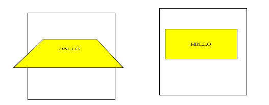
没那个,子元素会有动作但是没有3d效果
3、-webkit-transition: all .8s;
过渡属性 transition 可以设置4个属性 transition-property:规定应用过渡的 CSS 属性的名称。 transition-duration:定义效果花费的时间。默认是0 transition-timing-function :定义过渡效果时间曲线。默认是“ease” transition-delay:规定效果的延迟时间。默认是0
可以设置四个:那个过渡(property- 性质- 财产- 财产权- 属性) 、过渡时间(持续时间duration)、过渡样式 、延迟时间
那个过渡:
| none | 没有属性会获得过渡效果。 |
| all | 所有属性都将获得过渡效果。 |
| property | 定义应用过渡效果的 CSS 属性名称列表,列表以逗号分隔。 |
过渡效果:
| linear | 规定以相同速度开始至结束的过渡效果(等于 cubic-bezier(0,0,1,1))。 |
| ease | 规定慢速开始,然后变快,然后慢速结束的过渡效果(cubic-bezier(0.25,0.1,0.25,1))。 |
| ease-in | 规定以慢速开始的过渡效果(等于 cubic-bezier(0.42,0,1,1))。 |
| ease-out | 规定以慢速结束的过渡效果(等于 cubic-bezier(0,0,0.58,1))。 |
| ease-in-out | 规定以慢速开始和结束的过渡效果(等于 cubic-bezier(0.42,0,0.58,1))。 |
| cubic-bezier(n,n,n,n) | 在 |
4.-webkit-transform-style: preserve-3d;
2D Transform 方法
- vt. 改变,使…变形;转换
一、transform 向元素应用2d或者3d的转换
(1)2d:
transform
- transform属性可用于内联(inline)元素和块级(block)元素。它允许我们旋转、缩放和移动元素,他有几个属性值参数:
- rotate(旋转)允许你通过传递一个度数值来转动一个对象;
- scale是一个缩放功能,可以让任一元素变的更大。它使用一个或者两个正数和负数以及小数作为参数;当使用一个参数时表示X轴和Y轴的缩放相同;
- translate就是基于X和Y 坐标重新定位元素,当使用一个参数时表示X轴和Y轴的参数相同;
- skew倾斜(ps中的斜切),参数是度数,当使用一个参数时表示X轴和Y轴的参数相同;
- matrix矩阵变换,就是基于X和Y 坐标重新定位元素,它使用6个参数
transform-origin 允许你改变被转换元素的位置
| JavaScript 语法: | object.style.transformOrigin="20% 40%" |
|---|

二、改变元素基点transform-origin
- transform-origin是变形原点,也就是该元素围绕着那个点变形或旋转,该属性只有在设置了transform属性的时候起作用;
- 因为我们元素默认基点就是其中心位置,换句话说我们没有使用transform-origin改变元素基点位置的情况下,transform进行的rotate,translate,scale,skew,matrix等操作都是以元素自己中心位置进行变化的。
- 但有时候我们需要在不同的位置对元素进行这些操作,那么我们就可以使用transform-origin来对元素进行基点位置改变,使元素基点不在是中心位置,以达到你需要的基点位置。
- 下面我们主要来看看其使用规则:
transform-origin(X,Y):用来设置元素的运动的基点(参照点)。默认点是元素的中心点。其中X和Y的值可以是百分值,em,px,其中X也可以是字符参数值left,center,right;Y和X一样除了百分值外还可以设置字符值top,center,bottom 。
-
- 语法:-moz-transform-origin: [ | | left | center | right ][ | | top | center | bottom ] ?
- transform-origin接受两个参数,它们可以是百分比,em,px等具体的值,也可以是left,center,right,或者 top,center,bottom等描述性参数 ;
- top left | left top 等价于 0 0;
- top | top center | center top 等价于 50% 0
- right top | top right 等价于 100% 0
- left | left center | center left 等价于 0 50%
- center | center center 等价于 50% 50%(默认值)
- right | right center | center right 等价于 100% 50%
- bottom left | left bottom 等价于 0 100%
- bottom | bottom center | center bottom 等价于 50% 100%
- bottom right | right bottom 等价于 100% 100%
其中
left,center right是水平方向取值,对应的百分值为left=0%;center=50%;right=100%
而
top center bottom是垂直方向的取值,其中top=0%;center=50%;bottom=100%;
如果
只取一个值,表示垂直方向值不变。
注:
transform-origin并不是transform中的属性值,他具有自己的语法。
但是他要结合transform才能起作用
三、CSS3 transform-style 属性
| 规定被嵌套元素如何在 3D 空间中显示。
|
规定被嵌套元素如何在 3D 空间中显示。
4、perspective 属性
| 规定 3D 元素的透视效果。 |
5、 perspective-origin
perspective-origin 属性定义 3D 元素所基于的 X 轴和 Y 轴。该属性允许您改变 3D 元素的底部位置。
当为元素定义 perspective-origin 属性时,其子元素会获得透视效果,而不是元素本身。
注释:该属性必须与 perspective 属性一同使用,而且只影响 3D 转换元素。
6、backface-visibility 属性
backface-visibility 属性定义当元素不面向屏幕时是否可见。
1、动画 @keyframes 然后使用animation:第一个参数就行@keyframes 定义的参数
animation:[<animation-name> || <animation-duration> || <animation-timing-function> || <animation-delay> || <animation-iteration-count> || <animation-direction>] [, [<animation-name> || <animation-duration> || <animation-timing-function> || <animation-delay> || <animation-iteration-count> || <animation-direction>] ]*


 扫一扫
扫一扫


 253
253

 被折叠的 条评论
为什么被折叠?
被折叠的 条评论
为什么被折叠?
 到【灌水乐园】发言


