


在网页开发中,为了提高用户体验,经常会用到一些提示框来引导用户,这里分享下一些简单的提示框的制作
1.首先类似一个长方形右上角一个关闭按钮
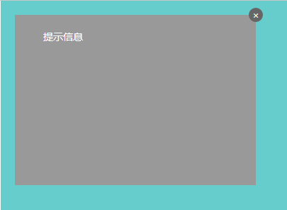
这里用到的主要是一些定位的知识,运用relative和absolute可以快速制作这样的一个提示框,想详细了解,点击这里
html代码:
<div id="position"> <div class="position-relative"> <span>提示信息</span> <a href="javascript:;"><i class="icon">×</i></a> </div> </div>
css代码:
     #position {
           position: relative;
           width: 500px;
           height: 400px;
            margin: 0 auto;
           color: #fff;
           background: #66cccc;
     }
     #position .position-relative {
            position: relative;
            top: 20px;
            left: 20px;
            width: 300px;
            height: 200px;
            padding: 20px;
            background: #999;
        }
        #position .position-relative .icon {
            display: block;
            position: absolute;
            top: -10px;
            right: -10px;
            overflow: hidden;
            /*
            white-space: nowrap;
            text-overflow: ellipsis;
            */
            border-radius: 50%;
            width: 20px;
            height: 20px;
            line-height: 20px;
            color: #eee;
            font-style: normal;
            text-align: center;
            background: #666;
        }
2.还有类似这种qq对话框

有了定位的知识后,这种对话框主要就是左边的小三角的制作了,其实这个我们可以利用border来制作,首先我们先来开一个例子:
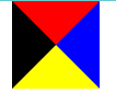
我们就给一个span标签来看看
html
<span class="icon-s"></span>
css
.icon-s {
            display: block;
            margin: 0 auto;
            width: 0;
            height: 0;
            border-style: solid;
            border-width: 40px;
            border-top-color: red;
            border-right-color: blue;
            border-bottom-color: yellow;
            border-left-color: black;
}
我们来看看效果:
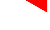
怎么样!很神奇对不对!其实到这里我们就可以看到我们要的三角形了,我们只要保留四个中的一个就行了,那么将其他三边设置为透明就行了
css
.icon-s {
            display: block;
            margin: 0 auto;
            width: 0;
            height: 0;
            border-style: solid;
            border-width: 40px;
            border-top-color: transparent; /*-*/
            border-right-color: red;
            border-bottom-color: transparent; /*-*/
            border-left-color: transparent; /*-*/
}

现在我们可以看到一个基本的雏形,接下来我们在来改改,把上边框的高度设为0,右边框的宽度设长一点
css:
.icon-s {
            display: block;
            margin: 0 auto;
            width: 0;
            height: 0;
            border-style: solid;
            border-width: 40px;
            border-top-width: 0; //
            border-right-width: 70px; //
            border-top-color: transparent;
            border-right-color: red;
            border-bottom-color: transparent;
            border-left-color: transparent;
}
这样子左边的三角形就出来了,接下来我们来简化一下代码:
.icon-s {
            display: block;
            margin: 0 auto;
            width: 0;
            height: 0;
            border-style: solid;
            border-color: transparent red transparent transparent;
            border-width: 0 70px 40px 40px;
}
考虑到IE低版本不支持transparent 属性我们可以设置dotted或是dashed
原因是在IE6下, 点线与虚线均以边框宽度为基准,点线长度必须是其宽度的3倍以上(height>=border-width*3),虚线宽长度必须是其宽度的5倍 以上(height>=border-width*5),否则点线和虚线都不会出现.
.icon-s {
            display: block;
            margin: 0 auto;
            width: 0;
            height: 0;
            border-style: dashed solid dashed dashed;
            border-color: transparent red transparent transparent;
            border-width: 0 70px 40px 40px;
        }
完整的demo:
<!doctype html> <html lang="en"> <head> <meta charset="UTF-8"> <meta name="Author" content="阿林十一"> <meta name="Keywords" content="关键字"> <meta name="Description" content="描述"> <title>提示框</title> <!--style start--> <style type="text/css"> /*-------- begin-base ------------*/ html, body, div, h1,h2,h3, ul,li, a, p, span { margin: 0; padding: 0; } html, body { width: 100%; height: 100%; } body { color: #666; font-size: 14px; font-family: "Microsoft Yahei"; } a { color: #eee; text-decoration: none; } li { list-style: none; } /*-------- end-base -------*/ #position { position: relative; width: 500px; height: 400px; margin: 0 auto; color: #fff; background: #66cccc; } #position .position-relative { position: relative; top: 20px; left: 20px; width: 300px; height: 200px; padding: 20px; background: #999; } #position .position-relative .icon { display: block; position: absolute; top: -10px; right: -10px; overflow: hidden; /* white-space: nowrap; text-overflow: ellipsis; */ border-radius: 50%; width: 20px; height: 20px; line-height: 20px; color: #eee; font-style: normal; text-align: center; background: #666; } #position .position-relative .tip { position: absolute; right: -212px; top:50%; margin-top: -20px; width: 200px; height: 40px; border-radius: 5px; background: #4392e0; } #position .position-relative .tip .icon-tip { position: absolute; top: 8px; left: -23px; border: 12px solid transparent; border-top-width: 0; border-right-color: #4392e0; } .icon-s { display: block; margin: 0 auto; width: 0; height: 0; border-style: dashed solid dashed dashed; border-color: transparent red transparent transparent; border-width: 0 70px 40px 40px; } </style> <!--style end--> </head> <body> <!-- position 定位 (参照点) 1、static 2、relative 相对定位(self) 3、absolute 绝对定位(2 1、relative |absolute| absolute first 2、body) 4、fixed --> <div id="position"> <div class="position-relative"> <span>提示信息</span> <a href="javascript:;"><i class="icon">×</i></a> <div class="tip"> <span class="tx">这里是提示信息!!!</span> <span class="icon-tip"></span> </div> </div> </div> <span class="icon-s"></span> </body> </html>


 6298
6298


 被折叠的 条评论
为什么被折叠?
被折叠的 条评论
为什么被折叠?
 到【灌水乐园】发言


