


JuheNews系列之二 · ToolBar+AppBarLayout+CoordinatorLayout+CollapsingToolbarLayout
上一篇《 JuheNews系列之一 · 前言》,介绍了下JuheNews项目的由来,下面介绍一些细节。
Android5.0重要的改变之一,除了Material Design风格的设计思想,应该就是沉浸式状态栏了吧。之前实现沉浸式的效果时,都是借助SystemBarTint来实现,或许以后你也可以丢弃这种方式了。
除此之外,由于actionbar不够灵活,项目中我一般喜欢把Activity的ActionBar去掉,然后自己在布局中写一个公用的HeaderLayout.xml,在需要ActionBar效果的Activity中直接include进来。现在Android似乎也已经提供了相比ActionBar而言更好的ToolBar了。
来看看这些新控件的表现吧。
ToolBar
还是先来看看官方的介绍吧。
A standard toolbar for use within application content.
一个应用程序使用中的标准工具栏A Toolbar is a generalization of {@link android.app.ActionBar action bars} for use within application layouts. While an action bar is traditionally part of an {@link android.app.Activity Activity’s} opaque window decor controlled by the framework, a Toolbar may be placed at any arbitrary level of nesting within a view hierarchy. An application may choose to designate a Toolbar as the action bar for an Activity using the {@link android.app.Activity#setActionBar(Toolbar) setActionBar()} method.
Toolbar可以看成是一个应用程序布局中通用的工具栏。工具栏通常作为一个不透明的Activity装饰器被Framework控制,而Toolbar可以被嵌套在任意一个层级的View中。你可以在你的程序中调用
setActionBar()方法指定一个Toolbar作为你的工具栏。Toolbar supports a more focused feature set than ActionBar. From start to end, a toolbar may contain a combination of the following optional elements: 相对ActionBar而言,Toolbar提供了更多牛逼的特性。从始至终,toolbar都提供了如下可选的属性。
- A navigation button. This may be an Up arrow, navigation menu toggle,close,collapse, done or another glyph of the app’s choosing. This button should always be used to access other navigational destinations within the container of the Toolbar and its signified content or otherwise leave the current context signified by the Toolbar.
- 导航按钮。这可能是一个向上的箭头、导航菜单切换、关闭、折叠、完成,或者或应用程序选择的另一种图案。这个按钮应该始终被用于访问Toolbar包含的内容和它所指向的内容中的其他目标,否则就离开Toolbar指向的当前页面。 The navigation button is vertically aligned within the Toolbar’s {@link android.R.styleable#View_minHeight minimum height}, if set. 如果设置了最小高度的话,导航按钮将是垂直对齐。
- A branded logo image. This may extend to the height of the bar and can be arbitrarily wide.
- 品牌的logo。高度可以扩展成工具栏一样,宽度则无限制。
- A title and subtitle. The title should be a signpost for the Toolbar’s current position in the navigation hierarchy and the content contained there. The subtitle, if present should indicate any extended information about the current content. If an app uses a logo image it should strongly consider omitting a title and subtitle.
- 标题和副标题。Toolbar的标题应该是一个当前位置导航层次结构和所包含内容层的路标,副标题的作用则是用来表明当前内容的扩展信息。如果当前应用使用了品牌的Logo的话,强烈建议考虑省略标题和副标题。
- One or more custom views. The application may add arbitrary child views to the Toolbar. They will appear at this position within the layout. If a child view’s {@link LayoutParams} indicates a {@link Gravity} value of {@link Gravity#CENTER_HORIZONTAL CENTER_HORIZONTAL} the view will attempt to center within the available space remaining in the Toolbar after all other elements have been measured.
- 一个或多个自定义View。程序可以添加任意子View到Toolbar。它们将按它们在布局中的位置原样显示,如果子View的LayoutParams参数中Gravity属性是CENTER_HORIZONTAL,该View将在Toolbar测量完其他所有子View后余下的剩余空间中尝试居中显示。
- An {@link ActionMenuView action menu}. The menu of actions will pin to the end of the Toolbar offering a few frequent, important or typical actions along with an optional overflow menu for additional actions. Action buttons are vertically aligned within the Toolbar’s {@link android.R.styleable#View_minHeight minimum height}, if set.
- 行为菜单。菜单的行为将固定在Toolbar尾端,借助一个溢出式菜单提供一些频繁、重要或者典型的附加操作。如果设置了Toolbar最小高度的话,这些按钮将垂直对齐。
In modern Android UIs developers should lean more on a visually distinct color scheme for toolbars than on their application icon. The use of application icon plus title as a standard layout is discouraged on API 21 devices and newer.
相比应用的图标,当今的Android开发者应该更多的去学习关于工具栏的视觉独特的配色方案。用应用程序的图标+标题的形式作为一个标准的布局已经不再被5.0及以上的设备所推荐了。
说了这么多,Toolbar其实就是作为替换旧的ActionBar的存在,那他究竟是怎样使用的呢?来看看官方文档上面给的说明。
- 1、在项目中添加v7 appcompat support library,即在build.gradle中添加如下代码
compile 'com.android.support:appcompat-v7:23.1.1' - 2、让Activity继承AppCompatActivity
public class MyActivity extends AppCompatActivity {
  // ...
}- 3、为了使用Toolbar,同时你应该去掉原来Activity上面的ActionBar。具体可以在style.xml文件中新建如下样式(官方文档说是直接用@style/Theme.AppCompat.Light.NoActionBar,其实差不多):
    <style name="AppTheme.NoActionBar">
        <item name="windowActionBar">false</item>
        <item name="windowNoTitle">true</item>
    </style>
然后在manifest.xml文件中,给application指定样式如下
<application
    android:theme="@style/Theme.AppCompat.Light.NoActionBar"
/>- 4、在Activity布局中添加Toolbar
<android.support.v7.widget.Toolbar
   android:id="@+id/my_toolbar"
   android:layout_width="match_parent"
   android:layout_height="?attr/actionBarSize"
   android:background="?attr/colorPrimary"
   android:elevation="4dp"
   android:theme="@style/ThemeOverlay.AppCompat.ActionBar"
app:popupTheme="@style/ThemeOverlay.AppCompat.Light"/>对于上面android:elevation="4dp",官方文档说Material Design建议app的工具栏有4个dp的海拔。android:elevation即代表了toolbar在Activity顶部的位置,因为你正在用toolbar作为app的工具栏。(见原文)
-5 、在Activity的onCreate()方法中调用Activity的setSupportActionBar()方法,并且将Toolbar作为参数传进去,这样Toolbar就能作为app的工具栏存在了。代码如下:
@Override
protected void onCreate(Bundle savedInstanceState) {
    super.onCreate(savedInstanceState);
    setContentView(R.layout.activity_my);
    Toolbar myToolbar = (Toolbar) findViewById(R.id.my_toolbar);
    setSupportActionBar(myToolbar);
}上面的第5步中,虽然不调用setSupportActionBar()也能使Toolbar显示,但是你并没有将Toolbar和Activity真正关联起来。你们可以把那句注释掉看看。
按照上面的步骤完成之后,Toolbar应该可以正常显示了。除此之外,Toolbar还有很多setXXX()方法,都是设置Toolbar的各种属性的。
        //先调用这个,才能设置向上箭头、给菜单重新设置监听器等
        setSupportActionBar(mToolbar);
        //设置向上箭头
        getSupportActionBar().setDisplayHomeAsUpEnabled(true);
        //先设置actionbar,再设置clicklistener
        mToolbar.setNavigationOnClickListener(new View.OnClickListener() {
            @Override
            public void onClick(View view) {
                Snackbar.make(view, "点击后退", Snackbar.LENGTH_SHORT).show();
            }
        });
        //重新设置一个菜单(似乎并没有什么卵用,为什么呢?)
        mToolbar.inflateMenu(R.menu.menu_set);
        //设置菜单点击事件,会覆盖Activity中的onOptionsItemSelected()方法
        mToolbar.setOnMenuItemClickListener(new Toolbar.OnMenuItemClickListener() {
            @Override
            public boolean onMenuItemClick(MenuItem item) {

                Snackbar.make(mToolbar, item.getItemId() + "", Snackbar.LENGTH_SHORT).show();
                return false;
            }
        });
        //设置logo
        mToolbar.setLogo(R.mipmap.ic_launcher);
        //设置主标题
        mToolbar.setTitle("title");
        //设置主标题字体颜色
        mToolbar.setTitleTextColor(Color.WHITE);
        //设置副标题
        mToolbar.setSubtitle("subTitle");
        //设置副标题字体颜色
        mToolbar.setSubtitleTextColor(Color.GREEN);
Toolbar本身也是个ViewGroup,所以我们可以再添加几个自定义View
    <android.support.v7.widget.Toolbar
        android:id="@+id/toolbar"
        xmlns:android="http://schemas.android.com/apk/res/android"
        android:layout_width="match_parent"
        android:layout_height="wrap_content"
        android:background="?attr/colorPrimary"
        android:minHeight="?attr/actionBarSize"
        android:popupTheme="@style/ThemeOverlay.AppCompat.Light"
        app:theme="@style/ThemeOverlay.AppCompat.ActionBar">

        <TextView
            android:layout_width="wrap_content"
            android:layout_height="match_parent"
            android:gravity="center_vertical"
            android:padding="5dp"
            android:text="自定义1"/>

        <ImageView
            android:layout_width="wrap_content"
            android:layout_height="match_parent"
            android:gravity="center_vertical"
            android:padding="5dp"
            android:src="@mipmap/ic_launcher"
            android:text="自定义1"/>

    </android.support.v7.widget.Toolbar>
运行之后的效果如下:

看完感觉黑色的向上箭头和黑色的菜单太丑了,怎么把它换成我们想要的切图呢?
对于向上箭头的话很简单,直接在代码中mToolbar.setNavigationIcon(R.mipmap.back)即可。
对于菜单稍微麻烦点,主要是给Toolbar替换样式。大概有下面4个步骤:
- 1、新建样式Toolbar的公共样式AppTheme.Toolbar
<style name="AppTheme.Toolbar" parent="ThemeOverlay.AppCompat.ActionBar">
</style>- 2、新建样式AppTheme.Toolbar.MoreStyle,继承上面的AppTheme.Toolbar并指定我们要替换的图片
<style name="AppTheme.Toolbar.MoreStyle" parent="AppTheme.Toolbar">
        <item name="android:src">@mipmap/more</item>
</style>- 3、新建样式AppTheme.Toolbar.More,也就是我们最终要给Toolbar的样式,如下
 <style name="AppTheme.Toolbar.More">
        <!--action menu的按钮样式-->
        <item name="actionOverflowButtonStyle">@style/AppTheme.Toolbar.MoreStyle</item>
        <!--工具栏上的文字颜色-->
        <item name="actionMenuTextColor">@android:color/white</item>
</style>- 4、在布局中将Toolbar的theme指定成上面的样式即可:
app:theme="@style/AppTheme.Toolbar.More"运行一下,是不是已经变成我们想要的效果了?

需要注意的是,如果你的菜单显示不出来,你要看你的Activity里面有没有重写下面这个方法:
 @Override
    public boolean onCreateOptionsMenu(Menu menu) {
        // Inflate the menu; this adds items to the action bar if it is present.
        getMenuInflater().inflate(R.menu.menu, menu);
        return true;
}没有重新这个方法,直接调用Toolbar.inflateMenu()是没用的哦。
关于Toolbar的介绍暂时就到这,更详细的介绍可以看下面两篇文章:
AppBarLayout
还是先来看看AppBarLayout的官方介绍。
AppBarLayout is a vertical {@link LinearLayout} which implements many of the features of material designs app bar concept, namely scrolling gestures.
AppBarLayout是一个实现了很多material designs app bar概念的垂直线性布局,即滚动动作。
Children should provide their desired scrolling behavior through{@link LayoutParams#setScrollFlags(int)} and the associated layout xml attribute:{@code app:layout_scrollFlags}.
子View应该通过LayoutParams#setScrollFlags(int)方法或者在xml布局中用app:layout_scrollFlags来提供它们想要的滚动行为。
This view depends heavily on being used as a direct child within a {@link CoordinatorLayout}.If you use AppBarLayout within a different {@link ViewGroup}, most of it’s functionality will not work.
AppBarLayout的作用很大程度上体现“在被为作一个直接的子View添加到CoordinatorLayout里”,如果你将AppBarLayout添加到一个其他的父控件里,大多数情况下它的功能是无法起作用的。
AppBarLayout also requires a separate scrolling sibling in order to know when to scroll.The binding is done through the {@link ScrollingViewBehavior} behavior class, meaning that you should set your scrolling view’s behavior to be an instance of {@link ScrollingViewBehavior}.A string resource containing the full class name is available.
AppBarLayout也需要绑定一个单独的滚动兄弟View来通知它何时滚动,绑定行为通过ScrollingViewBehavior行为类来完成,这意味着你应该给你的滚动View来设置一个ScrollingViewBehavior的实例,可以用一个包含完整类名的String资源来表示(比如android.support.design.widget.AppBarLayout$ScrollingViewBehavior)。
  <android.support.design.widget.CoordinatorLayout
         xmlns:android="http://schemas.android.com/apk/res/android"
         xmlns:app="http://schemas.android.com/apk/res-auto"
         android:layout_width="match_parent"
         android:layout_height="match_parent">

      <android.support.v4.widget.NestedScrollView
             android:layout_width="match_parent"
             android:layout_height="match_parent"
             app:layout_behavior="@string/appbar_scrolling_view_behavior">

          <!-- Your scrolling content -->

       </android.support.v4.widget.NestedScrollView>

       <android.support.design.widget.AppBarLayout
             android:layout_height="wrap_content"
             android:layout_width="match_parent">

          <android.support.v7.widget.Toolbar
                 ...
                 app:layout_scrollFlags="scroll|enterAlways"/>

          <android.support.design.widget.TabLayout
                 ...
                 app:layout_scrollFlags="scroll|enterAlways"/>

      </android.support.design.widget.AppBarLayout>

  </android.support.design.widget.CoordinatorLayout>
看了官方的介绍,其实已经很好理解了,AppBarLayout就是一个material designs风格下可以滚动的垂直线性布局,一般要跟CoordinatorLayout搭配使用,而且AppBarLayout要作为CoordinatorLayout直接子View,放在其他父控件中会失去它滚动的功能。
除此之外,需要绑定一个可以滚动的View来通知AppBarLayout何时进行滚动,可以是ScrollView、RecyclerView等等,而绑定的方式通过设置属性
app:layout_behavior="@string/appbar_scrolling_view_behavior"来实现。而字符串appbar_scrolling_view_behavior对应的值,大家可以跟进去看,它对应的其实就是
android.support.design.widget.AppBarLayout$ScrollingViewBehavior,也就是ScrollingViewBehavior的完整类名,这一点跟上面官方的介绍不谋而合。
也就是说以后官方提供了一个其他滚动方式的类(比如横向滚动AppBarLayout的类HorizontalScrollingBehavior),那只需要把HorizontalScrollingBehavior的完整类名赋值给app:layout_behavior即可。是不是有点类似于插件化的思想?
AppBarLayout里面定义的view只要设置了app:layout_scrollFlags属性,就可以在RecyclerView滚动事件发生的时候被触发:当CoordinatorLayout发现RecyclerView中定义了这个属性,它会搜索自己所包含的其他view,看看是否有view与这个behavior相关联。AppBarLayout.ScrollingViewBehavior描述了RecyclerView与AppBarLayout之间的依赖关系。RecyclerView的任意滚动事件都将触发AppBarLayout或者AppBarLayout里面view的改变。
enterAlways: 一旦向上滚动这个view就可见。app:layout_scrollFlags属性里面必须至少启用scroll这个flag,这样这个view才会滚动出屏幕,否则它将一直固定在顶部。可以使用的其他flag有:
enterAlwaysCollapsed: 顾名思义,这个flag定义的是何时进入(已经消失之后何时再次显示)。假设你定义了一个最小高度(minHeight)同时enterAlways也定义了,那么view将在到达这个最小高度的时候开始显示,并且从这个时候开始慢慢展开,当滚动到顶部的时候展开完。
exitUntilCollapsed: 同样顾名思义,这个flag时定义何时退出,当你定义了一个minHeight,这个view将在滚动到达这个最小高度的时候消失。
记住,要把带有scroll flag的view放在前面,这样收回的view才能让正常退出,而固定的view继续留在顶部。
AppBarLayoutd的使用总结起来有两点:
- 要放在CoordinatorLayout里面,且作为直接子View。
- AppBarLayoutd的滚动行为要通过绑定一个兄弟控件来完成。
看到这里,大家能想象一下AppBarLayout的工作场景吗?
根据官方介绍的描述,我们使用AppBarLayout的场景大致如下。
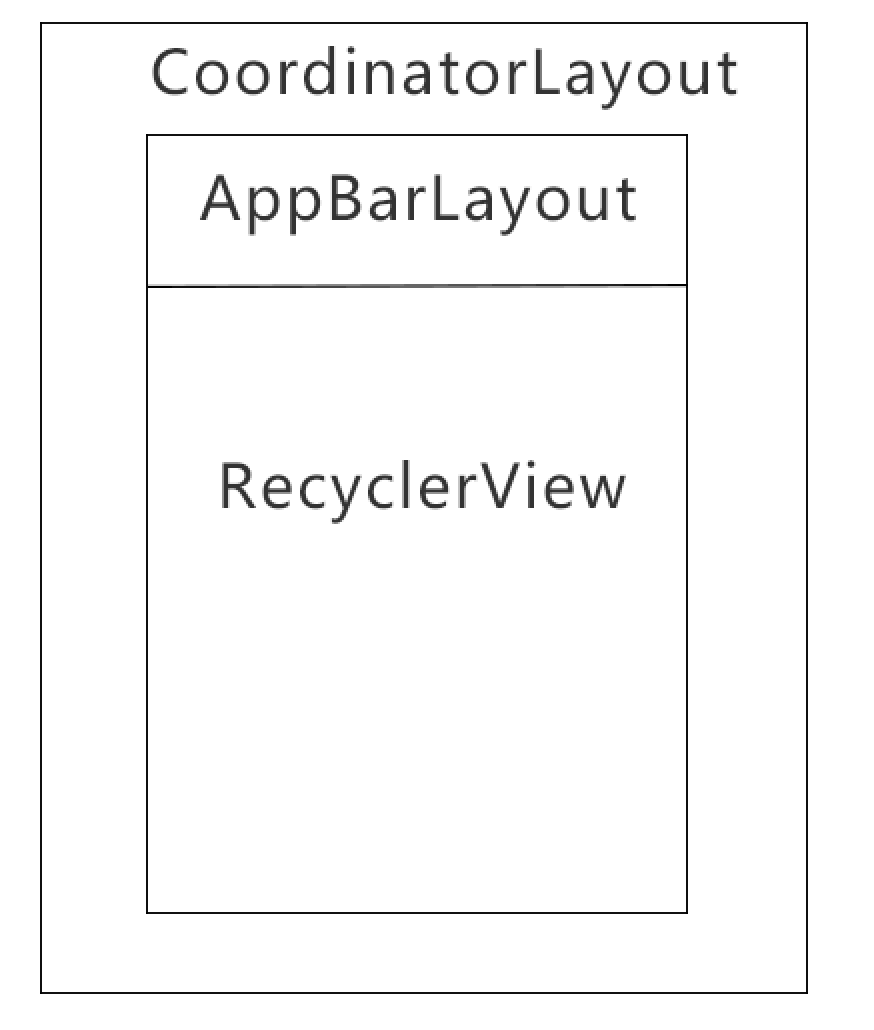
即当RecyclerView往上滚的时候,AppBarLayout便可以隐藏。当RecyclerView往下滚的时候,AppBarLayout便显示出来。像一些小说、资讯类app的详情页如果内容很多的话,用户上滑时,隐藏AppBarLayout就能看到更多内容;而当用户下滑时AppBarLayout又能很快显示出来提供返回等便捷操作,而不用一直返回到页面顶部用户才能看到。
是不是很智能?来看看代码怎么用吧。
首先看布局
<?xml version="1.0" encoding="utf-8"?>
<android.support.design.widget.CoordinatorLayout
    xmlns:android="http://schemas.android.com/apk/res/android"
    xmlns:app="http://schemas.android.com/apk/res-auto"
    android:layout_width="match_parent"
    android:layout_height="match_parent">

    <!-- Your scrolling content -->
    <android.support.v7.widget.RecyclerView
        android:id="@+id/recycler_view"
        android:layout_width="match_parent"
        android:layout_height="match_parent"
        app:layout_behavior="@string/appbar_scrolling_view_behavior"/>

    <android.support.design.widget.AppBarLayout
        android:layout_width="match_parent"
        android:layout_height="wrap_content">

        <android.support.v7.widget.Toolbar
            android:id="@+id/toolbar"
            xmlns:android="http://schemas.android.com/apk/res/android"
            android:layout_width="match_parent"
            android:layout_height="wrap_content"
            android:background="?attr/colorPrimary"
            android:minHeight="?attr/actionBarSize"
            android:popupTheme="@style/ThemeOverlay.AppCompat.Light"
            app:layout_scrollFlags="scroll|enterAlways"
            app:theme="@style/AppTheme.Toolbar.More">
        </android.support.v7.widget.Toolbar>

    </android.support.design.widget.AppBarLayout>

</android.support.design.widget.CoordinatorLayout>
上面我用RecyclerView替换掉了NestedScrollView,毕竟只要是支持滚动的View就可以了(不过不要直接在NestedScrollView中放一个RecyclerView哦,好像显示不出来)。
主要是布局,代码没什么特别的,主要给RecyclerView设置一个Adapter让他可以显示就行。
运行之后的效果图如下:

CoordinatorLayout
照例看官方介绍吧。
CoordinatorLayout is a super-powered {@link android.widget.FrameLayout FrameLayout}.
CoordinatorLayout是一个非常强大的FrameLayout。CoordinatorLayout is intended for two primary use cases: CoordinatorLayout主要适用于下面两种场景:
- As a top-level application decor or chrome layout
- 作为应用最顶层的修饰器。
- As a container for a specific interaction with one or more child views
- 作为一个特殊的容器跟一个或多个子View产生交互。
By specifying {@link CoordinatorLayout.Behavior Behaviors} for child views of a CoordinatorLayout you can provide many different interactions within a single parent and those views can also interact with one another. View classes can specify a default behavior when used as a child of a CoordinatorLayout using the {@link CoordinatorLayout.DefaultBehavior DefaultBehavior} annotation.
通过给CoordinatorLayout的子View指定Behaviors,你可以在单层的父容器中产生许多不同的交互,并且这些子View也可以跟另一个进行交互。CoordinatorLayout容器中的子View可以用DefaultBehavior来指定一个默认的行为。Behaviors may be used to implement a variety of interactions and additional layout modifications ranging from sliding drawers and panels to swipe-dismissable elements and buttons that stick to other elements as they move and animate.
当他们移动或者播放动画时,Behaviors可以被用于实现各种交互和额外的布局改动,包括滑动抽屉、滑动消失面板、固定按钮,及其他。Children of a CoordinatorLayout may have an {@link CoordinatorLayout.LayoutParams#setAnchorId(int) anchor}. This view id must correspond to an arbitrary descendant of the CoordinatorLayout, but it may not be the anchored child itself or a descendant of the anchored child. This can be used to place floating views relative to
other arbitrary content panes.
CoordinatorLayout中的子View可以有一个固定的id,该View的id必须符合CoordinatorLayout的任意一个子类,但是它不可以是该View本身或是固定子View的子View。
强行翻译完了,感觉一脸懵逼,英语渣伤不起。
CoordinatorLayout给人的印象就是为了方便它子View之间的各种交互效果。我们来看一个典型的例子:在RelativeLayout中的右下角放置一个FloatingActionButton,然后点击FloatingActionButton在RelativeLayout底部弹出一个SnackBar。下面是效果图。

虽然看起来并没有什么严重错误,但是用户体验很不好,因为弹出一个SnackBar之后就把FloatingActionButton遮住了,理想中的交互效果不应该是这样的。
现在我们把FloatingActionButton放在CoordinatorLayout里面再试试。

如何,这样的效果是不是看着友好多了。底部SnackBar弹出来的时候,自动把FloatingActionButton顶上去,这样就不会挡住了。(关于FloatingActionButton的更多交互效果实现可以参考这篇文章)
当然CoordinatorLayout的用处不止这个,别忘了上面我们介绍AppBarLayout的时候也是用了CoordinatorLayout来实现的,毕竟AppBarLayout只有在CoordinatorLayout中才有它存在的意义。
不过直接把AppBarLayout放在CoordinatorLayout里面是不能让它根据滚动来实现隐藏的效果,必须同时给AppBarLayout指定滚动标志(scroll flag),这一点上面已经介绍过了。
CollapsingToolbarLayout
看名字就知道了:可折叠的ToolBar。
CollapsingToolbarLayout is a wrapper for {@link Toolbar} which implements a collapsing app bar. It is designed to be used as a direct child of a {@link AppBarLayout}. CollapsingToolbarLayout contains the following features:
CollapsingToolbarLayout是实现了折叠工具栏的一个Toolbar的包装器,它被设计作为AppBarLayout的直接子View。CollapsingToolbarLayout有如下几点特性:
Collapsing title
折叠标题。
A title which is larger when the layout is fully visible but collapses and becomes smaller as the layout is scrolled off screen. You can set the title to display via {@link #setTitle(CharSequence)}. The title appearance can be tweaked via the {@code collapsedTextAppearance} and {@code expandedTextAppearance} attributes.
当布局完全显示时,标题会变大;当布局滑出屏幕时,标题会变小。你可以通过setTitle()来设置标题,标题的外观可以通过collapsedTextAppearance()和expandedTextAppearance()方法来调整属性。Content scrim
–沉浸式内容。
A full-bleed scrim which is show or hidden when the scroll position has hit a certain threshold. You can change this via {@link #setContentScrim(Drawable)}.
当滚动到一定值时显示或者隐藏的沉浸式体验,可以通过setContentScrim()来设置。Status bar scrim
沉浸式状态栏
A scrim which is show or hidden behind the status bar when the scroll position has hit a certain threshold. You can change this via {@link #setStatusBarScrim(Drawable)}. This only works on {@link Build.VERSION_CODES#LOLLIPOP LOLLIPOP} devices when we set to fit system windows.
当滚动到一定值时显示或者隐藏在状态栏后面的沉浸式效果,可以通过setStatusBarScrim()方法来设置,仅在Android5.0并且设置了适应窗口(fitsSystemWindows="true")时有用。Parallax scrolling children
视察滚动
Child views can opt to be scrolled within this layout in a parallax fashion. See {@link LayoutParams#COLLAPSE_MODE_PARALLAX} and {@link LayoutParams#setParallaxMultiplier(float)}.
该布局中的子View可以选择视察滚动的方式来滚动,详见LayoutParams#COLLAPSE_MODE_PARALLAX和LayoutParams#setParallaxMultiplier()。Pinned position children
顶部悬浮
Child views can opt to be pinned in space globally. This is useful when implementing a collapsing as it allows the {@link Toolbar} to be fixed in place even though this layout is moving. See {@link LayoutParams#COLLAPSE_MODE_PIN}.
子View可以选择全屏固定。这在你实现一个折叠效果的时候很有用,因为它允许Toolbar固定在顶部,尽管布局是移动的。详见LayoutParams#COLLAPSE_MODE_PIN。
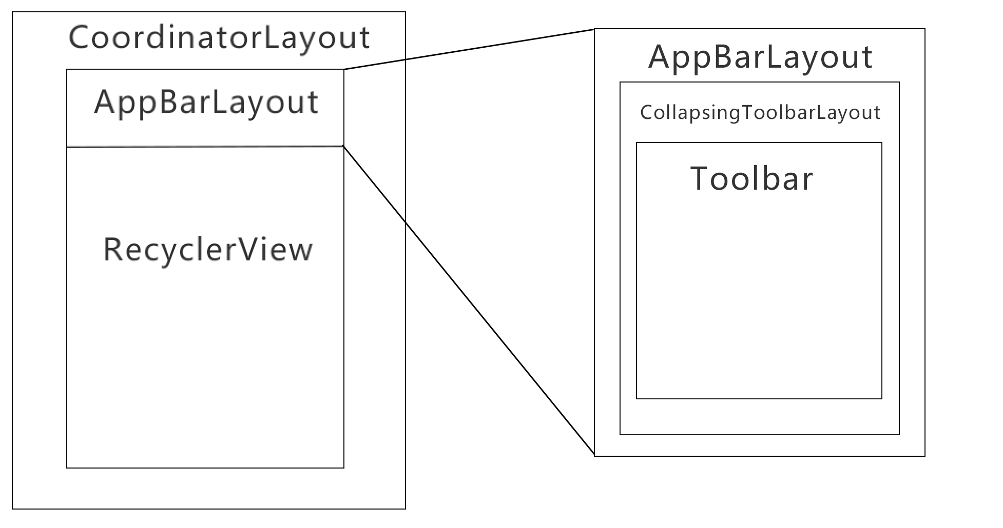
之前我们画了AppBarLayout的图,现在扩展一下。按照上面的描述,CollapsingToolbarLayout的使用场景如下:
来看看布局。
<?xml version="1.0" encoding="utf-8"?>
<android.support.design.widget.CoordinatorLayout
    xmlns:android="http://schemas.android.com/apk/res/android"
    xmlns:app="http://schemas.android.com/apk/res-auto"
    android:layout_width="match_parent"
    android:layout_height="match_parent"
    android:fitsSystemWindows="true">
    <!--fitsSystemWindows实现沉浸式效果-->

    <android.support.design.widget.AppBarLayout
        android:layout_width="match_parent"
        android:layout_height="256dp"
        android:fitsSystemWindows="true"
        android:theme="@style/ThemeOverlay.AppCompat.Dark.ActionBar">

        <android.support.design.widget.CollapsingToolbarLayout
            android:id="@+id/collapsingToolBarLayout"
            android:layout_width="match_parent"
            android:layout_height="match_parent"
            android:fitsSystemWindows="true"
            app:contentScrim="?attr/colorPrimary"
            app:expandedTitleMarginEnd="64dp"
            app:expandedTitleMarginStart="48dp"
            app:layout_scrollFlags="scroll|exitUntilCollapsed">

            <!--contentScrim:折叠之后显示的内容-->

            <android.support.v7.widget.Toolbar
                android:id="@+id/toolbar"
                android:layout_width="match_parent"
                android:layout_height="?attr/actionBarSize"
                app:layout_collapseMode="pin"
                app:popupTheme="@style/ThemeOverlay.AppCompat.Light">

                <!--layout_collapseMode="pin"表示固定在顶部-->

            </android.support.v7.widget.Toolbar>

        </android.support.design.widget.CollapsingToolbarLayout>

    </android.support.design.widget.AppBarLayout>

    <android.support.v7.widget.RecyclerView
        android:id="@+id/recycler_view"
        android:layout_width="match_parent"
        android:layout_height="match_parent"
        app:layout_behavior="@string/appbar_scrolling_view_behavior"/>

    <!--CoordinatorLayout的滚动行为-->

</android.support.design.widget.CoordinatorLayout>
下面是效果图:

像下面这种滚动视察的效果怎么实现呢?

你只需要在CollapsingToolbarLayout里面添加一个ImageView,然后给它添加属性app:layout_collapseMode="parallax"即可,parallax就是视察的意思。也可以用app:layout_collapseParallaxMultiplier="0.7"来设置视差因子。
完成后的效果图如下:

整体效果可以参考JuheNews项目:
项目地址:https://github.com/aishang5wpj/JuheNews
参考:
Android应用Design Support Library完全使用实例
Android5.0+(CoordinatorLayout)
Handling Scrolls with CoordinatorLayout
Android的材料设计兼容库(Design Support Library)


 1万+
1万+

 被折叠的 条评论
为什么被折叠?
被折叠的 条评论
为什么被折叠?
 到【灌水乐园】发言


