


目的:HTM+CSS实现立方体图片旋转展示效果
环境:
系统:Win10
环境:
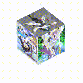
一、示例1。
话不多说直接上代码
<html>
	<head>
		<style>
			/*立方体效果*/
			.wrap {
			width: 120px;
			height: 200px;
			margin: 20px;
			position: fixed;
			top: 100px;
			left: 200px;
			display: table-cell;
			vertical-align: middle;
			text-align: center;
			z-index: 22;
			}

			.cube {
			width: 120px;
			height: 120px;
			margin: 0 auto;
			transform-style: preserve-3d;
			transform: rotateX(-30deg) rotateY(-80deg);
			animation: rotate linear 20s infinite;
			}

			@-webkit-keyframes rotate {
				from {
					transform: rotateX(0deg) rotateY(0deg);
				}
				to {
					transform: rotateX(360deg) rotateY(360deg);
				}
			}

			.cube div {
				position: absolute;
				width: 120px;
				height: 120px;
				opacity: 0.8;
				transition: all .4s;
			}

			.cube .out_front {
				transform: rotateY(0deg) translateZ(60px);
			}

			.cube .out_back {
				transform: translateZ(-60px) rotateY(180deg);
			}

			.cube .out_left {
				transform: rotateY(-90deg) translateZ(60px);
			}

			.cube .out_right {
				transform: rotateY(90deg) translateZ(60px);
			}

			.cube .out_top {
				transform: rotateX(90deg) translateZ(60px);
			}

			.cube .out_bottom {
				transform: rotateX(-90deg) translateZ(60px);
			}
		</style>
	</head>

	<body>
		<div class="wrap">
			<div class="cube">
				<div class="out_front"><img src="https://files-cdn.cnblogs.com/files/cjsblog/cube01.bmp" class="pic"></div>
				<div class="out_back"><img src="https://files-cdn.cnblogs.com/files/cjsblog/cube02.bmp" class="pic"></div>
				<div class="out_left"><img src="https://files-cdn.cnblogs.com/files/cjsblog/cube03.bmp" class="pic"></div>
				<div class="out_right"><img src="https://files-cdn.cnblogs.com/files/cjsblog/cube04.bmp" class="pic"></div>
				<div class="out_top"><img src="https://files-cdn.cnblogs.com/files/cjsblog/cube05.bmp" class="pic"></div>
				<div class="out_bottom"><img src="https://files-cdn.cnblogs.com/files/cjsblog/cube06.bmp" class="pic"></div>
			</div>
		</div>
	</body>
</html>
效果图:
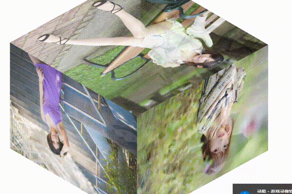
一、示例2,增大立方体。
话不多说直接上代码
<html>
	<head>
		<style>
			/*立方体效果*/
			.wrap {
			width: 800px;
			height: 600px;
			margin: 20px;
			position: fixed;
			top: 100px;
			left: 200px;
			display: table-cell;
			vertical-align: middle;
			text-align: center;
			z-index: 22;
			}

			.cube {
			width: 600px;
			height: 600px;
			margin: 0 auto;
			transform-style: preserve-3d;
			transform: rotateX(-30deg) rotateY(-80deg);
			animation: rotate linear 20s infinite;
			}

			@-webkit-keyframes rotate {
				from {
					transform: rotateX(0deg) rotateY(0deg);
				}
				to {
					transform: rotateX(360deg) rotateY(360deg);
				}
			}

			.cube div {
				position: absolute;
				width: 600px;
				height: 600px;
				opacity: 0.8;
				transition: all .4s;
			}

			.cube .out_front {
				transform: rotateY(0deg) translateZ(300px);
			}

			.cube .out_back {
				transform: rotateY(180deg) translateZ(-300px);
			}

			.cube .out_left {
				transform: rotateY(-90deg) translateZ(300px);
			}

			.cube .out_right {
				transform: rotateY(90deg) translateZ(300px);
			}

			.cube .out_top {
				transform: rotateX(90deg) translateZ(300px);
			}

			.cube .out_bottom {
				transform: rotateX(-90deg) translateZ(300px);
			}
		</style>
	</head>

	<body>
		<div class="wrap">
			<div class="cube">
				<div class="out_front"><img src="http://pic.sc.chinaz.com/files/pic/pic9/201906/zzpic18408.jpg" class="pic" height="600" width="600" ></div>
				<div class="out_back"><img src="http://pic.sc.chinaz.com/files/pic/pic9/201907/zzpic18997.jpg" class="pic" height="600" width="600" ></div>
				<div class="out_left"><img src="http://pic.sc.chinaz.com/files/pic/pic9/201907/zzpic19237.jpg" class="pic" height="600" width="600" ></div>
				<div class="out_right"><img src="http://pic.sc.chinaz.com/files/pic/pic9/201907/zzpic19021.jpg" class="pic" height="600" width="600" ></div>
				<div class="out_top"><img src="http://pic.sc.chinaz.com/files/pic/pic9/201907/zzpic18835.jpg" class="pic" height="600" width="600"></div>
				<div class="out_bottom"><img src="http://pic.sc.chinaz.com/files/pic/pic9/201906/zzpic18480.jpg" class="pic" height="600" width="600"></div>
			</div>
		</div>
	</body>
</html>
效果图:
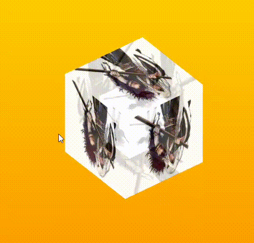
一、示例3。
话不多说直接上代码
<html>
   <head>
		<meta charset="utf-8" />
		<title>CSS3制作3D图片立方体旋转特效</title>

		<style type="text/css">
		html{
		  background:linear-gradient(#fc0 0%,#F80 80%);
		  height: 100%;
		}

		.wrap{
		  width: 650px;
		  height: 200px;
		  margin: 150px 360px;
		  position: relative;

		}
		.cube{
		  width: 200px;
		  height: 200px;
		  margin: 0 auto;
		  transform-style: preserve-3d;
		  transform: rotateX(-30deg) rotateY(-80deg);
		  -webkit-animation: rotate 20s infinite;
		  animation-timing-function: linear;
		}
		@-webkit-keyframes rotate{
		  from{transform: rotateX(0deg) rotateY(0deg);}
		  to{transform: rotateX(360deg) rotateY(360deg);}
		}
		.cube div{
		  position: absolute;
		  width: 200px;
		  height: 200px;
		  opacity: 0.8;
		  transition: all .4s;
		}
		.pic{
		  width: 200px;
		  height: 200px;
		}
		.cube .out_front{
		  transform: rotateY(0deg) translateZ(100px);
		}
		.cube .out_back{
		  transform: translateZ(-100px) rotateY(180deg);
		}
		.cube .out_left{
		  transform: rotateY(90deg) translateZ(100px);
		}
		.cube .out_right{
		  transform: rotateY(-90deg) translateZ(100px);
		}
		.cube .out_top{
		  transform: rotateX(90deg) translateZ(100px);
		}
		.cube .out_bottom{
		  transform: rotateX(-90deg) translateZ(100px);
		}
		.cube span{
		  display: bloack;
		  width: 100px;
		  height: 100px;
		  position: absolute;
		  top: 50px;
		  left: 50px;
		}
		.cube .in_pic{
		  width: 100px;
		  height: 100px;
		}
		.cube .in_front{
		  transform: rotateY(0deg) translateZ(50px);
		}
		.cube .in_back{
		  transform: translateZ(-50px) rotateY(180deg);
		}
		.cube .in_left{
		  transform: rotateY(90deg) translateZ(50px);
		}
		.cube .in_right{
		  transform: rotateY(-90deg) translateZ(50px);
		}
		.cube .in_top{
		  transform: rotateX(90deg) translateZ(50px);
		}
		.cube .in_bottom{
		  transform: rotateX(-90deg) translateZ(50px);
		}
		.cube:hover .out_front{
		  transform: rotateY(0deg) translateZ(200px);
		}
		.cube:hover .out_back{
		  transform: translateZ(-200px) rotateY(180deg);
		}
		.cube:hover .out_left{
		 transform: rotateY(90deg) translateZ(200px);
		}
		.cube:hover .out_right{
		 transform: rotateY(-90deg) translateZ(200px);
		}
		.cube:hover .out_top{
		 transform: rotateX(90deg) translateZ(200px);
		}
		.cube:hover .out_bottom{
		 transform: rotateX(-90deg) translateZ(200px);
		}


		</style>
	</head>

	<body>
		 <!--/*外层最大容器*/-->
		 <div class="wrap">
			 <!--    /*包裹所有元素的容器*/-->
			 <div class="cube">
				 <!--前面图片 -->
				 <div class="out_front">
					 <img src="./img/1.jpg"  class="pic">
				 </div>
				 <!--后面图片 -->
				 <div class="out_back">
					 <img src="./img/2.jpg"  class="pic">
				 </div>
				 <!--左图片 -->
				 <div class="out_left">
					 <img src="./img/3.jpg"  class="pic">
				 </div>
				 <div class="out_right">
					 <img src="./img/4.jpg" class="pic">
				 </div>
				 <div class="out_top">
					 <img src="./img/5.jpg"  class="pic">
				 </div>
				 <div class="out_bottom">
					 <img src="./img/6.jpg"  class="pic">
				 </div>
				 <!--小正方体 -->
				 <span class="in_front">
					 <img src="./img/7.jpg" class="in_pic" />
				 </span>
				 <span class="in_back">
					  <img src="./img/8.jpg" class="in_pic" />
				 </span>
				 <span class="in_left">
					 <img src="./img/9.jpg" class="in_pic" />
				 </span>
				 <span class="in_right">
					 <img src="./img/10.jpg" class="in_pic" />
				 </span>
				 <span class="in_top">
					 <img src="./img/11.jpg" class="in_pic" />
				 </span>
				 <span class="in_bottom">
					 <img src="./img/12.jpg" class="in_pic" />
				 </span>
			 </div>
		</div>
	</body>
</html>
效果图:


 2万+
2万+


 被折叠的 条评论
为什么被折叠?
被折叠的 条评论
为什么被折叠?
 到【灌水乐园】发言


