


一 、filter
1. 变白色
filter:brightness(100)
2.变黑色
filter:brightness(0)
二、滤镜 drop-shadow
1.使用了CSS3滤镜filter中的drop-shadow(drop-shadow滤镜可以给元素或图片非透明区域添加投影)。用drop-shadow添加投影模糊度为0,再隐藏原图片。
drop-shadow( x偏移,y偏移,模糊值,颜色) ,比如:filter: drop-shadow(100px 0 0 red);意思就是我们的图标大小是100px,那就x偏移100px,然后需要的图标是红色
<!DOCTYPE html>
<html lang="en">

<head>
    <meta charset="UTF-8">
    <meta name="viewport" content="width=device-width, initial-scale=1.0">
    <title>Document</title>
    <style>
        img {
            width: 100px;
            height: 100px;
        }

        .wrap {
            width: 100px;
            height: 100px;
            overflow: hidden;
        }

        .wrap img {
            width: 100px;
            height: 100px;
            position: relative;
            left: -100px;
            border-right: 100px solid transparent;
            filter: drop-shadow(100px 0px 0 blue);
        }
    </style>
</head>

<body>
    <h1>原图</h1>
    <img src="../../img/index.png" alt="">

    <h1>变成指定颜色</h1>
    <div class="wrap">
        <img src="../../img/index.png" alt="">
    </div>
</body>

</html>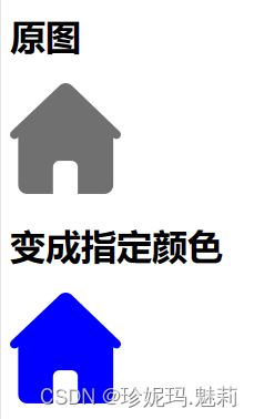
三、css background-blend-mode
此方法图片必须是黑图白底,如果是彩色的,颜色会混淆在一起;其次非图形部分必须是白色,不能是透明,因为透明会被当做黑色处理。
<!DOCTYPE html>
<html lang="en">

<head>
    <meta charset="UTF-8">
    <meta name="viewport" content="width=device-width, initial-scale=1.0">
    <title>Document</title>
    <style>
        img {
            width: 100px;
            height: 100px;
        }

        .colorimg {
            display: inline-block;
            width: 100px;
            height: 100px;
            background: url(../../img/indexblack.png) no-repeat, blue;
            background-size: cover;
            background-blend-mode: lighten;
        }
    </style>
</head>

<body>

    <h1>原图</h1>
    <img src="../../img/index.png" alt="">
    <h1>变成指定颜色</h1>
    <span class="colorimg"></span>
</body>

</html>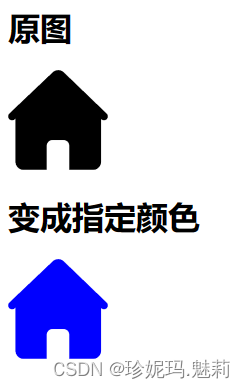
四、Css3 mask 修改图标颜色 (推荐)
CSS3 mask默认是基于透明度实现遮罩效果的。也就是实色区域显示,透明区域隐藏。因此,我们只需要把目标图标颜色#f4615c作为背景色,然后原始图标(无论什么颜色都可以)作为遮罩图片,效果就出来了。
<!DOCTYPE html>
<html lang="en">

<head>
    <meta charset="UTF-8">
    <meta name="viewport" content="width=device-width, initial-scale=1.0">
    <title>Document</title>
    <style>
        img {
            width: 100px;
            height: 100px;
        }

        .colorimg {
            display: inline-block;
            width: 100px;
            height: 100px;
            background: blue;
            background-size: 100%;
            -webkit-mask: url(../../img/index.png) no-repeat;
            -webkit-mask-size: 100% 100%;
            mask: url(img/snowflake.png) no-repeat;
            mask-size: 100% 100%;
        }
    </style>
</head>

<body>
    <h1>原图</h1>
    <img src="../../img/index.png" alt="">

    <h1>变成指定颜色</h1>
    <span class="colorimg"></span>
</body>

</html>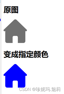
五、filter: grayscale(100%) brightness(200%),如果颜色调整不理想,可以将brightness的百分比继续增加已达到需要的白色效果。
六、网站变灰
  body *,html{
    -webkit-filter: grayscale(100%); /* webkit */
    -moz-filter: grayscale(100%); /*firefox*/
    -ms-filter: grayscale(100%); /*ie9*/-o-filter: grayscale(100%); /*opera*/
    filter: grayscale(100%);
    filter:progid:DXImageTransform.Microsoft.BasicImage(grayscale=1);
    filter:gray; /*ie9- */
  }
更多:


 1221
1221


 被折叠的 条评论
为什么被折叠?
被折叠的 条评论
为什么被折叠?
 到【灌水乐园】发言


