


switch 效果
https://proto.io/freebies/onoff/
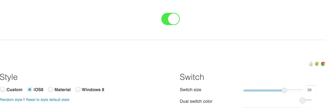
工作需要接触到了check box的效果展示,发现了一个可以自定义效果直接生成html和css的网站,共享如下,可以选择ios风格,windows风格或者android风格,非常简单友好,适合着急时候可以马上获取样式的小伙伴们。链接如下:
下面的内容是想要自己写一个这样的switch button的步骤:
原理
其本质是一个check box,原理是将check box隐藏,用一个label for标签设定开关背景样式,label:before来设置开关按钮样式。当点击check box时,给label和label:before来增加样式。
结果展示
height="266" width="100%" scrolling="no" src="//codepen.io/fiona2016/embed/qZLEZm/?height=266&theme-id=dark&default-tab=css,result&embed-version=2" allowfullscreen="true">See the Pen <a href="http://codepen.io/fiona2016/pen/qZLEZm/">qZLEZm</a> by Fiona (<a href="http://codepen.io/fiona2016">@fiona2016</a>) on <a href="http://codepen.io">CodePen</a>. See the Pen qZLEZm by Fiona (@fiona2016) on CodePen.
步骤讲解
- 知道label for的意义:
  <input type="checkbox" class="switch-checkbox" id="myswitchcheckbox" checked>
  <label for="myswitchcheckbox" id="myswitchlabel" class="switch-label"/>
上面的label与checkbox关联,注意是用**id**进行关联的。
2. 当checkbox 的状态是unchecked,和checked的时候,分别设置不同的样式。首先是 unchecked的样式。
     .switch-label{
  background:$color-unchecked-background;
  width:$width - $border-width * 2;
  height:$height - $border-width * 2;
  border:$border-width solid $color-unchecked-border;
  border-radius:$height;
  display:block;
  transition:all 0.3s ease-in;
}
.switch-label:before{
  content:"";
  display:block;
  background-color:$color-unchecked-background;
  width:$height - $border-width * 2;
  height:$height - $border-width * 2;
  border-radius:$height - $border-width * 2;
  line-height:$height - $border-width * 2;
  position:absolute;
  top:0;
  left:-$border-width;
  border:$border-width solid $color-unchecked-border;
  transition: all 0.3s ease-in 0s;
}
3.设置checked状态下的label样式。
  //当被选择时,外边框的颜色改变
  .switch-checkbox:checked + .switch-label,.switch-checkbox:checked + .switch-label:before{
  border-color:$color-checked-border;
}
//开关边框的颜色改变
.switch-checkbox:checked + .switch-label:before{
  left:$height;
}
//开关背景的颜色改变
.switch-checkbox:checked + .switch-label{
  background-color:$color-checked-background;
}


 扫一扫
扫一扫
 5728
5728

 被折叠的 条评论
为什么被折叠?
被折叠的 条评论
为什么被折叠?
 到【灌水乐园】发言


