


真正响应式的jQuery和css3斑马线表格美化插件。该表格插件使用无序列表制作,并有响应式、隔行变色斑马线、适用于移动设备等特定。表格式网页设计中的一个重要元素,它们能够让用户直观的了解某些数据。在这个demo中使用的表格不是标准的表格html结构,而是使用无序列表来制作表格。这样做的目的是为了使表格具有很好的相应性。HTML结构我们使用一个section来作为表格结构。header 中包含的是表格的第一列,没有将header和其它列放在同一个div中的原因是:在手机上header是fixed的。它的父元素将决定它在section中的位置。
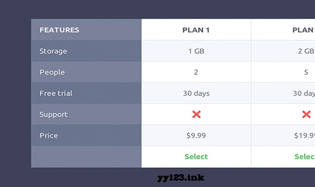
Features
- Feature 1
- Feature 2
- ...
Plan 1
- 1 GB
- 2
- ...
Plan 2
- 2 GB
- 5
- ...
CSS样式CSS文件中有一点要指出的是:我们使用2个div来包裹表格列(.cd-table-container 和 .cd-table-wrapper )。为什么需要两个div呢?因为第一个div这里设置它的宽度为90%和一个overflow-x:auto。第二个div的宽度是整个表格的宽度。通过这种方法,我们能让屏幕右边有一些margin,从而在表格宽度大于90%时让表格内容滚动起来。JAVASCRIPT在demo中仅使用jQuery来在小屏幕设备上去掉表格右边的小箭头。jQuery(document).ready(function($){ var $columns_number = $("#cd-table .cd-table-container").find(".cd-table-column").length; $(".cd-table-container").on("scroll", function(){ $this = $(this); //hide the arrow on scrolling if( $this.scrollLeft() > 0 ) { $(".cd-scroll-right").hide(); } //remove color gradient when table has scrolled to the end var total_table_width = parseInt($(".cd-table-wrapper").css("width").replace("px", "")), table_viewport = parseInt($("#cd-table").css("width").replace("px", "")); if( $this.scrollLeft() >= total_table_width - table_viewport - $columns_number) { $("#cd-table").addClass("table-end"); } else { $("#cd-table").removeClass("table-end"); } }); //scroll the table (scroll value equal to column width) when clicking on the .cd-scroll-right arrow $(".cd-scroll-right").on("click", function(){ $this= $(this); var column_width = $(this).siblings(".cd-table-container").find(".cd-table-column").eq(0).css("width").replace("px", ""), new_left_scroll = parseInt($(".cd-table-container").scrollLeft()) + parseInt(column_width); $(".cd-table-container").animate( {scrollLeft: new_left_scroll}, 200 ); $this.hide(); });});
dd:


 348
348


 被折叠的 条评论
为什么被折叠?
被折叠的 条评论
为什么被折叠?
 到【灌水乐园】发言


