


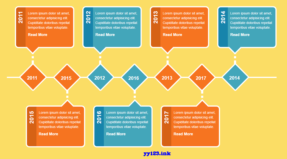
这是一款基于Bootstrap网格系统的响应式横向水平时间轴特效。该水平时间轴特效采用bootstrap网格进行布局,然后通过css代码来进行美化,效果简洁时尚。核心CSS3代码.main-timeline{ position: relative; }.main-timeline:before,.main-timeline:after{ content: ""; display: block; width: 100%; clear: both;}.main-timeline:before{ content: ""; width: 100%; height: 5px; background: #fff; margin: auto 0; position: absolute; top: 50%; left: 0;}.main-timeline .timeline{ width: 22%; float: left; margin-left: 3%; position: relative;}.main-timeline .timeline:before{ content: attr(data-heading); display: inline-block; font-size: 24px; font-weight: bold; color: #fff; transform: rotate(-90deg); position: absolute; top: 30px; left: -2px; z-index: 2;}.main-timeline .timeline:after{ content: ""; width: 5px; height: 60px; border-left: 9px dotted #fff; position: absolute; top: 54%; left: 71px;}.main-timeline .timeline-content{ padding: 15px 0 40px 50px; margin-bottom: 80px; border-radius: 15px; border: 5px solid #fff; text-align: left; background: #f67420; z-index: 1; position: relative;}.main-timeline .timeline:nth-child(even) .timeline-content{ background: #43a6ba; }.main-timeline .timeline-content:before{ content: ""; width: 40px; height: 100%; position: absolute; top: 0; left: 0; background: #d66215; border-radius: 10px 0 0 10px;}.main-timeline .timeline:nth-child(even) .timeline-content:before{ background: #1784ab; }.main-timeline .timeline-content:after{ content: ""; width: 40px; height: 40px; background: #f67420; border-bottom: 5px solid #fff; border-right: 5px solid #fff; position: absolute; bottom: -23px; left: 50px; transform: rotate(45deg); z-index: -1;}.main-timeline .timeline:nth-child(even) .timeline-content:after{ background: #43a6ba; }.main-timeline .description{ font-size: 14px; color: #fff;}.main-timeline .read-more{ display: inline-block; padding-right: 15px; font-size: 16px; font-weight: bold; color: #fff; text-transform: capitalize; position: relative;}.main-timeline .read-more:before{ content: "0da"; font-family: "FontAwesome"; font-size: 24px; position: absolute; top: -6px; right: 0;}.main-timeline .year{ display: inline-block; width: 85px; height: 85px; line-height: 85px; background: #f67420; border-radius: 5px; border: 5px solid #fff; text-align: center; margin-left: 34px; transform: rotate(45deg); position: relative;}.main-timeline .timeline:nth-child(even) .year{ background: #43a6ba; }.main-timeline .year span{ display: block; font-size: 20px; font-weight: bold; color: #fff; transform: rotate(-45deg);}.main-timeline .timeline.bottom{ margin: -7.7% 0 0 7%; }.main-timeline .timeline.bottom:nth-child(5n+1),.main-timeline .timeline.bottom:last-child{ margin-left: 3%; }.main-timeline .timeline.bottom:before{ top: auto; bottom: 110px;}.main-timeline .timeline.bottom:after{ top: auto; left: auto; bottom: 54%; right: 71px; border-color: #fff;}.main-timeline .timeline.bottom .timeline-content{ margin: 80px 0 0 0; padding: 15px 0 40px 50px;}.main-timeline .timeline.bottom .timeline-content:after{ border: none; border-top: 5px solid #fff; border-left: 5px solid #fff; bottom: auto; top: -23px; left: auto; right: 50px;}.main-timeline .timeline.bottom .year{ top: 4px; margin-left: 132px;}@media only screen and (max-width: 1199px){ .main-timeline:before{ width: 5px; height: 100%; top: 0; left: 5%; } .main-timeline .timeline, .main-timeline .timeline.bottom, .main-timeline .timeline.bottom:nth-child(5n+1), .main-timeline .timeline.bottom:last-child{ width: 85%; float: none; margin: 0 0 20px 15%; } .main-timeline .timeline:after, .main-timeline .timeline.bottom:after{ width: 60px; height: 5px; top: 50px; left: -58px; border-top: 9px dotted #fff; } .main-timeline .timeline-content, .main-timeline .timeline.bottom .timeline-content{ margin: 0; } .main-timeline .year, .main-timeline .timeline.bottom .year{ width: 65px; height: 65px; line-height: 60px; margin: 0; position: absolute; top: 20px; left: -15.5%; z-index: 1; } .main-timeline .timeline .timeline-content:after{ display: none; } .main-timeline .timeline.bottom:before{ bottom: auto; top: 30px; left: -2px; }}@media only screen and (max-width: 990px){ .main-timeline .year, .main-timeline .timeline.bottom .year{ left: -16.8%; }}@media only screen and (max-width: 767px){ .main-timeline .timeline:after, .main-timeline .timeline.bottom:after{ display: none; } .main-timeline .year, .main-timeline .timeline.bottom .year{ width: 30px; height: 30px; border: 3px solid #fff; left: -13.5%; } .main-timeline .year span{ display: none; }}@media only screen and (max-width: 480px){ .main-timeline .year, .main-timeline .timeline.bottom .year{ left: -15.5%; }}
dd:


 8610
8610


 被折叠的 条评论
为什么被折叠?
被折叠的 条评论
为什么被折叠?
 到【灌水乐园】发言


