


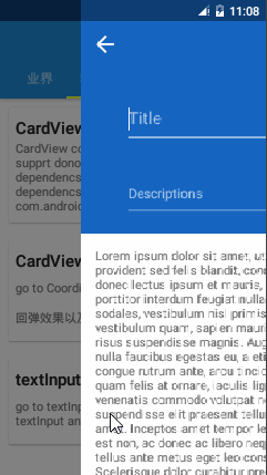
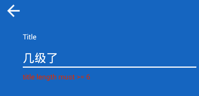
继CoordinatorLayout之后,继续研究 material design 的相关控件TextInputLayout,下面是效果图:
1.gradle 配置
compile ‘com.android.support:design:22.2.0’
compile ‘com.android.support:appcompat-v7:22.2.0’2.xml
 private android.widget.LinearLayout.LayoutParams setEditText(EditText editText,  LayoutParams lp) {
        if(this.mEditText != null) {
            throw new IllegalArgumentException("We already have an EditText, can only    have one");
        } else {
            .......
            .....
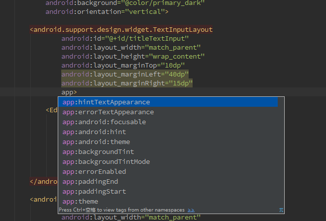
注意点:部分源代码中的内容 ,TextInputLayout 继承LinearLayout 且里面只能有一个editEditText,和scrollView 很像。下面是布局文件:
<android.support.design.widget.TextInputLayout
                android:id="@+id/titleTextInput"
                android:layout_width="match_parent"
                android:layout_height="wrap_content"
                android:layout_marginTop="10dp"
                android:layout_marginLeft="40dp"
                android:layout_marginRight="15dp"
                app:errorTextAppearance="@style/TextInput_Error_style">

            <EditText
                    android:id="@+id/title"
                    android:layout_width="match_parent"
                    android:layout_height="wrap_content"
                    android:textSize="20sp"
                    android:textColor="@color/white"
                    android:singleLine="true"
                    android:hint="Title"/>
        </android.support.design.widget.TextInputLayout>

        <android.support.design.widget.TextInputLayout
                android:id="@+id/descriptionsTextInput"
                android:layout_width="match_parent"
                android:layout_height="wrap_content"
                android:layout_marginLeft="40dp"
                android:layout_marginRight="15dp">

            <EditText
                    android:id="@+id/descriptions"
                    android:layout_width="match_parent"
                    android:layout_height="wrap_content"
                    android:textSize="16sp"
                    android:textColor="@color/white"
                    android:hint="Descriptions"/>
</android.support.design.widget.TextInputLayout>- 3.java
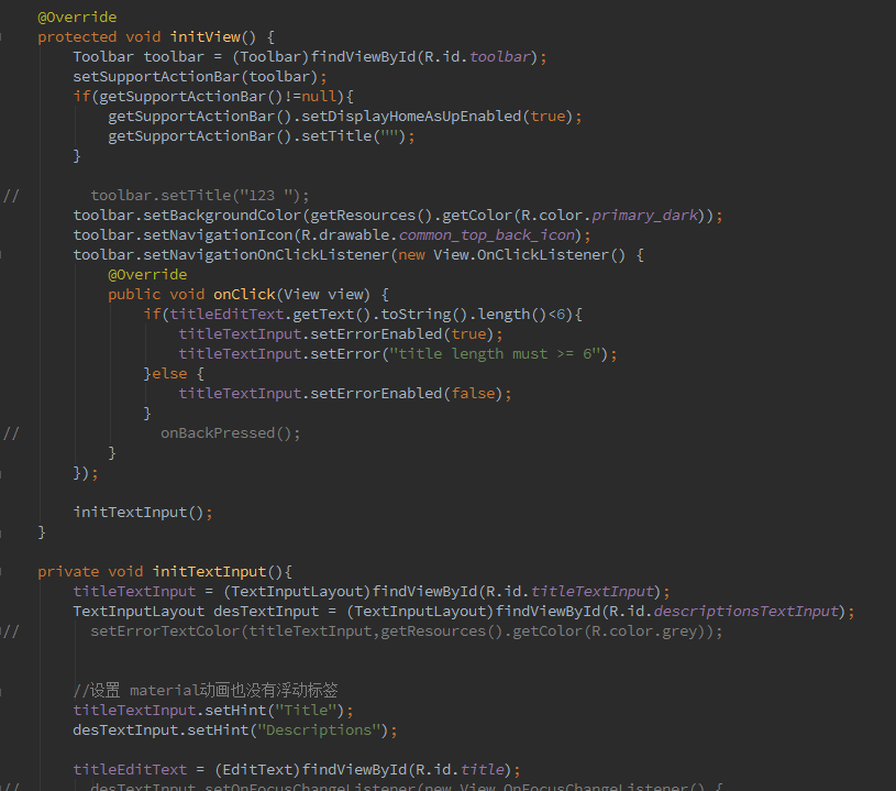
注意:不能 重写 TextInputLayout的OnFocusChangeListener的监听事件,因为在源代码中定义了动画效果和editText注入,重写了会导致动画失效。
设置 浮动标签动画效果
titleTextInput.setHint(“Title”);
if(titleEditText.getText().toString().length()<6){
   titleTextInput.setErrorEnabled(true);
   titleTextInput.setError("title length must >= 6");
}else {
   titleTextInput.setErrorEnabled(false);
}
这一部分是动态错误提示的相关代码
完成上面的,基本就可以出现TextInputLayout 的动画效果了,但是默认的颜色不是很好看,所以我们需要自定义相关的颜色,比如 hint 字的颜色,下划线的颜色,错误字体的颜色大小等,下面就是自定义颜色的部分:
谷歌把Design Support Library写的很好。每一个控件的颜色都是直接通过主题颜色绘制的,在 style.xml 中指定。打开它添加colorAccent 到主题以改变表单的颜色。在 style.xml 中修改相关的属性
<style name="AppTheme" parent="Theme.AppCompat.Light.NoActionBar">
        <item name="colorPrimary">@color/primary</item>
        <item name="colorPrimaryDark">@color/primary_dark</item>

        <!--<item name="colorAccent">#3498db</item>-->
        <item name="android:textColorHint">@color/alpha_white</item>
        <item name="colorControlNormal">@color/alpha_white</item>
        <item name="colorControlActivated">@color/white</item>
        <item name="colorControlHighlight">@color/white</item>
        <item name="android:windowTranslucentStatus">true</item>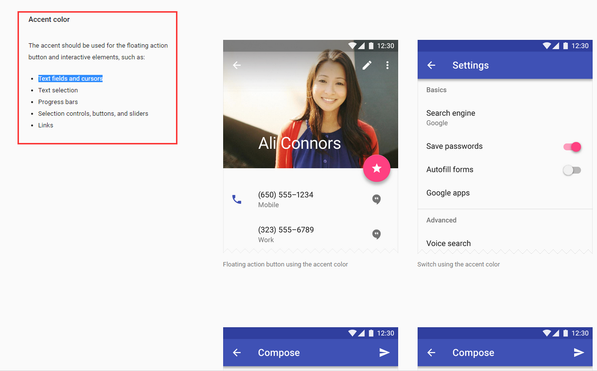
</style>- 2.1 colorAccent 是什么意思,哪里的颜色
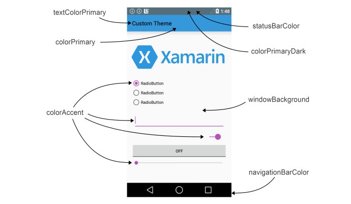
这张图片基本说明了colorAccent 代表的颜色,而在google 的官网上:
https://www.google.com/design/spec/style/color.html#color-color-schemes 也有相关的说明
2.2 其他相关颜色的说明
android:textColorHint 代表 hint 的颜色
colorControlNormal 代表 下划线没有获取焦点的颜色
colorControlActivated,colorControlHighlight 代表了获取焦点或者点击的时候 下划线 的颜色2.3 错误提示的颜色说明:
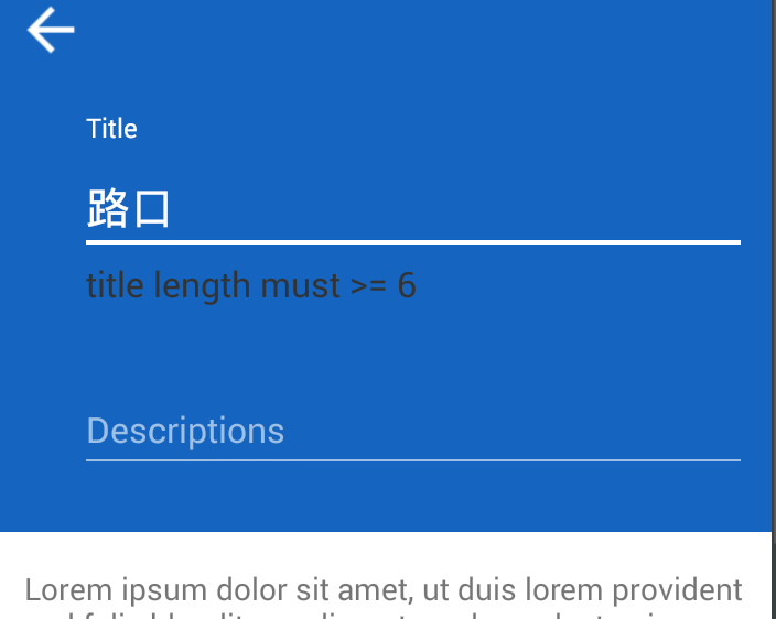
默认的错误提示的颜色是红色:在这种背景色下面,红色不是很好看,所以需要自定义颜色
在设置布局的时候errorTextAppearance这个属性,自定义style 写颜色和大小就可以了,至于另一个属性hintTextAppearance 这个属性修改颜色,好像没有什么效果,不起作用。
修改之后的效果,如下图:有的机器上面可能没有效果,下面提供一种解决方案:
public static void setErrorTextColor(TextInputLayout textInputLayout, int color) {
        try {
            Field fErrorView = TextInputLayout.class.getDeclaredField("mErrorView");
            fErrorView.setAccessible(true);
            TextView mErrorView = (TextView) fErrorView.get(textInputLayout);
            Field fCurTextColor = TextView.class.getDeclaredField("mCurTextColor");
            fCurTextColor.setAccessible(true);
            fCurTextColor.set(mErrorView, color);
        } catch (Exception e) {
            e.printStackTrace();
        }
    }
需要注意的是:
setErrorTextColor(titleTextInput,getResources().getColor(R.color.grey));
需要在titleTextInput.setErrorEnabled(true);之前调用
这个是 material design 的说明文档,收藏记录下:
https://www.google.com/design/spec/components/text-fields.html#text-fields-multi-line-text-field


 扫一扫
扫一扫
 1万+
1万+

 被折叠的 条评论
为什么被折叠?
被折叠的 条评论
为什么被折叠?
 到【灌水乐园】发言


