


通常情况下,我们都会使用css中的position:fixed 来固定导航。这无疑是一种比较方便的好方法,但是当它在移动端,文本框获得焦点的时候,就会几乎失效。
解决方案
<!DOCTYPE html>
<html lang="en">
    <head>
        <meta charset="utf-8">
        <meta content="width=device-width,user-scalabe=no,initial-scale=1" name="viewport">
        <style>
            html,body {
                margin:0;
                padding: 0;
                width: 100%;
                height: 100%;
            }

            header {
                height: 40px;
                background: skyblue;
                position: fixed;
                left: 0;
                right: 0;
                top: 0;
                text-align: center;
                line-height: 40px;
            }

            textarea {
                width: 100%;
                height: auto;
                text-align: left;
                line-height: 2.2em;
                color: #ccc;
                font-size: 15px;
                outline-style: none;
                /*禁止手动拖拽*/
                resize: none;
                overflow: auto;
                padding: 0;
                margin: 0;
                border: none;
            }

            main, section, header, footer {
                display: block;
                width: 100%;
            }

            main div {
                height: 200px;
                background: #eee;
            }

            /*可以把中间的主体区域手动设置成一个独立的滚动区域*/

            main {
                width: 100%;
                position: absolute;
                right: 0;
                left: 0;
                top: 40px;
                bottom: 0;
                overflow-y: scroll;
                /* 该属性可以使移动端滑动更加自然 */
                -webkit-overflow-scrolling: touch;
            }

        </style>
    </head>
    <body>
        <header>我是导航</header>
        <main>
            <section>
                <textarea>我是文本框里的内容</textarea>
                <div>这里是其他内容1</div>
            </section>
            <section>
                <textarea>我是文本框里的内容</textarea>
                <div>这里是其他内容1</div>
            </section>
            <section>
                <textarea>我是文本框里的内容</textarea>
                <div>这里是其他内容1</div>
            </section>
        </main>
    </body>
</html>
但是这种方法虽然可以让导航固定,不会掉下来,但是也会造成导航有时候会不固定在顶部,如图所示:
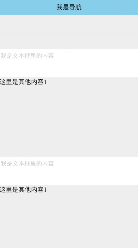
这是正常时的显示效果
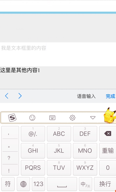
这是触及上面文本框时的显示效果
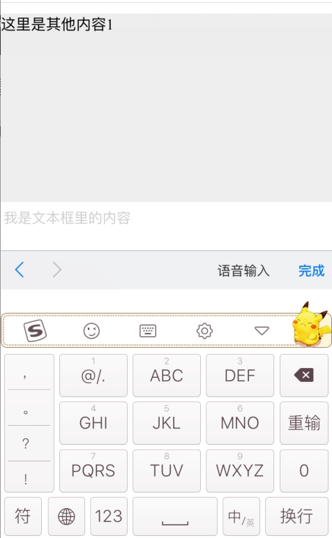
这是触及下面文本框时的显示效果
以上是参考网上的方案,大神们如果有更好的解决方案,欢迎给我留言,感激不尽!


 1343
1343

 被折叠的 条评论
为什么被折叠?
被折叠的 条评论
为什么被折叠?
 到【灌水乐园】发言


