


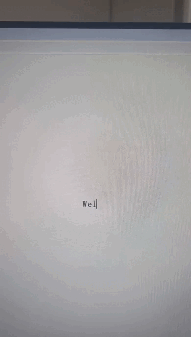
一、打字机效果?
效果如下----->
二、代码
1.第一种
代码如下:
<!DOCTYPE html>
<html lang="en">
<head>
  <meta charset="UTF-8">
  <meta name="viewport" content="width=device-width, initial-scale=1.0">
  <title>CSS Typing Effect</title>
  <style>
    body {
      display: flex;
      justify-content: center;
      align-items: center;
      height: 100vh;
      background-color: #f5f5f5;
      margin: 0;
      font-family: monospace;
    }

    .typewriter h1 {
      overflow: hidden; /* 使内容超出时不可见 */
      border-right: 2px solid black; /* 光标效果 */
      white-space: nowrap; /* 防止文字换行 */
      margin: 0 auto; /* 使内容居中 */
      letter-spacing: 2px; /* 字符间距 */
      animation: typing 4s steps(30, end), blink-caret 0.75s step-end infinite; /* 动画 */
    }

    /* 打字动画 */
    @keyframes typing {
      from { width: 0; }
      to { width: 100%; }
    }

    /* 光标闪烁效果 */
    @keyframes blink-caret {
      from, to { border-color: transparent; }
      50% { border-color: black; }
    }
  </style>
</head>
<body>

  <div class="typewriter">
    <h1>Welcome to the Typing Effect!</h1>
  </div>

</body>
</html>
2.第二种写法
代码如下:
<!DOCTYPE html>
<html lang="en">

<head>
    <meta charset="UTF-8">
    <meta http-equiv="X-UA-Compatible" content="IE=edge">
    <meta name="viewport" content="width=device-width, initial-scale=1.0">
    <title>Document</title>
    <style>
        h1 {
            width: 9em; /* 字符数+标点符号数量一致 */
            animation: typingWords 5s steps(9) forwards, cursor 0.5s steps(1) infinite;
            white-space: nowrap;
            overflow: hidden;
            border-right: 1px solid #000;
        }

        @keyframes typingWords {
            from {
                width: 0;
            }
            to {
                width: 9em;
            }
        }

        @keyframes cursor {
            50% {
                border-color: transparent;
            }
        }
    </style>
</head>

<body>
    <h1>凡人修仙传在下韩立</h1>
</body>

</html>
2.第三种写法
这种有js
<!DOCTYPE html>
<html lang="en">

<head>
    <meta charset="UTF-8">
    <meta http-equiv="X-UA-Compatible" content="IE=edge">
    <meta name="viewport" content="width=device-width, initial-scale=1.0">
    <title>Typing Effect</title>
    <style>
        h1 {
            border-right: 1px solid #000;
            white-space: nowrap;
            overflow: hidden;
            display: inline-block;
        }

        @keyframes cursor {
            50% {
                border-color: transparent;
            }
        }
    </style>
</head>

<body>
    <h1 id="typing"></h1>

    <script>
        const text = "凡人修仙传在下韩立";
        let i = 0;
        const speed = 200; // 速度:200ms/字符

        function typeWriter() {
            if (i < text.length) {
                document.getElementById("typing").textContent += text.charAt(i);
                i++;
                setTimeout(typeWriter, speed);
            }
        }

        typeWriter(); // 启动打字效果
    </script>
</body>

</html>
总结
三种实现打字机效果成品代码


 扫一扫
扫一扫


 470
470

 被折叠的 条评论
为什么被折叠?
被折叠的 条评论
为什么被折叠?
 到【灌水乐园】发言


