


在应用开发中,常常会遇到轮播图的使用,一般都是用作广告展示。下面来讲讲在小程序中使用轮播组件以及修改它的样式。
一、swiper组件
微信小程序swiper组件:https://developers.weixin.qq.com/miniprogram/dev/component/swiper.html
用法:
<swiper
  indicator-dots="{{indicatorDots}}"
  autoplay="{{autoplay}}"
  interval="{{interval}}"
  duration="{{duration}}"
>
  <block wx:for="{{imgUrls}}">
    <swiper-item>
      <image src="{{item}}" class="slide-image" width="355" height="150" />
    </swiper-item>
  </block>
</swiper>
二、开始修改样式
使用微信小程序的swiper组件,不做任何修改的话,是默认样式,显然并不能满足我们的一些特殊需求,这时就需要对它进行修改。
1、页面
其实真正修改的并不是swiper组件,而是在swiper组件中的我们需要的视图。
<view class="fix pl5 pr5 box_bb">
  <image class="banner mt10 {{ currentIndex==index?'active':''}}" src="{{item.src}}" mode="aspectFill" />
</view>
这部分就是通过自己定义样式来达到我们要的效果。
<view class="bannerDots flex_c abs">
    <view class="dot {{ currentIndex==index?'active':''}}"  wx:for="{{bannerData}}" wx:key="item.id"></view>
  </view>
因为swiper组件自己带有indicator-dots,但我们不使用,因此,就自己写一个。
全部代码:
<view class="rel bb1">
  <swiper class="bannerBox" autoplay="true" interval="3000" duration="500" previous-margin="50rpx" next-margin="50rpx" bindchange="bannerChange">
    <block wx:for="{{bannerData}}" wx:key="item.id">
      <swiper-item>
        <view class="fix pl5 pr5 box_bb">
          <image class="banner mt10 {{ currentIndex==index?'active':''}}" src="{{item.src}}" mode="aspectFill" />
        </view>
      </swiper-item>
    </block>
  </swiper>
  <view class="bannerDots flex_c abs">
    <view class="dot {{ currentIndex==index?'active':''}}"  wx:for="{{bannerData}}" wx:key="item.id"></view>
  </view>
</view>
2、wxss样式
.bannerBox{
    height: 208px;
}
.banner{
    overflow: hidden;
    height: 168px;
    transition: transform 500ms;
    transform: scale(0.95,0.9);  /* 缩放处理,产生一种层次感 */
    border-radius: 8px;
    box-shadow: 0px 6px 10px 0px rgba(179,154,139,1);
}
.banner.active{
    transform: scale(1,1);
}
.bannerDots{
    width: 100%;
    left: 0;
    bottom: 40px;
    height: 6px;
}
.dot{
    width: 6px;
    height: 6px;
    margin: 0 3px;
    border-radius: 3px;
    background-color: #fff;
}
.dot.active{
    width: 15px;
    background-color: rgb(221, 65, 3);
}
.fix {
    zoom: 1;
}
.fix:after {
    display: table;
    content: "";
    clear: both;
}
.pl5 {
    padding-left: 5px;
}
.pr5 {
    padding-right: 5px;
}
.mt10 {
    margin-top: 10px;
}
.box_bb {
    box-sizing: border-box;
}
.bb1 {
    border-bottom: 1px solid #F6F8FC;
}
.rel {
    position: relative;
}
.abs {
    position: absolute;
}
.flex_c {
    /* 水平居中*/
    display: flex;
    justify-content: center;
}
3、js文件
js文件中比较简单,根据自己的需求来。这里我只简单的定义一些变量来实现效果。
bannerData: [
      {
        src: '../../images/1.jpg',
        id: 0
      },
      {
        src: '../../images/2.jpg',
        id: 1
      },
      {
        src: '../../images/3.jpg',
        id: 2
      },
    ],
    currentIndex: 0,
swiper组件有一个bindchange事件,我们需要用到,在current 改变时会触发 change 事件,随即改变currentIndex的值,并改变currentIndex所在视图的样式。
bannerChange: function (e) {
    let current = e.detail.current;
    _this.setData({
      currentIndex: current
    })
  }
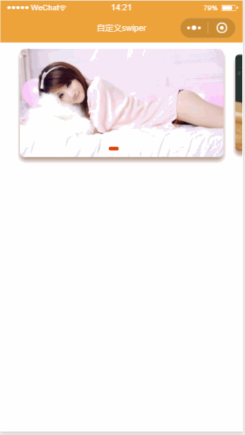
三、最终效果


 1176
1176


 被折叠的 条评论
为什么被折叠?
被折叠的 条评论
为什么被折叠?
 到【灌水乐园】发言


