


提供下拉选择菜单,可以让用户在多个选项之间选择。
说明
该组件从API Version 8开始支持。后续版本如有新增内容,则采用上角标单独标记该内容的起始版本。
子组件
无
接口
Select(options: Array<[SelectOption]>)
元服务API: 从API version 11开始,该接口支持在元服务中使用。
系统能力: SystemCapability.ArkUI.ArkUI.Full
参数:
| 参数名 | 类型 | 必填 | 说明 |
|---|---|---|---|
| options | Array<[SelectOption]> | 是 | 设置下拉选项。 |
SelectOption对象说明
系统能力: SystemCapability.ArkUI.ArkUI.Full
| 名称 | 类型 | 必填 | 说明 |
|---|---|---|---|
| value | [ResourceStr] | 是 | 下拉选项内容。元服务API: 从API version 11开始,该接口支持在元服务中使用。 |
| icon | [ResourceStr] | 否 | 下拉选项图片。元服务API: 从API version 11开始,该接口支持在元服务中使用。 |
| symbolIcon12+ | [SymbolGlyphModifier] | 否 | 下拉选项Symbol图片。symbolIcon优先级高于icon。元服务API: 从API version 12开始,该接口支持在元服务中使用。 |
属性
除支持[通用属性]外,还支持以下属性:
selected
selected(value: number | Resource)
设置下拉菜单初始选项的索引,第一项的索引为0。当不设置selected属性或设置异常值时,默认选择值为-1,菜单项不选中;当设置为undefined、null时,选中第一项。
从API version 10开始,该属性支持[$$]双向绑定变量。
元服务API: 从API version 11开始,该接口支持在元服务中使用。
系统能力: SystemCapability.ArkUI.ArkUI.Full
参数:
| 参数名 | 类型 | 必填 | 说明 |
|---|---|---|---|
| value | number | [Resource]11+ | 是 |
value
value(value: ResourceStr)
设置下拉按钮本身的文本内容。当菜单选中时默认会替换为菜单项文本内容。
从API version 10开始,该参数支持[$$]双向绑定变量。
元服务API: 从API version 11开始,该接口支持在元服务中使用。
系统能力: SystemCapability.ArkUI.ArkUI.Full
参数:
| 参数名 | 类型 | 必填 | 说明 |
|---|---|---|---|
| value | [ResourceStr]11+ | 是 | 下拉按钮本身的文本内容。 |
controlSize12+
controlSize(value: ControlSize)
设置Select组件的尺寸。
元服务API: 从API version 12开始,该接口支持在元服务中使用。
系统能力: SystemCapability.ArkUI.ArkUI.Full
参数:
| 参数名 | 类型 | 必填 | 说明 |
|---|---|---|---|
| value | [ControlSize]11+ | 是 | Select组件的尺寸。默认值:ControlSize.NORMAL |
controlSize、width、height接口作用优先级:
1)如果开发者只设置了width和height,当文字大小设置的是比较大的值的时候,文字超出组件大小,且以省略号方式显示;
2)如果开发者只设置了controlSize,没有设置width和height,组件宽高自适应文字,文字不超出组件,并设置最小宽度minWidth和最小高度minHeight;
3)如果controlSize、width、height接口都设置了,width和height设置的值生效,但如果width和height设置的值小于controlSize设置的最小宽度minWidth和最小高度minHeight,width和height设置的值不生效,宽高仍保持controlSize设置的最小宽度minWidth和最小高度minHeight。
menuItemContentModifier12+
menuItemContentModifier(modifier: ContentModifier)
定制Select下拉菜单项内容区的方法。
元服务API: 从API version 12开始,该接口支持在元服务中使用。
系统能力: SystemCapability.ArkUI.ArkUI.Full
参数:
| 参数名 | 类型 | 必填 | 说明 |
|---|---|---|---|
| modifier | [ContentModifier] | 是 | 在Select组件上,定制下拉菜单项内容区的方法。modifier: 内容修改器,开发者需要自定义class实现ContentModifier接口。 |
divider12+
divider(options: Optional | null)
设置分割线样式,不设置该属性则按“默认值”展示分割线。
元服务API: 从API version 12开始,该接口支持在元服务中使用。
系统能力: SystemCapability.ArkUI.ArkUI.Full
参数:
| 参数名 | 类型 | 必填 | 说明 |
|---|---|---|---|
| options | Optional<[DividerOptions]> | null | 是 |
font
font(value: Font)
设置下拉按钮本身的文本样式。当size为0的时候,文本不显示,当size为负值的时候,文本的size按照默认值显示。
元服务API: 从API version 11开始,该接口支持在元服务中使用。
系统能力: SystemCapability.ArkUI.ArkUI.Full
参数:
| 参数名 | 类型 | 必填 | 说明 |
|---|---|---|---|
| value | [Font] | 是 | 下拉按钮本身的文本样式。API Version 11及以前默认值:{size: KaTeX parse error: Expected 'EOF', got '}' at position 67: …ntWeight.Medium}̲API Version 12以…r(‘sys.float.ohos_id_text_size_button2’),否则为$r(‘sys.float.ohos_id_text_size_button1’)。 |
fontColor
fontColor(value: ResourceColor)
设置下拉按钮本身的文本颜色。
元服务API: 从API version 11开始,该接口支持在元服务中使用。
系统能力: SystemCapability.ArkUI.ArkUI.Full
参数:
| 参数名 | 类型 | 必填 | 说明 |
|---|---|---|---|
| value | [ResourceColor] | 是 | 下拉按钮本身的文本颜色。默认值: r ( ′ s y s . c o l o r . o h o s i d c o l o r t e x t p r i m a r y ′ ) 混合 r('sys.color.ohos_id_color_text_primary')混合 r(′sys.color.ohosidcolortextprimary′)混合r(‘sys.color.ohos_id_alpha_content_primary’)的透明度。 |
selectedOptionBgColor
selectedOptionBgColor(value: ResourceColor)
设置下拉菜单选中项的背景色。
元服务API: 从API version 11开始,该接口支持在元服务中使用。
系统能力: SystemCapability.ArkUI.ArkUI.Full
参数:
| 参数名 | 类型 | 必填 | 说明 |
|---|---|---|---|
| value | [ResourceColor] | 是 | 下拉菜单选中项的背景色。默认值: r ( ′ s y s . c o l o r . o h o s i d c o l o r c o m p o n e n t a c t i v a t e d ′ ) 混合 r('sys.color.ohos_id_color_component_activated')混合 r(′sys.color.ohosidcolorcomponentactivated′)混合r(‘sys.color.ohos_id_alpha_highlight_bg’)的透明度。 |
selectedOptionFont
selectedOptionFont(value: Font)
设置下拉菜单选中项的文本样式。当size为0的时候,文本不显示,当size为负值的时候,文本的size按照默认值显示。
元服务API: 从API version 11开始,该接口支持在元服务中使用。
系统能力: SystemCapability.ArkUI.ArkUI.Full
参数:
| 参数名 | 类型 | 必填 | 说明 |
|---|---|---|---|
| value | [Font] | 是 | 下拉菜单选中项的文本样式。默认值:{size: $r(‘sys.color.ohos_id_text_size_body1’),weight: FontWeight.Regular} |
selectedOptionFontColor
selectedOptionFontColor(value: ResourceColor)
设置下拉菜单选中项的文本颜色。
元服务API: 从API version 11开始,该接口支持在元服务中使用。
系统能力: SystemCapability.ArkUI.ArkUI.Full
参数:
| 参数名 | 类型 | 必填 | 说明 |
|---|---|---|---|
| value | [ResourceColor] | 是 | 下拉菜单选中项的文本颜色。默认值:$r(‘sys.color.ohos_id_color_text_primary_activated’) |
optionBgColor
optionBgColor(value: ResourceColor)
设置下拉菜单项的背景色。
元服务API: 从API version 11开始,该接口支持在元服务中使用。
系统能力: SystemCapability.ArkUI.ArkUI.Full
参数:
| 参数名 | 类型 | 必填 | 说明 |
|---|---|---|---|
| value | [ResourceColor] | 是 | 下拉菜单项的背景色。默认值:API version 11之前,默认值为Color.White。API version 11及之后,默认值为Color.Transparent。 |
optionFont
optionFont(value: Font)
设置下拉菜单项的文本样式。当size为0的时候,文本不显示,当size为负值的时候,文本的size按照默认值显示。
元服务API: 从API version 11开始,该接口支持在元服务中使用。
系统能力: SystemCapability.ArkUI.ArkUI.Full
参数:
| 参数名 | 类型 | 必填 | 说明 |
|---|---|---|---|
| value | [Font] | 是 | 下拉菜单项的文本样式。默认值:{size: $r(‘sys.float.ohos_id_text_size_body1’),weight: FontWeight.Regular} |
optionFontColor
optionFontColor(value: ResourceColor)
设置下拉菜单项的文本颜色。
元服务API: 从API version 11开始,该接口支持在元服务中使用。
系统能力: SystemCapability.ArkUI.ArkUI.Full
参数:
| 参数名 | 类型 | 必填 | 说明 |
|---|---|---|---|
| value | [ResourceColor] | 是 | 下拉菜单项的文本颜色。默认值:$r(‘sys.color.ohos_id_color_text_primary’) |
space10+
space(value: Length)
设置下拉菜单项的文本与箭头之间的间距。不支持设置百分比。设置为null、undefined,或者小于等于8的值,取默认值。
元服务API: 从API version 11开始,该接口支持在元服务中使用。
系统能力: SystemCapability.ArkUI.ArkUI.Full
参数:
| 参数名 | 类型 | 必填 | 说明 |
|---|---|---|---|
| value | [Length] | 是 | 下拉菜单项的文本与箭头之间的间距。默认值:8 |
arrowPosition10+
arrowPosition(value: ArrowPosition)
设置下拉菜单项的文本与箭头之间的对齐方式。
元服务API: 从API version 11开始,该接口支持在元服务中使用。
系统能力: SystemCapability.ArkUI.ArkUI.Full
参数:
| 参数名 | 类型 | 必填 | 说明 |
|---|---|---|---|
| value | [ArrowPosition] | 是 | 下拉菜单项的文本与箭头之间的对齐方式。默认值:ArrowPosition.END |
menuAlign10+
menuAlign(alignType: MenuAlignType, offset?: Offset)
设置下拉按钮与下拉菜单间的对齐方式。
元服务API: 从API version 11开始,该接口支持在元服务中使用。
系统能力: SystemCapability.ArkUI.ArkUI.Full
参数:
| 参数名 | 类型 | 必填 | 说明 |
|---|---|---|---|
| alignType | [MenuAlignType] | 是 | 对齐方式类型。默认值:MenuAlignType.START |
| offset | [Offset] | 否 | 按照对齐类型对齐后,下拉菜单相对下拉按钮的偏移量。默认值:{dx: 0, dy: 0} |
optionWidth11+
optionWidth(value: Dimension | OptionWidthMode )
设置下拉菜单项的宽度,不支持设置百分比。OptionWidthMode类型为枚举类型,OptionWidthMode决定下拉菜单是否继承下拉按钮宽度。
当设置为异常值或小于最小宽度56vp时,属性不生效,菜单项宽度设为默认值,即菜单默认宽度为2栅格。
元服务API: 从API version 12开始,该接口支持在元服务中使用。
系统能力: SystemCapability.ArkUI.ArkUI.Full
参数:
| 参数名 | 类型 | 必填 | 说明 |
|---|---|---|---|
| value | [Dimension] | [OptionWidthMode] | 是 |
optionHeight11+
optionHeight(value: Dimension)
设置下拉菜单显示的最大高度,不支持设置百分比。下拉菜单的默认最大高度是屏幕可用高度的80%,设置的菜单最大高度不能超过默认最大高度。
当设置为异常值或零时,属性不生效,下拉菜单最大高度设为默认值,即下拉菜单最大高度默认值为屏幕可用高度的80%。
如果下拉菜单所有选项的实际高度没有设定的高度大,下拉菜单的高度按实际高度显示。
元服务API: 从API version 12开始,该接口支持在元服务中使用。
系统能力: SystemCapability.ArkUI.ArkUI.Full
参数:
| 参数名 | 类型 | 必填 | 说明 |
|---|---|---|---|
| value | [Dimension] | 是 | 下拉菜单显示的最大高度。 |
menuBackgroundColor11+
menuBackgroundColor(value: ResourceColor)
设置下拉菜单的背景色。
元服务API: 从API version 12开始,该接口支持在元服务中使用。
系统能力: SystemCapability.ArkUI.ArkUI.Full
参数:
| 参数名 | 类型 | 必填 | 说明 |
|---|---|---|---|
| value | [ResourceColor] | 是 | 下拉菜单的背景色。默认值:API version 11之前,默认值为$r(‘sys.color.ohos_id_color_card_bg’)。API version 11及之后,默认值为Color.Transparent。 |
menuBackgroundBlurStyle11+
menuBackgroundBlurStyle(value: BlurStyle)
设置下拉菜单的背景模糊材质。
元服务API: 从API version 12开始,该接口支持在元服务中使用。
系统能力: SystemCapability.ArkUI.ArkUI.Full
参数:
| 参数名 | 类型 | 必填 | 说明 |
|---|---|---|---|
| value | [BlurStyle] | 是 | 下拉菜单的背景模糊材质。默认值:BlurStyle.COMPONENT_ULTRA_THICK |
ArrowPosition10+枚举说明
元服务API: 从API version 11开始,该接口支持在元服务中使用。
系统能力: SystemCapability.ArkUI.ArkUI.Full
| 名称 | 描述 |
|---|---|
| END10+ | 文字在前,箭头在后。 |
| START10+ | 箭头在前,文字在后。 |
MenuAlignType10+枚举说明
元服务API: 从API version 11开始,该接口支持在元服务中使用。
系统能力: SystemCapability.ArkUI.ArkUI.Full
| 名称 | 描述 |
|---|---|
| START | 按照语言方向起始端对齐。 |
| CENTER | 居中对齐。 |
| END | 按照语言方向末端对齐。 |
MenuItemConfiguration12+对象说明
元服务API: 从API version 12开始,该接口支持在元服务中使用。
系统能力: SystemCapability.ArkUI.ArkUI.Full
| 名称 | 类型 | 必填 | 说明 |
|---|---|---|---|
| value | [ResourceStr] | 是 | 下拉菜单项的文本内容。 |
| icon | [ResourceStr] | 否 | 下拉菜单项的图片内容。 |
| symbolIcon12+ | [SymbolGlyphModifier] | 否 | 下拉选项Symbol图片内容。 |
| selected | boolean | 是 | 下拉菜单项是否被选中。默认值:false |
| index | number | 是 | 下拉菜单项的索引。 |
| triggerSelect | (index: number, value: string) :void | 是 | 下拉菜单选中某一项的回调函数。index: 选中菜单项的索引。value: 选中菜单项的文本。说明: index会赋值给事件[onSelect]回调中的索引参数; value会返回给Select组件显示,同时会赋值给事件[onSelect]回调中的文本参数。 |
事件
onSelect
onSelect(callback: (index: number, value: string) => void)
下拉菜单选中某一项的回调。
元服务API: 从API version 11开始,该接口支持在元服务中使用。
系统能力: SystemCapability.ArkUI.ArkUI.Full
参数:
| 参数名 | 类型 | 必填 | 说明 |
|---|---|---|---|
| index | number | 是 | 选中项的索引。 |
| value | string | 是 | 选中项的值。 |
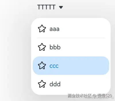
示例1
// xxx.ets
@Entry
@Component
struct SelectExample {
  @State text: string = "TTTTT"
  @State index: number = 2
  @State space: number = 8
  @State arrowPosition: ArrowPosition = ArrowPosition.END
  build() {
    Column() {
      Select([{ value: 'aaa', icon: $r("app.media.selection") },
        { value: 'bbb', icon: $r("app.media.selection") },
        { value: 'ccc', icon: $r("app.media.selection") },
        { value: 'ddd', icon: $r("app.media.selection") }])
        .selected(this.index)
        .value(this.text)
        .font({ size: 16, weight: 500 })
        .fontColor('#182431')
        .selectedOptionFont({ size: 16, weight: 400 })
        .optionFont({ size: 16, weight: 400 })
        .space(this.space)
        .arrowPosition(this.arrowPosition)
        .menuAlign(MenuAlignType.START, {dx:0, dy:0})
        .optionWidth(200)
        .optionHeight(300)
        .onSelect((index:number, text?: string | undefined)=>{
          console.info('Select:' + index)
          this.index = index;
          if(text){
            this.text = text;
          }
        })
    }.width('100%')
  }
}
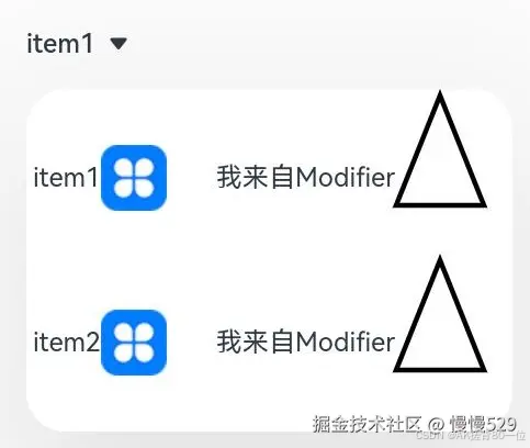
示例2
该示例实现了一个自定义下拉菜选项的Select组件。自定义下拉菜单选项样式为“文本 + 图片 + 空白间隔 + 文本 + 绘制三角形”,点击菜单选项后Select组件显示菜单选项的文本内容。
import { MenuItemModifier } from '@kit.ArkUI'

class MyMenuItemContentModifier implements ContentModifier<MenuItemConfiguration> {
  modifierText: string = ""
  constructor(text: string) {
    this.modifierText = text;
  }
  applyContent(): WrappedBuilder<[MenuItemConfiguration]> {
    return wrapBuilder(MenuItemBuilder)
  }
}

@Builder
function MenuItemBuilder(configuration: MenuItemConfiguration) {
  Row() {
    Text(configuration.value)
    Blank()
    Image(configuration.icon).size({ width: 40, height: 40 })
    Blank(30)
    Text((configuration.contentModifier as MyMenuItemContentModifier).modifierText)
    Path()
      .width('100px')
      .height('150px')
      .commands('M40 0 L80 100 L0 100 Z')
      .fillOpacity(0)
      .stroke(Color.Black)
      .strokeWidth(3)
  }
  .onClick(() => {
    configuration.triggerSelect(configuration.index, configuration.value.valueOf().toString())
  })
}

@Entry
@Component
struct SelectExample {
  @State text: string = "有modifier"
  build() {
    Column() {
      Row() {
        Select([{ value: 'item1', icon: $r("app.media.icon") },
          { value: 'item2', icon: $r("app.media.icon") }])
          .value(this.text)
          .onSelect((index:number, text?: string)=>{
            console.info('Select index:' + index)
            console.info('Select text:' + text)
          })
          .menuItemContentModifier(new MyMenuItemContentModifier("我来自Modifier"))

      }.alignItems(VerticalAlign.Center).height("50%")
    }
  }
}
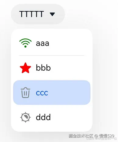
示例3
该示例实现了一个下拉菜单中图片为Symbol的Select组件。
// xxx.ets
import { SymbolGlyphModifier } from '@kit.ArkUI'

@Entry
@Component
struct SelectExample {
  @State text: string = "TTTTT"
  @State index: number = 2
  @State space: number = 8
  @State arrowPosition: ArrowPosition = ArrowPosition.END
  @State symbolModifier1: SymbolGlyphModifier = new SymbolGlyphModifier($r('sys.symbol.ohos_wifi')).fontColor([Color.Green]);
  @State symbolModifier2: SymbolGlyphModifier = new SymbolGlyphModifier($r('sys.symbol.ohos_star')).fontColor([Color.Red]);
  @State symbolModifier3: SymbolGlyphModifier = new SymbolGlyphModifier($r('sys.symbol.ohos_trash')).fontColor([Color.Gray]);
  @State symbolModifier4: SymbolGlyphModifier = new SymbolGlyphModifier($r('sys.symbol.exposure')).fontColor([Color.Gray]);
  build() {
    Column() {
      Select([{ value: 'aaa', symbolIcon: this.symbolModifier1 },
        { value: 'bbb', symbolIcon: this.symbolModifier2 },
        { value: 'ccc', symbolIcon: this.symbolModifier3 },
        { value: 'ddd', symbolIcon: this.symbolModifier4 }])
        .selected(this.index)
        .value(this.text)
        .font({ size: 16, weight: 500 })
        .fontColor('#182431')
        .selectedOptionFont({ size: 16, weight: 400 })
        .optionFont({ size: 16, weight: 400 })
        .space(this.space)
        .arrowPosition(this.arrowPosition)
        .menuAlign(MenuAlignType.START, {dx:0, dy:0})
        .onSelect((index:number, text?: string | undefined)=>{
          console.info('Select:' + index)
          this.index = index;
          if(text){
            this.text = text;
          }
        })
    }.width('100%')
  }
}
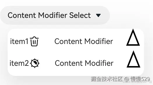
示例4
该示例实现了一个自定义下拉菜选项的Select组件。自定义下拉菜单选项样式为“文本 + Symbol图片 + 空白间隔 + 文本 + 绘制三角形”,点击菜单选项后Select组件显示菜单选项的文本内容。
import { MenuItemModifier, SymbolGlyphModifier } from '@kit.ArkUI'

class MyMenuItemContentModifier implements ContentModifier<MenuItemConfiguration> {
  modifierText: string = ""
  constructor(text: string) {
    this.modifierText = text;
  }
  applyContent(): WrappedBuilder<[MenuItemConfiguration]> {
    return wrapBuilder(MenuItemBuilder)
  }
}

@Builder
function MenuItemBuilder(configuration: MenuItemConfiguration) {
  Row() {
    Text(configuration.value)
    Blank()
    if (configuration.symbolIcon) {
      SymbolGlyph().attributeModifier(configuration.symbolIcon).fontSize(24)
    } else if (configuration.icon) {
      Image(configuration.icon).size({ width: 24, height: 24 })
    }
    Blank(30)
    Text((configuration.contentModifier as MyMenuItemContentModifier).modifierText)
    Blank(30)
    Path()
      .width('100px')
      .height('150px')
      .commands('M40 0 L80 100 L0 100 Z')
      .fillOpacity(0)
      .stroke(Color.Black)
      .strokeWidth(3)
  }
  .onClick(() => {
    configuration.triggerSelect(configuration.index, configuration.value.valueOf().toString())
  })
}

@Entry
@Component
struct SelectExample {
  @State text: string = "Content Modifier Select"
  @State symbolModifier1: SymbolGlyphModifier = new SymbolGlyphModifier($r('sys.symbol.ohos_trash')).fontColor([Color.Gray]);
  @State symbolModifier2: SymbolGlyphModifier = new SymbolGlyphModifier($r('sys.symbol.exposure')).fontColor([Color.Gray]);
  build() {
    Column() {
      Row() {
        Select([{ value: 'item1', icon: $r('app.media.icon'), symbolIcon: this.symbolModifier1 },
          { value: 'item1', icon: $r('app.media.icon'), symbolIcon: this.symbolModifier2 }])
          .value(this.text)
          .onSelect((index:number, text?: string)=>{
            console.info('Select index:' + index)
            console.info('Select text:' + text)
          })
          .menuItemContentModifier(new MyMenuItemContentModifier("Content Modifier"))

      }.alignItems(VerticalAlign.Center).height('50%')
    }
  }
}
示例5
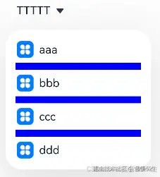
该示例实现了分割线样式支持自定义。
// xxx.ets
@Entry
@Component
struct SelectExample {
  @State text: string = "TTTTT"
  @State index: number = -1
  @State arrowPosition: ArrowPosition = ArrowPosition.END
  build() {
    Column() {
      Select([{ value: 'aaa', icon: $r("app.media.icon") },
        { value: 'bbb', icon: $r("app.media.icon") },
        { value: 'ccc', icon: $r("app.media.icon") },
        { value: 'ddd', icon: $r("app.media.icon") }])
        .selected(this.index)
        .value(this.text)
        .font({ size: 16, weight: 500 })
        .fontColor('#182431')
        .selectedOptionFont({ size: 16, weight: 400 })
        .optionFont({ size: 16, weight: 400 })
        .arrowPosition(this.arrowPosition)
        .menuAlign(MenuAlignType.START, {dx:0, dy:0})
        .optionWidth(200)
        .optionHeight(300)
        .divider( { strokeWidth: 5, color: Color.Blue, startMargin: 10, endMargin: 10 })
        .onSelect((index:number, text?: string | undefined)=>{
          console.info('Select:' + index)
          this.index = index;
          if(text){
            this.text = text;
          }
        })
    }.width('100%')
  }
}
示例6
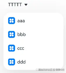
该示例实现了隐藏分割线。
// xxx.ets
@Entry
@Component
struct SelectExample {
  @State text: string = "TTTTT"
  @State index: number = -1
  @State arrowPosition: ArrowPosition = ArrowPosition.END
  build() {
    Column() {
      Select([{ value: 'aaa', icon: $r("app.media.icon") },
        { value: 'bbb', icon: $r("app.media.icon") },
        { value: 'ccc', icon: $r("app.media.icon") },
        { value: 'ddd', icon: $r("app.media.icon") }])
        .selected(this.index)
        .value(this.text)
        .font({ size: 16, weight: 500 })
        .fontColor('#182431')
        .selectedOptionFont({ size: 16, weight: 400 })
        .optionFont({ size: 16, weight: 400 })
        .arrowPosition(this.arrowPosition)
        .menuAlign(MenuAlignType.START, {dx:0, dy:0})
        .optionWidth(200)
        .optionHeight(300)
        .divider( null )
        .onSelect((index:number, text?: string | undefined)=>{
          console.info('Select:' + index)
          this.index = index;
          if(text){
            this.text = text;
          }
        })
    }.width('100%')
  }
}


 扫一扫
扫一扫


 被折叠的 条评论
为什么被折叠?
被折叠的 条评论
为什么被折叠?
 到【灌水乐园】发言


