


1.
<div class="top"></div>
 <img src="" class="bottom"/>
我的解决方法:一开始用了opacity和filter:alpha()方法,发现是整个图片一起透明
再然后我使用background-color:rgba();这个方法并不可行,它会使下面的一整个块产生一层透明层,这个一般用来处理另外一种透明,即一个透明层浮在另一个块之上。
正确的方法
 .top{
 position:relative;(这里使用相对定位并不会使这个快脱离文档流)
 z-index:2;
 }
就这么简单就可以了。
使用绝对定位时会使这个块脱离文档流,而使用z-index:-1,会使这个块在整个网页的底部
2、background简写属性:
当使用简写属性时,属性值得顺序为::
background-color
background-image
background-repeat
background-attachment
background-position
list-style简写属性
list-style-type
list-style-position (有关说明,请参见下面的CSS属性表)
list-style-image
3、a的伪类选择器顺序 LVHA【link visited hover active】
实战,永远比纸上谈兵,更让人记忆深刻!
放假三天做了9个简单的企业网站,然后发现自己学到了很多,遇到了以前很多没有遇到过的问题,然后通过不断地去问,不断地去百度,解决了这些问题。下面是我的总结
【tips:css选择器,transion,合理的利用相对绝对定位去更深刻的理解脱离文档流。hover文字改变的css实现】
①css选择器
最后一个子节点
li:not(:last-child)
li:not(:last-child)>img/div
不给最后一个li子节点里面的img或者div之类的元素赋予css渲染
go to http://www.cnblogs.com/wangfupeng1988/p/4282954.html
②transion在IE,6-9中均不兼容【未解决】
③hover文字改变的css实现
④相对绝对定位【实战让我有了更深刻的认识】
4.文字渐变
今天闹了个笑话,因为客户给的图片是jpg的,取色的时候发现总是无法取出正确的颜色,我就问我师父,说为什么他有超级无敌多的颜色,总是取不对,被我师傅笑死了,他说这叫渐变好不!!
然后我就去查渐变了。
go to http://www.qianduan.net/css3-text-gradient/
我还发现一个这个里面没有的东西
①文字中间
color: transparent;
-webkit-text-stroke:1px red;
试一试,你会发现
5、多行文本溢出省略号显示
①让文本只显示一行,然后溢出省略号显示
overflow: hidden;
text-overflow: ellipsis;
white-space: nowrap;
2、让文本显示两行,然后溢出部分省略号显示
line-height: 1.3rem;
    max-height: 2.6rem;
    display: -webkit-box;
    -webkit-box-orient: vertical;
-webkit-line-clamp: 2;但我觉得最重要的代码是这个-webkit-line-clamp: 2;
6、CSS3中隐藏滚动条但仍能继续滚动
核心代码:
::-webkit-scrollbar {
    width: 0px;
    height: 0px;
}
html:
<div class="content">
<ul>
<li>
<span class="fd-cny">价格</span>
<span>数量</span>
</li>
</ul>
</div>CSS:
.content {
min-width: 100%;
overflow-x: scroll;
white-space: nowrap;
}
.content {
overflow: hidden;
width: 100%;
height: auto;
overflow-x: scroll;
overflow-y: hidden;
background: url(../img/line.png) center right no-repeat;
background-size: 100% .8rem;
position: relative;
}
.content::-webkit-scrollbar {
width: 0px;
height: 0px;
}
.content ul {
white-space: nowrap;
background: url(../img/line-left.png) center repeat-x;
background-size: auto .1rem;
}
.wholesale-content li {
margin-right: 0.5rem;
display: inline-block;
}
.content li:first-child{
margin-left: 1.5rem;
}
.content li span {
display: block;
margin: 1.6rem 0;
}
.fd-cny {
color: #F15353;
}
.content li {
background: url(../img/point.png) center left no-repeat;
}7、连续英文、数字断行
word-break:break-all;8、超级无敌棒棒棒的:before,:after
适用场合:带尖角的对话框,实在是非常棒,我之前的处理方法是定义一个arrow块,然后让他绝对定位,现在用css也可以做出来了,可以避免过多的冗余的块!太棒了!
.talk:before{
    content: " ";
    width: 1rem;
    height: 1rem;
    display: block;
    position: absolute;
    border-top: 1px solid #EFEFEF;
    border-left: 1px solid #EFEFEF;
    transform: rotate(-45deg);//旋转角度,可以自己调整的
    background: #E6EAEE;
    top: 25%;
    z-index: -1;
    left: 0;
    margin-left: -.4rem;
}
还是超级超级无敌棒的:before,:after
实例:
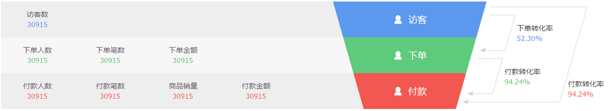
我需要完成这样一个模块
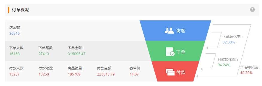
当然啦,箭头的部分我还没做出来,这是左边的部分,我给左边75%的宽度,然后让梯形的右侧恰好与左边的右侧吻合,这样我就可以让右侧25%的宽度,而不至于让右侧随着页面变化时而溢出或者是与网页右侧显示有空余。【箭头等做出来在分享】
代码部分
html:
<div class="order-detail">
    <div class="order-left fl">
        <ul class="order-msg fl">
            <li>
                <p>访客数</p>
                <p class="color-blue">30915</p>
            </li>
        </ul>

        <ul class="order-msg">
            <li>
                <p>下单人数</p>
                <p class="color-green">30915</p>
            </li>
            <li>
                <p>下单笔数</p>
                <p class="color-green">30915</p>
            </li>
            <li>
                <p>下单金额</p>
                <p class="color-green">30915</p>
            </li>
        </ul>
        <ul class="order-msg">
            <li>
                <p>付款人数</p>
                <p class="color-red">30915</p>
            </li>
            <li>
                <p>付款笔数</p>
                <p class="color-red">30915</p>
            </li>
            <li>
                <p>商品销量</p>
                <p class="color-red">30915</p>
            </li>
            <li>
                <p>付款金额</p>
                <p class="color-red">30915</p>
            </li>
        </ul>
    </div>
    <div class="order-echelon fl">
        <div class="echelon"></div>
        <div class="echelon second-echelon"></div>
        <div class="echelon third-echelon"></div>
    </div>
</div>css:
.order-detail{
height: 210px;
width: 100%;
box-sizing: border-box;
overflow: hidden;
}
.order-left{
position: relative;
width: 75%;
box-sizing: border-box;
overflow: hidden;
}
.order-left:after{
content: " ";
display: block;
background: #fff;
position: absolute;
top: 0;
right: 0;
width: 110px;
height: 210px;
}
.order-msg{
background: #eee;
height: 70px;
width: 100%;
box-sizing: border-box;
overflow: hidden;
}
.order-msg p:first-child{
color: #5D6067;
}
.order-msg:nth-child(2n){
background: #F7F7F7;
}
.order-msg:after{
clear: both;
}
.order-msg li{
padding-top: 15px;
width:15%;
box-sizing: border-box;
overflow: hidden;
text-align: center;
float: left;
}
.order-echelon{
margin-left: -300px;
width:300px;
box-sizing: border-box;
overflow: hidden;
}
.echelon{
color: #fff;
text-align: center;
position: relative;
background:#5B99EE;
height: 70px;
width: 300px;
}
.echelon p{
line-height: 70px;
font-size: 18px;
}
.echelon p i{
margin-right: 10px;
font-size: 20px;
}
.echelon:nth-of-type(2n):before{
border-bottom: 70px solid #F7F7F7;
}
.echelon:before{
position: absolute;
content: " ";
width: 40px;
height: 70px;
border-bottom: 70px solid #eee;
border-right:35px solid transparent;
border-left: 35px solid transparent;
display: block;
left: -35px;
}
.echelon:after{
position: absolute;
content: " ";
width: 40px;
height: 70px;
border-bottom: 70px solid #fff;
border-right:35px solid transparent;
border-left: 35px solid transparent;
display: block;
top: 0;
right: -35px;
}
.second-echelon{
background:#5ECB7C;
width: 230px;
margin-left: 35px;
}
.second-echelon:before{
content: " ";
border-right:35px solid transparent;
border-left: 35px solid transparent;
display: block;
left: -35px;
}
.third-echelon{
background: #F25752;
width: 160px;
margin-left: 70px;
}
.third-echelon:before{
content: " ";
border-right:35px solid transparent;
border-left: 35px solid transparent;
display: block;
left: -35px;
}
.color-green{
color:#5ECB7C;
}
.color-blue{
color:#5B99EE;
}
.color-red{
color:#F25752;
}哈哈哈,没错,我要大笑三声,这个玩意儿姐姐我做~出~来~啦!!
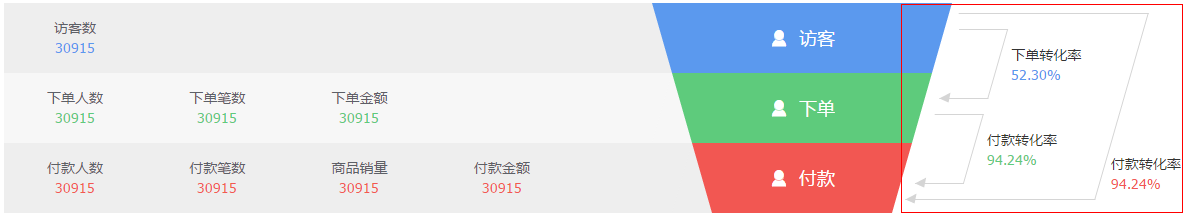
过程,首先我将最右边的那个大块旋转角度,与梯形的右斜边相吻合,然后给最右边的大块margin-left一个负数值【自己慢慢调整】
OK,直接上代码,哈哈哈【已经忍不住得意的心态了!!】
html:
<div class="order-arrow fl">
    <div class=" arrow-top">
        <div class="arrow-top-msg">
            <p>下单转化率</p>
            <p class="color-blue">52.30%</p>
        </div>
    </div>
    <div class=" arrow-bottom">
        <div class="arrow-top-msg">
            <p>付款转化率</p>
            <p class="color-green">94.24%</p>
        </div>
    </div>
    <div class="order-arrow-msg">
        <p>付款转化率</p>
        <p class="color-red">94.24%</p>
    </div>
</div>
css:【从此以后爱上:before,:after,一!发!不!可!收!拾!!!】
.order-arrow{
    position: relative;
    margin: 10px 0;
    width:16%;
    margin-left: -20px;
    height: auto;
    box-sizing: border-box;
    border: 1px solid #D5D5D5;
    border-left: none;
    -webkit-transform: skew(-16deg);//这里是将整个大块旋转,与梯形吻合
    -moz-transform: skew(-16deg);
    -o-transform: skew(-16deg);
}
.arrow-top{
    margin-left: 5px;
    position: relative;
    margin-top: 15px;
    width: 26%;
    height: 70px;
    border: 1px solid #d5d5d5;
    border-left:none;
}
//制作箭头,运用绝对定位将其固定在平行四边形底部
.arrow-top:after,.arrow-bottom:after,.order-arrow:after{
    content: " ";
    position: absolute;
    bottom: -5px;
    left: 0;
    display: block;
    z-index: -1;
    width: 0;
    height: 0;
    border-top: 5px solid transparent;
    border-right: 10px solid #D5D5D5;
    border-bottom: 5px solid transparent;
}
.arrow-bottom{
    margin: 15px 0;
    margin-left: 5px;
    position: relative;
    width: 26%;
    height: 70px;
    border: 1px solid #d5d5d5;
    border-left:none;
}
//因为最外面的大块旋转了-16度来和梯形吻合,那么里面所有的内容都会跟随父类一起旋转-16度,为了让里面的文字正常显示,我将文字再次旋转了16度
.arrow-top-msg{
    -webkit-transform: skew(16deg);
    -moz-transform: skew(16deg);
    -o-transform: skew(16deg);
    width: 200%;
    min-width: 71px;
    position: absolute;
    left: 130%;
    top: 15px;
}
.order-arrow-msg{
    -webkit-transform: skew(16deg);
    -moz-transform: skew(16deg);
    -o-transform: skew(16deg);
    width: 100%;
    position: absolute;
    left: 105%;
    bottom:5px;
}
传一下我自己做的成果图,啊哈哈哈哈哈
9.美化input type=file
http://www.jb51.net/css/69093.html
简单粗暴异常好用


 扫一扫
扫一扫
 681
681

 被折叠的 条评论
为什么被折叠?
被折叠的 条评论
为什么被折叠?
 到【灌水乐园】发言


