


偶然的一次机会,接触到viewPageIndicator这个控件,然后研究了一下demo,觉着跟fragment的组合使用,做成类似导航页还是相当不错的,而且使用相当简单。就把小小的demo分享出来,供大家参考。**
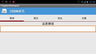
大家先来看下效果:
下面直接上代码:
1,fragment的布局文件,全部类似
<?xml version="1.0" encoding="utf-8"?>
<LinearLayout xmlns:android="http://schemas.android.com/apk/res/android"
    android:layout_width="match_parent"
    android:layout_height="match_parent"
    android:orientation="vertical" >

    <TextView
        android:layout_width="fill_parent"
        android:layout_height="wrap_content"
        android:gravity="center"
        android:text="这是微信"
        android:textSize="20sp" />
    <EditText
        android:layout_width="fill_parent"
        android:layout_height="wrap_content" >
    <requestFocus />

    </EditText>

</LinearLayout>
2,fragment.java
package com.example.fragmentmanager2;

import android.annotation.SuppressLint;
import android.os.Bundle;
import android.support.annotation.Nullable;
import android.support.v4.app.Fragment;
import android.view.LayoutInflater;
import android.view.View;
import android.view.ViewGroup;

/**
 * 项目名称:FragmentManager 类名称:NetBarFragment 类描述: 创建人:lc 创建时间:2015-2-11 下午4:18:05
 * 修改人:131 修改时间:2015-2-11 下午4:18:05 修改备注:
 *
 * @version
 *
 */
@SuppressLint("NewApi")
public class AFragment extends Fragment {
    private View rootView;

    @Override
    public void onCreate(Bundle savedInstanceState) {
        super.onCreate(savedInstanceState);
    }

    @Override
    public View onCreateView(LayoutInflater inflater,
            @Nullable ViewGroup container, @Nullable Bundle savedInstanceState) {
        if (null == rootView) {
            rootView = inflater.inflate(R.layout.a, container, false);
        } else {
            // 防止重复加载,出现闪退
            if (null != rootView) {
                ViewGroup parent = (ViewGroup) rootView.getParent();
                if (null != parent) {
                    parent.removeView(rootView);
                }
            }
        }
        return rootView;
    }

}
3,mainActivity.java
package com.example.fragmentmanager2;

import com.viewpagerindicator.TabPageIndicator;

import android.os.Bundle;
import android.support.v4.app.FragmentActivity;
import android.support.v4.app.FragmentPagerAdapter;
import android.support.v4.view.ViewPager;

public class MainActivity extends FragmentActivity  {
    @Override
    protected void onCreate(Bundle savedInstanceState) {
        super.onCreate(savedInstanceState);
        setContentView(R.layout.activity_main);
        initViews();
    }

    private void initViews() {
        FragmentPagerAdapter adapter = new MyAdapter(getSupportFragmentManager());
        ViewPager pager = (ViewPager) findViewById(R.id.pager);
        pager.setAdapter(adapter);
        TabPageIndicator indicator = (TabPageIndicator) findViewById(R.id.indicator);
        indicator.setViewPager(pager,0);
    }
}
4,另外一个需要定义的是style文件
<resources>

    <!--
        Base application theme, dependent on API level. This theme is replaced
        by AppBaseTheme from res/values-vXX/styles.xml on newer devices.
    -->
    <style name="AppBaseTheme" parent="android:Theme.Light">
        <!--
            Theme customizations available in newer API levels can go in
            res/values-vXX/styles.xml, while customizations related to
            backward-compatibility can go here.
        -->
    </style>

    <!-- Application theme. -->
    <style name="AppTheme" parent="AppBaseTheme">
        <!-- All customizations that are NOT specific to a particular API-level can go here. -->
    </style>

    <style name="StyledIndicators" parent="@android:style/Theme.Light">
        <item name="vpiCirclePageIndicatorStyle">@style/CustomCirclePageIndicator</item>
        <item name="vpiLinePageIndicatorStyle">@style/CustomLinePageIndicator</item>
        <item name="vpiTitlePageIndicatorStyle">@style/CustomTitlePageIndicator</item>
        <item name="vpiTabPageIndicatorStyle">@style/CustomTabPageIndicator</item>
        <item name="vpiUnderlinePageIndicatorStyle">@style/CustomUnderlinePageIndicator</item>
    </style>

    <style name="CustomTitlePageIndicator">
        <item name="android:background">#18FF0000</item>
        <item name="footerColor">#FFAA2222</item>
        <item name="footerLineHeight">1dp</item>
        <item name="footerIndicatorHeight">3dp</item>
        <item name="footerIndicatorStyle">underline</item>
        <item name="android:textColor">#AA000000</item>
        <item name="selectedColor">#FF000000</item>
        <item name="selectedBold">true</item>
    </style>

    <style name="CustomLinePageIndicator">
        <item name="strokeWidth">4dp</item>
        <item name="lineWidth">30dp</item>
        <item name="unselectedColor">#FF888888</item>
        <item name="selectedColor">#FF880000</item>
    </style>

    <style name="CustomCirclePageIndicator">
        <item name="fillColor">#FF888888</item>
        <item name="strokeColor">#FF000000</item>
        <item name="strokeWidth">2dp</item>
        <item name="radius">10dp</item>
        <item name="centered">true</item>
    </style>

    <style name="CustomTabPageIndicator" parent="Widget.TabPageIndicator">
        <item name="android:background">@drawable/custom_tab_indicator</item>
        <item name="android:textAppearance">@style/CustomTabPageIndicator.Text</item>
        <item name="android:textColor">#FF555555</item>
        <item name="android:textSize">16sp</item>
        <item name="android:divider">@drawable/custom_tab_indicator_divider</item>
        <item name="android:dividerPadding">10dp</item>
        <item name="android:showDividers">middle</item>
        <item name="android:paddingLeft">8dp</item>
        <item name="android:paddingRight">8dp</item>
        <item name="android:fadingEdge">horizontal</item>
        <item name="android:fadingEdgeLength">8dp</item>
    </style>

    <style name="CustomTabPageIndicator.Text" parent="android:TextAppearance.Medium">
        <item name="android:typeface">monospace</item>
    </style>

    <style name="CustomUnderlinePageIndicator">
        <item name="selectedColor">#FFCC0000</item>
        <item name="android:background">#FFCCCCCC</item>
        <item name="fadeLength">1000</item>
        <item name="fadeDelay">1000</item>
    </style>
</resources>
好了,很简单的,很好用的使用,大家可以去这里下载demo,viewpageIndicator我也上传了。下载地址:
http://download.csdn.net/download/baidu_17508977/8493297


 395
395

 被折叠的 条评论
为什么被折叠?
被折叠的 条评论
为什么被折叠?
 到【灌水乐园】发言


