


自定义控件
虽然我也写过自定义控件,但是从没有进行一个系统的总结,正好借这本书的内容,重新梳理一下,
通常情况下,常用的有三种方法:
- 对现有控件进行扩展
- 通过组合控件来实现新的控件
- 重写view来实现全新的控件(最难)
1. 对现有控件进行拓展
对原生控件的扩展,只需要重写onDraw(Canvas canvas)即可
 private void initPaint(){
        paint1 = new Paint();
        paint1.setColor(getResources().getColor(android.R.color.holo_blue_bright));
        paint1.setStyle(Paint.Style.FILL);
        paint2 = new Paint();
        paint2.setColor(getResources().getColor(android.R.color.holo_green_dark));
        paint2.setStyle(Paint.Style.FILL);
    }
        @Override
    protected void onDraw(Canvas canvas) {
        //TODO 回调父类方法前,对TextView来说绘制文本内容之前
        //绘制一个外层矩形
        canvas.drawRect(0, 0, getMeasuredWidth(), getMeasuredHeight(), paint1);
        //绘制一个内层矩形
        canvas.drawRect(10, 10, getMeasuredWidth()-10, getMeasuredHeight()-10, paint2);
        canvas.save();
        //绘制文字前平移10px
        canvas.translate(10, 0);
        super.onDraw(canvas);
        canvas.restore();
        //TODO 回调父类方法后,对TextView来说绘制文本内容之后
    }
控件效果如下图:

再来一个复杂点的效果(动态文字闪烁效果):
思路:通过设置一个不断变化的LinearGradient,并使用带有该属性的Paint对象来绘制要显示的文字。首先,在onSizeChanged(),中进行一些对象的初始化工作,根据view的宽设置一个LinearGradient渐变渲染器。
private int mViewWidth;
    private Paint paint;
    private LinearGradient linearGradient;
    private Matrix matrix;
    private int mTranslate;
    @Override
    protected void onSizeChanged(int w, int h, int oldw, int oldh) {
        super.onSizeChanged(w, h, oldw, oldh);
        if(mViewWidth==0){
            mViewWidth = getMeasuredWidth();
            if(mViewWidth>0){
                paint = getPaint();
                linearGradient = new LinearGradient(0, 0, mViewWidth, 0,
                        new int[]{Color.BLUE,0xffffffff,Color.GREEN}, new float[]{0,1,2}, Shader.TileMode.MIRROR);
                paint.setShader(linearGradient);
                matrix = new Matrix();
            }
        }
    }
其中最关键的是,使用getPaint()方法获取绘制当前TextView的Paint,并给这个Paint设置一个LinearGradient,
最后,
在onDraw()方法中,通过矩阵的方式来不断平移渐变效果
 @Override
    protected void onDraw(Canvas canvas) {
        //TODO 回调父类方法前,对TextView来说绘制文本内容之前
        super.onDraw(canvas);
        Log.e("mess", "------onDraw----");
        if(matrix != null){
            mTranslate += mViewWidth/5;
            if(mTranslate>2*mViewWidth){
                mTranslate =-mViewWidth;
            }
            matrix.setTranslate(mTranslate, 0);
            linearGradient.setLocalMatrix(matrix);
            postInvalidateDelayed(100);
        }
        //TODO 回调父类方法后,对TextView来说绘制文本内容之后
    }
下面看效果图:

2. 创建复合控件
复合控件,最常见的其实就是我们的TitleBar了,一般就是一个left+title+right组合,我以前是做成一个xml文件,然后各个需要的地方,用<\include>标签引用,看了书上的例子,是把我这种xml的形式,做成了一个单独控件,就学习学习这种写法吧。
Begin
(1). values 目录下新建attrs.xml 定义属性
<?xml version="1.0" encoding="utf-8"?>
    <resources>
        <declare-styleable name="TitleBar">
            <!-- 定义title文字,大小,颜色 -->
            <attr name="title" format="string" />
            <attr name="titleTextSize" format="dimension"/>
            <attr name="titleTextColor" format="color" />
            <!-- 定义left 文字,大小,颜色,背景 -->
            <attr name="leftText" format="string" />
            <attr name="leftTextSize" format="dimension" />
            <attr name="leftTextColor" format="color" />
            <!-- 表示背景可以是颜色,也可以是引用 -->
            <attr name="leftBackGround" format="color|reference" />
            <!-- 定义right 文字,大小,颜色,背景 -->
            <attr name="rightText" format="string" />
            <attr name="rightTextSize" format="dimension"/>
            <attr name="rightTextColor" format="color" />
            <attr name="rightBackGround" format="color|reference" />
        </declare-styleable>
    </resources>
(2). 获取自定义的属性
  /**
     * 获取自定义的属性
     *
     * @param context
     */
    private int leftTextColor;
    private Drawable leftBackGround;
    private String leftText;
    private float leftTextSize;

    private int rightTextColor;
    private String rightText;
    private float rightTextSize;

    private int titleTextColor;
    private String titleText;
    private float titleTextSize;

    private void initAttr(Context context, AttributeSet attrs) {
        TypedArray typed = context.obtainStyledAttributes(attrs, R.styleable.TitleBar);
        // 从TypedArray中取出对应的值为要设置的属性赋值,给个默认值
        leftTextColor = typed.getColor(R.styleable.TitleBar_leftTextColor, 0XFFFFFFFF);
        leftBackGround = typed.getDrawable(R.styleable.TitleBar_leftBackGround);
        leftText = typed.getString(R.styleable.TitleBar_leftText);
        leftTextSize = typed.getDimension(R.styleable.TitleBar_leftTextSize, 20);

        rightTextColor = typed.getColor(R.styleable.TitleBar_rightTextColor, 0XFFFFFFFF);
        rightText = typed.getString(R.styleable.TitleBar_rightText);
        rightTextSize = typed.getDimension(R.styleable.TitleBar_rightTextSize, 20);

        titleTextColor = typed.getColor(R.styleable.TitleBar_titleTextColor, 0XFFFFFFFF);
        titleText = typed.getString(R.styleable.TitleBar_title);
        titleTextSize = typed.getDimension(R.styleable.TitleBar_titleTextSize, 20);
        // 不要忘记调用
        typed.recycle();

    }
(3).代码布局组件
    private TextView titleView;
    private Button leftButton;
    private Button rightButton;

    private RelativeLayout.LayoutParams leftParams;
    private RelativeLayout.LayoutParams rightParams;
    private RelativeLayout.LayoutParams titleParams;

    /**
     * 代码布局
     *
     * @param context
     */
    @SuppressWarnings("deprecation")
    private void initView(Context context) {
        titleView = new TextView(context);
        leftButton = new Button(context);
        rightButton = new Button(context);

        // 为创建的组件赋值
        titleView.setText(titleText);
        titleView.setTextSize(titleTextSize);
        titleView.setTextColor(titleTextColor);
        titleView.setGravity(Gravity.CENTER);

        leftButton.setText(leftText);
        leftButton.setTextColor(leftTextColor);
        leftButton.setBackgroundDrawable(leftBackGround);
        leftButton.setTextSize(leftTextSize);

        rightButton.setText(rightText);
        rightButton.setTextSize(rightTextSize);
        rightButton.setTextColor(rightTextColor);

        // 为组件布局
        // 在左边
        leftParams = new LayoutParams(LayoutParams.WRAP_CONTENT, LayoutParams.MATCH_PARENT);
        leftParams.addRule(RelativeLayout.ALIGN_PARENT_LEFT, RelativeLayout.TRUE);
        addView(leftButton, leftParams);

        // 在右边
        rightParams = new LayoutParams(LayoutParams.WRAP_CONTENT, LayoutParams.MATCH_PARENT);
        rightParams.addRule(RelativeLayout.ALIGN_PARENT_RIGHT, RelativeLayout.TRUE);
        addView(rightButton, rightParams);

        //中间
        titleParams = new LayoutParams(LayoutParams.WRAP_CONTENT, LayoutParams.MATCH_PARENT);
        rightParams.addRule(RelativeLayout.CENTER_IN_PARENT, RelativeLayout.TRUE);
        addView(titleView, titleParams);

        //添加点击监听,(下面讲述如何引入的)
        leftButton.setOnClickListener(new OnClickListener() {

            @Override
            public void onClick(View v) {
                if (listener != null) {
                    listener.leftClick();
                }
            }
        });

        rightButton.setOnClickListener(new OnClickListener() {

            @Override
            public void onClick(View v) {
                if (listener != null) {
                    listener.rightClick();
                }
            }
        });

    }
(4).定义接口
public interface TitleBarClickListener{
        //左点击
        void leftClick();
        //右点击
        void rightClick();
    }
(5).暴露接口给调用者
public void setTitleBarClickListener(TitleBarClickListener listener) {
        this.listener = listener;
    }
看下例子 布局文件
<com.example.day_1.TitleBar
        android:id="@+id/titlebar"
        android:layout_width="match_parent"
        android:layout_height="100dp"
        android:layout_alignParentBottom="true"
        app:leftBackGround="#ff000000"
        app:leftText="left"
        app:leftTextColor="#ffff6734"
        app:leftTextSize="25dp"
        app:rightText="right"
        app:rightTextSize="25dp"
        app:rightTextColor="#ff123456"
        app:title="title"
        app:titleTextColor="#ff654321"/>
代码
private TitleBar titlebar;

    @Override
    protected void onCreate(Bundle savedInstanceState) {
        super.onCreate(savedInstanceState);
        setContentView(R.layout.activity_main);
        titlebar = (TitleBar) findViewById(R.id.titlebar);
        titlebar.setTitleBarClickListener(this);
    }

    @Override
    public void leftClick() {
        Toast.makeText(this, "left---", Toast.LENGTH_LONG).show();

    }

    @Override
    public void rightClick() {
        Toast.makeText(this, "right---", Toast.LENGTH_LONG).show();

    }
效果如下图:

3.重写view实现全新的控件
这个是我觉着三种自定义类型里,最难得了,迄今为止没有写出过什么出彩的控件,所以还是好好学习书上的内容吧,增加新技能。
———————————Begin——————————-
(1) .弧线展示图
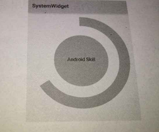
思路:这个view可以分为三个部分,中间的圆圈,中间显示的文字,外圈的圆弧。只要有了这样的思路,剩余的就是在onDraw()方法中去绘制了。
- 测量控件大小,onMeasure()
private int mMeasureHeigth;// 控件高度
        private int mMeasureWidth;// 控件宽度
        // 圆形
        private Paint mCirclePaint;
        private float mCircleXY;//圆心坐标
        private float mRadius;//圆形半径
        // 圆弧
        private Paint mArcPaint;
        private RectF mArcRectF;//圆弧的外切矩形
        private float mSweepAngle;//圆弧的角度
        private float mSweepValue = 50;
        // 文字
        private Paint mTextPaint;
        private String mShowText;//文本内容
        private float mShowTextSize;//文本大小

        @Override
        protected void onMeasure(int widthMeasureSpec, int heightMeasureSpec) {
            mMeasureWidth = MeasureSpec.getSize(widthMeasureSpec);//获取控件宽度
            mMeasureHeigth = MeasureSpec.getSize(heightMeasureSpec);//获取控件高度
            setMeasuredDimension(mMeasureWidth, mMeasureHeigth);
            initView();
        }

        /**
         *准备画笔,
         */
        private void initView() {

            float length = Math.min(mMeasureWidth,mMeasureHeigth)
            // 圆
            mCircleXY = length / 2;// 确定圆心坐标
            mRadius = (float) (length * 0.5 / 2);// 确定半径
            mCirclePaint = new Paint();
            mCirclePaint.setAntiAlias(true);// 去锯齿
            mCirclePaint.setColor(getResources().getColor(android.R.color.holo_green_dark));

            // 弧线
            // 矩形
            mArcRectF = new RectF((float) (length * 0.1), (float) (length * 0.1), (float) (length * 0.9),
                (float) (length * 0.9));
            mSweepAngle = (mSweepValue / 100f) * 360f;
            mArcPaint = new Paint();
            mArcPaint.setColor(getResources().getColor(android.R.color.holo_blue_bright));
            mArcPaint.setStrokeWidth((float) (length * 0.1));//圆弧宽度
            mArcPaint.setStyle(Style.STROKE);//圆弧
            // 文字
            mShowText = setShowText();
            mShowTextSize = setShowTextSize();
            mTextPaint = new Paint();
            mTextPaint.setTextSize(mShowTextSize);
            mTextPaint.setTextAlign(Paint.Align.CENTER);

        }

        private float setShowTextSize() {
            this.invalidate();
            return 50;
        }

        private String setShowText() {
            this.invalidate();
            return "Android Skill";
        }

        public void forceInvalidate() {
            this.invalidate();
        }

        public void setSweepValue(float sweepValue) {
            if (sweepValue != 0) {
                mSweepValue = sweepValue;
            } else {
                mSweepValue = 25;
            }
            this.invalidate();
}- 绘制控件, onDraw()
@Override
        protected void onDraw(Canvas canvas) {
            super.onDraw(canvas);
            // 绘制圆
            canvas.drawCircle(mCircleXY, mCircleXY, mRadius, mCirclePaint);
            // 绘制圆弧,逆时针绘制,角度跟
            canvas.drawArc(mArcRectF, 90, mSweepAngle, false, mArcPaint);
            // 绘制文字
            canvas.drawText(mShowText, 0, mShowText.length(), mCircleXY, mCircleXY + mShowTextSize / 4, mTextPaint);

        }
圆弧的绘制,开始位置如下图所示角度,以顺时针绘制图形

- 效果如下图

(2).音频条形图

思路:绘制n个小矩形,每个矩形有些偏移即可
准备工作
private int mWidth;//控件的宽度
        private int mRectWidth;// 矩形的宽度
        private int mRectHeight;// 矩形的高度
        private Paint paint;
        private int mRectCount;// 矩形的个数
        private int offset = 5;// 偏移
        private double mRandom;
        private LinearGradient lg;// 渐变

        private void initView() {
            paint = new Paint();
            paint.setColor(Color.GREEN);
            paint.setStyle(Paint.Style.FILL);
            mRectCount = 12;
        }

        //重写onSizeChanged方法

        @Override
        protected void onSizeChanged(int w, int h, int oldw, int oldh) {
            super.onSizeChanged(w, h, oldw, oldh);
            mWidth = getWidth();
            mRectHeight = getHeight();
            mRectWidth = (int) (mWidth * 0.6 / mRectCount);
            lg = new LinearGradient(0, 0, mRectWidth, mRectHeight, Color.GREEN, Color.BLUE, TileMode.CLAMP);
            paint.setShader(lg);
        }

        //重写onDraw方法
        @Override
        protected void onDraw(Canvas canvas) {
            super.onDraw(canvas);
            for (int i = 0; i < mRectCount; i++) {
                mRandom = Math.random();
                float currentHeight = (int) (mRectHeight * mRandom);
                canvas.drawRect((float) (mWidth * 0.4 / 2 + mRectWidth * i + offset * i), currentHeight,
                    (float) (mWidth * 0.4 / 2 + mRectWidth * (i + 1) + offset * i), mRectHeight, paint);
            }
            postInvalidateDelayed(1000);
        }
view的绘制坐标如下图所示:

效果图如下:

后记:
就像本书作者说的:无论多么复杂的自定义view都是慢慢迭代起来的功能,不要被自定义view吓到,总之,非常感谢作者,我对自定义view总算是有了一个完整的认识


 扫一扫
扫一扫
 1357
1357

 被折叠的 条评论
为什么被折叠?
被折叠的 条评论
为什么被折叠?
 到【灌水乐园】发言


