


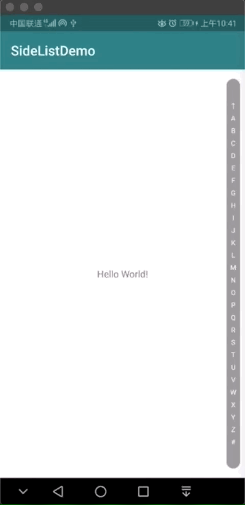
目标效果如下。
实现步骤:
- 绘制导航条内容
- 触摸显示效果
- 展示选中内容
1、绘制导航条
这一步不难,目的就是把文字绘制到画布的指定位置上(就当复习吧,为了方便这里的单位都是用的像素,没转换成密度)。首先创建个类,定义要实现的基本功能。
import android.content.Context
import android.util.AttributeSet
import android.view.View

/**
 * 字母导航条
 * by lyan 2020-04-18
 */
class LetterNavigationView @JvmOverloads constructor(
    context: Context?, attrs: AttributeSet?, defStyleAttr: Int = 0, defStyleRes: Int = 0
) : View(context, attrs, defStyleAttr, defStyleRes) {


    /**
     * 绘制
     */
    override fun onDraw(canvas: Canvas?) {
        super.onDraw(canvas)
        //绘制背景
        drawBackground(canvas!!)
        //绘制文字
        drawBarWords(canvas)
    }

    /**
     * 绘制导航条背景
     */
    private fun drawBackground(canvas: Canvas) {

    }

    /**
     * 绘制导航条文字
     */
    private fun drawBarWords(canvas: Canvas) {
    }

    /**
     * 确定控件的大小
     */
    override fun onSizeChanged(w: Int, h: Int, oldw: Int, oldh: Int) {
        super.onSizeChanged(w, h, oldw, oldh)

    }

}
1.1 绘制导航条背景
接下来先把导航条的背景绘制出来。下面定义了一些全局属性,注意magicNumber这个常量。这个值是用来绘制四分之一拟圆用的。(最常见的就是拼图式的滑块验证码,那个拼图滑块就可以使用贝塞尔曲线绘制半圆,这里将使用path绘制一个圆角矩形作为导航条的背景)。
    //导航栏的宽度(px)
    private val barWidth = 60
    //常量系数(用于使用贝塞尔曲线绘制拟圆)
    private val magicNumber = 0.551784f
    //导航条右边距偏移量(目的让导航条距离屏幕最右边有一定的距离)
    private val paddingRightOffset = 10f
    //画笔
    private val paint = Paint(Paint.ANTI_ALIAS_FLAG).apply {
        style = Paint.Style.FILL
    }
    //绘制导航条背景用
    private val bgPath = Path()
    //当行条横坐标中间点
    private var barCenterX = 0f
在控件确定大小后,设置导航条绘制的中心横坐标(之后的字母绘制都会使用到这个值,主要作用是为了保证字母和背景绘制到同一个区域内)。
    /**
     * 确定控件的大小
     */
    override fun onSizeChanged(w: Int, h: Int, oldw: Int, oldh: Int) {
        super.onSizeChanged(w, h, oldw, oldh)
        val barRight = w - paddingRightOffset//导航条右侧
        barCenterX = barRight - barWidth * 0.5f//导航条的中心
    }
示例中引用界面的布局如下。
<?xml version="1.0" encoding="utf-8"?>
<androidx.constraintlayout.widget.ConstraintLayout xmlns:android="http://schemas.android.com/apk/res/android"
    xmlns:app="http://schemas.android.com/apk/res-auto"
    xmlns:tools="http://schemas.android.com/tools"
    android:layout_width="match_parent"
    android:layout_height="match_parent"
    tools:context=".MainActivity">

    <com.lyan.sidelistdemo.LetterNavigationView
        app:layout_constraintTop_toTopOf="parent"
        app:layout_constraintBottom_toBottomOf="parent"
        app:layout_constraintRight_toRightOf="parent"
        android:layout_margin="4dp"
        android:layout_width="100dp"
        android:layout_height="0dp"/>

</androidx.constraintlayout.widget.ConstraintLayout>
当所用属性都设置好值后,就可以绘制导航条的背景了。回到drawBackground()方法中,创建一个闭合路径,随后绘制路径。这样一个圆角矩形就绘制完成了。
    /**
     * 绘制导航条背景
     */
    private fun drawBackground(canvas: Canvas) {
        val barLeft = (width - barWidth).toFloat() - paddingRightOffset//左侧
        val barTop = barWidth.toFloat()//顶部
        val barRight = width.toFloat() - paddingRightOffset//右侧
        val barBottom = height.toFloat() - barWidth//底部
        val barSize = barWidth * 0.5f//圆半径
        val barOffset = barSize * magicNumber//偏移量
        bgPath.moveTo(barLeft, barTop)
        bgPath.cubicTo(
            barLeft,
            barTop - barOffset,
            barCenterX - barOffset,
            barSize,
            barCenterX,
            barTop - barSize
        )
        bgPath.cubicTo(
            barCenterX + barOffset,
            barSize,
            barRight,
            barTop - barOffset,
            barRight,
            barTop
        )
        bgPath.lineTo(barRight, barTop)
        bgPath.lineTo(barRight, barBottom)
        bgPath.cubicTo(
            barRight,
            barBottom + barOffset,
            barCenterX + barOffset,
            barBottom + barSize,
            barCenterX,
            barBottom + barSize
        )
        bgPath.cubicTo(
            barCenterX - barOffset,
            barBottom + barSize,
            barLeft,
            barBottom + barOffset,
            barLeft,
            barBottom
        )
        bgPath.close()
        canvas.drawPath(bgPath, paint)
        bgPath.reset()
    }
像绘制这种图形方式很多,使用paint绘制图形拼接,还是使用canvas绘制bitmap拼接都是可以的,方式很多不要局限这一种。废话不多说,看一下效果。

1.2 绘制导航条字母列表
bgSelect这个属性是用来切换导航条的绘制颜色,这里为了方便叙述,提前放了进来。正常来讲它的作用会在添加触摸事件后才会体现出来。(注意:65~90就是即将要绘制的26个大写字母,这里偷个懒)。
    //导航条字体大小
    private val barWordSize = 30f
    //文本画笔
    private val textPaint = TextPaint(Paint.ANTI_ALIAS_FLAG).apply {
        textAlign = Paint.Align.CENTER
    }

    private var bgSelect = false//背景色切换状态

    //字母列表
    private val wordList by lazy {
        //字母列表
        mutableListOf("↑").apply {
            (65..90).forEach { word -> add(word.toChar().toString()) }
            add("#")
        }
    }
    //字母绘制区域
    private val wordRectF = mutableListOf<RectF>()
    //文字高度
    private var textHeight = 0f
接下来重写onSizeChanged()方法,在方法中确定每个文字的绘制区域,确定好文字绘制区域后,将会方便之后添加触摸事件的效果。
    /**
     * 确定控件的大小
     */
    override fun onSizeChanged(w: Int, h: Int, oldw: Int, oldh: Int) {
        super.onSizeChanged(w, h, oldw, oldh)
        val textPadding = barWidth * 2.0f//绘制文字的上下边距
        val barLeft = w - barWidth - paddingRightOffset//导航条右侧
        val barRight = w - paddingRightOffset//导航条右侧
        val allTextHeight = h - 2 * textPadding//绘制文字的总高度
        barCenterX = barRight - barWidth * 0.5f//导航条的中心
        //绘制文字区域的高度
        textHeight = allTextHeight / wordList.size
        //设置文字区域
        for (index in wordList.indices) {
            wordRectF.add(
                RectF(
                    barLeft,
                    textPadding + index * textHeight,
                    barRight,
                    textPadding + index * textHeight + textHeight
                )
            )
        }
    }
确定好文字的绘制区域和文字高度后就可以绘制字母了,回到drawBarWords()方法中,遍历文字绘制区域绘制字母。(由于触摸事件还没添加,所以绘制之后文字的颜色会是白色)
    /**
     * 绘制导航条文字
     */
    private fun drawBarWords(canvas: Canvas) {
        textPaint.textSize = barWordSize
        if (bgSelect) {
            textPaint.color = Color.BLACK
        } else {
            textPaint.color = Color.WHITE
        }
        for (index in wordRectF.indices) {
            canvas.drawText(
                wordList[index], barCenterX,
                textBaseLine(wordRectF[index].bottom - textHeight * 0.5f),
                textPaint
            )
        }
    }
textBaseLine()这个方法将会确定文字绘制的基线,保证文字绘制后的视觉效果是绘制区域纵坐标的中心点。这样导航条的大致效果基本就出来了。
2、添加触摸事件
添加触摸事件前,先改造下onDraw()方法。添加drawSelectWord()用来绘制选中文字的效果。
    //触摸是的背景颜色
    private val fgColor = Color.parseColor("#ee2981FF")
    //默认的背景颜色
    private val bgColor = Color.parseColor("#6d030303")
    /**
    /**
     * 绘制
     */
    override fun onDraw(canvas: Canvas?) {
        super.onDraw(canvas)
        //绘制背景
        drawBackground(canvas!!)
        //绘制选中文字的背景
        drawSelectWord(canvas)
        //绘制文字
        drawBarWords(canvas)
    }

    /**
     * 绘制选中文字的背景
     */
    private fun drawSelectWord(canvas: Canvas) {

    }
添加选中的回调方法(该回调方法将会在字母导航条和列表结合的时候用到)。
    private var wordSelectedListener: ((word: String, wordIndex: Int) -> Unit)? = null

    fun setWordSelectedListener(wordSelectedListener: (word: String, wordIndex: Int) -> Unit) {
        this.wordSelectedListener = wordSelectedListener
    }
添加触摸事件。在ACTION_MOVE事件中,判断触摸区域是哪个文字所在的区域。随后通过回调函数返回给调用层所选的内容。最后触发重绘刷新当前控件的视图效果。
    private var selectTouchRectF: RectF? = null//选中区域
    private lateinit var temporaryRectF: RectF//当前触摸区域
    private var selectIndex = 0//选中的索引
    /**
     * 处理滑动选择
     */
    override fun dispatchTouchEvent(event: MotionEvent?): Boolean {
        return if (event!!.x < (width - barWidth - paddingRightOffset) || event.x > width - paddingRightOffset) {
            bgSelect = false//复原背景色
            invalidate()
            false
        } else {
            when (event.action) {
                MotionEvent.ACTION_DOWN -> {
                    bgSelect = true//切换背景色
                }
                MotionEvent.ACTION_MOVE -> {
                    //绘制选中的选项的背景色
                    if (bgSelect) {
                        for (position in wordRectF.indices) {
                            temporaryRectF = wordRectF[position]
                            if (event.x in temporaryRectF.left..temporaryRectF.right && event.y in temporaryRectF.top..temporaryRectF.bottom) {
                                selectIndex = position
                                break
                            }
                        }
                        //处理选项不符的选中项
                        if (event.y < temporaryRectF.top) {
                            return false
                        }
                        //导航没有变化
                        if (null != selectTouchRectF && temporaryRectF.top == selectTouchRectF!!.top) {
                            return false
                        } else {//导航区域变化
                            selectTouchRectF = temporaryRectF
                            wordSelectedListener?.invoke(wordList[selectIndex], selectIndex)
                        }
                    }
                }
                MotionEvent.ACTION_UP -> {
                    bgSelect = false//复原背景色
                    selectTouchRectF = null//清空选中区域
                }
            }
            invalidate()
            true
        }
    }
触摸事件触发后。如果当前滑动区域是字母所在的位置,重绘刷新界面。回到drawSelectWord()方法中,绘制选中文字的背景为白色。
    /**
     * 绘制选中文字的背景
     */
    private fun drawSelectWord(canvas: Canvas) {
        if (bgSelect && selectTouchRectF != null) {
            paint.color = Color.WHITE
            val radius = textHeight * 0.5f
            canvas.drawCircle(barCenterX, selectTouchRectF!!.top + radius, radius, paint)
        }
    }
接下来看下效果。

3、导航提示框
接下来就接近尾声了,因为在上一步这个控件的主要功能已经完成了。这一步也只是锦上添花而已。因为这个提示想怎么实现都可以。(当初写的时候效果稍微借鉴了微信的通讯录,但是没做的那么精细)。

此处重点也就是如何绘制这个提示窗。很简单,就是使用path的三阶贝塞尔曲线绘制四分之三圆,随后连接一点闭合路径。效果大致如下:

接下来回到代码中绘制这样的一张图片。用来做提示框的背景图。
    //绘制提示
    private val sin45 = (sin(Math.PI / 180 * 45) * 10000).roundToInt() * 0.0001f
    private val hintBgSize = 160f//设置画布的大小(正方形)
    private val hintBgSizeRecF =
        Rect(0, 0, (hintBgSize / sin45).toInt(), (hintBgSize / sin45).toInt())
    //字母选中后的提示背景
    private val hintBg: Bitmap by lazy {
        val width = hintBgSizeRecF.right
        val height = hintBgSizeRecF.bottom
        val centerX = width * 0.5f
        val centerY = height * 0.5f
        val radius = hintBgSize * 0.5f
        val hintLeft = centerX - radius
        val hintRight = centerX + radius
        val hintTop = centerY - radius
        val hintBottom = centerY + radius
        val offset = radius * magicNumber
        Bitmap.createBitmap(width, height, Bitmap.Config.ARGB_8888).apply {
            val canvas = Canvas(this)
            val paint = Paint(Paint.ANTI_ALIAS_FLAG)
            paint.style = Paint.Style.FILL
            paint.isDither = true
            paint.color = fgColor
            val path = Path()
            canvas.save()
            canvas.rotate(-135f, centerX, centerY)
            path.moveTo(hintLeft, centerY)
            path.cubicTo(hintLeft, centerY - offset, centerX - offset, hintTop, centerX, hintTop)
            path.cubicTo(centerX + offset, hintTop, hintRight, centerY - offset, hintRight, centerY)
            path.cubicTo(
                hintRight,
                centerY + offset,
                centerX + offset,
                hintBottom,
                centerX,
                hintBottom
            )
            path.lineTo(hintLeft, hintBottom)
            path.close()
            canvas.drawPath(path, paint)
            canvas.restore()
            path.reset()
            paint.reset()
        }
    }
再改造下onSizeChanged()方法,添加上获取提示背景绘制区域的功能代码。
    private var hintBgRectFOffset = 0f//提示背景绘制的偏移量
    private lateinit var hintBgRectF: Rect//提示背景的绘制区域
    /**
     * 确定控件的大小
     */
    override fun onSizeChanged(w: Int, h: Int, oldw: Int, oldh: Int) {
        super.onSizeChanged(w, h, oldw, oldh)
		//…… 省略 ……
        //设置提示背景的绘制区域
        hintBgRectFOffset = hintBg.height * 0.5f
        hintBgRectF = Rect(barLeft.toInt() - hintBg.width, 0, barLeft.toInt(), hintBg.height)
    }
再改造下drawSelectWord()方法,添加绘制提示背景的功能,同时绘制上文字。
    /**
     * 绘制选中文字的背景
     */
    private fun drawSelectWord(canvas: Canvas) {
        if (bgSelect && selectTouchRectF != null) {
            paint.color = Color.WHITE
            val radius = textHeight * 0.5f
            canvas.drawCircle(barCenterX, selectTouchRectF!!.top + radius, radius, paint)
            //绘制提示
            canvas.drawBitmap(hintBg, hintBgSizeRecF, hintBgRectF, null)
            //绘制提示文字
            textPaint.textSize = 45f
            textPaint.color = Color.WHITE
            canvas.drawText(
                wordList[selectIndex], (hintBgRectF.left + hintBgRectF.right) * 0.5f,
                textBaseLine((hintBgRectF.top + hintBgRectF.bottom) * 0.5f), textPaint
            )
        }
    }
效果还算可以,就是少了点意思。这提示的位置有些不对。因为它没有跟随手势上下滑动。

接下来完善这个功能,回到事件分发的方法中。加上动态计算提示窗高度偏移量的功能。

    val selectCenterY =
        (selectTouchRectF!!.top + selectTouchRectF!!.bottom) * 0.5f
    //提示显示的偏移量
    hintBgRectF.top = (selectCenterY - hintBgRectFOffset).toInt()
    hintBgRectF.bottom = (selectCenterY + hintBgRectFOffset).toInt()
再来看下效果。效果还算可以,基本够造一阵子。
 当然这还没完,接下来还会使用带有悬浮头效果的分组列表与字母导航条进行联动。


 2719
2719


 被折叠的 条评论
为什么被折叠?
被折叠的 条评论
为什么被折叠?
 到【灌水乐园】发言


