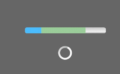
写一个自定义进度颜色和圆形转动的ProgressBar(详细介绍)

先上图:


我们得自定义ProgressBar的样式

<span style="white-space:pre">	</span><style name="self_define_ProgressBar" parent="@android:style/Widget.ProgressBar.Horizontal"> //继承了android横向的ProgressBar的样式
  	    <item name="android:indeterminateOnly">false</item>
  	    <item name="android:progressDrawable">@drawable/self_define_progress</item>
  	</style>

<?xml version="1.0" encoding="UTF-8"?>
<layer-list xmlns:android="http://schemas.android.com/apk/res/android">

	<item android:id="@android:id/background" >	//定义的是背景色
		<shape>
			<corners android:radius="5dip" />
			<gradient android:angle="270" android:centerColor="#efefef"
				android:centerY="0.75" android:endColor="#a3a3a3"
				android:startColor="#c7c7c7" />
		</shape>
	</item>

	<item android:id="@android:id/secondaryProgress">   //如果有2级进度,需要定义这一项,gradient定义的是渐变色,clip如果没有的话,进度条会充满整个Progessbar
		<clip>
			<shape>
				<corners android:radius="5dip" />
				<gradient android:angle="270" android:centerColor="#99CC99"
					android:centerY="0.75" android:endColor="#99CC99"
					android:startColor="#99CC99" />
			</shape>
		</clip>
	</item>

	<item android:id="@android:id/progress">  //这个是定义1级进度,如果1级进度比2级进度大且1级进度不透明,就可以覆盖掉2级进度
		<clip>
			<shape>
				<corners android:radius="5dip" />
				<gradient android:angle="270" android:centerColor="#4abbfd"
					android:centerY="0.75" android:endColor="#4abbfd"
					android:startColor="#4abbfd" />
			</shape>
		</clip>
	</item>

</layer-list>


在代码里这样使用:

	private ProgressBar mProgressBar;
	private Task mTask = new Task();
	private int mCount = 0;
	private Handler mHander = new MyHandler();
	
	@Override
	protected void onCreate(Bundle savedInstanceState) {
		super.onCreate(savedInstanceState);
		requestWindowFeature(Window.FEATURE_NO_TITLE);
		setContentView(R.layout.activity_main);
		mProgressBar = (ProgressBar)findViewById(R.id.progress);
		Timer timer = new Timer();
		timer.schedule(mTask, 1000, 1000);
	}
	
	private class MyHandler extends Handler{

		@Override
		public void handleMessage(Message msg) {
			mCount += 10;
			mProgressBar.setProgress(mCount);
			super.handleMessage(msg);
		}
	}
	
	private class Task extends TimerTask{

		@Override
		public void run() {
			mHander.sendEmptyMessage(10);
		}
	}


对于圆形并有转圈动画的进度条:shape的值(rectagle矩形,oval椭圆,line水平直线,ring环形) tpye的值:渐变的样式 liner线性渐变 radial环形渐变 sweep

<?xml version="1.0" encoding="utf-8"?>
<rotate xmlns:android="http://schemas.android.com/apk/res/android"
        android:pivotX="50%" 
	android:pivotY="50%"
        android:fromDegrees="0" 
	android:toDegrees="360">
        
    <shape
            android:shape="ring"<span style="font-family:verdana, ms song, 宋体, Arial, 微软雅黑, Helvetica, sans-serif;color:#666666;"><span style="font-size: 14px; line-height: 18px;">  
</span></span>            android:innerRadiusRatio="3"
            android:thicknessRatio="8"
            android:useLevel="false">

        <size
                android:width="37dip"
                android:height="37dip"
        />
        
        <gradient
                android:type="sweep"//type为sweep为环形转圈
                android:useLevel="false"
                android:startColor="#F7F7F7"
                android:centerColor="#F7F7F7"
                android:centerY="0.50"
                android:endColor="#B3B4B4"
        />
        
    </shape>
    
</rotate>


  • 0
    点赞
  • 3
    收藏
    觉得还不错? 一键收藏
  • 0
    评论
实现圆弧进度条的自定义ProgressBar,可以使用Canvas和Paint来绘制。 首先,创建一个自定义ProgressBar类,继承自ProgressBar类,并实现构造方法和onDraw方法: ``` public class CircleProgressBar extends ProgressBar { private Paint paint; // 画笔 private int roundColor; // 圆环颜色 private int progressColor; // 进度颜色 private int textColor; // 文字颜色 private float textSize; // 文字大小 private float roundWidth; // 圆环宽度 private int max; // 最大进度 private boolean textIsDisplayable; // 是否显示进度文字 private int style; // 进度样式 public static final int STROKE = 0; public static final int FILL = 1; public CircleProgressBar(Context context) { this(context, null); } public CircleProgressBar(Context context, AttributeSet attrs) { this(context, attrs, 0); } public CircleProgressBar(Context context, AttributeSet attrs, int defStyle) { super(context, attrs, defStyle); // 获取自定义属性的值 TypedArray mTypedArray = context.obtainStyledAttributes(attrs, R.styleable.CircleProgressBar); roundColor = mTypedArray.getColor(R.styleable.CircleProgressBar_roundColor, Color.RED); progressColor = mTypedArray.getColor(R.styleable.CircleProgressBar_progressColor, Color.GREEN); textColor = mTypedArray.getColor(R.styleable.CircleProgressBar_textColor, Color.GREEN); textSize = mTypedArray.getDimension(R.styleable.CircleProgressBar_textSize, 15); roundWidth = mTypedArray.getDimension(R.styleable.CircleProgressBar_roundWidth, 5); max = mTypedArray.getInteger(R.styleable.CircleProgressBar_max, 100); textIsDisplayable = mTypedArray.getBoolean(R.styleable.CircleProgressBar_textIsDisplayable, true); style = mTypedArray.getInt(R.styleable.CircleProgressBar_style, 0); mTypedArray.recycle(); // 初始化画笔 paint = new Paint(); } @Override protected synchronized void onDraw(Canvas canvas) { super.onDraw(canvas); // 获取圆心坐标和半径 int centerX = getWidth() / 2; int centerY = getHeight() / 2; int radius = (int) (centerX - roundWidth / 2); // 绘制圆环 paint.setColor(roundColor); paint.setStyle(Paint.Style.STROKE); paint.setStrokeWidth(roundWidth); paint.setAntiAlias(true); canvas.drawCircle(centerX, centerY, radius, paint); // 绘制进度条 paint.setStrokeWidth(roundWidth); paint.setColor(progressColor); RectF oval = new RectF(centerX - radius, centerY - radius, centerX + radius, centerY + radius); switch (style) { case STROKE: paint.setStyle(Paint.Style.STROKE); canvas.drawArc(oval, 0, 360 * getProgress() / getMax(), false, paint); break; case FILL: paint.setStyle(Paint.Style.FILL_AND_STROKE); if (getProgress() != 0) canvas.drawArc(oval, 0, 360 * getProgress() / getMax(), true, paint); break; } // 绘制文字 paint.setStrokeWidth(0); paint.setColor(textColor); paint.setTextSize(textSize); paint.setTypeface(Typeface.DEFAULT_BOLD); int percent = (int) (((float) getProgress() / (float) getMax()) * 100); if (textIsDisplayable && percent >= 0) { String text = percent + "%"; float textWidth = paint.measureText(text); canvas.drawText(text, centerX - textWidth / 2, centerY + textSize / 2, paint); } } } ``` 在这个类中,我们定义了几个自定义属性,包括圆环颜色进度颜色、文字颜色、文字大小、圆环宽度、最大进度、是否显示进度文字、进度样式等。在构造方法中,我们获取了这些属性的值,并初始化了画笔。在onDraw方法中,我们首先获取了圆心坐标和半径,然后使用画笔绘制了圆环和进度条,最后绘制了进度文字。 接下来,在布局文件中使用这个自定义ProgressBar: ``` <com.example.circleprogressbar.CircleProgressBar android:id="@+id/circle_progressbar" android:layout_width="wrap_content" android:layout_height="wrap_content" android:layout_centerInParent="true" app:roundColor="#cccccc" app:roundWidth="5dp" app:progressColor="#FF4081" app:textColor="#FF4081" app:textSize="20sp" app:textIsDisplayable="true" app:style="STROKE" /> ``` 最后,在Java代码中设置进度值即可: ``` CircleProgressBar circleProgressBar = findViewById(R.id.circle_progressbar); circleProgressBar.setProgress(50); // 设置进度为50% ``` 这样就完成了自定义的圆弧进度条的实现。

“相关推荐”对你有帮助么?

  • 非常没帮助
  • 没帮助
  • 一般
  • 有帮助
  • 非常有帮助
提交
评论
添加红包

请填写红包祝福语或标题

红包个数最小为10个

红包金额最低5元

当前余额3.43前往充值 >
需支付:10.00
成就一亿技术人!
领取后你会自动成为博主和红包主的粉丝 规则
hope_wisdom
发出的红包
实付
使用余额支付
点击重新获取
扫码支付
钱包余额 0

抵扣说明:

1.余额是钱包充值的虚拟货币,按照1:1的比例进行支付金额的抵扣。
2.余额无法直接购买下载,可以购买VIP、付费专栏及课程。

余额充值