


一、
win10,notebook, python 3.6
参考:
https://www.cnblogs.com/wei-li/archive/2012/05/23/2506940.html
1、7、10,绘制多幅图
2、绘制多图标
3、图片保存
4、Matplotlib.pylab快速绘图
5、散点图
6、轴标题
8、添加图例
9、直方图
二、
1、绘制多子图
绘制多子图(快速绘图)
Matplotlib 里的常用类的包含关系为 Figure -> Axes -> (Line2D, Text, etc.)一个Figure对象可以包含多个子图(Axes),在matplotlib中用Axes对象表示一个绘图区域,可以理解为子图。
可以使用subplot()快速绘制包含多个子图的图表,它的调用形式如下:
subplot(numRows, numCols, plotNum)
subplot将整个绘图区域等分为numRows行* numCols列个子区域,
然后按照从左到右,从上到下的顺序对每个子区域进行编号,左上的子区域的编号为1。
如果numRows,numCols和plotNum这三个数都小于10的话,可以把它们缩写为一个整数,
例如subplot(323)和subplot(3,2,3)是相同的。
subplot在plotNum指定的区域中创建一个轴对象。如果新创建的轴和之前创建的轴重叠的话,之前的轴将被删除。
subplot()返回它所创建的Axes对象,我们可以将它用变量保存起来,
然后用sca()交替让它们成为当前Axes对象,并调用plot()在其中绘图。
import matplotlib.pyplot as plt
import numpy as np
%matplotlib inline

for idx,color in enumerate('rgbyck'):
    plt.subplot(321+idx,axisbg=color)
plt.show()
2、
绘制多图表(快速绘图)
如果需要同时绘制多幅图表,
可以给figure()传递一个整数参数指定Figure对象的序号,
如果序号所指定的Figure对象已经存在,将不创建新的对象,而只是让它成为当前的Figure对象。
plt.sca(1),选择子图1,
import matplotlib.pyplot as plt
import numpy as np
%matplotlib inline

plt.figure(1) # 创建图表1
plt.figure(2) # 创建图表2
ax1 = plt.subplot(211) # 在图表2中创建子图1
ax2 = plt.subplot(212) # 在图表2中创建子图2

x = np.linspace(0, 3, 100)
for i in range(5):
    plt.figure(1)  #❶ # 选择图表1
    plt.plot(x, np.exp(i*x/3))
    plt.sca(ax1)   #❷ # 选择图表2的子图1
    plt.plot(x, np.sin(i*x))
    plt.sca(ax2)  # 选择图表2的子图2
    plt.plot(x, np.cos(i*x))


3、保存图片
X1 = range(0, 50)
Y1 = [num**2 for num in X1] # y = x^2

X2 = [0, 1]
Y2 = [0, 1] # y = x


Fig = plt.figure(figsize=(8,4)) # Create a `figure' instance
Ax = Fig.add_subplot(111) # Create a `axes' instance in the figure
Ax.plot(X1, Y1, X2, Y2) # Create a Line2D instance in the axes


Fig.show()
Fig.savefig("test.pdf")
4、
Matplotlib.pylab快速绘图
matplotlib还提供了一个名为pylab的模块,其中包括了许多NumPy和pyplot模块中常用的函数,方便用户快速进行计算和绘图,
十分适合在IPython交互式环境中使用。这里使用下面的方式载入pylab模块:
import pylab as pl
import numpy as np
import pylab as pl

x = [1, 2, 3, 4, 5]# Make an array of x values
y = [1, 4, 9, 16, 25]# Make an array of y values for each x value

pl.plot(x, y)# use pylab to plot x and y
pl.show()# show the plot on the screen
5、
散点图 Scatter plots
把pl.plot(x, y)改成pl.plot(x, y, 'o')即可,下图的蓝色版本
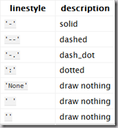
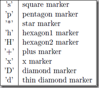
线条颜色 线条样式 marker样式

import numpy as np
import pylab as pl

x = [1, 2, 3, 4, 5]# Make an array of x values
y = [1, 4, 9, 16, 25]# Make an array of y values for each x value

pl.plot(x, y)# use pylab to plot x and y
pl.show()# show the plot on the screen
x = [1, 2, 3, 4, 5]# Make an array of x values
y = [1, 4, 9, 16, 25]# Make an array of y values for each x value

pl.plot(x, y,'o')# use pylab to plot x and y
pl.show()# show the plot on the screen
pl.plot(x, y,'or')# use pylab to plot x and y
pl.show()# show the plot on the screen

6、图和轴标题以及轴坐标限度 Plot and axis titles and limits
import numpy as np
import pylab as pl

x = [1, 2, 3, 4, 5]# Make an array of x values
y = [1, 4, 9, 16, 25]# Make an array of y values for each x value
pl.plot(x, y)# use pylab to plot x and y

pl.title('Plot of y vs. x')# give plot a title
pl.xlabel('x axis')# make axis labels
pl.ylabel('y axis')

pl.xlim(0.0, 7.0)# set axis limits
pl.ylim(0.0, 30.)

pl.show()# show the plot on the screen
7、在一个坐标系上绘制多个图 Plotting more than one plot on the same set of axes
import numpy as np
import pylab as pl

x1 = [1, 2, 3, 4, 5]# Make x, y arrays for each graph
y1 = [1, 4, 9, 16, 25]
x2 = [1, 2, 4, 6, 8]
y2 = [2, 4, 8, 12, 16]

pl.plot(x1, y1,'r')# use pylab to plot x and y
pl.plot(x2, y2, 'g')

pl.title('Plot of y vs. x')# give plot a title
pl.xlabel('x axis')# make axis labels
pl.ylabel('y axis')


pl.xlim(0.0, 9.0)# set axis limits
pl.ylim(0.0, 30.)


pl.show()# show the plot on the screen
8、
添加图例 Figure legends
pl.legend((plot1, plot2), (’label1, label2’), 'best’, numpoints=1)
如果在当前figure里plot的时候已经指定了label,如plt.plot(x,z,label="cos(x2)"),直接调用plt.legend()就可以了哦。
import matplotlib.pyplot as plt
import numpy as np
import pylab as pl

x1 = [1, 2, 3, 4, 5]
y1 = [1, 4, 9, 16, 25]
x2 = [1, 2, 4, 6, 8]
y2 = [2, 4, 8, 12, 16]

plot1, = pl.plot(x1, y1, 'r')
plot2, = pl.plot(x2, y2, 'go')

pl.title('Plot of y vs. x')
pl.xlabel('x axis')
pl.ylabel('y axis')


pl.xlim(0.0, 9.0)
pl.ylim(0.0, 30.)


pl.legend([plot1, plot2],['red line', 'green circles'] )# make legend
pl.show()
import matplotlib.pyplot as plt
import numpy as np
import pylab as pl

x=[1,2,3,4,5,6,7]
labels=['S1(25%)','S1(50%)','S1(75%)','S2','S3(25%)','S3(50%)','S3(75%)']
y1=[0.328,0.320,0.313,0.738,0.259,0.258,0.254]
y2=[0.230,0.234,0.232,0.738,0.233,0.233,0.253]

plot1,=pl.plot(x,y1,'r')

plot2,=pl.plot(x,y2,'b')
pl.xticks(x,labels)
pl.title('the loss percentage of T=7&T=14')
pl.ylabel('average losses(%)')
pl.ylim(0.0,1.0)
pl.legend([plot1,plot2],'best',numpoints=1)
import matplotlib.pyplot as plt
import numpy as np
import pylab as pl

fig = plt.figure(figsize=(5,5))
ax = fig.add_subplot(111)
x = np.arange(-np.pi,np.pi,np.pi/100)
y1 = np.sin(x)
y2 = np.cos(x)

sin, = ax.plot(x,y1,color = 'red',label = 'jksdk')
cos, = ax.plot(x,y2,color = 'blue',label = 'sjdk')

plt.legend(loc = 'upper left')
plt.show()
9、直方图
import numpy as np
import pylab as pl

np.random.seed(1234) #设置随机种子为1234
# make an array of random numbers with a gaussian distribution with
# mean = 5.0
# rms = 3.0
# number of points = 1000
data = np.random.normal(5.0, 3.0, 1000)

# 如果不想要黑色轮廓可以改为pl.hist(data, histtype=’stepfilled’)这里不起作用
# pl.hist(data, histtype='stepfilled')
pl.hist(data)
# make plot labels
pl.xlabel('data')
pl.show()

# 自定义直方图bin宽度
bins = np.arange(-5., 16., 1.) #浮点数版本的range
pl.hist(data, bins)
pl.show()

10、同一画板上绘制多幅子图 Plotting more than one axis per canvas
如果需要同时绘制多幅图表的话,可以是给figure传递一个整数参数指定图标的序号,
如果所指定序号的绘图对象已经存在的话,将不创建新的对象,而只是让它成为当前绘图对象。
import matplotlib.pyplot as plt
import numpy as np
%matplotlib inline

fig1 = pl.figure(1)
pl.subplot(211)
pl.subplot(211) # 把绘图区域等分为2行*1列共两个区域, 然后在区域1(上区域)中创建一个轴对象.
pl.subplot(212)  # 在区域2(下区域)创建一个轴对象。
import matplotlib.pyplot as plt
import numpy as np

f1 = pl.figure(1)
pl.subplot(221)
pl.subplot(222)
pl.subplot(212)


 2599
2599


 被折叠的 条评论
为什么被折叠?
被折叠的 条评论
为什么被折叠?
 到【灌水乐园】发言


