


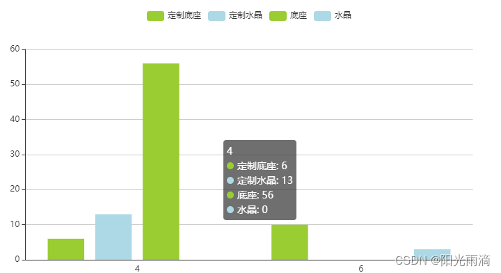
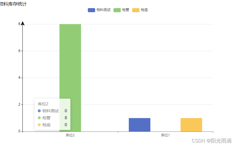
想展示这种效果
后端返回的数据是这样的

分别是数组里面套数组在套对象,并且里面的数组是随时变化的,并不是固定不动的,里面的库位1和库位2分别是俩个大横坐标,里面包含了几个对象,每个对象都有一个oname和number分别是该数据的名字和数量,那么应该怎么把这种数据展示到柱状图上显示出来呢?直接看代码
//其中echarts里的option配置是这样写的,可以直接复制
     var option = {
                legend: {},
                tooltip: {
                    trigger: 'axis',
                    axisPointer: {
                        type: 'shadow'
                    }
                },
                dataset: {
                    source: this.resultArrays
                },
                xAxis: { type: 'category' },
                yAxis: {
                    axisTick: {
                        show: true, //是否显示刻度线
                    },
                    axisLine: {
                        show: true, // 是否显示坐标轴轴线
                        symbol: ['none', 'arrow'], // 轴线两边的箭头,none表示没有箭头,arrow表示有箭头,可取值为字符串或长度为2的数组:默认不显示箭头 'none'。两端都显示箭头 'arrow',只在末端显示箭头 ['none', 'arrow']
                        symbolSize: [10, 15], // 轴线两边的箭头的大小,第一个数字表示宽度(垂直坐标轴方向),第二个数字表示高度(平行坐标轴方向),默认值[10, 15]。
                        symbolOffset: 10, // 轴线两边的箭头的偏移,如果是数组,第一个数字表示起始箭头的偏移,第二个数字表示末端箭头的偏移;如果是数字,表示这两个箭头使用同样的偏移。
                        // 坐标轴轴线样式设置
                        lineStyle: {
                            color: '#000',
                            width: 1,
                            type: 'solid',
                        }
                    },
                },
                series: this.barNumber
            };
          //调接口
          statisticsList({ source: 1 }).then(response => {
                //拿到每项的汉字
                const newArray2 =
                Object.values(response.data).flatMap(arr=>arr.map(item=> item.oname));
                const uniqueArray = [...new Set(newArray2)];
                uniqueArray.unshift('product')
                //拿到汉字的数量
                let number = uniqueArray.length - 1
                //获取横坐标和相应的值
                const newArray = Object.entries(response.data).flatMap(([field, arr]) =>
                [
                    field, ...arr.map(obj => obj.number)
                ]);
                let resultArrays = [];
                let currentArray = [];
                let oname = []

                for (let i = 0; i < newArray.length; i++) {
                    const item = newArray[i];
                    if (typeof item === 'string') {
                        if (currentArray.length > 0) {
                            resultArrays.push(currentArray);
                            currentArray = [];
                        }
                    }
                    currentArray.push(item);
                }
                // 将最后一个数组添加到结果数组中
                resultArrays.push(currentArray);
                //将汉字分配添加到数组中
                resultArrays.unshift(uniqueArray)
                //判断有几个柱状图
                const barNumber = new Array(number).fill().map(() => ({ type: 'bar' }));
                //其中别忘在data里定义barNumber 和resultArrays
                this.barNumber = barNumber
                this.resultArrays = resultArrays
            });
最后展示效果为


 338
338


 被折叠的 条评论
为什么被折叠?
被折叠的 条评论
为什么被折叠?
 到【灌水乐园】发言


