


看到好多自助建立导航网站都用的onenav开源框架,准备和自己的网站集成一下,发现引入后样式冲突布局又又又乱了,自己继续手写一个,现在体会到开源那么多,为啥还要造轮子了。
      <div class="nav-container" style="display: flex; width: 100vw; background-color: aqua; min-height: 400px; flex-direction: column; margin-top: 63px">
        <div class="banner" style="width: 100%; min-height: 30px; background-color: wheat">主标题</div>
        <div class="nav-content" style="display: flex; width: 100vw; background-color: aqua; min-height: 400px; flex-direction: row">
          <div class="left" style="width: 280px; min-height: 300px; background-color: red">左侧菜单导航</div>
          <div class="right" style="width: 100%; min-height: 300px; background-color: blue; display: flex; flex-direction: column">
            <div class="group" style="width: 100%; min-height: 100px; background-color: rgb(67, 67, 105); display: flex; flex-direction: column">
              <div class="tab" style="width: 100%; min-height: 40px; background-color: rgb(38, 38, 70); display: flex; flex-direction: column">tabs</div>
              <div class="navs" style="width: 100%; min-height: 100px; background-color: rgb(161, 94, 141); display: flex; flex-direction: row; flex-wrap: wrap">
                <div class="nav" style="width: 200px; height: 60px; background-color: rgb(54, 150, 78); margin: 5px; display: flex; flex-direction: column; flex-wrap: wrap"></div>
                <div class="nav" style="width: 200px; height: 60px; background-color: rgb(54, 150, 78); margin: 5px; display: flex; flex-direction: column; flex-wrap: wrap"></div>
              </div>
            </div>
          </div>
        </div>
      </div>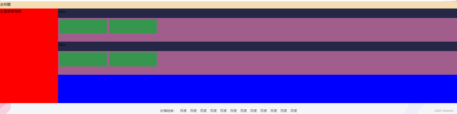


 3478
3478


 被折叠的 条评论
为什么被折叠?
被折叠的 条评论
为什么被折叠?
 到【灌水乐园】发言


