


引言
在 QML 界面开发中,元素的布局与定位是构建高效、美观 UI 的核心基础。Qt Quick 提供了一套灵活的布局系统,通过 Column/Row/Grid 等定位器(Positioners)以及 Repeater 动态生成组件,开发者能够快速实现从简单线性排列到复杂网格布局的多种场景。本文结合官方示例与实战代码,详细解析 QML 布局系统的核心机制,涵盖基础布局、网格系统、流式布局、动态生成等核心功能,并提供完整可运行工程,助力开发者掌握规范化布局开发思维。
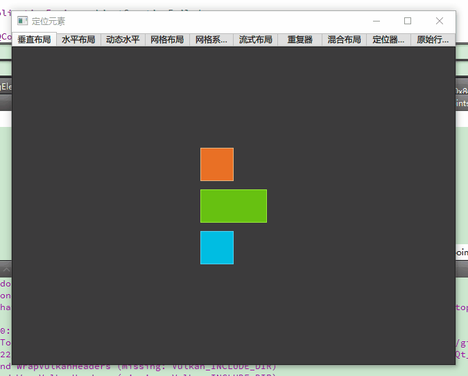
一、运行效果图
本文示例程序运行后呈现以下效果:
二、基础定位器:线性布局的核心应用
1. 垂直布局 Column
核心特性
- 子元素垂直堆叠,通过
spacing控制垂直间距 - 自动分配空间:未指定尺寸的子元素可通过
Layout.fillHeight填充剩余空间 - 典型场景:菜单列表、表单输入框垂直排列
完整代码(ColumnExample.qml)
import QtQuick
DarkSquare {  // 深灰色背景容器(自定义组件,48x48px,深灰色边框)
    id: root
    Column {  // 垂直布局容器
        anchors.centerIn: parent  // 居中显示
        spacing: 12  // 子元素间距12px
        // 红色正方形(自定义组件,48x48px,橙色边框)
        RedSquare { }
        // 绿色正方形(宽度96px,高度48px,绿色边框)
        GreenSquare { width: 96 }
        // 蓝色正方形(默认48x48px,蓝色边框)
        BlueSquare { }
    }
}
关键属性解析
| 属性 | 说明 |
|---|---|
spacing | 子元素垂直间距,单位像素(px),默认 0 |
Layout.alignment | 子元素水平对齐方式(如 Qt.AlignHCenter、Qt.AlignRight) |
clip | 是否裁剪超出容器的子元素,默认false |
2. 水平布局 Row
动态宽度最佳实践
import QtQuick
BrightSquare {  // 浅灰色背景容器(自定义组件,动态计算尺寸)
    id: root
    // 容器宽度=子元素总宽度+左右边距,高度=子元素总高度+上下边距
    width: row.childrenRect.width + 2*margins
    height: row.childrenRect.height + 2*margins
    property int margins: 20  // 统一边距参数化
    Row {  // 水平布局容器
        id: row
        anchors.fill: parent  // 填充父容器
        anchors.margins: root.margins  // 应用边距
        spacing: root.margins/2  // 间距为边距的一半(10px)
        // 三个红色正方形,间距10px,边距20px
        RedSquare { }
        RedSquare { }
        RedSquare { }
    }
}
布局方向控制
layoutDirection属性支持LeftToRight(默认)、RightToLeft,适配阿拉伯语等右向语言界面
三、结构化布局:网格与流式布局进阶
3. 网格布局 Grid
固定网格 vs 动态网格
// 固定2x2网格(`GridExample.qml`)
Grid {
    rows: 2          // 2行
    columns: 2       // 2列
    spacing: 8       // 行列间距8px
    RedSquare { }    // 第1行第1列
    RedSquare { }    // 第1行第2列
    RedSquare { }    // 第2行第1列
    RedSquare { }    // 第2行第2列
}

// 动态12列网格系统(`GridsystemExample.qml`)
Grid {
    columns: 12                  // 12列响应式网格
    spacing: 12                  // 列间距12px
    Repeater {
        model: columns * rows     // 生成12列×8行=96个子元素
        delegate: RedSquare {
            width: cellWidth      // 单元格宽度=64px(通过父容器计算)
            height: cellHeight    // 单元格高度=64px
        }
    }
}
网格填充方向
flow属性支持TopToBottom(默认逐行填充)、LeftToRight(逐列填充),满足不同布局需求
4. 流式布局 Flow
自适应换行实现
Flow {
    anchors.fill: parent        // 填充父容器
    anchors.margins: 20        // 20px边距
    spacing: 20                // 元素间距20px
    // 子元素超出容器宽度时自动换行
    RedSquare { }
    BlueSquare { }
    GreenSquare { }
    RedSquare { }
    BlueSquare { }
    GreenSquare { }
}
应用场景
- 标签云:标签数量不确定时自动换行
- 图片列表:不同尺寸图片混合排列,按流向自动布局
四、动态布局:Repeater 高效生成子元素
5. 数据驱动布局示例(RepeaterExample.qml)
DarkSquare {
    id: root
    width: 320; height: 320
    property variant colorArray: ["#00bde3", "#67c111", "#ea7025"]  // 预设颜色库
    Grid {
        anchors.fill: parent
        spacing: 4  // 网格间距4px
        Repeater {
            model: 16  // 生成16个子元素(4x4网格)
            delegate: Rectangle {
                required property int index  // 显式声明索引,避免隐式依赖
                property int colorIndex: Math.floor(Math.random()*3)  // 随机颜色索引
                width: 56; height: 56  // 子元素尺寸
                color: root.colorArray[colorIndex]  // 应用随机颜色
                border.color: Qt.lighter(color)  // 亮色边框
                // 居中显示序号(中文标签)
                Text {
                    anchors.centerIn: parent
                    color: "#f0f0f0"
                    text: "格子 " + (index + 1)
                }
            }
        }
    }
}
性能优化建议
- 小数据量:直接使用
Repeater配合固定模型 - 大数据量:改用
ListView/GridView并结合Loader延迟加载,避免内存占用过高
五、复合布局:混合使用多种定位器
6. 典型分层布局(mixed.qml)
Column {  // 外层垂直布局(头部-主体-尾部结构)
    width: 240; height: 120
    // 顶部栏:绿色色块,高度占比20%
    GreenSquare {
        height: parent.height*0.2
        width: parent.width  // 撑满父容器宽度
    }
    // 主体层:水平布局,两个蓝色色块分别占40%和60%宽度
    Row {
        height: parent.height*0.6  // 高度占比60%
        width: parent.width
        BlueSquare {
            width: parent.width*0.4  // 左半部分40%
            height: parent.height  // 撑满父容器高度
        }
        BlueSquare {
            width: parent.width*0.6  // 右半部分60%
            height: parent.height
        }
    }
    // 底部栏:绿色色块,高度占比20%
    GreenSquare {
        height: parent.height*0.2
        width: parent.width
    }
}
设计思路
- 层级分离:通过垂直布局划分页面结构,内部嵌套水平布局实现区域细分
- 百分比布局:使用
parent.width/height实现响应式设计,适配不同屏幕尺寸
六、原始定位:手动坐标控制
7. 精确位置布局(RawRowExample.qml)
BrightSquare {
    id: root
    width: 224; height: 88
    // 手动指定三个红色正方形的坐标(左上角定位)
    RedSquare { x: 20; y: 20 }
    RedSquare { x: 88; y: 20 }  // 间距68px(88-20)
    RedSquare { x: 156; y: 20 }
}
适用场景
- 极简界面:少量元素需要精确像素级定位
- 游戏开发:动态物体的坐标实时计算与更新
七、布局系统最佳实践
1. 自定义组件封装
// 统一颜色块组件(48x48px,带边框)
// RedSquare.qml
Rectangle {
    width: 48; height: 48
    color: "#ea7025"
    border.color: Qt.lighter(color)  // 亮色边框提升视觉层次
}
- 优势:减少重复代码,统一视觉规范,方便后续修改样式
2. 参数化设计原则
// 将边距、间距等常用值定义为属性
property int margins: 20
property int spacing: margins/2
- 好处:全局修改一处即可影响所有相关布局,提升维护效率
3. 响应式设计技巧
- 使用
anchors布局:通过fill/centerIn/margins实现元素自适应 - 结合
Layout附加属性:Column { Label { text: "标题"; Layout.fillWidth: true } // 撑满父容器宽度 }
八、常见问题与解决方案
Repeater 性能瓶颈
- 现象:数据量较大时界面卡顿
- 解决:改用
ListView并设置itemHeight/itemWidth,启用deferredLoading
九、总结
- 布局体系全覆盖:掌握线性布局、网格系统、流式布局、动态生成等核心能力
- 工程化实践:通过自定义组件、参数化设计提升代码复用性与可维护性
- 响应式设计:学会使用百分比、锚定布局适配不同屏幕尺寸


 扫一扫
扫一扫


 被折叠的 条评论
为什么被折叠?
被折叠的 条评论
为什么被折叠?
 到【灌水乐园】发言


