实现垂直水平居中的几种方法
<body>
    <div id="box1">
        <div id="box2"></div>
    </div>
</body>
一、已知需要居中盒子的宽高
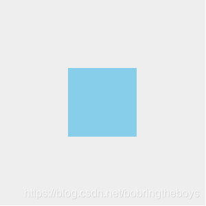
1.需要居中的盒子绝对定位,设置top:50%;left:50%;margin-top:负高度的一般;margin-left:负宽度的一半。
#box1{
   width: 300px;
   height:300px;
   background-color: #eee;
   margin: auto;
   margin-top: 30px;
   position: relative;
}
#box2{
    position: absolute;
    width: 100px;
    height: 100px;
    top: 50%;
    left: 50%;
    margin-left: -50px;
    margin-top: -50px;
    background-color: skyblue;
}
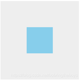
2.需要定位的盒子绝对定位,上下左右0,margin:auto
#box1{
   width: 300px;
   height: 300px;
   background-color: #eee;
   margin: auto;
   margin-top: 30px;
   position: relative;
}
#box2{
    position: absolute;
    width: 100px;
    height: 100px;
    top: 0;
    left: 0;
    bottom: 0;
    right: 0;
    margin: auto;
    background-color: skyblue;
}
3.父元素不设高度,通过padding来让盒子居中。
#box1{
   width: 300px;
   padding:100px 0;
   background-color: #eee;
   margin: auto;
   margin-top: 30px;
}
#box2{
	width: 100px;
	height: 100px;
    margin: auto;
	background-color: skyblue
}

二、未知需要居中盒子的宽高
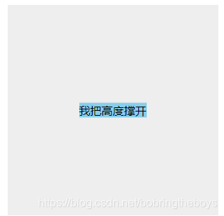
<div id="box1">
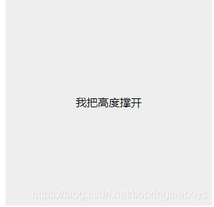
<div id="box2">我把高度撑开</div>
</div>
1.定位+transform,未知宽高由内容撑开。但是内容过多或超出父盒子,这个需要自己把握。当然如果设置宽高也是可以的。
#box1{
   width: 300px;
   height: 300px;
   background-color: #eee;
   margin: auto;
   margin-top: 30px;
   position: relative;
}
#box2{
	background-color: skyblue;
    position: absolute;
    left: 50%;
    top: 50%;
    transform: translate(-50%, -50%);
}
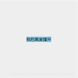
2.flex布局,和上面一样如果不设置宽高则高度由内容撑开如果设置宽高也是可以的哦。
    #box1 {
      width: 300px;
      height: 300px;
      background-color: #eee;
      margin: auto;
      margin-top: 30px;
      display: flex;
      display: -webkit-flex;
      display: -moz-flex;
      display: -ms-flex;
      justify-content: center;
      align-items: center;
    }
    #box2 {
      background-color: skyblue;
    }
3. 使用 display:table-cell 和 vertical-align 对容器里的文字进行垂直居中
    #box1 {
      width: 300px;
      height: 300px;
      background-color: #eee;
      display: table;
    }
    #box2 {
      display: table-cell;
      text-align: center;
	  vertical-align: middle;
    }


 538
538


 被折叠的 条评论
为什么被折叠?
被折叠的 条评论
为什么被折叠?
 到【灌水乐园】发言


