


<!DOCTYPE html>
<html lang="en">
	<head>
		<meta charset="utf-8">

		<!-- Always force latest IE rendering engine (even in intranet) & Chrome Frame
		Remove this if you use the .htaccess -->
		<meta http-equiv="X-UA-Compatible" content="IE=edge,chrome=1">

		<title>index</title>
		<meta name="description" content="">
		<meta name="author" content="boonya">

		<meta name="viewport" content="width=device-width; initial-scale=1.0">

		<!-- Replace favicon.ico & apple-touch-icon.png in the root of your domain and delete these references -->
		<link rel="shortcut icon" href="/favicon.ico">
		<link rel="apple-touch-icon" href="/apple-touch-icon.png">
		<style>
		    div{
		    	color: #0A0F5A;
		    	size: 10px;
		    	font-family: '楷体';
		    	margin:20px;
		    	text-align:center;

		    }
			#header{
				border:2px solid #a1a1a1;
				padding:10px 40px;
				background:#dddddd;
				width:400px;
				height:100px;
				border-radius:25px;
			}
			#center{
				width: 400px;
				height: 100px;
				background: #1FCEAA;
				box-shadow:30px 30px 10px #5A310A;
			}
		</style>
	</head>

	<body>
		<div id="header">
			border-radius属性允许您向元素添加圆角!
		</div>
		<div id="center">
			box-shadow属性阴影
		</div>
	</body>
</html>
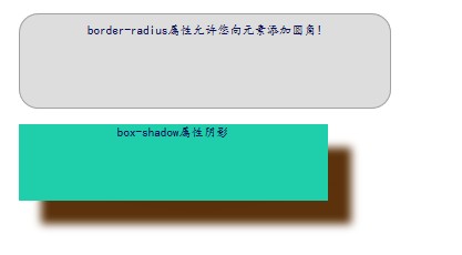
效果图:


 2万+
2万+

 被折叠的 条评论
为什么被折叠?
被折叠的 条评论
为什么被折叠?
 到【灌水乐园】发言


