


stroke-dasharray
stroke-dasharray是做什么用的?先看下面代码
<svg>
    <rect x="20" y="20" width="100" height="100" fill="none" stroke-width="1" stroke="red">
    </rect>
</svg>
结果:
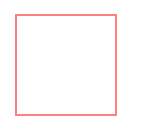
我们先看一下stroke属性的作用是什么.我们在上面使用rect标签画出一个矩形,起始点的x和y坐标都为20,宽和高都为100.stroke属性描述的是矩形边框的颜色,而stroke-width则定义了边框的宽度.
我们在此基础上添加一些代码看下效果:
<svg>
      <rect x="20" y="20" width="100" height="100" fill="none" stroke-width="1"
      stroke="red" stroke-dasharray="10"></rect>
</svg> 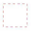
当我们把stroke-dasharray设置为10的时候,可以看到实线变成了虚线.并且每一小份实线的长度和间隔都为10.
如果我们设置stroke-dasharray:10 20;则表示每一小份实线的长度为10,间隔为20.
如果我们把stroke-dasharray的值设置的足够大,比如等于这个矩形的周长400,既stroke-dasharray:400.
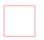
从上面的结果我们可以看出,此时矩形的每一小份实线的长度为400,间隔也为400时,边框描绘出来的图形就是一个实线的矩形.stroke-dasharray的作用也可以看出来就是对边框的展现形式做成虚线的处理,而每一小份实线的长度和之间的间隔则由具体的参数决定.
stroke-dashoffset
stroke-dashoffset属性通常与stroke-dasharray以及css相关属性配合使用可以做出小巧的动画.stroke-dashoffset的作用是什么呢?
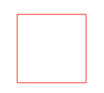
我们还是看上面的矩形案例添加上stroke-dashoffset属性来观察效果.
<svg>
         <rect stroke-dashoffset="0" x="20" y="20" width="100" height="100" fill="none" stroke-width="1" stroke="red" stroke-dasharray="400"></rect>
</svg>
当设置stroke-dashoffset为0,什么反应都没有.
当设置stroke-dashoffset:400时矩形直接消失了.
当设置stroke-dashoffset:300时矩形只剩下了一条边.
当设置stroke-dashoffset:800时,完整的矩形又神奇的出现了.
stroke-dashoffset这个属性是相对于起始点做偏移,正数x,相当于往左移动了x个长度.负数x,相当于往右移动了x个长度。不管是往哪一边偏移,dasharray都是循环的,遵循 短实线-间隔-短实线-间隔.因此我们总算知道了为什么stroke-dashoffset设置为400的时候会消失,因为矩形的周长等于400,刚好把这一小份的实线给偏移走了,而800又是一段新的实线。
那么也就是说我们可以通过设置stroke-dashoffset的值让边框显示的文络发生移动,如果再配合上css中的animation属性或者transition属性就可以做出很多精美的动画了.
线条增长动画
<style>
@keyframes animate2{
0% {stroke-dashoffset: 320;}
100% {stroke-dashoffset: 0;}
}
.line{
animation: animate2 3s 0.9s linear both;
}
</style>
<svg>
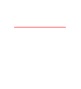
<line class="line" x1="30" y1="30" x2="300" y2="30" stroke-width="20" stroke="red" stroke-dasharray="300,320"/>
</svg>结果:

利用stroke-dashoffset属性使线条线性增长
环形动画
<style>
  .circle {
    animation: animate2 3s 0.9s linear both;
    stroke: #0084ff;
    stroke-width: 2px;
    fill: none;
    stroke-dasharray: 320;
  }
  @keyframes animate2{
     0% {stroke-dashoffset: 320;}
     100% {stroke-dashoffset: 0;}
  }
</style>

<svg>
    <circle class="circle" cx="51" cy="51" r="50">
    </circle>
</svg> 
path标签动画
<style>
 @keyframes animate1{
    0% {stroke-dashoffset: 564;}
    100% {stroke-dashoffset: 0;}
 }
.spiral{
    fill:none;
    animation: animate1 3s 0.9s linear both;
    stroke-dasharray: 564;
 }
</style>

<svg height="400" width="300">
        <path d="M153 334
        C153 334 151 334 151 334
        C151 339 153 344 156 344
        C164 344 171 339 171 334
        C171 322 164 314 156 314
        C142 314 131 322 131 334
        C131 350 142 364 156 364
        C175 364 191 350 191 334
        C191 311 175 294 156 294
        C131 294 111 311 111 334
        C111 361 131 384 156 384
        C186 384 211 361 211 334
        C211 300 186 274 156 274" stroke="red" stroke-width="1" class="spiral"/>
</svg> 


 2277
2277


 被折叠的 条评论
为什么被折叠?
被折叠的 条评论
为什么被折叠?
 到【灌水乐园】发言


