


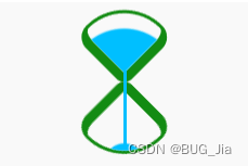
代码详解
- 定义dom元素,容器中包含两个元素,分别代表沙漏的上半部分和下半部分:
<div class="loader">
   <span class="top"></span>
   <span class="bottom"></span>
</div>
- 居中显示
body {
    margin: 0;
    height: 100vh;
    display: flex;
    align-items: center;
    justify-content: center;
    background-color: gainsboro;
}
- 定义容器尺寸,并设置元素整体布局
.loader {
    width: 4.3em;
    height: 9.8em;
    font-size: 10px;
    position: relative;
    display: flex;
    flex-direction: column;
    align-items: center;
    justify-content: space-between;
}
- 画出两个正方形:
.top,
.bottom {
    width: 3.5em;
    height: 3.5em;
    border-style: solid;
    border-color: rgb(19, 139, 19);;
}
- 通过边框、圆角和旋转,把两个正方形变成沙漏型状
.top,
.bottom {
    border-width: 0.2em 0.2em 0.6em 0.6em;
    border-radius: 50% 100% 50% 30%;
}

.top {
    transform: rotate(-45deg);
}

.bottom {
    transform: rotate(135deg);
}
- 用伪元素画出沙子,上部的沙子的顶部是大圆弧,下部的沙子的顶部是小圆弧:
.top::before,
.bottom::before {
    content: '';
    position: absolute;
    width: inherit;
    height: inherit;
    background-color: deepskyblue;
}

.top::before {
    border-radius: 0 100% 0 0;
}

.bottom::before {
    border-radius: 0 0 0 35%;
}
- 定义沙子的动画属性:
.top::before,
.bottom::before {
    animation: 2s linear infinite;
}
- 增加沙子从沙漏的上半部落下的动画效果:
.top::before {
    animation-name: drop-sand;
}

@keyframes drop-sand {
    to {
        transform: translate(-2.5em, 2.5em);
    }
}
- 增加沙子的沙漏在下半部堆积的动画效果:
.bottom::before {
    transform: translate(2.5em, -2.5em);
    animation-name: fill-sand;
}

@keyframes fill-sand {
    to {
        transform: translate(0, 0);
    }
}
- 隐藏沙漏上半部和下半部容器外的部分,此时上面 2 个动画的叠加效果是沙子从上半部漏下,慢慢在下半部堆积:
 .top,
.bottom {
    overflow: hidden;
}
- 用外层容器的伪元素制作一个窄长条,模拟流动的沙子:
.loader::after {
    content: '';
    position: absolute;
    width: 0.2em;
    height: 4.8em;
    background-color: deepskyblue;
    top: 1em;
}
- 增加沙子流动的动画效果:
.loader::after {
    animation: flow 2s linear infinite;
}

@keyframes flow {
    10%, 100% {
        transform: translateY(3.2em);
    }
}
- 最后,增加沙漏的翻转动画:
.loader {
    animation: rotating 2s linear infinite;
}

@keyframes rotating {
    0%, 90% {
        transform: rotate(0);
    }

    100% {
        transform: rotate(0.5turn);
    }
}


 338
338


 被折叠的 条评论
为什么被折叠?
被折叠的 条评论
为什么被折叠?
 到【灌水乐园】发言


