


一、水平居中
1、行内元素(text-align:center)
(适用:行内元素,或类行内元素(如文本)。包括inline/inline-block/inline-table/inline/flex 等类型的元素实现居中。)
行内元素水平居中,可把行内元素嵌套在水平居中的块状元素中。
<style>
.container{width:800px; background-color:#f6f6f6;}
.a-center{text-align:center;}
.span{background-color: yellow;}
.block-1{width:80%; background-color: #ccc;}
</style>
<div class='container'>
  <div class='a-center'>
    <span class='span-1'>1、行内元素嵌套在包含text-align:center的块状元素中。适用inline/inline-block/inline-table/inline/flex 等类型的元素实现居中。</span>
  </div>
  <div class='a-center block-1'>2、块状元素使用text-align:center居中无效</div>
  <span class='a-center span'>3、行内元素直接使用text-align:center居中无效</span>
</div>
2、块状元素
1)将margin-left和margin-right设置为auto(适用:宽度固定的块状元素。)
(对于宽度不固定的块状元素,如果把margin-left和margin-right设置为auto,会把块状元素撑到最大。因此不能采用这种方式。
另外垂直居中不能通过使用margin:auto来实现。宽度计算是适应父级元素规则,而高度计算则是一系列“撑高”规则,而非“适应于父级”规则。)
对于宽度固定的块状元素,可以将margin-left和margin-right设置为auto来实现目标。
<style>
.container{width:800px; background-color:#ccc;}
.block-1{width:80%; background-color: yellow; margin: 0 auto;}
</style>
<div class='container'>
  <div class='a-center block-1'>2、块状元素使用text-align:center居中无效</div>
</div>
效果如下图所示:

优缺点:上面这种方式,只适用固定宽度的元素。但只要块状元素的宽度是固定的,不论宽度值设置为多少,都能保持居中效果。
2)display:inline-block和text-align:center结合(适用:宽度不固定的块状元素,且父元素只有一个块状元素)
对于宽度不固定的块状元素,将块状元素设置为display:inline-block,再将其嵌套在另外一个text-align:center的块状元素中。
<style>
.container{width:600px; background-color:#ccc;text-align:center;}
.inlinebox{display:inline-block; background-color: yellow; margin: 0 auto;}
</style>
<div class='container'>
  <div class='a-center inlinebox'>不固定宽度的块状元素居中</div>
</div>
优缺点:只适用宽度不固定的元素,只适用于只有父元素只有一个子元素或父元素的多个子元素都需要居中。并且这个方案需要改变父元素的水平对齐方式。并且如果父元素有多个子元素,没有办法让这个元素处于父元素的中间。
3)display:table和margin:auto结合(适用:所有块状元素)
<style>
.centerbox{display:table; background-color:#f6f6f6;margin: 0 auto;}
</style>
<div class='centerbox'>块状元素水平居中</div>4)使用position:absolute,设置left、top,margin-left、margin-top(适用:宽度固定的块状元素)
设置元素position:absolute,并设置left、top为50%,margin-left、margin-top分别为元素-1/2元素宽、-1/2元素高。
<style>
.container{position:relative; width:400px; height:200px; border:1px solid #ddd;}
.centerbox{
  position:absolute;
  width:200px;
  height:100px;
  top:50%;/*垂直居中相关*/
  left:50%;/*水平居中相关*/
  margin-top:-50px; /*垂直居中相关*/
  margin-left:-100px;/*水平居中相关*/
  background-color: #ddd;
}
</style>
<div class='container'>
  <div class='a-center centerbox'>固定宽度的块状元素居中</div>
</div>
效果如下图所示:
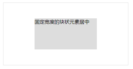
优缺点:兼容所有浏览器,但这种方式只适用宽度固定的块状元素。并且需要根据自身宽度去设置margin-left值。
5)使用position:fixed,同样设置left、margin-left(适用:宽度不固定的块状元素)
设置元素position:fixed,并设置left为50%,margin-left为 -1/2元素宽
<style>
.centerbox{
  position:fixed;
  width:200px;
  height:100px;
  left:50%;/*水平居中相关*/
  top:50%;/*垂直居中相关*/
  margin-top:-50px;/*垂直居中相关/
  margin-left:-100px;/*水平居中相关*/
  background-color: #ddd;
}
</style>
<div class='a-center centerbox'>固定宽度的块状元素居中</div>
效果如下图:
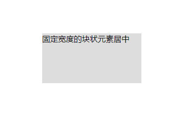
优缺点:postion:fixed不兼容IE6及以下浏览器,并且这种方式只适用宽度固定的块状元素。并且需要根据自身宽度去设置margin-left值。
6)使用position:absoute,设置left、right、margin-left、margin-right(适用:宽度不固定的块状元素)
<style>
.centerbox{
  position:fixed;
  width:200px;
  height:100px;
  left:0;/*水平居中相关*/
  right:0;/*水平居中相关*/
  bottom:0;/*垂直居中相关*/
  top:0;/*垂直居中相关*/
  margin:auto;/*水平居中、垂直居中相关/
  background-color: #ddd;
}
</style>
<div class='a-center centerbox'>固定宽度的块状元素居中</div>
优缺点:这种方式不需要根据元素宽度去设置margin的值。但是这种方式只适用宽度固定的块状元素。
7)使用position:fixed,同样设置left、right、margin-left、margin-right(适用:宽度不固定的块状元素)
设置元素为position:fixed,同时设置left、right为0,margin-left、margin-right为auto
<style>
.centerbox{
  position:fixed;
  width:200px;
  height:100px;
  left:0;/*水平居中相关/
  right:0;/*水平居中相关*/
  bottom:0;/*垂直居中相关/
  top:0;/*垂直居中相关*/
  margin:auto;/*水平居中、垂直居中相关*/
  background-color: #ddd;
}
</style>
<div class='a-center centerbox'>固定宽度的块状元素居中</div><style>
.centerbox{display:table; background-color:#f6f6f6;margin: 0 auto;}
</style>
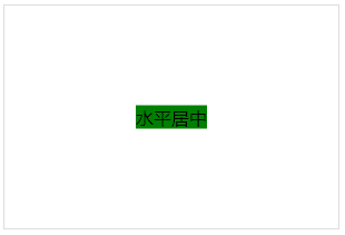
<div class='centerbox'>块状元素水平居中</div>8)使用css3的display:-webkit-box属性,再设置-webkit-box-pack:center(适用:宽度是否固定都可适用)
<style>
.container{
	width:500px;
	height:90px;
	display:-webkit-box;
        /*水平居中*/
	-moz-box-pack:center; /*Firefox支持*/
	-webkit-box-pack:center; /*Safari、Opera 以及 Chrome 支持 */
	-ms-flex-pack: center; /*IE10版本*/
        /*垂直居中*/
	-webkit-box-align:center; /*Safari、Opera 以及 Chrome 支持 */
	-moz-box-align:center; /*Firefox支持*/
	background:yellow;
	color:black;
}
.centerbox1{background-color:red;}
.centerbox2{background-color:green;}
</style>
<div class='container'>
   <div class='centerbox1'>元素居中</div>
   <div class='centerbox2'>元素居中</div>
</div>
优缺点:实现简单,不论元素宽度是否固定均可使用。但只适用于只有父元素只有一个子元素或父元素的多个子元素都需要居中(如果多个子元素超出宽度会溢出显示)。并且不支持IE9及以下版本。
9)使用css3的新属性transform:translate(x,y)属性(适用:宽度是否固定都可适用,但chrome下宽度要为偶数)
<style>
.centerbox{
  position:absolute;
  width:200px;
  top:50%;
  left:50%;
  transform:translate(-50%,-50%);
  -webkit-transform:translate(-50%,-50%);
  -moz-transform:translate(-50%,-50%);
  -ms-transform:translate(-50%,-50%);
  background:red;
}
</style>
<div class='container'>
  <div class='centerbox'>块状元素水平居中</div>
</div>
效果图如下:
优缺点:不论块状元素宽度是否固定均可使用。但是IE8及以下版本不支持transform;另外在Chrome浏览器下如果元素宽度计算出来的值必须是偶数,否则会出现像糊(最新的Chrome版本不会有这个问题,我测试环境是61的,是正常的)。
二、垂直居中
由于水平居中里面有些代码实现已经把垂直居中的也包括进去了,垂直居中的就简单描述。
1、高度确定的单行文本元素(行内元素和块状元素均可以)
将height和line-height设置成一样的值。
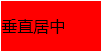
<style>
.middlebox{display:inline-block; width:100px; height:50px; line-height:50px; background-color:red}
</style>
<span class='middlebox'>垂直居中</span>
2、块状元素
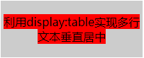
1)插入display:table、display:table-cell等元素,并将元素放到display:table-cell元素中(适用:高度不确定的块状元素)
<style>
.container{width:200px; height:80px; background-color:#ccc;text-align:center;}
.table{display:table; height:100%;}
.table-cell{display:table-cell;vertical-align:middle;}
.middlebox{width:100px; height:50px; background-color:red}
</style>
<div class='container'>
  <div class='table'>
    <div class='table-cell'>
	  <span class='middlebox'>利用display:table实现多行文本垂直居中</span>
	</div>
  </div>
</div>
效果如下图所示:
优缺点:IE7及其以下版本不兼容display:table、display:table-cell。另外这个方案需要增加额外的标签。
3、块状元素垂直居中的其他方式
在一、2、块状元素中的3)-9)实现类似,代码中其实已经包含,不再叙述。
说明:如果是固定宽度、高度的元素,居中都好处理。对于元素宽度、高度不固定的,目前除了用display:table-cell来实现,还没有找到兼容性比较好的方式。


 291
291

 被折叠的 条评论
为什么被折叠?
被折叠的 条评论
为什么被折叠?
 到【灌水乐园】发言


