


 本文详细介绍了Echarts的多种图表配置,包括柱状图、折线图、提示框、网格样式、轴的定制、颜色渐变等。通过实例代码展示了如何实现上下左右位置调整、自定义提示框内容、柱状图数值显示、轴线隐藏、背景色修改、渐变色柱状图以及面积图渐变色等效果。内容实用,适合Echarts图表开发的学习和参考。
本文章都是博主自己写项目中遇到或者项目所需的一些,可以说是干货满满,拿走不谢

1、上下左右位置,option子级
grid: {
   left: 20,
     right: 20,
     top: 60,
     bottom: 20,
     containLabel: true
   },
2、网格样式 option子级
yAxis: {
 axisTick: {
    show: false
  },
  axisLine: {  //这是y轴文字颜色
      lineStyle: {
          color: color || '#333',
      }
  },
  splitLine: {//y轴的网格 样式
      lineStyle: {
          color: "rgb(49, 73, 117)",
          width: 1,
          type: 'dashed'
      }
  },
  splitArea : {show : false}//保留网格区域
},
3、自定义提示框 option子级 详细见 上篇博文
tooltip:{
          trigger: 'axis',
          triggerOn: "mousemove",
          formatter:function(params){
            let tip = ''
            let unit = ''
            params.forEach(el=>{
              if(el.seriesName.indexOf('电压')!==-1){
                unit = ' V'
              }else if(el.seriesName.indexOf('电流')!==-1){
                unit = ' A'
              }else if(el.seriesName.indexOf('功率')!==-1){
                unit = ' W'
              }else if(el.seriesName.indexOf('电表值')!==-1){
                unit = ' kW·h'
              }
              tip += el.seriesName + ':' + el.value +  unit +'<br/>'
            })
            return tip
          }
        },
4、横向柱状图(修改网格区域及x轴文字斜向展示;tips:正面展示数值重叠导致看不清数值)
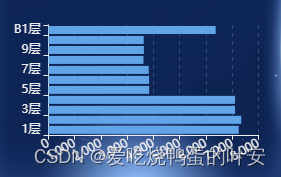
配置见下面代码
title: {
            text: '区域用'+ title +'统计情况',
            textStyle: {
                color: '#eee',// 文字颜色
                fontSize: 18// 文字大小
            }
        },
        color: ['#61A5E8'],//修改柱状图颜色
        tooltip: {
            trigger: 'axis',
            axisPointer: {
                type: 'shadow'
            }
        },
        grid: {
            left: '3%',
            right: '4%',
            bottom: '3%',
            containLabel: true
        },
        xAxis: {
            type: 'value',
            boundaryGap: [0, 0.01],
            axisLine: {  //这是x轴文字颜色
              lineStyle: {
                  color: "#eee",
              },
            },
            axisLabel: {// x轴旋转30度
              interval: 0,
              rotate: 30
            },
            splitLine: {//y轴的网格
              lineStyle: {
                  color: "rgb(49, 73, 117)",
                  width: 1,
                  type: 'dashed'
              }
            },
            splitArea : {show : false}//保留网格区域
        },
        yAxis: {
          type: 'category',
          data: yAxisData,
          axisLine: {  //这是y轴文字颜色
            lineStyle: {
                color: "#eee",
            }
          },
        },
        series: [
            {
                name: '',
                type: 'bar',
                data: seriesData
            }
        ]
5、柱状图数值显示在柱子上

series: [
   {
       data: seriesData,
       label: { //柱体上显示数值
           show: true,//开启显示
           position: 'top',//在上方显示
           textStyle: {//数值样式
               fontSize: '14px',
               color: '#666'
           },
           formatter: '{c}',
       },
       type: 'bar'
     }
   ]
6、柱状图 基本柱状图 自定义柱状颜色(如上图)
传入的数值样式如下代码:
seriesData: [{
      value: 323,
      itemStyle: {color: '#61D9AC'}
      }, {
      value: 212,
      itemStyle: {color: '#FFDC4C'}
  }],
7、隐藏轴、刻度线、刻度线值等
yAxis: {
      type: 'value',
      axisTick: {
        show: false // 不显示坐标轴刻度线
      },
      axisLine: {  //这是y轴文字颜色
        show: false, // 不显示坐标轴线
        lineStyle: {
            color: themeColor || "#333",
        }
      },
      axisLabel: {
        show: false, //隐藏刻度值
      },
      splitArea : {show : false}//保留网格区域
    },
8、修改legend文字颜色

legend: {
  data: legendData,
  textStyle:{
    color: themeColor || '#333'
  }
},
或者如下形式
legend: {//无legend属性可隐藏色块文字提示
      orient: 'horizontal',
      left: 'left',
      top:'12%',
      // bottom:'bottom',
      textStyle:{
        color: themeColor || '#333'
      }
  },
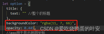
9、修改整个echarts的背景色
backgroundColor不支持半透明rgba(11, 7, 66,.445)
加opacity透明度加持即可
10、柱状图渐变色 && 变圆角 && 加边框 && 圆柱图
在option中的series字段中添加如下属性

itemStyle: {
  normal: {//渐变色
  	barBorderRadius: [20,20,0,0],//圆角
  	borderColor: "#fff",// 边框颜色
    borderWidth: 1,// 边框宽度
      color: new echarts.graphic.LinearGradient(0, 1, 0, 0, [{
        offset: 0,
        color: "#1268f327" // 0% 处的颜色
      }, {
        offset: 0.6,
        color: "#08a5fa67" // 60% 处的颜色
      }, {
        offset: 1,
        color: "#01cbfee5" // 100% 处的颜色
      }], false)
    }
  },
完整option配置如下:(个别变量为动态配置项)
title: {
  text: titleTxt,
   show:true,//默认值true,可选为:true(显示) | false(隐藏)
   textStyle: {
       color: themeColor || '#333',// 文字颜色
       fontSize: 16// 文字大小
   }
},
 xAxis: {
   type: 'category',
   data: xAxisData,
   axisLine: {  //这是x轴文字颜色
     // show: false, // 不显示坐标轴线
     lineStyle: {
       color: themeColor || "#333",
     },
   },
   axisTick: {
     show: false // 不显示坐标轴刻度线
   },
 },
 yAxis: {
   type: 'value',
   axisTick: {
     show: showYzhou || false // 不显示坐标轴刻度线
   },
   splitLine: {// 水平刻度线
       show: false
   },
   axisLine: {  //这是y轴文字颜色
     show: showYzhou || false, // 不显示坐标轴线
     lineStyle: {
         color: themeColor || "#333",
     }
   },
   axisLabel: {
     show: showYzhou || false, //隐藏刻度值
   },
   splitArea : {show: false}//保留网格区域
 },
 series: [
   {
     data: seriesData,
     label: { //柱体上显示数值
         show: true,//开启显示
         position: 'top',//在上方显示
         textStyle: {//数值样式
             fontSize: '14px',
             color: themeColor ||  '#666'
         },
         formatter: '{c}',
     },
     type: 'bar',
     itemStyle: {
       normal: {//渐变色
       		barBorderRadius: [20,20,0,0],//圆角
       		borderColor: "#fff",
            borderWidth: 1,
         color: new echarts.graphic.LinearGradient(0, 1, 0, 0, [{
           offset: 0,
           color: "#1268f327" // 0% 处的颜色
         }, {
           offset: 0.6,
           color: "#08a5fa67" // 60% 处的颜色
         }, {
           offset: 1,
           color: "#01cbfee5" // 100% 处的颜色
         }], false)
       }
     },
   }
 ]
1、圆柱图
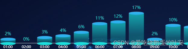
如上柱状图的基础上,换掉series,如下,
series:[
          {
            "name": "数据上椭圆",
            type: 'pictorialBar',
            symbolSize: [barWidth, 10],
            symbolOffset: [0, -6],
            symbolPosition: 'end',
            z: 12,
            "label": {
              "normal": {
                "show": true,
                "position": "top",
                fontSize: 14,
                color: color,
                formatter:function(params,index){
                  return params.value+"%";
                }
              }
            },
            color: "#2DB1EF",
            data: seriesData
          },
          {
            name: '下椭圆',
            type: 'pictorialBar',
            symbolSize: [barWidth, 10],
            symbolOffset: [0, 7],
            z: 12,
            "color": color,
            "data": seriesData
          },
          {
            type: 'bar',
            "barWidth": barWidth,
            barGap: '10%', // Make series be overlap
            barCateGoryGap: '10%',
            itemStyle: {
              normal: {
                color: new echarts.graphic.LinearGradient(0, 0, 0, 0.7, [{
                    offset: 0,
                    color: "rgba(25,223,221,.7)"
                  },
                  {
                    offset: 1,
                    color: "rgba(25,223,221,.3)"
                  }
                ]),
              },
            },
            data: seriesData
          },
        ]
去掉series下椭圆的数据就是如下图的效果

11、折线图面积区域渐变色
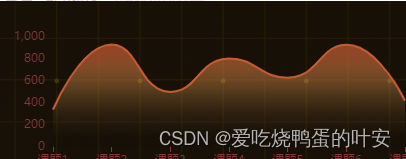
        areaStyle: {
              normal: {
                  color: {
                      x: 0,
                      y: 0,
                      x2: 0,
                      y2: 1,
                      colorStops: [
                           {
                               offset: 0.1,
                               color: '#c55D34' // 0% 处的颜色
                           },
                           {
                               offset: 0.5,
                               color: 'rgba(255,185,91, 0.3)' // 0% 处的颜色
                           },
                           {
                               offset: 0.7,
                               color: 'rgba(255,185,91, 0.1)' // 0% 处的颜色
                           },
                           {
                               offset: 0.9,
                               color: 'rgba(0,0,0, 0.1)' // 100% 处的颜色
                           }
                      ],
                      globalCoord: false // 缺省为 false
               }
         }


 被折叠的 条评论
为什么被折叠?
被折叠的 条评论
为什么被折叠?
 到【灌水乐园】发言


