matplotlib基础(4)之饼图 pie

76 篇文章 0 订阅
36 篇文章 0 订阅
from matplotlib import colors
import matplotlib.pyplot as plt
import numpy as np
from numpy.core.fromnumeric import size


# 饼图 
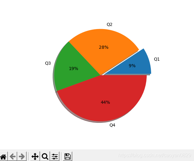
x = ['Q1', 'Q2', 'Q3', 'Q4', ]
y = [10, 30, 20, 48]
plt.axes(aspect=1)  # pie本身是椭圆, aspect=1使其为圆形

"""
autopct:展示数值占比  %2.f保留两位小数  %%  第一个%为转译 第二个为%字符串
explode:模块浮动 按x值排序算 
"""
plt.pie(y, labels=x, autopct='%2.f%%', explode=[0.1, 0, 0, 0], shadow=True)

plt.show()

效果:


  • 0
    点赞
  • 0
    收藏
    觉得还不错? 一键收藏
  • 0
    评论
以下是一个matplotlib绘制4个饼图在一起展示的例子: ```python import matplotlib.pyplot as plt # 定义数据 sizes1 = [15, 30, 45, 10] sizes2 = [20, 20, 40, 20] sizes3 = [30, 10, 10, 50] sizes4 = [25, 25, 25, 25] labels = ['A', 'B', 'C', 'D'] # 定义颜色 colors = ['red', 'orange', 'yellow', 'green'] # 定义图形大小 fig = plt.figure(figsize=(8, 6)) # 绘制第一个饼图 ax1 = fig.add_subplot(221) ax1.pie(sizes1, labels=labels, colors=colors, autopct='%1.1f%%', startangle=90) ax1.set_title('Pie Chart 1') # 绘制第二个饼图 ax2 = fig.add_subplot(222) ax2.pie(sizes2, labels=labels, colors=colors, autopct='%1.1f%%', startangle=90) ax2.set_title('Pie Chart 2') # 绘制第三个饼图 ax3 = fig.add_subplot(223) ax3.pie(sizes3, labels=labels, colors=colors, autopct='%1.1f%%', startangle=90) ax3.set_title('Pie Chart 3') # 绘制第四个饼图 ax4 = fig.add_subplot(224) ax4.pie(sizes4, labels=labels, colors=colors, autopct='%1.1f%%', startangle=90) ax4.set_title('Pie Chart 4') # 展示图形 plt.show() ``` 解释一下代码: 首先,定义了四个数据集(sizes1、sizes2、sizes3、sizes4)和对应的标签(labels)。 同时,定义了用到的颜色(colors)。 然后,设置了整个图形的大小(figsize)。 接着,用add_subplot方法在图形中设置四个小图。在每个小图里,分别调用pie方法绘制饼图,并设置对应的标签、颜色、自动百分比显示和起始角度。最后,为每个小图设置标题。 最后,用plt.show()方法展示整个图形。

“相关推荐”对你有帮助么?

  • 非常没帮助
  • 没帮助
  • 一般
  • 有帮助
  • 非常有帮助
提交
评论
添加红包

请填写红包祝福语或标题

红包个数最小为10个

红包金额最低5元

当前余额3.43前往充值 >
需支付:10.00
成就一亿技术人!
领取后你会自动成为博主和红包主的粉丝 规则
hope_wisdom
发出的红包
实付
使用余额支付
点击重新获取
扫码支付
钱包余额 0

抵扣说明:

1.余额是钱包充值的虚拟货币,按照1:1的比例进行支付金额的抵扣。
2.余额无法直接购买下载,可以购买VIP、付费专栏及课程。

余额充值