


安卓中LinearLayout是用得最得心应手的容器,但有时候貌似不尽人意,其实安卓中的容器真的很灵活。!
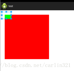
1.让子元素超出容器限制。初步想象一下,貌似子元素给定margin为负数即可超出,但事实却是超出容器部分没有绘制出来。
其实是可以绘制出来的,红色容器的容器(注意是红色控件的容器,不是红色容器自己)给定android:clipChildren="false"即可,该参数默认为true,即其内元素会被其容器裁剪,注意之所以是红色容器的容器,是因为绿色按钮突出部分已不在红色容器绘制范围内了,而属于红色容器的容器。
2.下面这种布局,按传统模式一般最外层用LinearLayout,里面再套RelativeLayout,以及各种恶心的排位。
其实可以来得更爽快一点,一个LinearLayout容器搞定。
<LinearLayout xmlns:android="http://schemas.android.com/apk/res/android"
    android:layout_width="match_parent"
    android:layout_height="match_parent"
    android:background="#ffffff"
    android:clipToPadding="false"
    android:orientation="horizontal"
    android:padding="10dp" >

    <TextView
        android:id="@+id/tvVIP"
        android:layout_width="wrap_content"
        android:layout_height="wrap_content"
        android:text="VIP1"
        android:textColor="#000000"
        android:textStyle="bold" />

    <EditText
        android:id="@+id/et"
        android:layout_width="0dp"
        android:layout_height="wrap_content"
        android:layout_weight="1"
        android:paddingRight="20dp"
        android:text="1000" />

    <TextView
        android:layout_width="wrap_content"
        android:layout_height="wrap_content"
        android:layout_marginLeft="-20dp"
        android:text="元" />

    <Button
        android:id="@+id/btnDel"
        android:layout_width="wrap_content"
        android:layout_height="20dp"
        android:layout_marginLeft="-15dp"
        android:layout_marginTop="-10dp" />

</LinearLayout>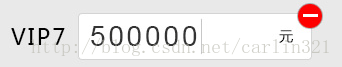


 2766
2766

 被折叠的 条评论
为什么被折叠?
被折叠的 条评论
为什么被折叠?
 到【灌水乐园】发言


