


 本文详细介绍了Flex布局的基础概念、容器及项目的属性,并通过实例演示了如何使用Flex布局实现常见网页布局。
Flex布局----Flexible box "弹性布局"
将一个容器指定为 Flex 布局
//块状元素
.box{ display: flex;}
//内联元素
.box{ display: inline-flex;}
//Webkit 内核的浏览器,必须加上-webkit前缀。
.box{ display: -webkit-flex; /* Safari */ display: flex;}
设为 Flex 布局以后,子元素的float(浮动)、clear(清除浮动)和vertical-align(垂直对齐方式)属性将失效。
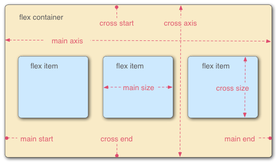
- 采用 Flex 布局的元素,称为容器(flex container)。
- 子元素成为容器成员,称为项目(flex item)。
- 容器默认存在两根轴:水平的主轴(main axis)和垂直的交叉轴(cross axis),主轴和交叉轴不是固定的,两者是相对的,互相垂直。
一、容器的属性:
- flex-direction:row | row-reverse | column | column-reverse;主轴方向
- flex-wrap:nowrap | wrap | wrap-reverse;换行方式
- flex-flow:row nowrap | column nowrap;flex-direction和flex-wrap的复合属性
- justify-content: flex-start | flex-end | center | space-between | space-around;项目对齐(主轴)
- align-items:flex-start | flex-end | center | baseline | stretch;项目对齐(交叉轴)
- align-content:flex-start | flex-end | center | space-between | space-around | stretch;多轴线对齐
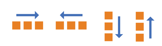
1. flex-direction:决定主轴的方向(即项目的排列方向)
- row(默认值):主轴为水平方向,起点在左端。
- row-reverse:主轴为水平方向,起点在右端。
- column:主轴为垂直方向,起点在上沿。
- column-reverse:主轴为垂直方向,起点在下沿。
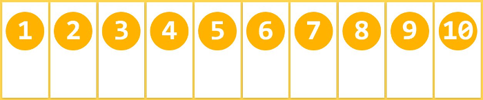
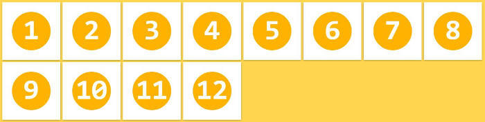
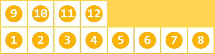
2. flex-wrap:一条轴线排不下,如何换行
- nowrap(默认):不换行。
- wrap:换行,第一行在上方。
- wrap-reverse:换行,第一行在下方。
3.flex-flow:是flex-direction属性和flex-wrap
默认:row nowrap
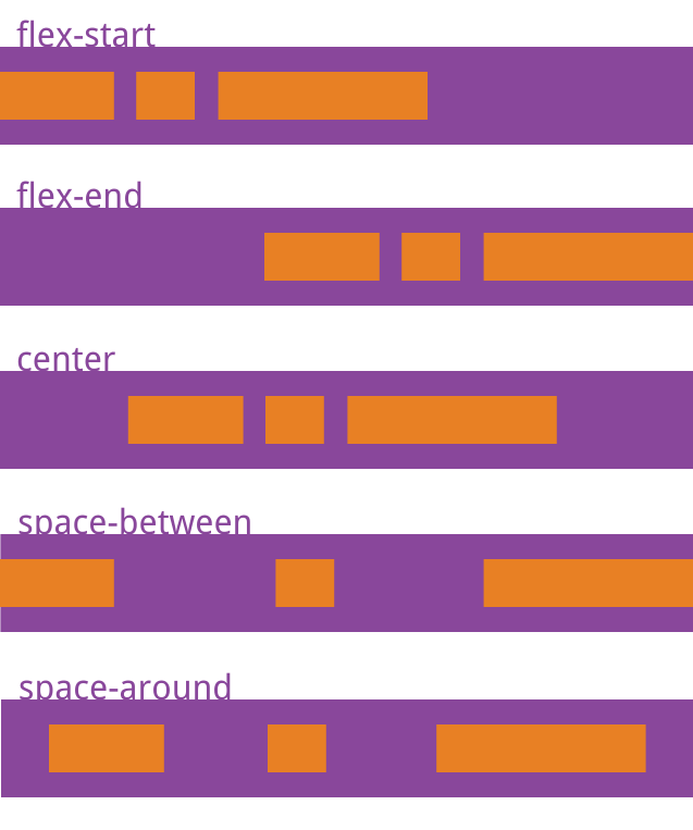
4.justify-content:项目在主轴上的对齐方式
【以flex-direction取row值为例(主轴水平方向,起点在左端)】
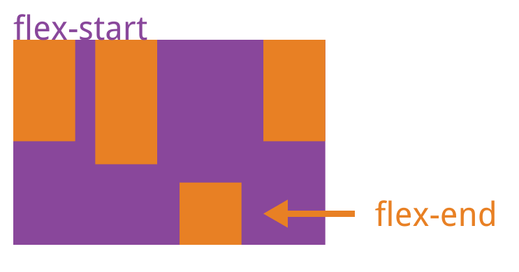
- flex-start(默认值):左对齐
- flex-end:右对齐
- center: 居中
- space-between:两端对齐,项目之间的间隔都相等。
- space-around:每个项目两侧的间隔相等。所以,项目之间的间隔比项目与边框的间隔大一倍。
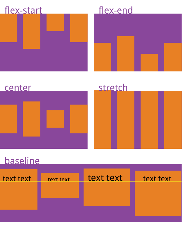
5.align-items:项目在交叉轴的上对齐方式
【此时交叉轴为垂直方向】
- flex-start:交叉轴的起点对齐。
- flex-end:交叉轴的终点对齐。
- center:交叉轴的中点对齐。
- baseline: 项目的第一行文字的基线对齐。
- stretch(默认值):如果项目未设置高度或设为auto,将占满整个容器的高度。
【注】当容器设置flex-direction:column;则主轴为垂直方向,起点在上沿。那么,
justify-content: center;在主轴方向的居中。即垂直方向的居中。
align-items: center;在交叉轴方向的居中。即水平方向的居中。(从平面上正着看)
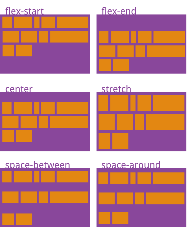
6.align-content:多根轴线的对齐方式。如果项目只有一根轴线,该属性不起作用。
- flex-start:与交叉轴的起点对齐。
- flex-end:与交叉轴的终点对齐。
- center:与交叉轴的中点对齐。
- space-between:与交叉轴两端对齐,轴线之间的间隔平均分布。
- space-around:每根轴线两侧的间隔都相等。所以,轴线之间的间隔比轴线与边框的间隔大一倍。
- stretch(默认值):轴线占满整个交叉轴。
二、项目的属性
- order: 0(默认) -1 2 5 排列顺序【越小越前】
- flex-grow:0(不放大) 1 2 4 放大比例【对剩余空间的分配比例,越大分越多】
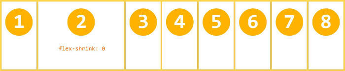
- flex-shrink:1(缩小) 0(不缩小) 缩小比例【对项目内容的缩放比例,越大缩越多】
- flex-basis:100px 设置宽度,覆盖width
- flex:auto (1 1 auto) 和 none (0 0 auto) flex-grow, flex-shrink 和 flex-basis的简写
- align-self:auto(继承父元素) 单个项目交叉轴对齐方式,可覆盖align-items属性
1.order:定义项目的排列顺序。数值越小,排列越靠前,默认为0。
2.flex-grow:
当父元素的宽度大于所有子元素的宽度的和时(即父元素会有剩余空间),子元素如何分配父元素的剩余空间。
默认值为0,意思是该元素不索取父元素的剩余空间,如果值大于0,表示索取。值越大,索取的越厉害。
如果所有项目的flex-grow属性都为1,则它们将等分剩余空间(如果有的话)。
如果一个项目的flex-grow属性为2,其他项目都为1,则前者占据的剩余空间将比其他项多一倍。
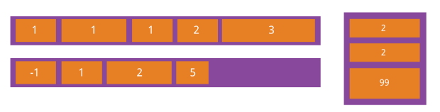
例:父元素宽400px.
A:width:100px; flex-grow:1;
B:width:200px; flex-grow:2;
则:A:自身宽度(100px)+ A获得的剩余空间的宽度(100px * (1/(1+2)))
B:自身宽度(200px)+ B获得的剩余空间的宽度(100px * (2/(1+2)))
3.flex-shrink:
当父元素的宽度小于所有子元素的宽度的和时(即子元素会超出父元素),子元素如何缩小自己的宽度的。
默认值为1,当父元素的宽度小于所有子元素的宽度的和时,子元素的宽度会减小。值越大,减小的越厉害。如果值为0,表示不减小。
如果所有项目的flex-shrink属性都为1,当空间不足时,都将等比例缩小。
如果一个项目的flex-shrink属性为0,其他项目都为1,则空间不足时,前者不缩小。
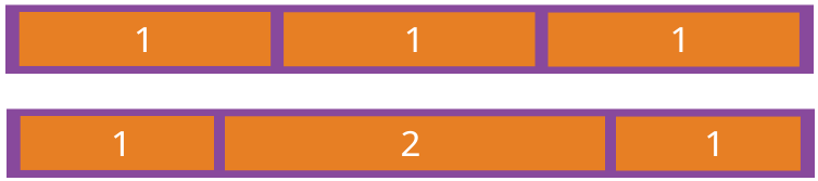
例:父级宽度是300px。A, B, C 的宽度分别是155px, 200px, 50px。flex-shrink分别是2,1,1。超出的空间就是 -105px。
- 每个项目的width值乘以flex-shrink值求积,
A:(155 * 2) = 310
B:(200 * 1) = 200
C:(50 * 1) = 50
- 然后再求和所有项目的乘积。
(310 + 200 + 50) = 560
- 得到求占比之后还要乘以要腾出的空间。
A:(310 / 560) * 105 = 58.125
B:(200 / 560) * 105 = 37.5
C:(50 / 560) * 105 = 9.375
- 得到每一项要腾出的空间,这样就得出计算后的宽度了。
A:(155 - 58.125) = 96.875
B:(200 - 37.5) = 162.5
C:(50 - 9.375) = 40.625
【注】 如果父级的空间足够:flex-grow有效,flex-shrink无效。
如果父级的空间不够:flex-shrink 有效,flex-grow无效。
4.flex-basis:该属性来设置该元素的宽度。当然,width也可以用来设置元素宽度。如果元素上同时设置了width和flex-basis,那么flex-basis会覆盖width的值。它的默认值为auto,即项目的本来大小。
5.flex:flex-grow, flex-shrink 和 flex-basis的简写,默认值为0 1 auto。后两个属性可选。
该属性有两个快捷值:auto (1 1 auto) 和 none (0 0 auto)。
建议优先使用这个属性,而不是单独写三个分离的属性,因为浏览器会推算相关值。
6.align-self:允许单个项目有与其他项目不一样的对齐方式,可覆盖align-items属性。默认值为auto,表示继承父元素的align-items属性,如果没有父元素,则等同于stretch。
该属性可能取6个值,除了auto,其他都与align-items属性完全一致。
实例练习
1.基本网格布局,就是平均分布。
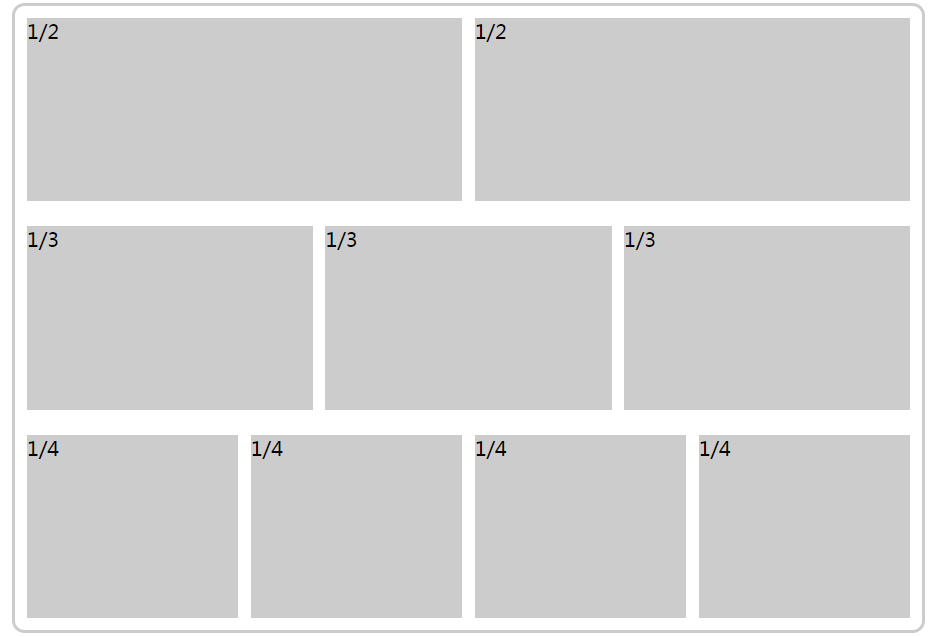
<div class="box">
<div>
<div>1/2</div>
<div>1/2</div>
</div>
<div>
<div>1/3</div>
<div>1/3</div>
<div>1/3</div>
</div>
<div>
<div>1/4</div>
<div>1/4</div>
<div>1/4</div>
<div>1/4</div>
</div>
</div>
.box{
margin: 0 auto;
width: 90%;
height: 600px;
background-color: #ffffff;
border-radius: 10px;
border:2px solid #cccccc;
display:flex;
flex-direction: column;
justify-content: space-around;
}
.box>div{
height:180px ;
display:flex;
flex-direction: row;
}
.box>div>div{
flex:auto;
margin: 5px;
background-color: #cccccc;
}
2.某个网格的宽度为固定的百分比,其余网格平均分配剩余的空间。
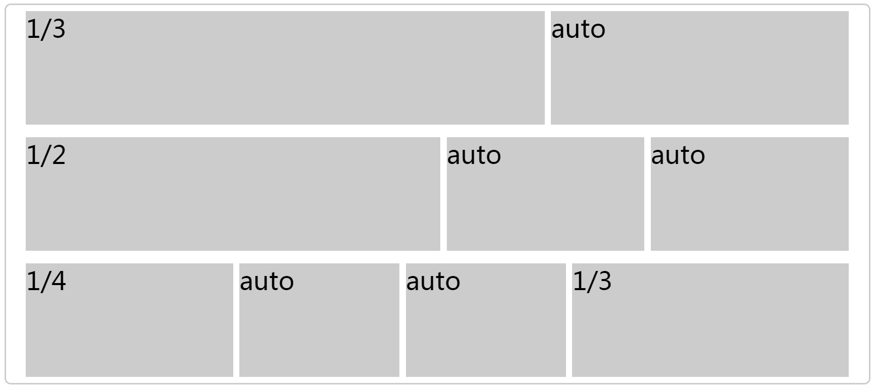
<div class="box">
<div>
<div class="item1">1/3</div>
<div class="item">auto</div>
</div>
<div>
<div class="item2">1/2</div>
<div class="item">auto</div>
<div class="item">auto</div>
</div>
<div>
<div class="item3">1/4</div>
<div class="item">auto</div>
<div class="item">auto</div>
<div class="item4">1/3</div>
</div>
</div>
.box{
font-size: 40px;
margin: 0 auto;
width: 90%;
height: 600px;
background-color: #ffffff;
border-radius: 10px;
border:2px solid #cccccc;
display:flex;
flex-direction: column;
justify-content: space-around;
align-items: center;
}
.box>div{
width: 96%;
height:180px ;
display:flex;
flex-direction: row;
}
.item{
flex:auto;
background-color: #cccccc;
margin:0 5px;
}
.item1{
flex:33.333%;
background-color: #cccccc;
margin:0 5px;
}
.item2{
flex:0 50%;
background-color: #cccccc;
margin:0 5px;
}
.item3{
flex:0 25%;
background-color: #cccccc;
margin:0 5px;
}
.item4{
flex:0 33.333%;
background-color: #cccccc;
margin:0 5px;
}
3.圣杯布局(Holy Grail Layout)指的是一种最常见的网站布局。页面从上到下,分成三个部分:头部(header),躯干(body),尾部(footer)。其中躯干又水平分成三栏,从左到右为:导航、主栏、副栏。
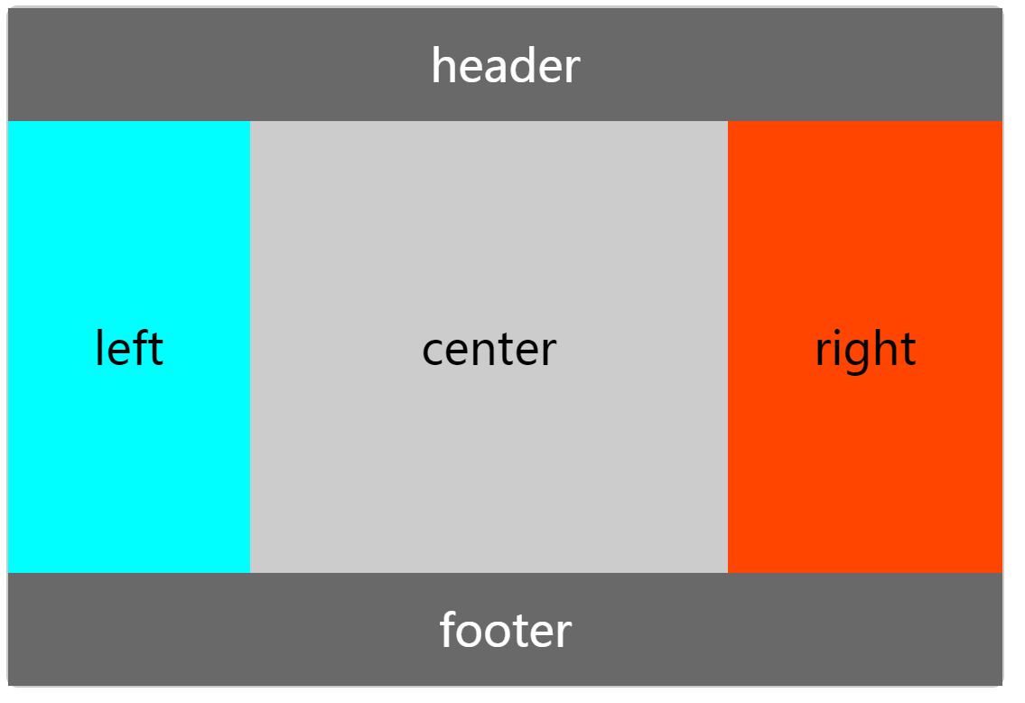
<div class="box">
<div class="header">header</div>
<div class="section">
<div class="left">left</div>
<div class="center">center</div>
<div class="right">right</div>
</div>
<div class="footer">footer</div>
</div>
.box{
font-size: 40px;
margin: 0 auto;
width: 90%;
height: 600px;
background-color: #ffffff;
border-radius: 10px;
border:2px solid #cccccc;
display:flex;
flex-direction: column;
}
.header,.footer{
height: 100px;
background-color: dimgrey;
color: white;
text-align: center;
line-height: 100px;
}
.section{
flex:auto;
display:flex;
}
.section>div{
text-align: center;
line-height: 400px;
}
.left{
background-color: aqua;
flex-grow:1;
}
.center{
background-color: #cccccc;
flex-grow:2;
}
.right{
background-color: orangered;
flex-grow:1;
}
http://www.ruanyifeng.com/blog/2015/07/flex-examples.html Flex 布局教程:实例篇
http://www.ruanyifeng.com/blog/2015/07/flex-grammar.html?utm_source=tuicool Flex 布局教程:语法篇
http://static.vgee.cn/static/index.html Flex 布局示例
https://www.jianshu.com/p/0642dfe0e571 flex-grow、flex-shrink、flex-basis详解
https://segmentfault.com/a/1190000006741711 深入理解 flex-grow & flex-shrink & flex-basis


 扫一扫
扫一扫


 148
148

 被折叠的 条评论
为什么被折叠?
被折叠的 条评论
为什么被折叠?
 到【灌水乐园】发言


