


之前项目中使用highchart绘制了几个统计图,搜寻了许久才找到多色带的实现方式,故做此分享,供大家参考。
实现的效果图如下:
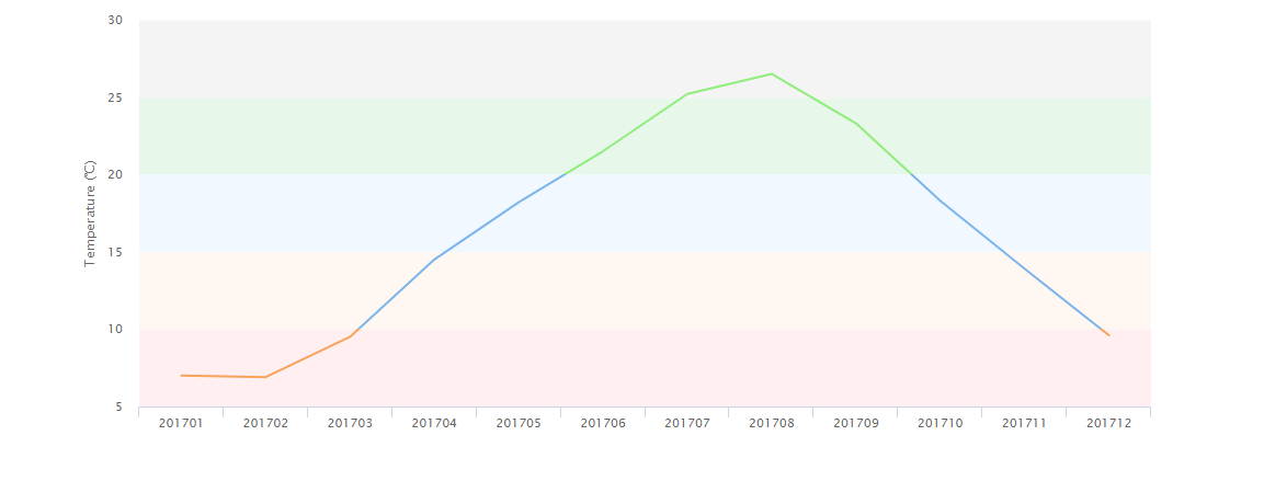
代码:
<!doctype html>
<html>
<head>
	<meta charset="UTF-8">
	<title>Document</title>
	<script src="http://cdn.bootcss.com/jquery/2.1.4/jquery.min.js"></script>
	 <script src="http://code.highcharts.com/highcharts.js"></script>
</head>
<body>
<div id="container" style="width: 1000px; height: 400px; margin: 0 auto"></div>
<script language="JavaScript">
$(document).ready(function() {

 var chart = {
            plotBackgroundColor: {
                //linearGradient: [0, 0, 500, 500],
                stops: [
                    [0, 'rgb(255, 255, 255)'],
                    [1, 'rgb(200, 200, 255)']
                ]
                //color:[]
            },
            panning: true,
            type: 'line'
        }
	  var title = {
      text: null
   };
   /*var subtitle = {
        text: 'Source: runoob.com'
   };*/
   var xAxis = {
       categories: ['201701', '201702', '201703', '201704', '201705', '201706'
              ,'201707', '201708', '201709', '201710', '201711', '201712'],
       labels: {
        rotation: 0
    	} //设置x轴倾斜角度
   };
   var yAxis = {
   	//设置样式
      className: 'highcharts-color-1',
      //隔行显示不同的颜色
      //alternateGridColor: '#FDFFD5',
      title: {
         text: 'Temperature (\xB0C)'
      },
      gridLineWidth:'0px',
      plotLines: [{
         value: 0,
         width: 1,
         color: '#808080',
      }],
      //设置分辨带,沿y轴显示不同颜色
       plotBands:[
                {
                    from:30,
                    to:25,
                    color:'#f4f4f4',
                    label:{
                        //text: 'level1',
                        style:{color:'#808080'}
                    }
                },
                {
                    from:25,
                    to:20,
                    color: '#e7f7e9',
                    label:{
                       // text: 'level2',
                        style:{color:'#606060'}
                    }
                },
                {
                    from:20,
                    to:15,
                    color:'#f1f8ff',
                    label:{
                       // text:'level3',
                        style:{color:'#ccc'}
                    }
                },
                {
                    from:15,
                    to:10,
                    color:'#fff7f2',
                    label:{
                        //text:'level4',
                        style:{color:'#fff'}
                    }
                },
                {
                    from:10,
                    to:5,
                    color:'#Ffeff0',
                    label:{
                       // text:'level5',
                        style:{color:'#ff3300'}
                    }
                }
            ]

   };

   var tooltip = {
      valueSuffix: '\xB0C'
   }
   //图例设置
   var legend = {
      layout: 'vertical',
      align: 'right',
      verticalAlign: 'middle',
      borderWidth: 0,
      enabled: false
   };
   //增加访问链接设置
    var credits = {
            	text: 'Example.com',
            	enabled:false
            	//href: 'http://www.example.com'
        	}
      //数据点配置设置
     var plotOptions = {
            series: {
                marker: {
                    enabled: false, /*数据点是否显示*/
                    //radius: 5,  /*数据点大小px*/
                    //fillColor:'#ff3300'         /*数据点颜色*/
                },


            }
        }
   var series =  [
      {
         name: '策略评分',
         data: [7.0, 6.9, 9.5, 14.5, 18.2, 21.5, 25.2,
            26.5, 23.3, 18.3, 13.9, 9.6],
            zones: [{
                      value: 10,
                     color: '#f7a35c',
                    //dashStyle: 'dot'
                 }, {
                    value: 20,
                    color: '#7cb5ec'
                },{
                  color: '#90ed7d'
                 }]
      }
   ];

   var json = {};
   json.chart = chart;
   json.title = title;
   //json.subtitle = subtitle;
   json.xAxis = xAxis;
   json.yAxis = yAxis;
   json.tooltip = tooltip;
   json.legend = legend;
   json.series = series;
   json.credits = credits;
   json.plotOptions = plotOptions;
  // json.scrollbar =scrollbar;
   json.navigator = navigator;
   //json.rangeSelector = rangeSelector;

   $('#container').highcharts(json);

});
</script>

</body>
</html>


 3571
3571

 被折叠的 条评论
为什么被折叠?
被折叠的 条评论
为什么被折叠?
 到【灌水乐园】发言


