


上一篇我们讲到自定义ViewChatgpt左侧的头像,本节继续讲解三个部分
- 右侧内容区域
- 整个item的布局
- 整个列表数据的加载
先看看右侧内容
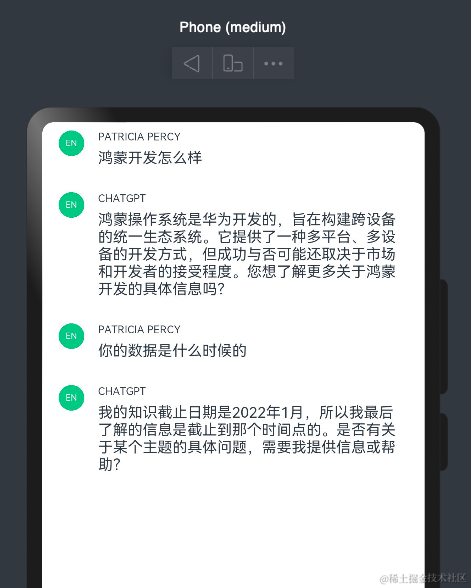
先上代码上图,可以看出此视图用了Column+Text
@Entry
@Component
export default struct ContentComponent {
  build() {
    Column() {
      Text("PATRICIA PERCY")
        .fontSize(10)
        .margin({ bottom: 6 })
      Text("鸿蒙开发怎么样")
        .fontSize(14)
    }.alignItems(HorizontalAlign.Start)
    .padding({ top: 16, left: 8, right: 16, bottom: 8 })
  }
}

Text控件上节我们已经介绍过,下面介绍下Column布局
Column其实是线性布局的一种,类似于android中的LinearLayout,子元素垂直方向上排列

Column可以让子元素在水平方向上有三种排列方式
HorizontalAlign.Start, HorizontalAlign.Center,HorizontalAlign.End

回到我们的项目,这里用到了HorizontalAlign.Start,让子元素靠左剧中,让用户名跟内容靠左
下面我们将昨天绘制的头像区域跟内容区域结合起来,这里为了给大家看清楚布局区域,特意给指定区域添加背景色

这里用到一个Row布局将整个item分成两部分,左边放头像占比10%,右侧放内容区域占比90%,下面我们讲下Row布局,Row布局也是线性布局,相当于让子元素横向排列
跟Column布局一样Row布局也有三种排列方式VerticalAlign.Top,VerticalAlign.Center,VerticalAlign.Bottom分别对应上中下,本项目设置的是VerticalAlign.Top
item写完后下面就介绍下列表布局老规矩先上图
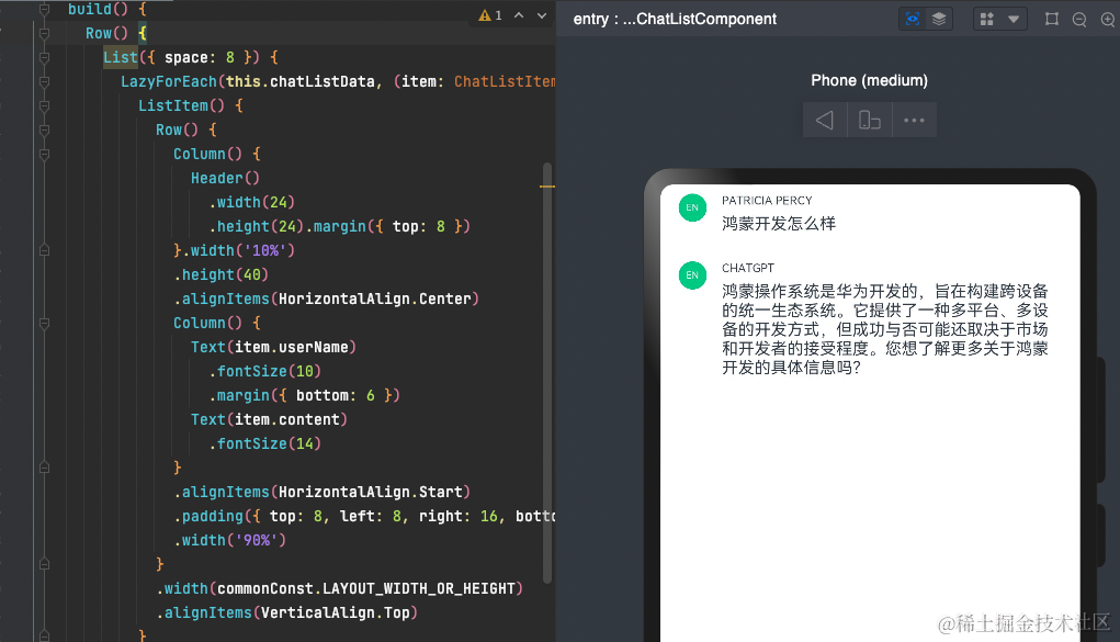
@Entry
@Component
export default struct ChatList {
@Provide chatListData: ListDataSource = new ListDataSource();
build() {
Row() {
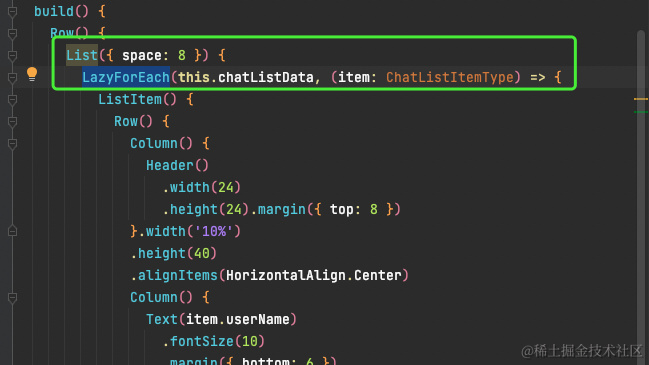
List({ space: 8 }) {
LazyForEach(this.chatListData, (item: ChatListItemType) => {
ListItem() {
Row() {
Column() {
Header()
.width(24)
.height(24).margin({ top: 8 })
}.width('10%')
.height(40)
.alignItems(HorizontalAlign.Center)
Column() {
Text(item.userName)
.fontSize(10)
.margin({ bottom: 6 })
Text(item.content)
.fontSize(14)
}
.alignItems(HorizontalAlign.Start)
.padding({ top: 8, left: 8, right: 16, bottom: 8 })
.width('90%')
}
.width(commonConst.LAYOUT_WIDTH_OR_HEIGHT)
.alignItems(VerticalAlign.Top)
}
})
}
.width(commonConst.GOODS_LIST_WIDTH)
}
.justifyContent(FlexAlign.Center)
.width(commonConst.LAYOUT_WIDTH_OR_HEIGHT)
}
}
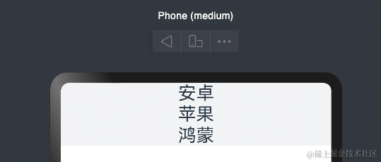
可以看出其实就是list控件包裹了我们上面实现的item,下面介绍下list用法看下最简单用法
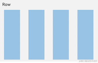
list也有水平跟竖直排列
默认是垂直方向
@Component
struct PlatList {
  build() {
    List() {
      ListItem() {
        Text('安卓').fontSize(24)
      }

      ListItem() {
        Text('苹果').fontSize(24)
      }

      ListItem() {
        Text('鸿蒙').fontSize(24)
      }
    }
    .backgroundColor('#FFF1F3F5')
    .alignListItem(ListItemAlign.Center)
  }
}
横向排列

多列可以设置列数
List() {
  ...
}
.lanes(2)

接下来我们看下数据绑定
ArkTS通过ForEach提供了组件的循环渲染能力
首先我们定义一个class对象
export class ChatListItemType {
  headImg: Resource;
  userName: Resource;
  content: Resource;

  constructor(headImg: Resource, userName: Resource,content: Resource) {
    this.headImg = headImg;
    this.userName = userName;
    this.content = content
  }
}
接下来模拟一组数据
export const chatInitialList: ChatListItemType[] = [
  new ChatListItemType($r('app.media.goodsImg'), $r('app.string.user'), $r('app.string.user_qa')),
  new ChatListItemType($r('app.media.goodsImg_2'), $r('app.string.gpt'), $r('app.string.gpt_answer')),
]
然后就可以在我们ChatList做列表迭代
最后上个图
下一节预告,我们将介绍头部区域,底部区域实现,欢迎学习
往期章节


 被折叠的 条评论
为什么被折叠?
被折叠的 条评论
为什么被折叠?
 到【灌水乐园】发言


