


1. 两个div横向排列,并顶端对齐
(1) 左右两个div都设置为float:left,如果div没有设置宽度, div的宽度会根据div里的内容自动调整。
<!DOCTYPE html PUBLIC "-//W3C//DTD XHTML 1.0 Transitional//EN"
"http://www.w3.org/TR/xhtml1/DTD/xhtml1-transitional.dtd">
<html xmlns="http://www.w3.org/1999/xhtml">
<head>
<meta http-equiv="Content-Type" content="text/html; charset=utf-8"
/>
<title>无标题文档</title>
<style type="text/css">
* { margin: 0; padding:0;}
.left {
float: left;
width: 200px;
height: 200px;
background:#009966;
}
.right {
height: 200px;
background: #FF6633;
float:left;
}
</style>
</head>
<body>
<div class="left">I am left</div>
<div class="right">I am right</div>
</body>
</html>
(2) 只有左侧div设置为float:left,右侧div设置overflow:auto;,右侧div将会占据整个右侧剩余宽度。
<!DOCTYPE html PUBLIC "-//W3C//DTD XHTML 1.0 Transitional//EN"
"http://www.w3.org/TR/xhtml1/DTD/xhtml1-transitional.dtd">
<html xmlns="http://www.w3.org/1999/xhtml">
<head>
<meta http-equiv="Content-Type" content="text/html; charset=utf-8"
/>
<title>无标题文档</title>
<style type="text/css">
* { margin: 0; padding:0;}
.left {
float:left;
width: 200px;
height: 200px;
background:#009966;
}
.right {
height: 200px;
background: #FF6633;
overflow:auto;
}
</style>
</head>
<body>
<div class="left">I am left</div>
<div class="right">I am right</div>
</body>
</html>
(3) 两个div都设置为display: inline-block;这样可能会出现两个div顶端不对齐的情况,可以在右侧div设置vertical-align: top;
<!DOCTYPE html PUBLIC "-//W3C//DTD XHTML 1.0 Transitional//EN"
"http://www.w3.org/TR/xhtml1/DTD/xhtml1-transitional.dtd">
<html xmlns="http://www.w3.org/1999/xhtml">
<head>
<meta http-equiv="Content-Type" content="text/html; charset=utf-8"
/>
<title>无标题文档</title>
<style type="text/css">
* { margin: 0; padding:0;}
.left {
display: inline-block;
width: 200px;
height: 200px;
background:#009966;
}
.right {
height: 200px;
background: #FF6633;
display: inline-block;
vertical-align: top; //与左侧div顶部对齐
}
</style>
</head>
<body>
<div class="left">I am left</div>
<div class="right">I am right</div>
</body>
</html>
Add: display:block就是将元素显示为块级元素.
block元素的特点是:
总是在新行上开始;
高度,行高以及顶和底边距都可控制;
宽度缺省是它的容器的100%,除非设定一个宽度
<div>, <p>, <h1>, <form>, <ul> 和 <li>是块元素的例子。
display:inline就是将元素显示为行内元素.
inline元素的特点是:
和其他元素都在一行上;
高,行高及顶和底边距不可改变;
宽度就是它的文字或图片的宽度,不可改变。
<span>, <a>, <label>, <input>, <img>, <strong> 和<em>是inline元素的例子。
inline和block可以控制一个元素的行宽高等特性,需要切换的情况如下:
让一个inline元素从新行开始;
让块元素和其他元素保持在一行上;
控制inline元素的宽度(对导航条特别有用);
控制inline元素的高度;
无须设定宽度即可为一个块元素设定与文字同宽的背景色。
display:inline-block将对象呈递为内联对象,但是对象的内容作为块对象呈递。旁边的内联对象会被呈递在同一行内,允许空格。
inline-block的元素特点:
将对象呈递为内联对象,但是对象的内容作为块对象呈递。旁边的内联对象会被呈递在同一行内,允许空格。(准确地说,应用此特性的元素呈现为内联对象,周围元素保持在同一行,但可以设置宽度和高度地块元素的属性)
并不是所有浏览器都支持此属性,目前支持的浏览器有:Opera、Safari在IE中对内联元素使用display:inline-block,IE是不识别的,但使用display:inline-block在IE下会触发layout,从而使内联元素拥有了display:inline-block属性的表症。从上面的这个分析,也不难理解为什么IE下,对块元素设置display:inline-block属性无法实现inline-block的效果。这时块元素仅仅是被display:inline-block触发了layout,而它本就是行布局,所以触发后,块元素依然还是行布局,而不会如Opera中块元素呈递为内联对象。
IE下块元素如何实现display:inline-block的效果?
有两种方法:
1、先使用display:inline-block属性触发块元素,然后再定义display:inline,让块元素呈递为内联对象(两个display要先后放在两个CSS声明中才有效果,这是IE的一个经典bug,如果先定义了display:inline-block,然后再将display设回inline或block,layout不会消失)。代码如下(...为省略的其他属性内容):
div {display:inline-block;...}
div {display:inline;}
2、直接让块元素设置为内联对象呈递(设置属性display:inline),然后触发块元素的layout(如:zoom:1等)。代码如下:
div {display:inline; zoom:1;...}
以下用个例子来说明三者的区别和用
<!DOCTYPE html PUBLIC "-//W3C//DTD XHTML 1.0 Transitional//EN" "http://www.w3.org/TR/xhtml1/DTD/xhtml1-transitional.dtd">
<html xmlns="http://www.w3.org/1999/xhtml">
<head>
<meta http-equiv="Content-Type" content="text/html; charset=gb2312" />
<title>display:inline、block、inline-block的区别</title>
</head>
<style>
div,span{background-color:green;margin:5px;border:1px solid #333;padding:5px;height:52px;color:#fff;}
.b{display:block;}
.i{display:inline;}
div.ib{display:inline-block;}
div.ib{display:inline;}
a.ib{display:inline-block;}
a.ib{display:block;}
span.v{padding:0;margin:0;border:0;vertical-align:middle;height:100%}
</style>
<body>
<div>div display:block</div>
<div class="i">div display:inline</div>
<div class="ib">div display:inline-block</div>
<span>span display:inline</span>
<span class="b">span display:block</span>
<span><a class="ib">a display:block</a></span><br />
<div><span class="v"></span>vertical-align:middle</div>
</body>
</html>
2. 点击一个div展开另一个div时,防浏览器底部遮挡
Javascript:
IE中:
document.body.clientWidth ==> BODY对象宽度
document.body.clientHeight ==> BODY对象高度
document.documentElement.clientWidth ==> 可见区域宽度
document.documentElement.clientHeight ==> 可见区域高度
FireFox中:
document.body.clientWidth ==> BODY对象宽度
document.body.clientHeight ==> BODY对象高度
document.documentElement.clientWidth ==> 可见区域宽度
document.documentElement.clientHeight ==> 可见区域高度
Opera中:
document.body.clientWidth ==> 可见区域宽度
document.body.clientHeight ==> 可见区域高度
document.documentElement.clientWidth ==> 页面对象宽度(即BODY对象宽度加上Margin宽)
document.documentElement.clientHeight ==> 页面对象高度(即BODY对象高度加上Margin高)
alert(document.body.clientWidth); //网页可见区域宽(body)
alert(document.body.clientHeight); //网页可见区域高(body)
alert(document.body.offsetWidth); //网页可见区域宽(body),包括border、margin等
alert(document.body.offsetHeight); //网页可见区域宽(body),包括border、margin等
alert(document.body.scrollWidth); //网页正文全文宽,包括有滚动条时的未见区域
alert(document.body.scrollHeight); //网页正文全文高,包括有滚动条时的未见区域
alert(document.body.scrollTop); //网页被卷去的Top(滚动条)
alert(document.body.scrollLeft); //网页被卷去的Left(滚动条)
alert(window.screenTop); //浏览器距离Top
alert(window.screenLeft); //浏览器距离Left
alert(window.screen.height); //屏幕分辨率的高
alert(window.screen.width); //屏幕分辨率的宽
alert(window.screen.availHeight); //屏幕可用工作区的高
alert(window.screen.availWidth); //屏幕可用工作区的宽
Jquery
alert($(window).height()); //浏览器当前窗口可视区域高度
alert($(document).height()); //浏览器当前窗口文档的高度
alert($(document.body).height()); //浏览器当前窗口文档body的高度
alert($(document.body).outerHeight(true)); //浏览器当前窗口文档body的总高度 包括border padding margin
alert($(window).width()); //浏览器当前窗口可视区域宽度
alert($(document).width()); //浏览器当前窗口文档对象宽度
alert($(document.body).width()); //浏览器当前窗口文档body的宽度
alert($(document.body).outerWidth(true)); //浏览器当前窗口文档body的总宽度 包括border padding margin
Add: 1. $("#div_id").height(); // 获得的是该div本身的高度, (不包含padding,margin,border)
2. $("#div_id").outerHeight(); // 包含该div本身的高度, padding上下的高度, 以及border上下的高度(不包含margin的高度)
3. $("#div_id").outerHeight(true); // 包含该div本身的高度, 以及padding,border,margin上下的总高度
JQuery中animate()方法用法实例
方式一:
以“属性名/值”对象的方式定义动画终止样式属性。例如:
代码如下:
$("div").animate( {width:"1000px"})
以上代码能够将div从原有的宽度调整到1000px。也可以一次性使用多组“属性名/值”对象。例如:
代码如下:
$("div").animate( {width:"1000px",fontSize:20})
以上代码能够将div从原有的宽度调整到1000px,从原有的字体大小调整到20px。需要特别注意以下三点:
1.如果尺寸没有单位,那么默认单位是px。
2.属性值需要用双引号包裹,如果属性值是数字的话可以省略。
3.类似font-szie或者background-color这样的属性需要去掉中间的中横线,并且第二个单词首字母要大写。
animate()方法可以明确的规定动画效果持续的时间,如果不规定则使用默认值normal。例如:
代码如下:
$("div").animate( {width:"1000px",fontSize:20},2000)
以上代码规定动画效果在2000毫秒(2秒)后完成。
在动画执行完成后可以调用回调函数。例如:
代码如下:
$("div").animate( {width:"1000px"},5000,function(){alert("调整完成")})
以上代码能够在动画完成以后触发回调函数,于是弹出一个提示框。
实例代码:
代码如下:
<!DOCTYPE html>
<html>
<head>
<meta charset=" utf-8">
<meta name="author" content="http://www.jb51.net/" />
<title>脚本之家</title>
<style type="text/css">
div{
width:150px;
height:150px;
border:1px solid blue;
}
</style>
<script type="text/javascript" src="mytest/jQuery/jquery-1.8.3.js"></script>
<script type="text/javascript">
$(document).ready(function(){
$("button").click(function(){
$("div").animate( {width:"1000px",fontSize:20},5000,function(){alert("调整完成")});
});
});
</script>
</head>
<body>
<div>小蚂蚁</div>
<button id="btn1">执行个动画</button>
</body>
</html>
方式二:
方式一中,只有定义动画终止样式属性的时候使用大括号{},后面比如动画速度、回调函数等等都是裸露的,他们之间都是用逗号间隔。在我们将要介绍的方式二中,速度、回调函数、队列等等都要放在大括号{}中。例如:
代码如下:
$("div").animate( {width:"1000px"}, {queue:false, duration:1000,complete:function(){alert("ok")}})
queue参数可以规定动画是否加入动画队列执行,如果进入动画队列,将按照顺序执行,也就是第一个动画执行完成之后,队列中的第二个动画再执行,以此类推。如果queue参数值为true就是将动画加入队列执行,否则就是不加入队列。
duration参数就是定义动画的持续时间。
complete参数定义动画的回调函数。
实例代码:
代码如下:
<!DOCTYPE html>
<html>
<head>
<meta charset=" utf-8">
<meta name="author" content="http://www.jb51.net/" />
<title>脚本之家</title>
<style type="text/css">
.first{
width:150px;
height:150px;
border:1px solid blue;
}
.second{
width:150px;
height:150px;
border:1px solid blue;
}
</style>
<script type="text/javascript" src="mytest/jQuery/jquery-1.8.3.js"></script>
<script type="text/javascript">
$(document).ready(function(){
$("#btn1").click(function(){
$(".first").animate({width:"1000px"},{queue:true, duration:5000,complete:function a(){alert("宽度设置完成")}})
.animate( {fontSize:'7em'},{queue:true, duration:5000})
.animate( {borderWidth:10},{queue:true, duration:5000,complete:function a(){alert("宽度设置完成")}});
});
$("#btn2").click(function(){
$(".second").animate({width:"1000px"},{queue:false, duration:1000})
.animate( {fontSize:'7em'} , 1000 )
.animate( {borderWidth:10}, 1000);
})
})
</script>
</head>
<body>
<div class="first">欢迎来到脚本之家</div>
<div class="second">欢迎来到脚本之家</div>
<button id="btn1">执行第一个动画</button>
<button id="btn2">执行第二个动画</button>
</body>
</html>
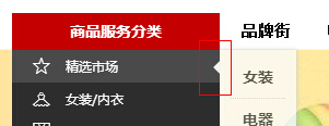
3. 气泡效果尖角的实现
在各种网站里面,我们会经常看到类似于这样的尖角:(示例:新浪微博)
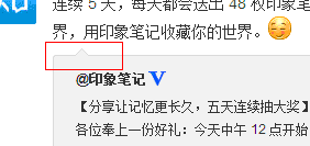
它实现的方式有多种,哪种才是最简单的?哪种才是最优秀的?首先我声明一下,我还不清楚这个东西具体叫什么名字(哪位知道还望告知),暂且叫尖角吧,通俗易懂。我查看了各大互联网公司的网站,包括腾讯、百度、新浪、天猫、去哪网,
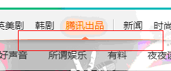
腾讯:
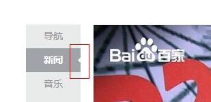
百度:
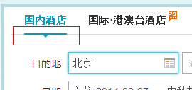
去哪网:
天猫:
其中,百度和腾讯直接用的背景图片,简单粗暴,没有艺术细菌。
优点:形状随意;
缺点:不方便维护;
下面要说的是新浪微博,右键小尖角,查看元素,可以看到一段代码:
<div class="WB_arrow"><em class="S_line1_c">◆</em><span class="S_bg1_c">◆</span></div>
可以发现,新浪是利用◆文字图标,颜色与背景色一致,外层边框同理,两个◆叠起来留,一上一下留出一个像素就算是边框了,很巧妙。为了便于理解,我把这两块◆改成便于区分的颜色,如下图:
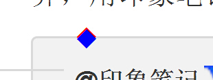
蓝色块刚好把红色块”下半身“遮住了。如果不太明白,请直接移步新浪微博查看源码。
优点:大小颜色随意、方便维护;
缺点:形状固定;
让人欣慰的是天猫和去哪网的做法,完全代码实现。以天猫为例:
html部分:
<i class="market-nav-arrow"></i>
css部分:
height: 0;
font-size: 0;
line-height: 0;
border-style: solid;
border-width: 7px 7px 7px 0;
border-color: transparent #f3f3f3;
利用css边框来模拟尖角,最重要的一句是
border-color: transparent #f3f3f3;
上下边框透明,左右设定尖角需要的颜色,而左边框的大小为0,剩下一个大小为7px的右边框,就构成了上图天猫中的尖角,让我把右边框大小设为7px,结果就这个样子:
border-width: 7px 7px 7px 7px;
左右两个尖角,如果需要向右的尖角,只需要把右边框大小设置为0px即可:
border-width: 7px 0px 7px 7px;
上下尖角同理,去哪网也是这么干的,个人比较喜欢这种方式。
优点:大小、颜色随意,方便维护;
缺点:形状单一
补充:如果不考虑IE6和7,最好的方式是利用伪类实现尖角效果:
<style>
.WB_arrow{width: 200px; height: 200px; border: 2px solid blue; position: relative; margin: 100px auto;}
.WB_arrow:before,.WB_arrow:after{ content: ""; width: 0; height: 0; position: absolute;display: block; border-width: 20px; border-style: solid; }
.WB_arrow:before{right: -40px; top: 40px; border-color: transparent transparent transparent blue;}
.WB_arrow:after{right: -38px; top: 40px; border-color: transparent transparent transparent white;}
</style>
<div class="WB_arrow"></div>
效果:
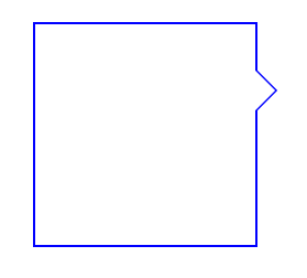
优点:大小、颜色随意,方便维护,减少不必要的代码;
缺点:不兼容IE6/7


 2939
2939

 被折叠的 条评论
为什么被折叠?
被折叠的 条评论
为什么被折叠?
 到【灌水乐园】发言


