


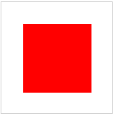
第一步:
先画一个正方形。如图:
| 1 2 3 4 5 6 7 8 9 10 11 12 13 14 15 16 17 18 19 20 21 22 23 24 25 | <!DOCTYPE html> <html> <head> <meta charset="utf-8"> <title>css画桃心</title> <style media="screen"> .heart-body { width: 500px; margin: 100px auto; position: relative; } .heart-shape { position: relative; width: 100px; height: 100px; background-color: #f70e0e; } </style> </head> <body> <div class="heart-body"> <div class="heart-shape"></div> </div> </body> </html> |
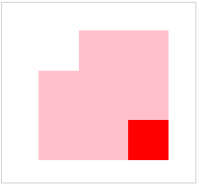
第二步:
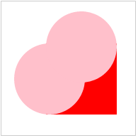
将利用伪元素before和 :after,在正方形的左边和上边各画一个正方形,然后再利用border-radius: 50%;属性,修饰下这两个正方形,然后就得到了两个圆,如图所示:
.heart-shape:before,
.heart-shape:after {
position: absolute;
content: '';
width: 100px;
height: 100px;
background-color: #ffc0cb;
}
.heart-shape:before {
left: -45px;
}
.heart-shape:after {
top: -45px;
}
利用border-radius: 50%; 属性:
.heart-shape:before,.heart-shape:after {
position: absolute;
content: '';
width: 100px;
height: 100px;
-webkit-border-radius: 50%;
/**兼容苹果;谷歌,等一些浏览器认*/
-moz-border-radius: 50%;
/**兼容火狐浏览器*/
-o-border-radius: 50%;
/**兼容opera浏览器*/
border-radius: 50%;
background-color: #ffc0cb;
}
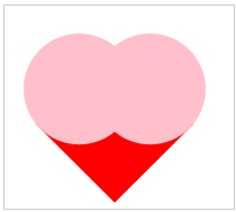
第三步:
类名为:heart-shape的div 利用transform: rotate(45deg); 属性将他们旋转45度,如图所示:
.heart-shape {
position: relative;
width: 100px;
height: 100px;
background-color: #f70e0e;
-webkit-transform: rotate(45deg);
/* Safari 和 Chrome */
-moz-transform: rotate(45deg);
/* Firefox */
-ms-transform: rotate(45deg);
/* IE 9 */
-o-transform: rotate(45deg);
/* Opera */
transform: rotate(45deg);
}
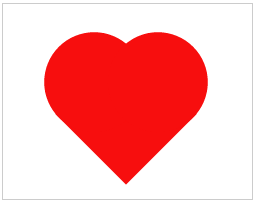
把圆的背景色和正方形的背景色没给统一的颜色,是为了大家更好的看到明显的效果图,接下来将其背景色设置成统一的,最终的爱心就出来了,如图所示:
.heart-shape:before,.heart-shape:after {
position: absolute;
content: '';
width: 100px;
height: 100px;
-webkit-border-radius: 50%;
/**兼容苹果;谷歌,等一些浏览器认*/
-moz-border-radius: 50%;
/**兼容火狐浏览器*/
-o-border-radius: 50%;
/**兼容opera浏览器*/
border-radius: 50%;
background-color: #f70e0e;
}
完整代码
<!DOCTYPE html>
<html>
<head>
<meta charset="UTF-8">
<title>css画桃心</title>
</head>
<style>
.heart_body {
width: 200px;
margin: 100px auto;
position: relative;
}
.heart_shape {
position: relative;
width: 100px;
height: 100px;
background: #f70e0e;
}
.heart_shape:before,
.heart_shape:after {
position: absolute;
content: '';
width: 100px;
height: 100px;
background: #f70e0e;
border-radius: 50%;
}
.heart_shape:before {
left: -45px;
}
.heart_shape:after {
top: -45px;
}
</style>
<body>
<div class="heart_body">
<div class="heart_shape"></div>
</div>
</body>
</html>


 972
972

 被折叠的 条评论
为什么被折叠?
被折叠的 条评论
为什么被折叠?
 到【灌水乐园】发言


