


在编写HTML页面时,我们会对文本、图片等等需要居中显示的时候,一般都是单独使用水平居中或者垂直居中,可是今天给大家讲讲css教程中的水平垂直同时居中的方法,一共有5种思路,现在分享给大家:
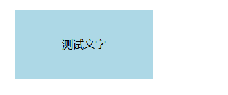
思路一: text-align + line-height实现单行文本水平垂直居中
<style>
.test{
text-align: center;
line-height: 100px;}</style>
<div class="test" style="background-color: lightblue;width: 200px;">测试文字</div>
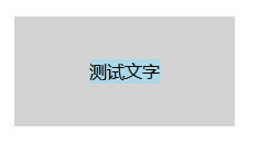
思路二: text-align + vertical-align
【1】在父元素设置text-align和vertical-align,并将父元素设置为table-cell元素,子元素设置为inline-block元素
[注意]若兼容IE7-浏览器,将结构改为<table>结构来实现table-cell的效果;用display:inline;zoom:1;来实现inline-block的效果
<style>
.parent{
display: table-cell;
text-align: center;
vertical-align: middle;}
.child{
display: inline-block;}</style>
<div class="parent" style="background-color: gray; width:200px; height:100px;">
<div class="child" style="background-color: lightblue;">测试文字</div></div>

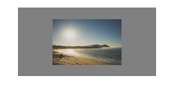
【2】若子元素是图像,可不使用table-cell,而是其父元素用行高替代高度,且字体大小设为0。子元素本身设置vertical-align:middle
<style>
.parent{
text-align: center;
line-height: 100px;
font-size: 0;}
.child{
vertical-align: middle;}</style>
<div class="parent" style="background-color: gray; width:200px; ">
<img class="child" src="http://www.maiziedu.com/uploads/rs/26/ddzmgynp/img1.gif" width="50%" alt="test"></div>
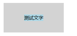
思路三: margin + vertical-align
要想在父元素中设置vertical-align,须设置为table-cell元素;要想让margin:0 auto实现水平居中的块元素内容撑开宽度,须设置为table元素。而table元素是可以嵌套在tabel-cell元素里面的,就像一个单元格里可以嵌套一个表格
[注意]若兼容IE7-浏览器,需将结构改为<table>结构
<style>
.parent{
display:table-cell;
vertical-align: middle;}
.child{
display: table;
margin: 0 auto;}</style>
<div class="parent" style="background-color: lightgray; width:200px; height:100px; ">
<div class="child" style="background-color: lightblue;">测试文字</div></div>
思路四: 使用absolute
【1】利用绝对定位元素的盒模型特性,在偏移属性为确定值的基础上,设置margin:auto
<style>
.parent{
position: relative;}
.child{
position: absolute;
top: 0;
left: 0;
right: 0;
bottom: 0;
height: 50px;
width: 80px;
margin: auto;}</style>
<div class="parent" style="background-color: lightgray; width:200px; height:100px; ">
<div class="child" style="background-color: lightblue;">测试文字</div></div>

【2】利用绝对定位元素的偏移属性和translate()函数的自身偏移达到水平垂直居中的效果
[注意]IE9-浏览器不支持
<style>
.parent{
position: relative;}
.child{
position: absolute;
top: 50%;
left: 50%;
transform: translate(-50%,-50%);}</style>
<div class="parent" style="background-color: lightgray; width:200px; height:100px; ">
<div class="child" style="background-color: lightblue;">测试文字</div></div>

【3】在子元素宽高已知的情况下,可以配合margin负值达到水平垂直居中效果
<style>
.parent{
position: relative;}
.child{
position: absolute;
top: 50%;
left: 50%;
width: 80px;
height: 60px;
margin-left: -40px;
margin-top: -30px;}</style>
<div class="parent" style="background-color: lightgray; width:200px; height:100px; ">
<div class="child" style="background-color: lightblue;">测试文字</div></div>
思路五: 使用flex
[注意]IE9-浏览器不支持
【1】在伸缩项目上使用margin:auto
<style>
.parent{
display: flex;}
.child{
margin: auto;}</style>
<div class="parent" style="background-color: lightgray; width:200px; height:100px; ">
<div class="child" style="background-color: lightblue;">测试文字</div></div>

【2】在伸缩容器上使用主轴对齐justify-content和侧轴对齐align-items
<style>
.parent{
display: flex;
justify-content: center;
align-items: center;}</style>
<div class="parent" style="background-color: lightgray; width:200px; height:100px; ">
<div class="child" style="background-color: lightblue;">测试文字</div></div>


 1371
1371


 被折叠的 条评论
为什么被折叠?
被折叠的 条评论
为什么被折叠?
 到【灌水乐园】发言


