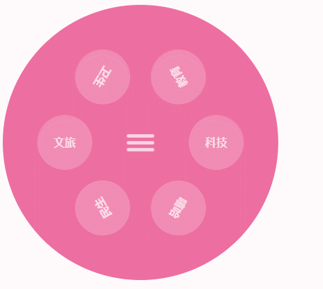
效果图
JS
import React, { useState } from 'react';
import styles from './style.less'
const index = () =>
{
const [navData, setNavData] = useState([
{ name: '文旅', id: 1, rotate: 0 },
{ name: '卫生', id: 2, rotate: 60 },
{ name: '教育', id: 3, rotate: 120 },
{ name: '科技', id: 4, rotate: 180 },
{ name: '嘻哈', id: 5, rotate: 240 },
{ name: '民生', id: 6, rotate: 300 },
])
const [isShow, setIsShow] = useState(true)
const [mouse, setMouse] = useState(false)
const [rotate, setRotate] = useState(0)
const click = () =>
{
setIsShow(!isShow)
}
const handleMouse = (flag) =>
{
return () =>
{
setMouse(flag)
}
}
const aaa = (index) =>
{
console.log(index - rotate);
setRotate(index)
}
return (
<div style={{ transform: `rotate(-${rotate}deg)`, transition: 'all 1s' }} className={styles.container}>
<nav className={styles.menu} >
<div
style={{ transform: `rotate(${rotate}deg)`, transition: 'all 1s' }}
onMouseEnter={handleMouse(true)}
onMouseLeave={handleMouse(false)} onClick={click} className={styles.togglerContainers}>
<div className={mouse ? styles.menu_toggler_active : styles.menu_toggler}></div>
</div>
<ul >
{
navData.map((data, index) => (
<li style={isShow ? { transform: `rotate(${data.rotate}deg) translateX(-110px)` } : null} key={index} className={`${styles.menu_item} ${isShow && styles.menu_item_active} `} >
{}
<a style={{ transform: `rotate(${data.rotate - rotate}deg)`, transition: 'all 1s' }} onClick={() => { aaa(data.rotate) }}>{data.name}</a>
</li>
))
}
</ul>
</nav>
</div >
);
};
export default index
CSS
.container {
  background: #ed6ea0;
  width: 400px;
  height: 400px;
  border-radius: 50%;

  .togglerContainers {
    position: absolute;
    display: block;
    top: 0;
    bottom: 0;
    left: 0;
    right: 0;
    margin: auto;
    width: 40px;
    height: 40px;
    z-index: 2;
    cursor: pointer;
  }

  .menu_toggler {
    width: 100%;
    height: 5px;
    display: block;
    z-index: 1;
    border-radius: 2.5px;
    background: rgba(255, 255, 255, 0.7);
    transition: transform 0.5s, top 0.5s;
    position: absolute;
    top: 0;
    bottom: 0;
    left: 0;
    right: 0;
    margin: auto;
  }

  .menu_toggler_active {
    width: 100%;
    height: 5px;
    display: block;
    z-index: 1;
    border-radius: 2.5px;
    background: rgba(255, 255, 255, 1);
    transition: transform 0.5s, top 0.5s;
    position: absolute;
    top: 0;
    bottom: 0;
    left: 0;
    right: 0;
    margin: auto;

    &::before,
    &::after {
      width: 40px;
      height: 5px;
      display: block;
      z-index: 1;
      border-radius: 2.5px;
      background: rgba(255, 255, 255, 1);
      transition: transform 0.5s, top 0.5s;
      content: "";
      position: absolute;
      left: 0;
    }

    &::after {
      top: -10px;
    }

    &::before {
      top: 10px;
    }
  }


  .menu_toggler::before,
  .menu_toggler::after {
    width: 40px;
    height: 5px;
    display: block;
    z-index: 1;
    border-radius: 2.5px;
    background: rgba(255, 255, 255, 0.7);
    transition: transform 0.5s, top 0.5s;
    content: "";
    position: absolute;
    left: 0;
  }

  .menu_toggler::before {
    top: 10px;
  }

  .menu_toggler::after {
    top: -10px;
  }


  // 活跃的按钮
  .menu_item_active {
    opacity: 1 !important;
  }

  .menu_item_active:nth-child(1) {
    transform: rotate(0deg) translateX(-110px);

  }

  .menu_item_active:nth-child(2) {
    transform: rotate(60deg) translateX(-110px);
  }

  .menu_item_active:nth-child(3) {
    transform: rotate(120deg) translateX(-110px);
  }

  .menu_item_active:nth-child(4) {
    transform: rotate(180deg) translateX(-110px);
  }

  .menu_item_active:nth-child(5) {
    transform: rotate(240deg) translateX(-110px);
  }

  .menu_item_active:nth-child(6) {
    transform: rotate(300deg) translateX(-110px);
  }

  .menu_item_active:nth-child(1) a {
    transform: rotate(0deg);
  }

  .menu_item_active:nth-child(2) a {
    transform: rotate(-60deg);
  }

  .menu_item_active:nth-child(3) a {
    transform: rotate(-120deg);
  }

  .menu_item_active:nth-child(4) a {
    transform: rotate(-180deg);
  }

  .menu_item_active:nth-child(5) a {
    transform: rotate(-240deg);
  }

  .menu_item_active:nth-child(6) a {
    transform: rotate(-300deg);
  }

  .menu_item {
    position: absolute;
    display: block;
    top: 0;
    bottom: 0;
    left: 0;
    right: 0;
    margin: auto;
    width: 80px;
    height: 80px;
    opacity: 0;
    transition: 0.5s;
  }

  .menu_item a {
    display: block;
    width: inherit;
    height: inherit;
    line-height: 80px;
    color: rgba(255, 255, 255, 0.7);
    background: rgba(255, 255, 255, 0.2);
    border-radius: 50%;
    text-align: center;
    text-decoration: none;
    font-size: 16px;
    transition: 0.2s;
    font-weight: 700;

    &:hover {
      box-shadow: 0 0 0 2px rgba(255, 255, 255, 0.3);
      color: #fff;
      background: rgba(255, 255, 255, 0.3);
      font-size: 18px;
    }
  }

}


 扫一扫
扫一扫
 999
999

 被折叠的 条评论
为什么被折叠?
被折叠的 条评论
为什么被折叠?
 到【灌水乐园】发言


