


Jetpack Compose改变了我们在Android上管理主题的方式。它提供了更大的灵活性,使我们能够以更多的方式定义用户界面(UI)。此外,Compose中的动画系统使我们能够轻松创建令人印象深刻和愉悦的UI动画。
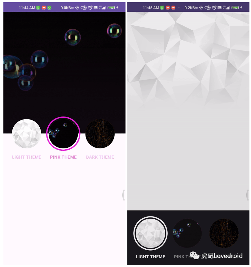
在本教程中,我将结合这两个特性,创建一个在主题之间过渡的动画。最终结果将如下所示:
为了创建这个动画,我们将使用AnimatedContent。它是一种工具,可以根据状态显示不同的内容。当状态发生变化时,内容会平稳地从前一个状态过渡到新的状态。首先,我们应该创建一个包含当前主题数据的对象,并将其作为状态传递进去。
data class CustomTheme(
    val primaryColor: Color,
    val backgroundColor: Color,
    val textColor: Color,
    val image: Int,
)

val darkTheme = CustomTheme(
    primaryColor = Color(0xFFE9B518),
    backgroundColor = Color(0xFF111111),
    textColor = Color(0xFFE8C660),
    image = R.drawable.dark,
)

val lightTheme = CustomTheme(
    primaryColor = Color(0xFFFFFFFF),
    backgroundColor = Color(0xFFF1F1F1),
    textColor = Color(0xFF232526),
    image = R.drawable.light,
)

val pinkTheme = CustomTheme(
    primaryColor = Color(0xFFF01EE5),
    backgroundColor = Color(0xFF110910),
    textColor = Color(0xFFEE8CE1),
    image = R.drawable.pink,
)
在这段代码中,我创建了一个数据类和三个具有不同颜色的主题。
现在,我们可以使用AnimatedContent,并将此对象设置为状态。
@OptIn(ExperimentalAnimationApi::class)
@Composable
fun ThemePicker() {
var theme by remember { mutableStateOf(lightTheme) }
AnimatedContent(
targetState = theme,
modifier = Modifier
.background(Color.Black)
.fillMaxSize(),
) { currentTheme ->
Surface(
modifier = Modifier
.fillMaxSize(),
color = currentTheme.backgroundColor
) {
Box {
Box(
modifier = Modifier
.fillMaxWidth()
.height(300.dp)
) {
Image(
painter = painterResource(id = currentTheme.image),
contentDescription = "headerImage",
contentScale = ContentScale.Crop,
)
Box(
modifier = Modifier
.fillMaxSize()
.background(
brush = Brush.verticalGradient(
colors = listOf(
Color.Transparent,
currentTheme.backgroundColor.copy(alpha = .2f),
currentTheme.backgroundColor
)
)
)
)
}
Row(
modifier = Modifier
.align(Alignment.Center),
horizontalArrangement = Arrangement.Center,
verticalAlignment = Alignment.CenterVertically,
) {
ThemeButton(
theme = lightTheme,
currentTheme = currentTheme,
text = "Light",
) {
theme = lightTheme
}
ThemeButton(
theme = darkTheme,
currentTheme = currentTheme,
text = "Dark",
) {
theme = darkTheme
}
ThemeButton(
theme = pinkTheme,
currentTheme = currentTheme,
text = "Pink",
) {
theme = pinkTheme
}
}
}
}
}
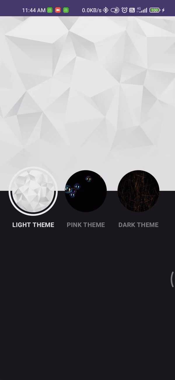
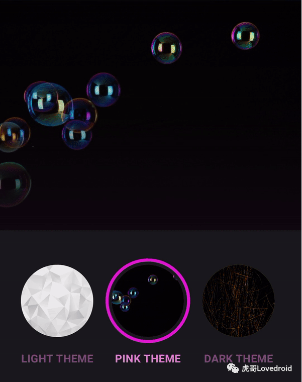
}初始状态的主题被设置并赋予AnimatedContent。在内容中,我们使用currentTheme来为用户界面进行样式设置。使用currentTheme而不只是"theme"是很重要的,这样在状态改变时可以避免过去内容的突然变化。用户界面包括一个头部图片和三个按钮,用于在不同主题之间进行切换。在这个阶段,我们将会看到以下这样的动画:
这是与AnimatedContent一起提供的标准动画。
transitionSpec = {
    fadeIn(
        initialAlpha = 0f,
        animationSpec = tween(100)
    ) with fadeOut(
        targetAlpha = .9f,
        animationSpec = tween(800)
    ) + scaleOut(
        targetScale = .95f,
        animationSpec = tween(800)
    )
}
可以,但我们需要修改它以实现最终结果中的循环揭示动画。
为了在AnimatedContent中实现所需的效果,我们需要一种特定的动画。新内容将快速淡入,而旧内容则会逐渐淡出并在较长时间内进行缩小。新内容快速淡入的目的是为了在揭示动画中立即开始。在AnimatedContent中切换状态时,新内容被视为完全新的组件,这会触发其自己的LaunchedEffect。我们将从这一点开始启动动画,并利用该值在新内容上进行一个圆形裁剪动画。
...
    var theme by remember { mutableStateOf(lightTheme) }
    var animationOffset by remember { mutableStateOf(Offset(0f, 0f)) }

    AnimatedContent(
        ...
    ) { currentTheme ->

        val configuration = LocalConfiguration.current
        val screenHeight = configuration.screenHeightDp.dp * 0.49f

        val revealSize = remember { Animatable(1f) }
        LaunchedEffect(key1 = "reveal", block = {
            if (animationOffset.x > 0f) {
                revealSize.snapTo(0f)
                revealSize.animateTo(
                    1f,
                    tween(800)
                )
            } else revealSize.snapTo(1f)
        })

        Box(
            modifier = Modifier
                .fillMaxSize()
                .clip(CirclePath(revealSize.value, animationOffset))
        ){
        Surface(
...animationOffset状态确定圆形动画的起始位置。我们将在ThemeButton内部设置它。revealSize控制剪裁新内容的动画圆的大小。在LaunchedEffect中,如果有有效的起始点,我们会启动圆形剪裁动画。如果没有有效的起始点,则表示这是打开屏幕时的初始组合,我们只需将动画快速切换到结尾。然后,我们用剪裁框将Surface包围起来。需要注意的是,我们使用自定义形状而不是默认的CircleShape,后者是带有大半径的圆角矩形。我需要一个与默认形状无法实现的不同外观。
class CirclePath(
    private val progress: Float,
    private val origin: Offset = Offset(0f, 0f),
): Shape {

    override fun createOutline(
        size: Size,
        layoutDirection: LayoutDirection,
        density: Density
    ): Outline {
        val center = Offset(
            x = size.center.x - ((size.center.x - origin.x) * (1f - progress)),
            y = size.center.y - ((size.center.y - origin.y) * (1f - progress)),
        )
        val radius = (sqrt(
            size.height * size.height + size.width * size.width
        ) * .5f) * progress

        return Outline.Generic(
            Path().apply {
                addOval(
                    Rect(
                        center = center,
                        radius = radius
                    )
                )
            }
        )
    }

}
The CirclePath形状需要一个十进制数来表示当前进度和动画的起始点。这些值连同大小一起用于创建一个动画,显示出覆盖整个内容的圆形形状。最后,当点击按钮时,我们需要指定动画应该从哪里开始。这些信息存储在ThemeButton中,并在点击按钮时发送。
@Composable
fun ThemeButton(
    theme: CustomTheme,
    currentTheme: CustomTheme,
    text: String = "Pink Theme",
    onClick: (Offset) -> Unit = {}
) {
    val isSelected = theme == currentTheme
    var offset: Offset = remember { Offset(0f, 0f) }
    Column(
        horizontalAlignment = Alignment
            .CenterHorizontally,
    ) {
        Box(
            modifier = Modifier
                .onGloballyPositioned {
                    offset = Offset(
                        x = it.positionInWindow().x + it.size.width / 2,
                        y = it.positionInWindow().y + it.size.height / 2,
                    )
                }
                .size(110.dp)
                .border(
                    4.dp,
                    color = if (isSelected) theme.primaryColor else Color.Transparent,
                    shape = CircleShape
                )
                .padding(8.dp)
                .background(color = theme.primaryColor, shape = CircleShape)
                .clip(CircleShape)
                .clickable { onClick(offset) }
        ) {
            Image(
                painter = painterResource(id = theme.image),
                contentDescription = "themeImage",
                contentScale = ContentScale.Crop,
                modifier = Modifier.fillMaxSize()
            )
        }
        Spacer(modifier = Modifier.height(8.dp))
        Text(
            text = text.uppercase(),
            color = currentTheme.textColor,
            fontWeight = FontWeight.Bold,
            fontSize = 14.sp,
            modifier = Modifier
                .padding(2.dp)
                .alpha(if (isSelected) 1f else .5f)
        )
    }
}这是对ThemButton的解释。当点击按钮时,距离中心的距离被发送。我们可以将这个距离作为开始圆形展示动画的起点,就像这样:
ThemeButton(
    ...
) {
    animationOffset = it
    theme = lightTheme
}

ThemeButton(
    ...
) {
    animationOffset = it
    theme = darkTheme
}

ThemeButton(
    ...
) {
    animationOffset = it
    theme = pinkTheme
}
那就这样!我们为选择主题创建了一种特别的动画,我们的用户一定会喜欢。
此外,我还为底部样式创建了一个主题选择器,提供了额外的功能。
GitHub
https://github.com/sanathsajeevakumara/ThemePickerAnimation


 1801
1801


 被折叠的 条评论
为什么被折叠?
被折叠的 条评论
为什么被折叠?
 到【灌水乐园】发言


