


当遇到用ECharts绘制复杂环形图的需求时,你的解决方案是什么?直接用图片当背景图?nonono,分辨率不够遇到大屏岂不糊掉?别急,我们可以到相关网站去查找类似的环形图再加以改进,达到UI设计稿的效果。
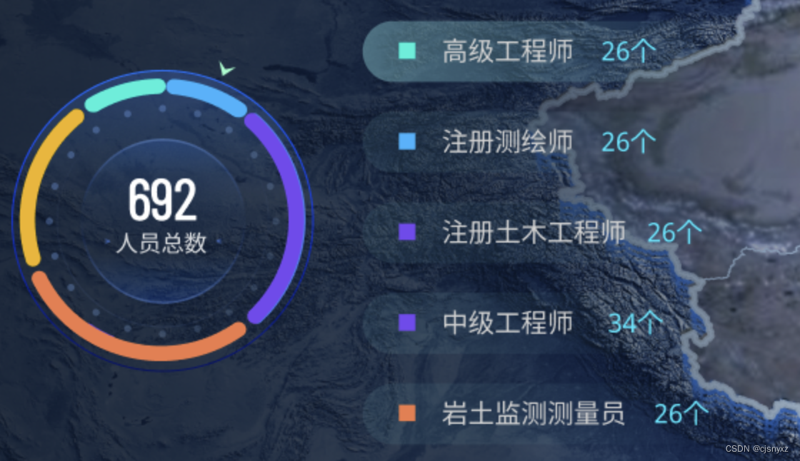
我的思路是将复杂的环形图拆分成一个个饼状图,再一一绘制。主要实现代码如下:
外圆 -- 上半圆装饰线
{
        id: 'out_decoration',
        type: 'pie',
        radius: ['85%', '85.8%'],
        center: ['45%', '50%'],
        avoidLabelOverlap: false,
        z: 10,
        label: {
          normal: {
            show: false,
          },
          emphasis: {
            show: false,
          },
        },
        itemStyle: {
          normal: {
            color: {
              type: 'linear',
              x: 0,
              y: 1,
              x2: 0,
              y2: 0,
              colorStops: [
                {
                  offset: 0,
                  color: 'rgba(42, 72, 233, 0.1)',
                },
                {
                  offset: 0.5,
                  color: 'rgba(42, 72, 233, 1)',
                },
              ],
            },
          },
        },
      },
外圆
{
        id: 'out',
        type: 'pie',
        radius: ['0%', '83%'],
        center: ['45%', '50%'],
        avoidLabelOverlap: false,
        hoverAnimation: false,
        label: {
          normal: {
            show: false,
            position: 'center',
          },
          emphasis: {
            show: false,
            textStyle: {
              fontWeight: 'bold',
            },
          },
        },
        itemStyle: {
          normal: {
            color: {
              type: 'linear',
              x: 0,
              y: 0.4,
              x2: 0,
              y2: 0,
              colorStops: [
                {
                  offset: 0,
                  color: 'rgba(198, 210, 255, 0.1)',
                },
                {
                  offset: 0.5,
                  color: 'rgba(78, 159, 255, 0.3)',
                },
              ],
            },
          },
        },
        labelLine: {
          normal: {
            show: false,
          },
        },
      },
环形数据
{
        id: 'ring',
        type: 'pie',
        name: '类型统计',
        z: 100,
        radius: ['78%', '70%'],
        center: ['45%', '50%'],
        label: {
          show: false,
        },
        itemStyle: {
          borderRadius: 20,
          borderWidth: 3, // 设置border的宽度有多大
          color: (params) => {
            const index = params.dataIndex;
            return props.colorList[index];
          },
        },
        data: chartData,
      },
刻度尺
{
        id: 'dividing_rule',
        type: 'gauge',
        radius: '80%',
        center: ['45%', '50%'],
        startAngle: 225, // 刻度起始
        endAngle: -134.8, // 刻度结束
        z: 4,
        splitNumber: 5,
        axisTick: {
          show: true,
          length: 4,
          lineStyle: {
            width: 4,
            color: 'rgba(120,174,255, 0.3)',
          },
        },
        splitLine: {
          length: 0, // 刻度节点线长度
          lineStyle: {
            width: 1,
            color: 'rgba(120,174,255, 0.3)',
          }, // 刻度节点线
        },
        axisLabel: {
          color: 'rgba(255,255,255,0)',
          fontSize: 12,
        }, // 刻度节点文字颜色
        pointer: {
          show: false,
        },
        axisLine: {
          lineStyle: {
            opacity: 0,
          },
        },
        detail: {
          show: false,
        },
      },
右刻度尺
{
        id: 'right',
        type: 'gauge',
        radius: '48%',
        center: ['45%', '50%'],
        startAngle: -30, // 刻度起始
        endAngle: -30, // 刻度结束
        z: 4,
        splitNumber: 1,
        axisTick: {
          show: true,
          length: 2,
          lineStyle: {
            width: 2,
            color: '#4981F2',
          },
        },
        splitLine: {
          show: false,
        },
        axisLabel: {
          color: 'rgba(255,255,255,0)',
          fontSize: 12,
        }, // 刻度节点文字颜色
        pointer: {
          show: false,
        },
        axisLine: {
          lineStyle: {
            opacity: 0,
          },
        },
        detail: {
          show: false,
        },
      },
到此已经渲染大部分结构,其他部分:下半圆装饰、内圆、左刻度尺也是类似。


 1万+
1万+


 被折叠的 条评论
为什么被折叠?
被折叠的 条评论
为什么被折叠?
 到【灌水乐园】发言


