


1、在网页设计中我们经常遇到宽度自适应,但有时候可能一种高度自适应的问题。这个时候我们的position之absolute就可以帮你了。
2、position之absolute是脱离文档流。当width、height设置某值后,该元素的值就是该值。那width、height没有设置的时候呢?
3、该元素的witdh、height会根据父元素(需设置position:relative,没有则按浏览器作为父元素)的width、height和该元素left、bottom、top、right而改变。
公式:
该元素的witdh = 父元素的width-top-bottom;
该元素的height= 父元素的height-left-right;
该元素位置(该元素left,该元素top);
废话不多说,上图!
html:
|
1
2
3
4
5
6
|
<
body
>
<
div
class="container">
<
div
class="B">
</
div
>
</
div
>
</
body
>
|
css:
|
1
2
|
.container {
width
:
600px
;
height
:
600px
;
background
:
#999999
;
position
:
relative
;}
.B {
background
:
#D9C666
;
position
:
absolute
;
top
:
5
|
|
1
|
0px
;
left
:
100px
;
bottom
:
100px
;
right
:
100px
; }
|
效果:

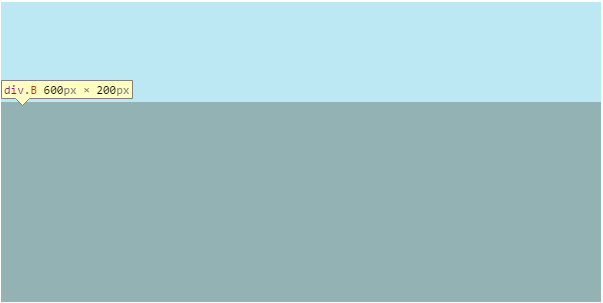
4、假如有一高度自适应的div,父元素高度300px,里面有两个div,一个高度100px,希望另一个填满剩下的高度
html:
|
1
2
3
4
5
6
|
<
div
class="container">
<
div
class="A">
</
div
>
<
div
class="B">
</
div
>
</
div
>
|
css:
|
1
2
3
|
.container {
width
:
600px
;
height
:
300px
;
background
:
#999999
;
position
:
relative
;}
.A {
height
:
100px
;
background
:
#BBE8F2
; }
.B {
width
:
100%
;
background
:
#D9C666
;
position
:
absolute
;
top
:
100px
;
left
:
0
;
bottom
:
0
; }
|
效果:
就这么简单的完成!


 644
644


 被折叠的 条评论
为什么被折叠?
被折叠的 条评论
为什么被折叠?
 到【灌水乐园】发言


