


 本文详细介绍了网页布局中的圣杯布局与双飞翼布局的实现方式,通过具体的CSS和HTML代码示例展示了如何让左侧和右侧元素浮动在居中元素两侧的方法。
圣杯布局有个问题,当面板的center部分比两边的子面板宽度小的时候,布局就会乱掉。
因此也就有了双飞翼布局来克服这个问题。双飞翼布局在center上添加一个标签。
要了解这两个布局 看再多不如自己写几遍 很多东西网上不会讲解很细 但是自己实现几遍 会豁然开朗
圣杯布局
center面板先占满整行 两边面板被挤下去 然后center用padding来留出空白给两边面板
两边面板 left面板用margin负值 -100%就是向左移动整个center的宽度(是不包括两边留白的padding),
right面板 -250px 向左移动自身宽度的大小 才能够恰好挤进上一行
最后用相对定位把两边面板移到该在的位置。
css:
.main { padding: 0 250px 0 300px;overflow: hidden;}
.center { width: 100%; height: 600px; background: grey; float: left;}
.left { width: 300px; height: 600px; background: yellow; float: left; margin-left: -100%; position: relative; left: -300px;}
.right { width: 250px; height: 600px; background: green; float: left; margin-left: -250px; position:relative; right: -250px;}
html:
<div class="main">
<div class="center"></div>
<div class="left"></div>
<div class="right"></div>
</div>
双飞翼布局
center面板先占满整行 两边面板被挤下去
在center中还有一层div,centerin用来设置左右margin给两边面板留位置,
两边面板 left面板用margin负值 -100% 向左移动整个center的宽度 ,right面板-250px移动整个自身的宽度
css:
.main { overflow: hidden;}
.center { width: 100%; height: 600px; background: grey; float: left;}
.centerin { margin: 0 250px 0 300px;}
.left { width: 300px; height: 600px; background: yellow; float: left;margin-left: -100%;}
.right { width: 250px; height: 600px; background: green; float: left;margin-left: -250px;}
html:
<div class="main">
<div class="centerBig">
<div class="center"></div>
</div>
<div class="left"></div>
<div class="right"></div>
</div>
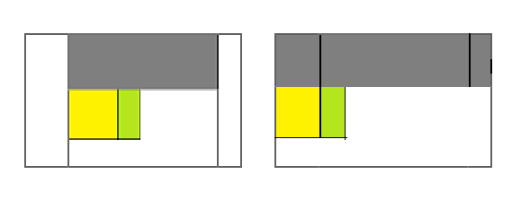
左边是圣杯 右边是双飞翼


 扫一扫
扫一扫


 563
563

 被折叠的 条评论
为什么被折叠?
被折叠的 条评论
为什么被折叠?
 到【灌水乐园】发言


