


纯HTML+CSS实现动画
本文给出纯HTML+CSS实现的几个网页动画,生动形象,比较有参考价值。【这里的“纯”指仅用HTML(Hypertext Markup Language,文本标记语言)和CSS(Cascading Style Sheet,层叠样式表)实现动画功能,不使用图片,也不使用JavaScript脚本语言】,源码参考自网络。
相关基础知识可参见 HTML5+CSS入门与提高学习系列 https://blog.csdn.net/cnds123/article/details/113860164
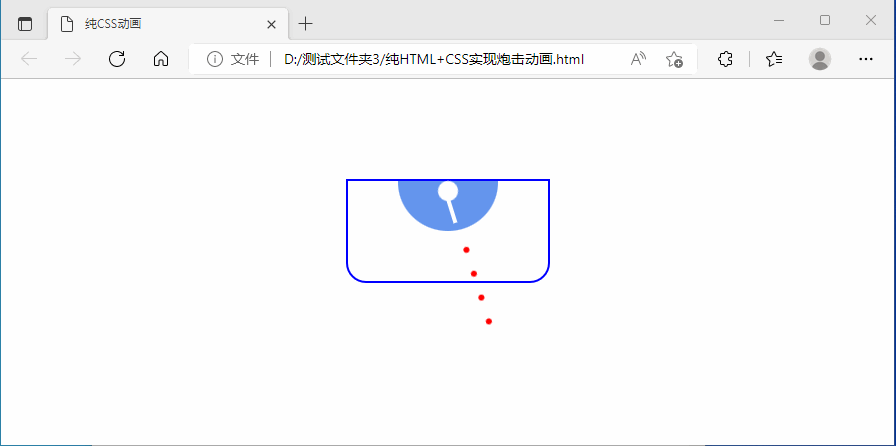
炮击
效果如下图:
源码如下:
<!DOCTYPE html>
<html>
<head>
<meta charset=utf-8"/>
    <title>纯CSS动画</title>
    <meta charset="utf-8" />
    <style>
    .tank{
        width:200px;
        height:100px;
        margin:100px auto;
        border:2px solid blue;
        border-radius:0 0 20px 20px;
        /*矩形圆角*/
    }
    .battery{
        width:100px;
        height:50px;
        margin:0px auto;
        background-color:cornflowerblue;
        border-radius:0 0 50px 50px;
    }
    .spiale{
        width:20px;
        height:20px;
        border-radius:10px;
        background-color:white;
        margin:auto;
        animation:go 3s infinite linear,gol 300ms infinite linear;
    }
    .gun{
        width:4px;
        height:25px;
        margin:-2px auto 0px;
        background-color:#fff;
        transform-origin:top;
        animation:go 3s infinite linear;/* 引用 go infinite 无限循环 linear 匀速*/
    }
    @keyframes gol{
        /*4个点*/
        0%{box-shadow:0px 50px 0px -7px red,
               0px 75px 0px -7px red,
               0px 100px 0px -7px red,
               0px 125px 0px -7px red;
        }
        100%{box-shadow:0px 75px 0px -7px red,
                 0px 100px 0px -7px red,
                 0px 125px 0px -7px red,
                 0px 150px 0px -7px red;
        }
    }
    @keyframes go{
        0%{transform:rotate(-45deg)}/*-45deg 为-45度*/
        50%{transform:rotate(45deg)}
        100%{transform:rotate(-45deg)}
    }
    </style>
</head>
<body>
    <div class="tank">
        <div class="battery">
            <div class="spiale"></div>
            <div class="gun"></div>
        </div>
    </div>
</body>
</html>
保存文件名:HTML+CSS实现炮击动画.html,用浏览器运行。
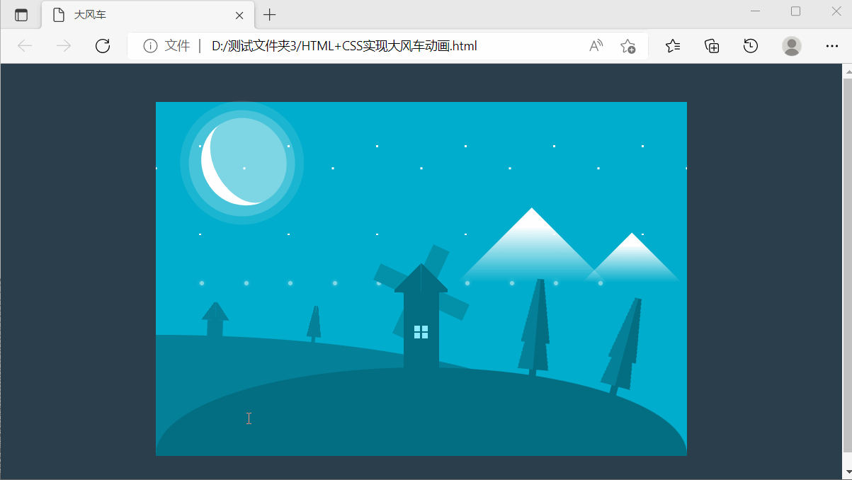
大风车
效果如下图:
大风车源码如下:
<!DOCTYPE html>
<html>
<head>
  <meta charset="UTF-8">
  <title>大风车</title>
<style>
.mill, .near, .landscape, body {
  display: flex;
  flex-flow: row wrap;
}

.mill {
  justify-content: flex-end;
}

.near, body {
  justify-content: center;
}

.mill, body {
  align-items: center;
}

.mill-shell {
  display: flex;
  justify-content: center;
  align-items: center;
}

.star:nth-of-type(1) {
  left: calc( 50 * 1px);
  animation-duration: 1 1s;
}

.star:nth-of-type(2) {
  left: calc( 50 * 2px);
  animation-duration: 1 2s;
}

.star:nth-of-type(3) {
  left: calc( 50 * 3px);
  animation-duration: 1 3s;
}

.star:nth-of-type(4) {
  left: calc( 50 * 4px);
  animation-duration: 1 4s;
}

.star:nth-of-type(5) {
  left: calc( 50 * 5px);
  animation-duration: 1 5s;
}

.star:nth-of-type(6) {
  left: calc( 50 * 6px);
  animation-duration: 1 6s;
}

.star:nth-of-type(7) {
  left: calc( 50 * 7px);
  animation-duration: 1 7s;
}

.star:nth-of-type(8) {
  left: calc( 50 * 8px);
  animation-duration: 1 8s;
}

.star:nth-of-type(9) {
  left: calc( 50 * 9px);
  animation-duration: 1 9s;
}

.star:nth-of-type(10) {
  left: calc( 50 * 10px);
  animation-duration: 1 10s;
}

body {
  background: #2a3e4b;
  height: 100vh;
}

.landscape {
  position: relative;
  background: #00adcc;
  width: 600px;
  height: 400px;
  min-width: 600px;
}

.near {
  position: relative;
  z-index: 20;
  border-radius: 50%/100% 100% 0 0;
  align-self: flex-end;
  background-color: #036e81;
  width: 600px;
  height: 100px;
}

.far {
  position: relative;
  bottom: -100px;
  z-index: 10;
  border-radius: 0% 100% 0% 0%;
  align-self: flex-end;
  background-color: #068099;
  width: 500px;
  height: 130px;
}

.mountains {
  position: absolute;
  width: 150px;
  height: 150px;
  top: 150px;
  bottom: auto;
  left: auto;
  right: 100px;
  background: linear-gradient(135deg, white 10%, transparent 40%);
  transform: rotate(45deg);
}
.mountains::after {
  content: "";
  position: absolute;
  width: 100px;
  height: 100px;
  top: -60px;
  bottom: auto;
  left: 100px;
  right: auto;
  background: linear-gradient(135deg, white 10%, transparent 40%);
}

.sky {
  position: relative;
  background: radial-gradient(white 2%, transparent 0) repeat center/100px 100px, radial-gradient(white 2%, transparent 0) repeat top left/100px 100px;
  width: 100%;
  height: 150px;
}

.star {
  position: absolute;
  width: 5px;
  height: 5px;
  top: 0;
  bottom: auto;
  left: 100px;
  right: auto;
  border-radius: 50%;
  background: white;
  animation: starFall 3s linear infinite;
  box-shadow: 0px 0px 5px white;
}

.mill {
  width: 60px;
  height: 150px;
  position: relative;
  flex-direction: column;
  margin-top: -145px;
}
.mill > div {
  z-index: 10;
}
.mill__roof {
  width: 60px;
  height: 60px;
  background: linear-gradient(45deg, #036e81 50%, transparent 0) no-repeat right bottom/50% 60%, linear-gradient(-45deg, #036e81 50%, transparent 0) no-repeat left bottom/50% 60%;
}
.mill-shell {
  width: 40px;
  height: 90px;
  background: #036e81;
}
.mill-shell__window {
  position: relative;
  width: 15px;
  height: 15px;
  background: #88eafc;
}
.mill-shell__window::after, .mill-shell__window::before {
  content: "";
  position: absolute;
  width: 2px;
  height: 100%;
  top: auto;
  bottom: auto;
  left: calc(50% - 1px);
  right: auto;
  background: #036e81;
}
.mill-shell__window::before {
  position: absolute;
  width: 100%;
  height: 2px;
  top: calc(50% - 1px);
  bottom: auto;
  left: 0;
  right: auto;
}
.mill::after, .mill::before {
  content: "";
  position: absolute;
  width: 110px;
  height: 20px;
  top: 50px;
  bottom: auto;
  left: auto;
  right: auto;
  background: #0490a9;
  z-index: 5;
  animation: millRun 2s linear infinite;
}
.mill::before {
  position: absolute;
  width: 20px;
  height: 110px;
  top: 5px;
  bottom: auto;
  left: auto;
  right: auto;
}

.house {
  position: absolute;
  width: 35px;
  height: 40px;
  top: -37px;
  bottom: auto;
  left: 50px;
  right: auto;
  background: linear-gradient(55deg, #068099 50%, transparent 0) no-repeat top right/50% 50%, linear-gradient(-55deg, #068099 50%, transparent 0) no-repeat top left/50% 50%, linear-gradient(#068099, #068099) no-repeat bottom center/50% 50%;
  transform: rotate(2deg);
}

.three {
  position: absolute;
  width: 40px;
  height: 120px;
  top: -100px;
  bottom: auto;
  left: auto;
  right: 150px;
  transform: rotate(5deg);
  background: linear-gradient(80deg, #036e81 50%, transparent 0) no-repeat top right/50% 60%, linear-gradient(-80deg, #068099 50%, transparent 0) no-repeat top left/50% 60%, linear-gradient(80deg, #036e81 50%, transparent 0) no-repeat center right/50% 70%, linear-gradient(-80deg, #068099 50%, transparent 0) no-repeat center left/50% 70%, linear-gradient(#036e81, #036e81) no-repeat bottom center/20% 70%;
}
.three:nth-of-type(3) {
  position: absolute;
  width: 40px;
  height: 120px;
  top: -80px;
  bottom: auto;
  left: auto;
  right: 50px;
  transform: rotate(15deg);
}
.three:nth-of-type(1) {
  background: linear-gradient(80deg, #068099 50%, transparent 0) no-repeat center right/50% 70%, linear-gradient(-80deg, #068099 50%, transparent 0) no-repeat center left/50% 70%, linear-gradient(#068099, #068099) no-repeat bottom center/20% 70%;
  position: absolute;
  width: 20px;
  height: 50px;
  top: -40px;
  bottom: auto;
  left: 170px;
  right: auto;
  transform: rotate(5deg);
}

.moon {
  position: absolute;
  width: 100px;
  height: 80px;
  top: 20px;
  bottom: auto;
  left: 50px;
  right: auto;
  border-radius: 50%;
  border-bottom: 15px solid white;
  transform: rotate(60deg);
  background: rgba(255, 255, 255, 0.3);
}
.moon::after {
  content: "";
  position: absolute;
  width: 120px;
  height: 120px;
  top: -10px;
  bottom: auto;
  left: -10px;
  right: auto;
  border-radius: 50%;
  background: rgba(255, 255, 255, 0.2);
}
.moon::before {
  content: "";
  position: absolute;
  width: 140px;
  height: 140px;
  top: -20px;
  bottom: auto;
  left: -20px;
  right: auto;
  border-radius: 50%;
  background: rgba(255, 255, 255, 0.1);
}

@keyframes millRun {
  to {
    transform: rotate(90deg);
  }
}
@keyframes starFall {
  100% {
    top: 400px;
    opacity: 0;
  }
}
</style>

</head>

<body >
  <div class="landscape">
  <div class="sky">
    <div class="star"> </div>
    <div class="star"> </div>
    <div class="star"> </div>
    <div class="star"> </div>
    <div class="star"> </div>
    <div class="star"> </div>
    <div class="star"> </div>
    <div class="star"> </div>
    <div class="star"> </div>
    <div class="star"> </div>
    <div class="moon"></div>
  </div>
  <div class="mountains"> </div>
  <div class="far">
    <div class="three"></div>
    <div class="house"></div>
  </div>
  <div class="near">
    <div class="mill">
      <div class="mill__roof"></div>
      <div class="mill-shell">
        <div class="mill-shell__window"></div>
      </div>
    </div>
    <div class="three"> </div>
    <div class="three"></div>
  </div>
</div>

</body>

</html>
保存文件名:HTML+CSS实现大风车动画.html,用浏览器运行。
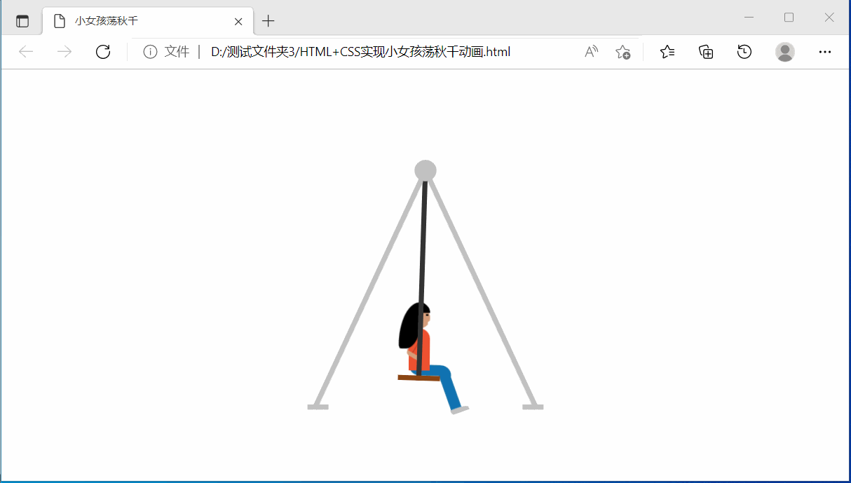
小女孩荡秋千
效果如下图:
小女孩荡秋千源码如下:
<!DOCTYPE html>
<html >
<head>
  <meta charset="UTF-8">
  <title>小女孩荡秋千</title>
<style>
.wrapper {
  position: absolute;
  top: 50%;
  left: 50%;
  width: 200px;
  height: 200px;
  transform: translate(-50%, -50%) scale(1.2);
}
.wrapper .pole {
  position: absolute;
  width: 5px;
  height: 250px;
  left: 50%;
  transform-origin: center top;
  transform: translateX(-50%) rotate(-25deg);
  color: silver;
  background: currentColor;
}
.wrapper .pole.two {
  transform: translateX(-50%) rotateY(-180deg) rotate(-25deg);
}
.wrapper .pole:before {
  content: "";
  position: absolute;
  top: -10px;
  left: -7px;
  width: 20px;
  height: 20px;
  border-radius: 100%;
  background: currentColor;
}
.wrapper .pole:after {
  content: "";
  position: absolute;
  left: 0;
  bottom: 0;
  width: 20px;
  height: 5px;
  transform: translateX(-50%) rotate(25deg);
  background: currentColor;
}
.wrapper .swing {
  position: absolute;
  width: 40px;
  height: 100%;
  left: calc(50% - 20px);
  transform-origin: center top;
  -webkit-animation-duration: 0.8s;
          animation-duration: 0.8s;
  -webkit-animation-iteration-count: infinite;
          animation-iteration-count: infinite;
  -webkit-animation-timing-function: ease-in-out;
          animation-timing-function: ease-in-out;
  -webkit-animation-direction: alternate;
          animation-direction: alternate;
}
.wrapper .swing .human {
  position: absolute;
  width: 40px;
  height: 80px;
  bottom: 5px;
  z-index: -1;
}
.wrapper .swing .human .top-part {
  position: absolute;
  width: 40px;
  height: 80px;
  bottom: 5px;
  transform-origin: center bottom;
  -webkit-animation-name: body-animation;
          animation-name: body-animation;
  -webkit-animation-duration: 0.8s;
          animation-duration: 0.8s;
  -webkit-animation-iteration-count: infinite;
          animation-iteration-count: infinite;
  -webkit-animation-timing-function: ease-in-out;
          animation-timing-function: ease-in-out;
  -webkit-animation-direction: alternate;
          animation-direction: alternate;
}
.wrapper .swing .human .top-part .head {
  position: absolute;
  bottom: 40px;
  left: 50%;
  transform: translateX(-50%);
  width: 20px;
  height: 20px;
  background: #d59e7b;
  border-radius: 100%;
  z-index: 2;
}
.wrapper .swing .human .top-part .head .hair {
  position: absolute;
  top: -5px;
  left: -10px;
  background: black;
  width: 22px;
  height: 44px;
  border-top-right-radius: 0%;
  border-top-left-radius: 100%;
  border-bottom-right-radius: 75%;
  border-bottom-left-radius: 10%;
  z-index: 2;
}
.wrapper .swing .human .top-part .head .fringe {
  position: absolute;
  top: -5px;
  left: 0;
  width: 0px;
  height: 0px;
  border-top: 10px solid black;
  border-bottom: 10px solid black;
  border-left: 10px solid transparent;
  border-right: 10px solid transparent;
  border-radius: 100%;
  transform: rotate(45deg);
}
.wrapper .swing .human .top-part .head .eye {
  content: "";
  position: absolute;
  top: 6px;
  right: 2px;
  width: 2px;
  height: 2px;
  background: black;
  border-radius: 100%;
}
.wrapper .swing .human .top-part .head .mouth {
  position: absolute;
  top: 10px;
  right: 0px;
  width: 0px;
  height: 0px;
  border-top: 3px solid transparent;
  border-bottom: 3px solid transparent;
  border-left: 3px solid transparent;
  border-right: 3px solid white;
  border-radius: 100%;
  transform: rotate(28deg);
}
.wrapper .swing .human .top-part .body {
  position: absolute;
  bottom: 0px;
  left: 50%;
  transform: translateX(-50%);
  background: #ee5130;
  width: 20px;
  height: 40px;
  border-top-left-radius: 20px;
  border-top-right-radius: 20px;
}
.wrapper .swing .human .top-part .body .hand {
  position: absolute;
  top: 20%;
  left: 10%;
}
.wrapper .swing .human .top-part .body .hand .hand-one {
  position: absolute;
  transform: rotate(30deg);
  width: 5px;
  height: 15px;
  background: #ee5130;
  box-shadow: 0 -1px 0px 1px rgba(0, 0, 0, 0.2);
  border-top-right-radius: 100%;
  border-top-left-radius: 100%;
}
.wrapper .swing .human .top-part .body .hand .hand-two {
  background: #d59e7b;
  position: absolute;
  top: 14px;
  left: -6px;
  width: 4px;
  height: 15px;
  transform-origin: center top;
  transform: rotate(-60deg);
  border-top-left-radius: 15px;
}
.wrapper .swing .human .leg-one {
  position: absolute;
  bottom: 0;
  left: 10px;
  width: 40px;
  height: 10px;
  background: #1973ad;
  border-bottom-left-radius: 20px;
  border-top-right-radius: 20px;
  z-index: -1;
}
.wrapper .swing .human .leg-two {
  position: absolute;
  width: 40px;
  height: 10px;
  bottom: 5px;
  right: -5px;
  border-top-right-radius: 50%;
  border-bottom-right-radius: 20px;
  background: #1973ad;
  transform-origin: right center;
  transform: rotate(-90deg);
  -webkit-animation-name: leg-animation;
          animation-name: leg-animation;
  -webkit-animation-duration: 0.8s;
          animation-duration: 0.8s;
  -webkit-animation-iteration-count: infinite;
          animation-iteration-count: infinite;
  -webkit-animation-timing-function: ease-in-out;
          animation-timing-function: ease-in-out;
  -webkit-animation-direction: alternate;
          animation-direction: alternate;
}
.wrapper .swing .human .leg-two:after {
  content: "";
  position: absolute;
  left: -5px;
  top: -1px;
  background: silver;
  height: 18px;
  width: 5px;
  border-top-left-radius: 3px;
  border-bottom-right-radius: 50%;
}
.wrapper .swing .swing-rod {
  position: absolute;
  width: 5px;
  height: 200px;
  left: 50%;
  transform: translateX(-50%);
  background: #323232;
}
.wrapper .swing .bottom {
  position: absolute;
  width: 100%;
  height: 5px;
  bottom: 0;
  background: saddlebrown;
}
.wrapper .swing:nth-of-type(1) {
  -webkit-animation-name: swing-1;
          animation-name: swing-1;
}
.wrapper .swing:nth-of-type(4) {
  -webkit-animation-name: swing-2;
          animation-name: swing-2;
}

@-webkit-keyframes swing-1 {
  from {
    transform: rotate(-35deg);
  }
  to {
    transform: rotate(35deg);
  }
}

@keyframes swing-1 {
  from {
    transform: rotate(-35deg);
  }
  to {
    transform: rotate(35deg);
  }
}
@-webkit-keyframes body-animation {
  from {
    transform: rotate(-25deg);
  }
  to {
    transform: rotate(20deg);
  }
}
@keyframes body-animation {
  from {
    transform: rotate(-25deg);
  }
  to {
    transform: rotate(20deg);
  }
}
@-webkit-keyframes leg-animation {
  from {
    bottom: 2px;
    right: -8px;
    transform: rotate(-55deg);
  }
  to {
    bottom: 2px;
    right: 5px;
    transform: rotate(-170deg);
  }
}
@keyframes leg-animation {
  from {
    bottom: 2px;
    right: -8px;
    transform: rotate(-55deg);
  }
  to {
    bottom: 2px;
    right: 5px;
    transform: rotate(-170deg);
  }
}
</style>

</head>

<body  >
  <div class="wrapper">
  <div class="swing">
    <div class="human">
      <div class="top-part">
        <div class="head">
          <div class="hair"></div>
          <div class="fringe"></div>
          <div class="eye"></div>
          <div class="mouth"></div>
        </div>
        <div class="body">
          <div class="hand">
            <div class="hand-one"></div>
            <div class="hand-two"></div>
          </div>
        </div>
      </div>
      <div class="leg-one"></div>
      <div class="leg-two"></div>
    </div>
    <div class="swing-rod"></div>
    <div class="bottom"></div>
  </div>
  <div class="pole one"></div>
  <div class="pole two"></div>
</div>

</body>

</html>
保存文件名:HTML+CSS实现小女孩荡秋千动画.html,用浏览器运行。


 2万+
2万+


 被折叠的 条评论
为什么被折叠?
被折叠的 条评论
为什么被折叠?
 到【灌水乐园】发言


